
Fresh & Tasty
Feast Your Eyes
Latest & Greatest
Fresh & Tasty Feast Your Eyes Latest & Greatest
branding Reviews
Opinions and reviews of restaurant, hotel, and food & beverage branding projects from around the world.
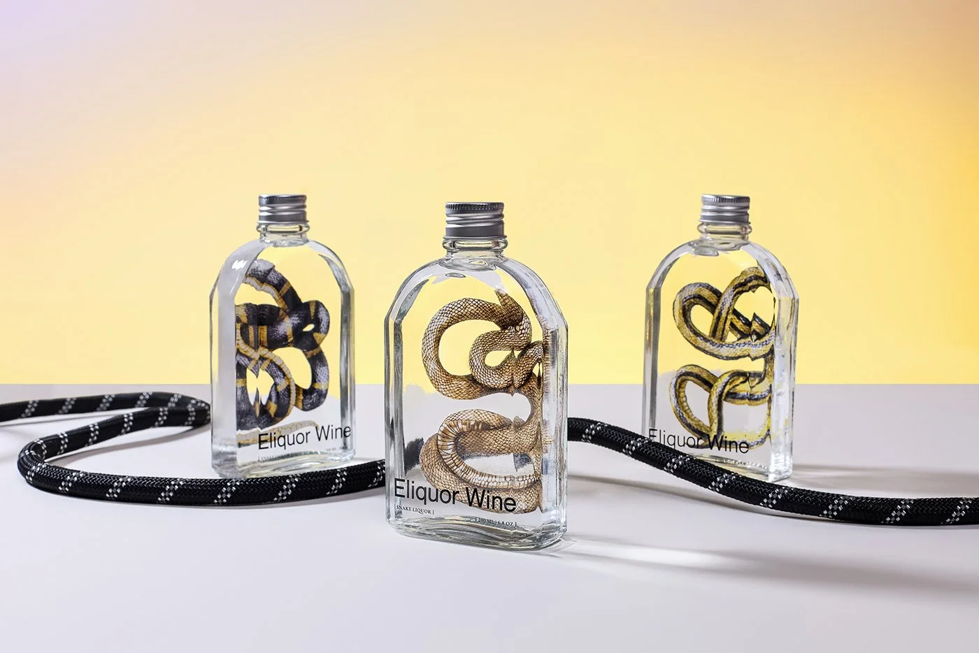
Layơ Lab turned one of snake wine’s biggest barriers into its strongest design asset. A critique of Eliquor Snake Wine and what hospitality brands can learn from preserving the strange things that make them memorable.
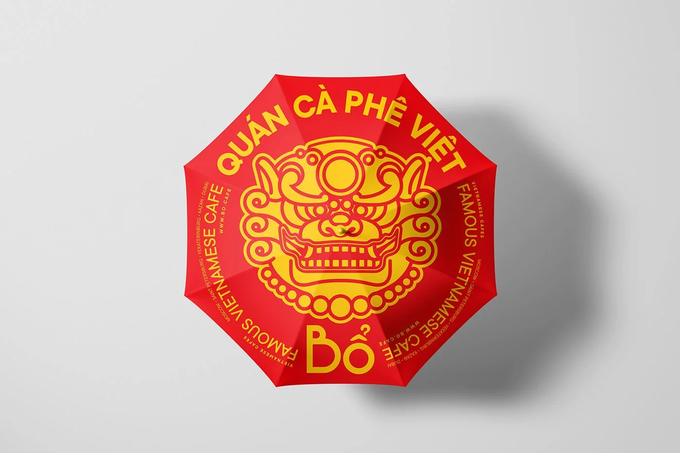
Bo Vietnamese Cafe refuses to whisper. Joseph Szala reviews W Design Bureau’s aggressive, neo-brutalist branding that champions authenticity over safe, tired tropes.
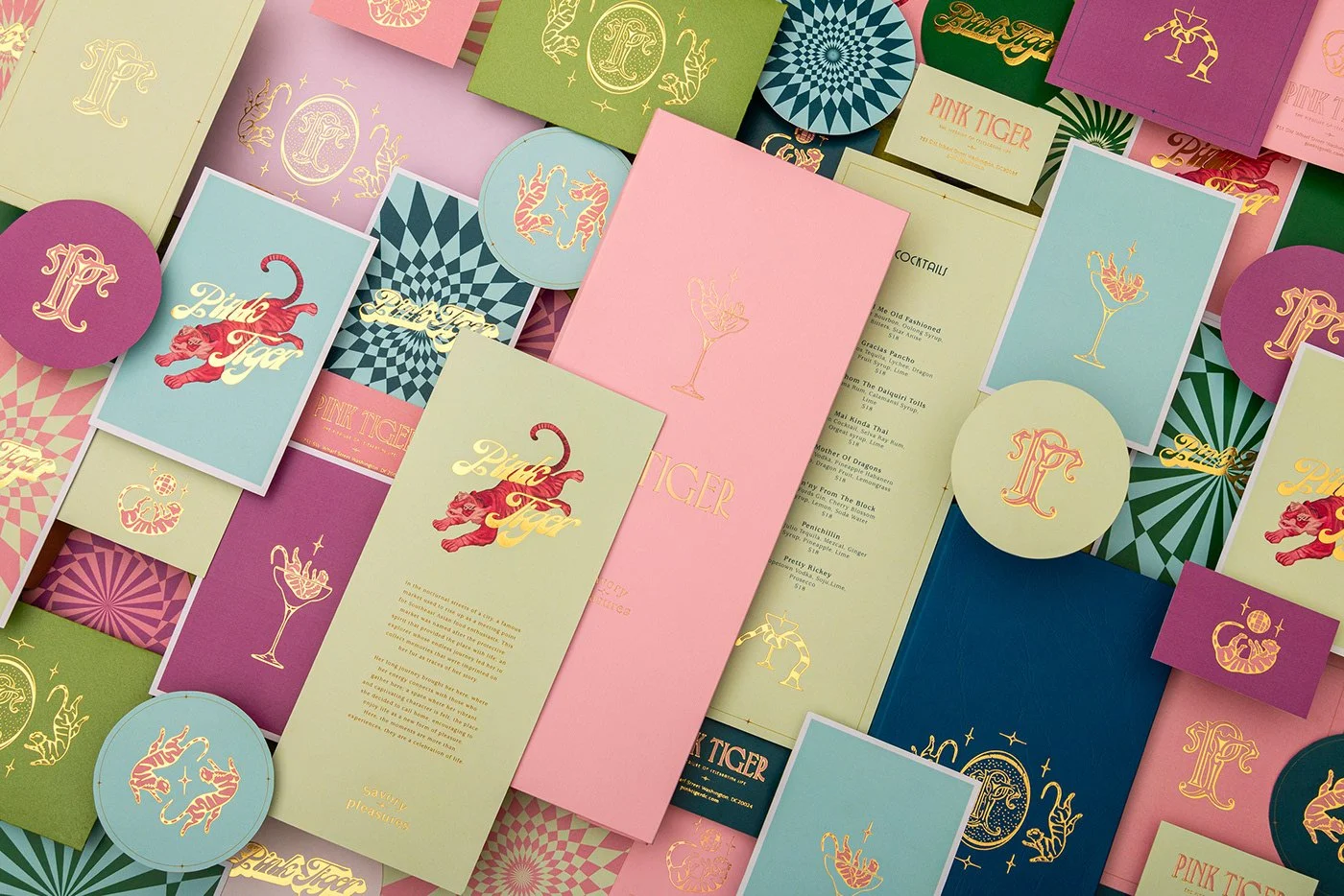
Asian cuisine branding is often stuck in a red-and-black echo chamber. Pink Tiger breaks out with a fever dream of 1920s leisure. Here is why this visual rebellion matters for restaurant leaders looking to charge ahead of the herd.
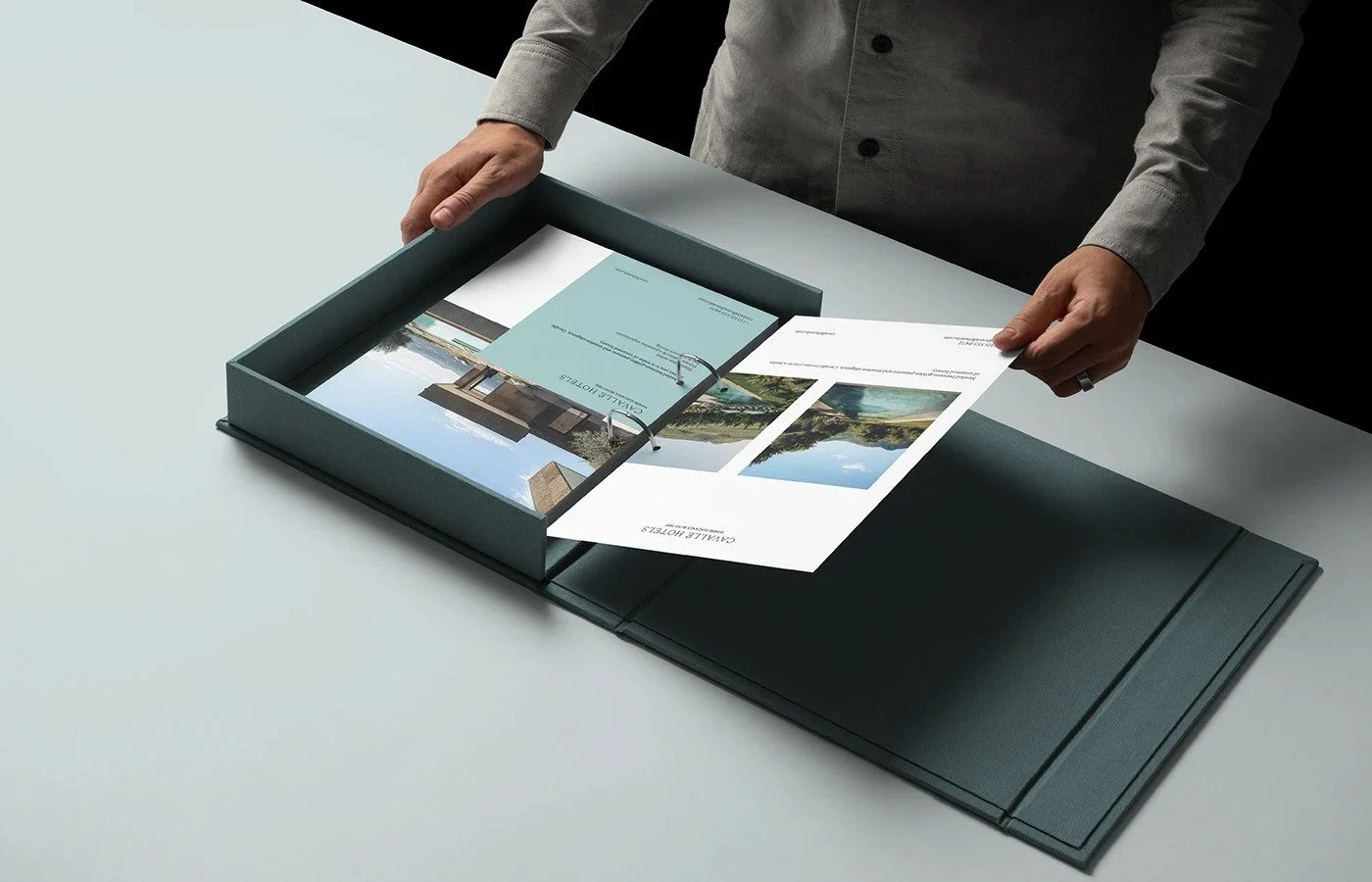
Yasser Elyamni’s identity for Cavallé Hotels delivers a disciplined study in contemporary luxury minimalism. The work blends atmospheric gradients, editorial typography, and restrained composition to present a serene hospitality brand. The critique explores the strengths of this system, its alignment with luxury strategy, and areas where symbolic language and experiential elements could elevate distinctiveness.
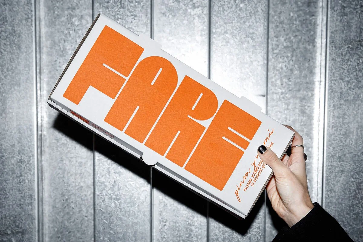
The branding for FARE applies a contemporary interpretation of classical Roman form to position a modern Pinsa concept with notable conceptual clarity. This critique unpacks the visual decisions that shape the identity, assessing the strengths in cohesion and historical reference along with the areas where emotional tone and brand warmth could be strengthened for greater hospitality resonance.
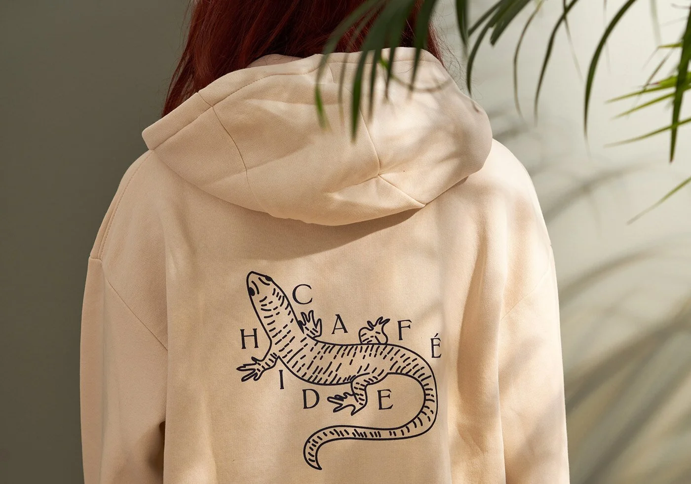
Studio Born gives Café Hide a quiet, confident identity rooted in classic revivalism and nostalgic pen-and-ink charm. The handcrafted feel of sticker-based packaging and a soothing neutral palette builds instant warmth, yet the system leaves room to grow. A broader visual language—beyond the singular logo—could unlock a richer, more flexible brand story.
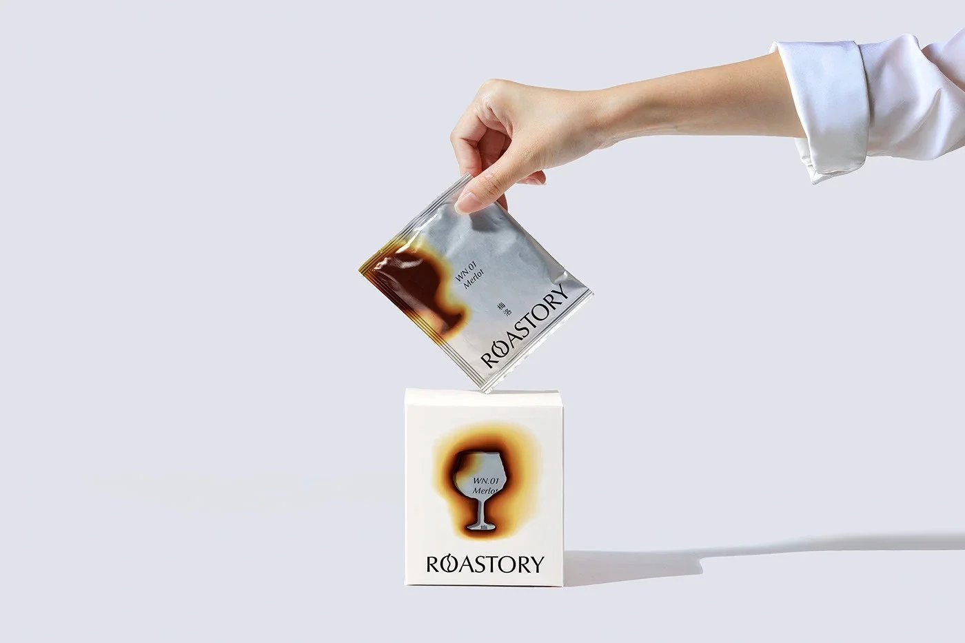
Roastory’s identity walks with a quiet swagger—clean layouts, rich white space, and a tactile burn-mark signature that gives the brand its pulse. The system feels intentional and grounded, though the logo’s bean-shaped “O” and a monotone packaging suite hold it back from greatness. This review breaks down what works, what wobbles, and why the brand still earns respect for its contemporary craft approach.
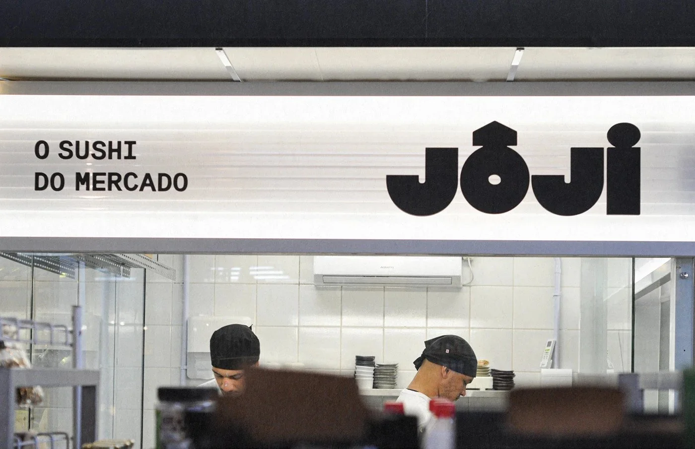
Joji Sushi’s branding flips the script on traditional Japanese design. Created by Bolden Branding in São Paulo, the identity fuses geometric typography, raw market energy, and a fearless color palette of dragon green and electric pink. It’s a study in contrast—heritage and heat, craft and chaos—capturing the rhythm of sushi made in the heart of the market.
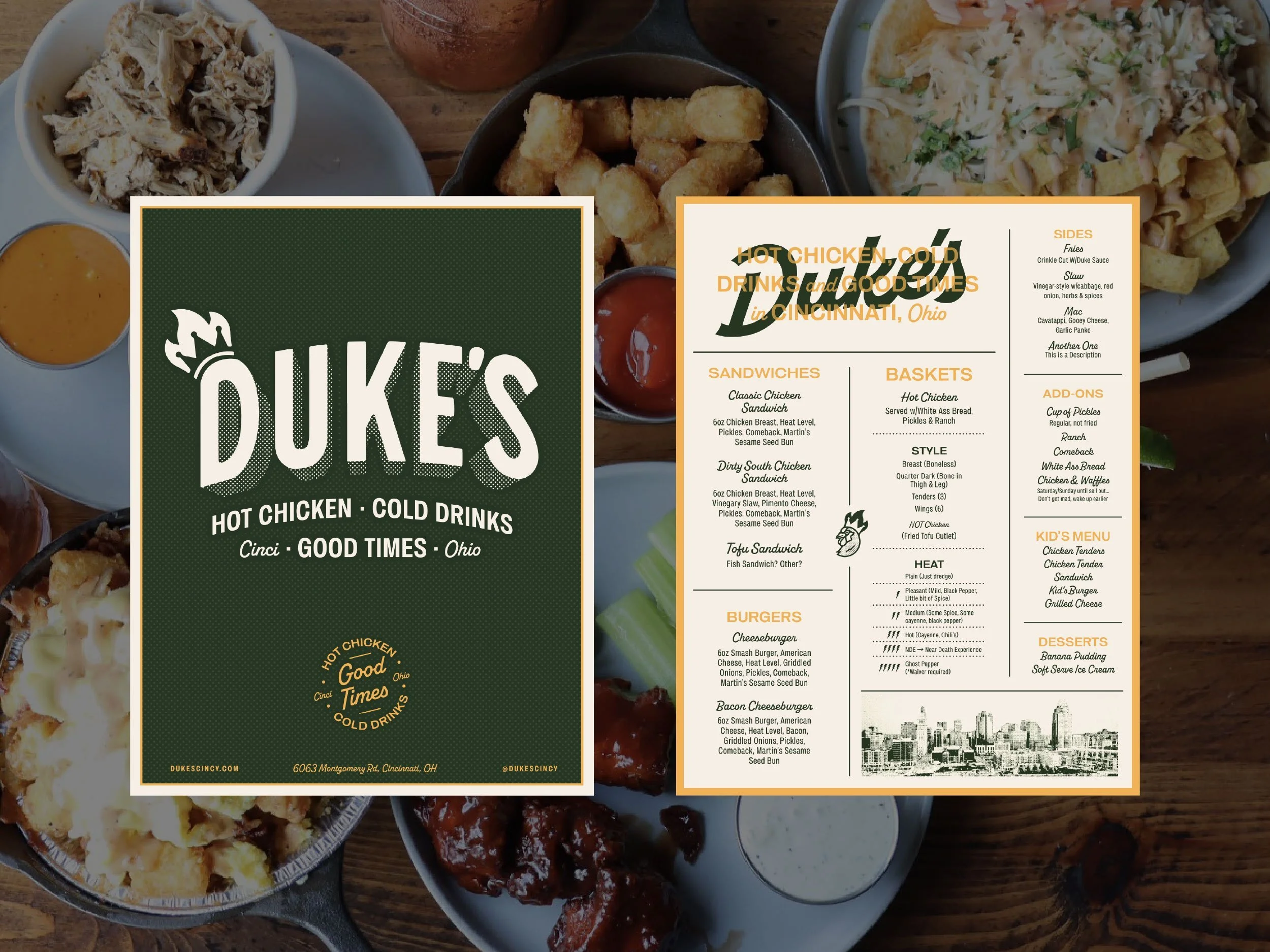
Vicarel Studios turned up the heat for Duke’s Hot Chicken in Cincinnati with a brand identity steeped in vintage Americana and neighborhood swagger. The design balances craft authenticity with modern energy—bold typography, lightning-fast roosters, and a color palette that feels both seasoned and fresh. This case study breaks down how the studio’s nostalgic design language builds a timeless yet current restaurant brand that delivers on its promise: hot chicken, cold drinks, and good times.
Paper Play’s identity for THE SENSE transforms the humble croissant into architecture. Clean geometry replaces cliché. All-caps typography asserts calm confidence. The palette whispers, the mark remembers. This is geometric minimalism built for flavor—a Chengdu café where design and ritual share the same table.
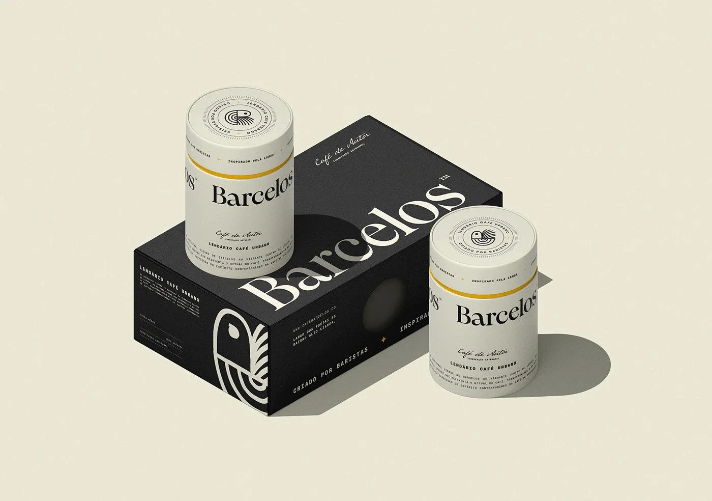
Barcelos Coffee revives a Portuguese legend with precision and poise. Designed by Gustavo Bortoletto in São Paulo, the identity distills the famed Barcelos rooster into clean geometry and balanced typography. It’s a visual dialogue between heritage and modernism—black and white, serif and monospace, craft and city grit. A minimalist roast that feels both local and global, steeped in authenticity.
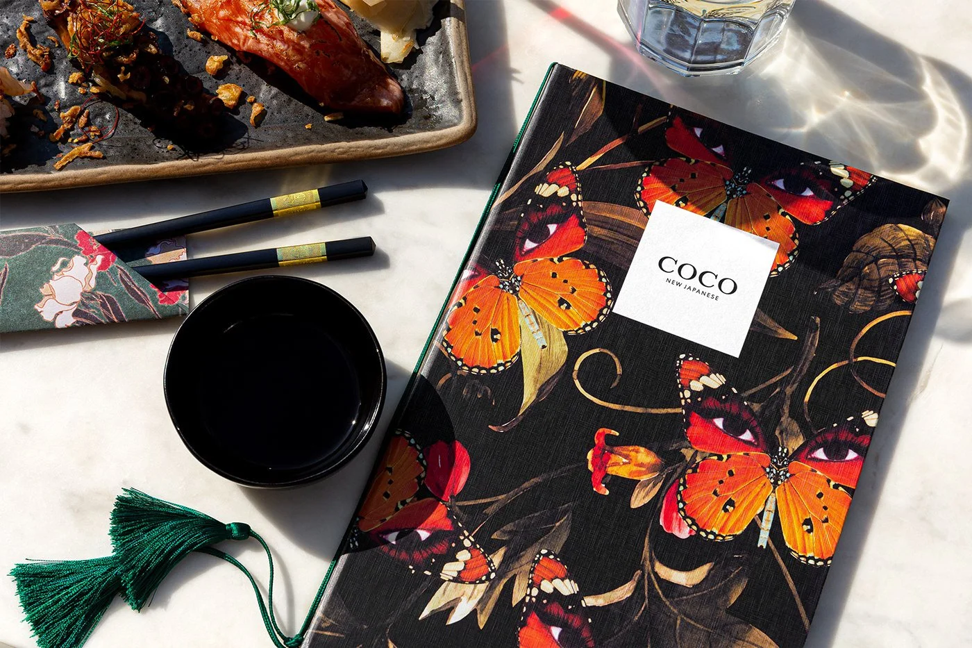
COCO New Japanese rewrites the rules of restaurant branding in Kyiv. Its identity mixes Art Deco geometry with Japanese surrealism — butterflies with eyes, gilded ginkgo leaves, and menus dressed in deep emerald and blood red. This isn’t minimalism. It’s modern Japan through a cinematic lens, where every printed piece feels like a scene from a story you want to taste.
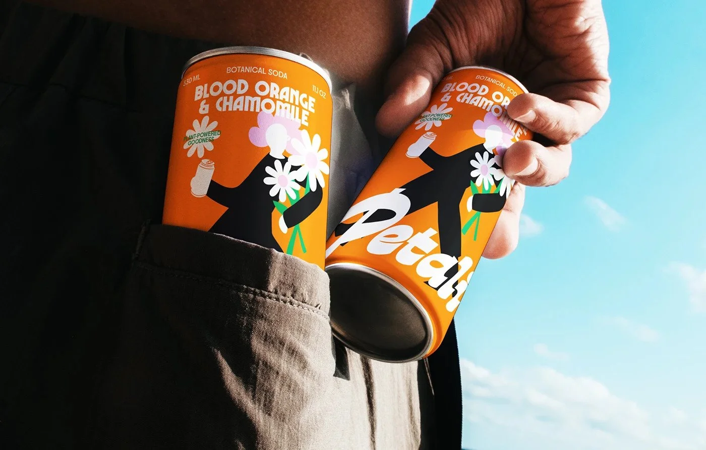
Petali doesn’t whisper wellness—it struts in. Designer Yuliia Hrabynska flips the botanical drink trope on its head, coating it in orange swagger and pop-art precision. It’s soda with soul, style, and something most brands miss—nerve.

Cherries isn’t just serving soft serve—it’s serving a full brand experience dipped in nostalgia and wrapped for today. The Working Assembly reimagines a classic ice cream shop with bold retro visuals, retail-ready packaging, and a cherry mascot ready for prime time. This is New Americana, designed to scale.

In Melbourne’s crowded street food scene, Bammi doesn’t whisper tradition—it shouts design. With a blistering red palette and bubble-wrapped typography, Hue Studio built a brand that owns the curb. No clichés. No clutter. Just pure, fast-casual firepower, baked into every visual touchpoint.

Marrowe Tea House flips the script on traditional tea branding. No florals. No clichés. Just a myth-fueled identity system with a geometric monkey mark and a story-first design language that carves out space in a crowded, over-soft category.

Domino’s just rolled out a rebrand that hits like a hot slice at 2 AM—clean, bold, and unapologetically craveable. The iconic domino tile gets room to breathe. Typography stretches its legs. And a cheeky new tagline leans into flavor-first marketing. But not everything rises. One design move cuts a little too close to a competitor’s crust.

Break Maiden’s branding for Intermezzo captures the soul of a modern coastal café—refined, relaxed, and beautifully intentional. With understated typography, sun-washed tones, and tactile details, the identity turns quiet design into a lasting impression.

Studio Boam’s branding for Red Lake Bourbon captures the tension between heritage and modernity — rugged Americana filtered through a Parisian lens. This Graze.media critique explores how restraint, texture, and typography come together to create a timeless bourbon identity that’s as sophisticated as it is soulful.
Get Recognized for Amazing Work
Show off your craft! Submit your latest restaurant branding, packaging, or design projects to have your work seen, shared, and celebrated by fellow designers and industry pros.
What’s the Graze all about
Graze explores the world of restaurant branding, design, and creative storytelling. We review the most compelling restaurant identities—from logos and menus to interiors and packaging. Our content feeds designers, restaurateurs, and brand enthusiasts looking for fresh ideas and sharp insights. If you love great food and even better design, you’re in the right place.
Solid & Bold transformed Hotel Tauernhof by looking deeper than the usual visual shorthand of alpine hospitality. The result offers a valuable lesson for restaurants and hotels alike: locality becomes powerful when designers study the place instead of decorating with its clichés.