Hide Cafe restaurant branding
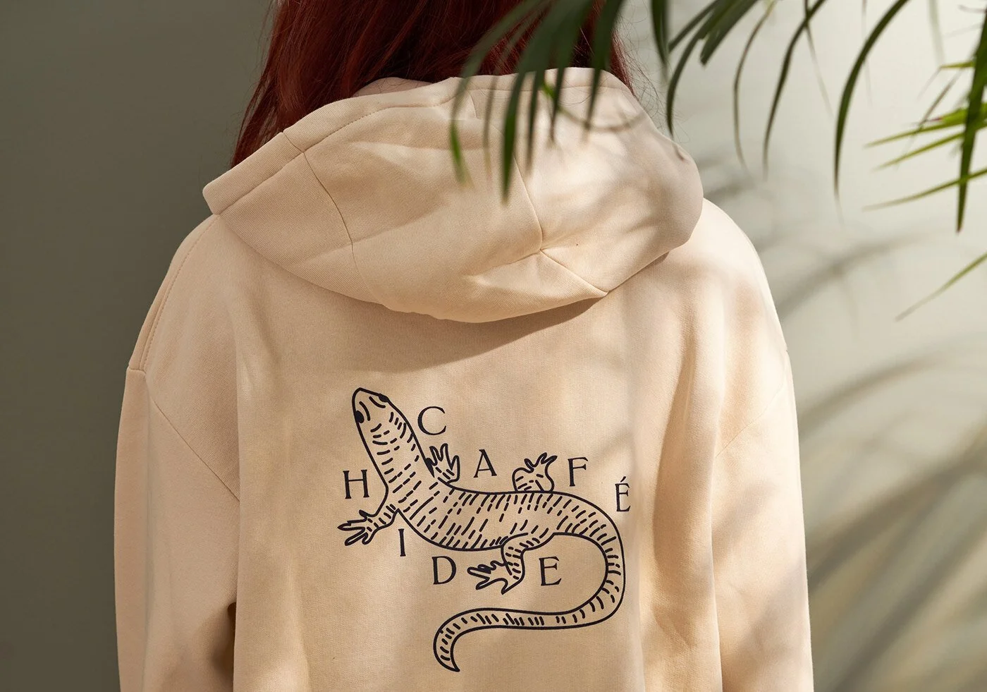
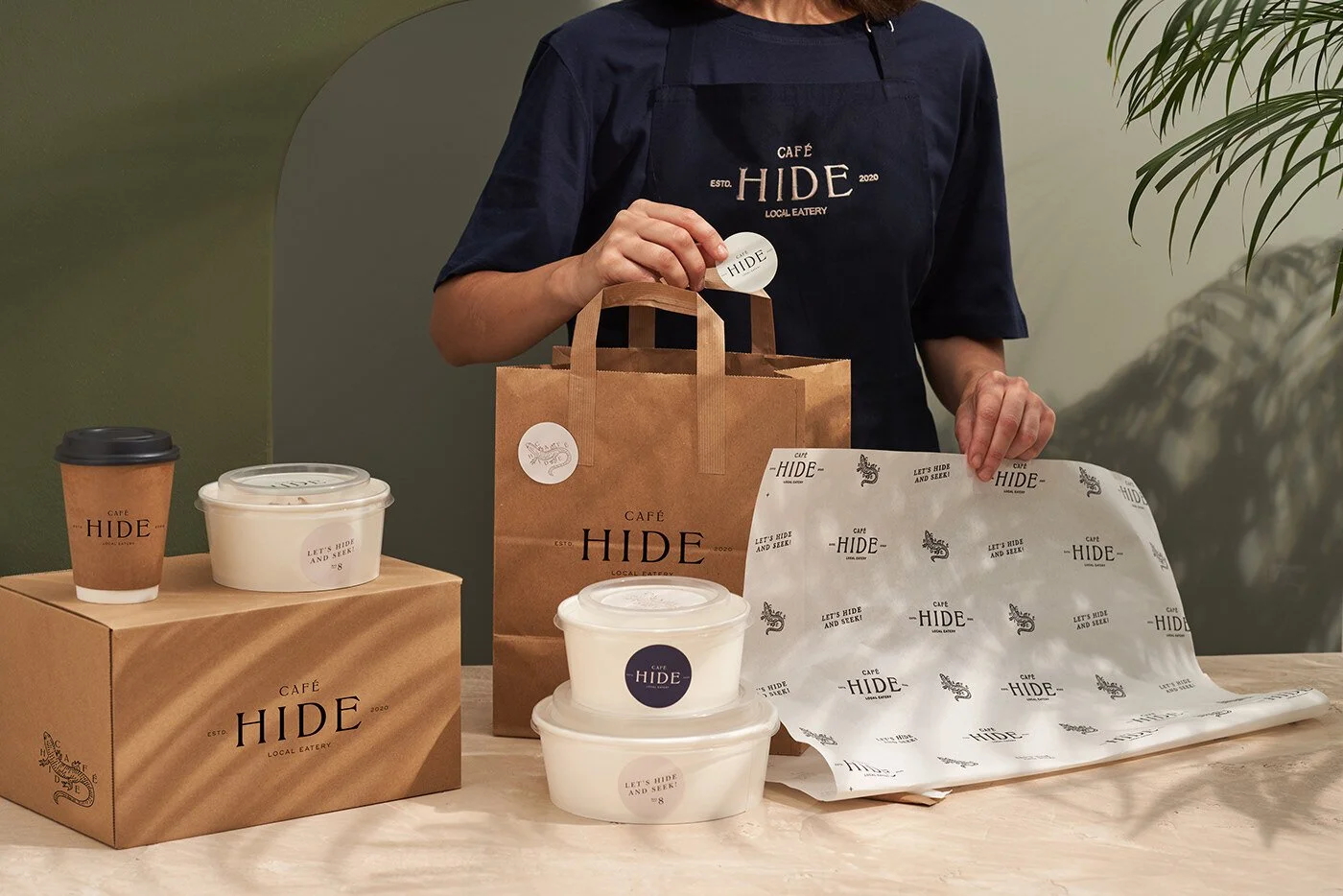
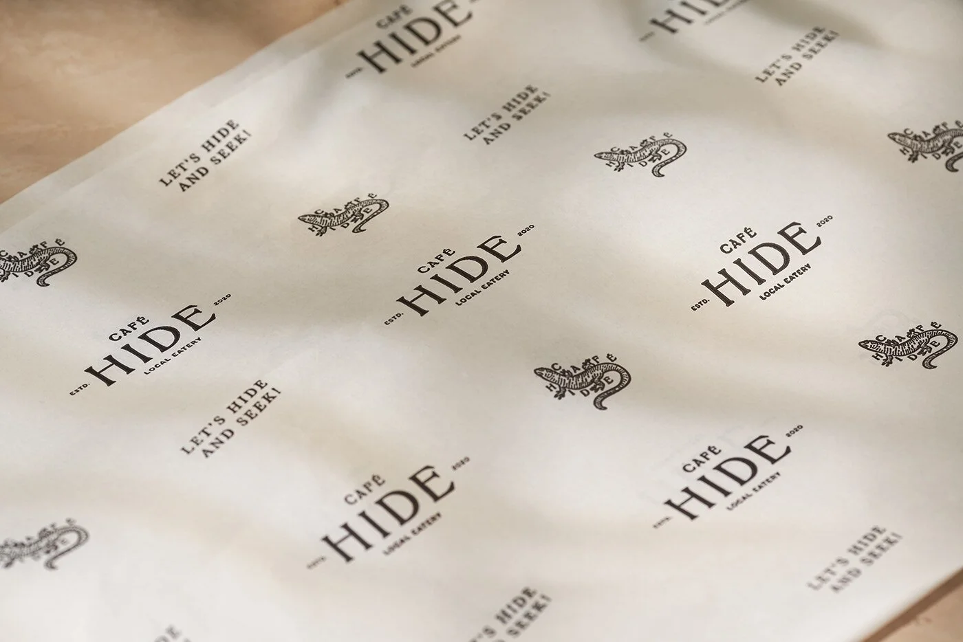
Studio Born walks Café Hide into that sweet spot where nostalgia feels freshly ironed rather than dusty. The whole identity drifts in with a calm confidence, anchored in that classic revivalist spirit designers keep returning to when they want a brand to feel rooted, familiar, and unbothered by the chaos of trend cycles. You see it instantly in the typography—restrained, serifed, almost literary—and in that pen-and-ink lizard illustration, which feels lifted from a field guide found in a well-traveled backpack. It’s the kind of visual that keeps a brand from slipping into generic café territory. It gives the place a small wink of personality without pushing the volume.
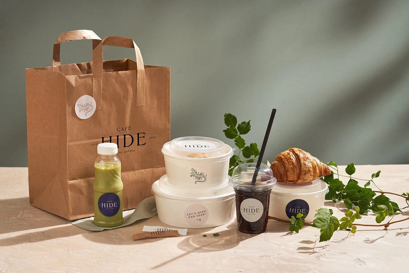
The packaging system leans hard into that handmade warmth. Brown kraft, soft whites, and muted neutrals create an atmosphere that doesn’t need to shout its virtue. Stickers become the connective tissue—a low-cost trick with high-touch charm. There’s something honest about a brand that doesn’t pretend its takeout line is couture, but still treats every touchpoint like someone’s going to admire it up close. The restraint works. Nothing feels overworked. Nothing feels like a designer performing acrobatics for their portfolio.
But once you settle into the cadence of it all, the system starts to reveal its ceiling. The brand relies almost entirely on the singular logo lockup, stamped and restamped until it risks becoming wallpaper. The identity has a quiet soul, but it needs more than repetition to evolve into a fully flexible ecosystem. Café Hide deserves a typography stack with range, a suite of secondary marks, patterns, textures, maybe even narrative fragments that expand the story beyond “local eatery with a classic touch.” Right now, everything rests on that lone lizard, that lone logo, that lone tone of voice. It’s a solid spine, but the body needs muscle.
There’s also an untapped emotional layer. The name Hide begs for playful storytelling, or contemplative storytelling, or even subtle dramatics. “Let’s hide and seek!” starts pointing in a direction, but the system never builds out the path. You feel the beginnings of a world—the lizard, the classic typography, the printed tissue—but the world stops just before the horizon. Give it some narrative color, some unexpected textures, some new angles of expression, and the whole thing could open up with cinematic depth.
Studio Born crafted something elegant, composed, and unmistakably intentional. It just needs a wider vocabulary to keep Café Hide from becoming too still. A brand this handsome deserves more places to roam.
Credits
Designer/Agency: Studio Born
Location: Miami, Florida USA, Istanbul, Turkey
Photographer: Haldun Kırkbir
Styling & Art Direction: Studio Born