Barcelos Coffee branding
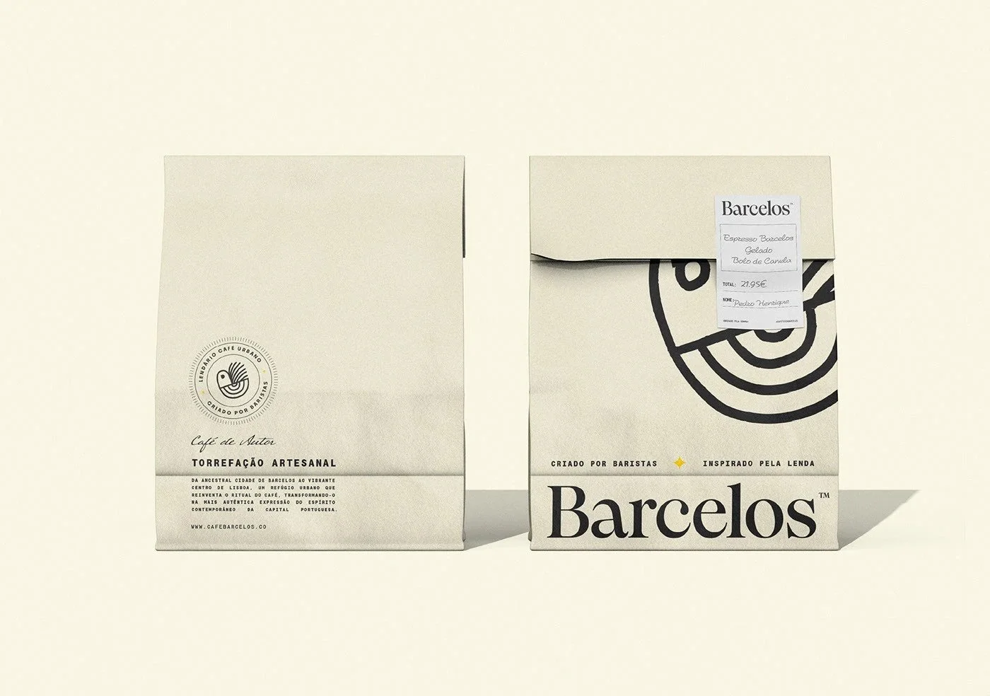
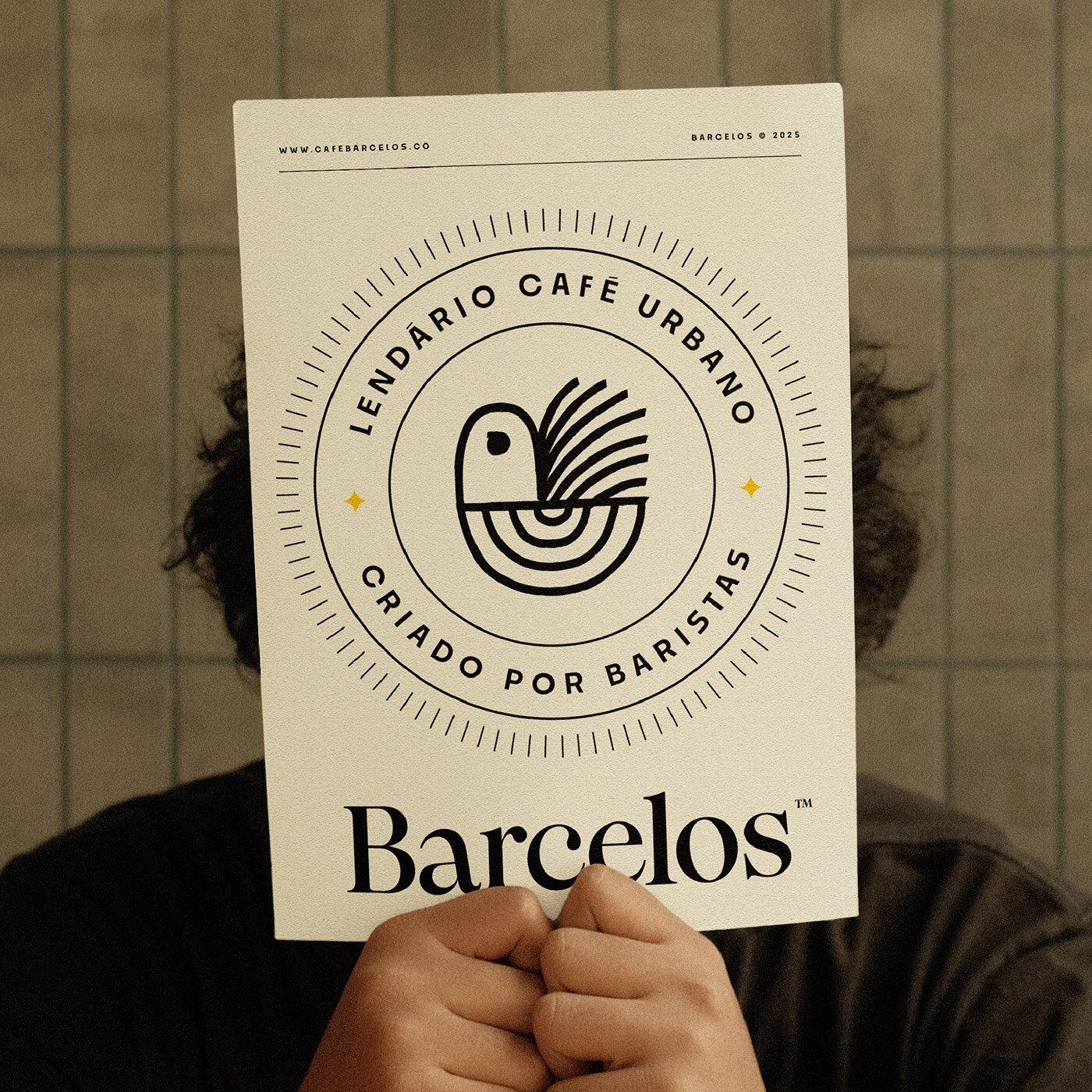
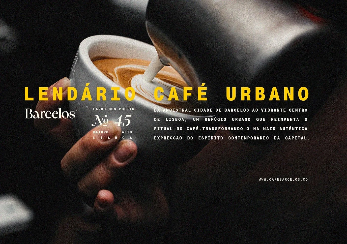
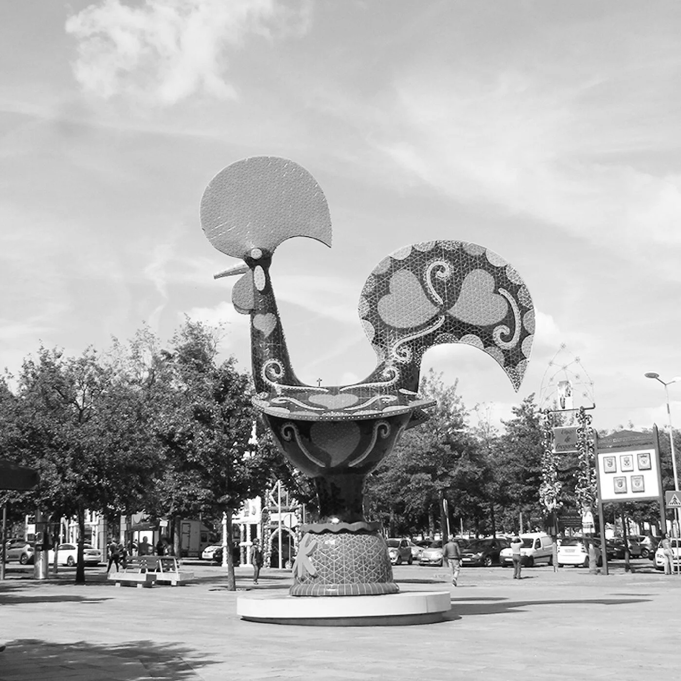
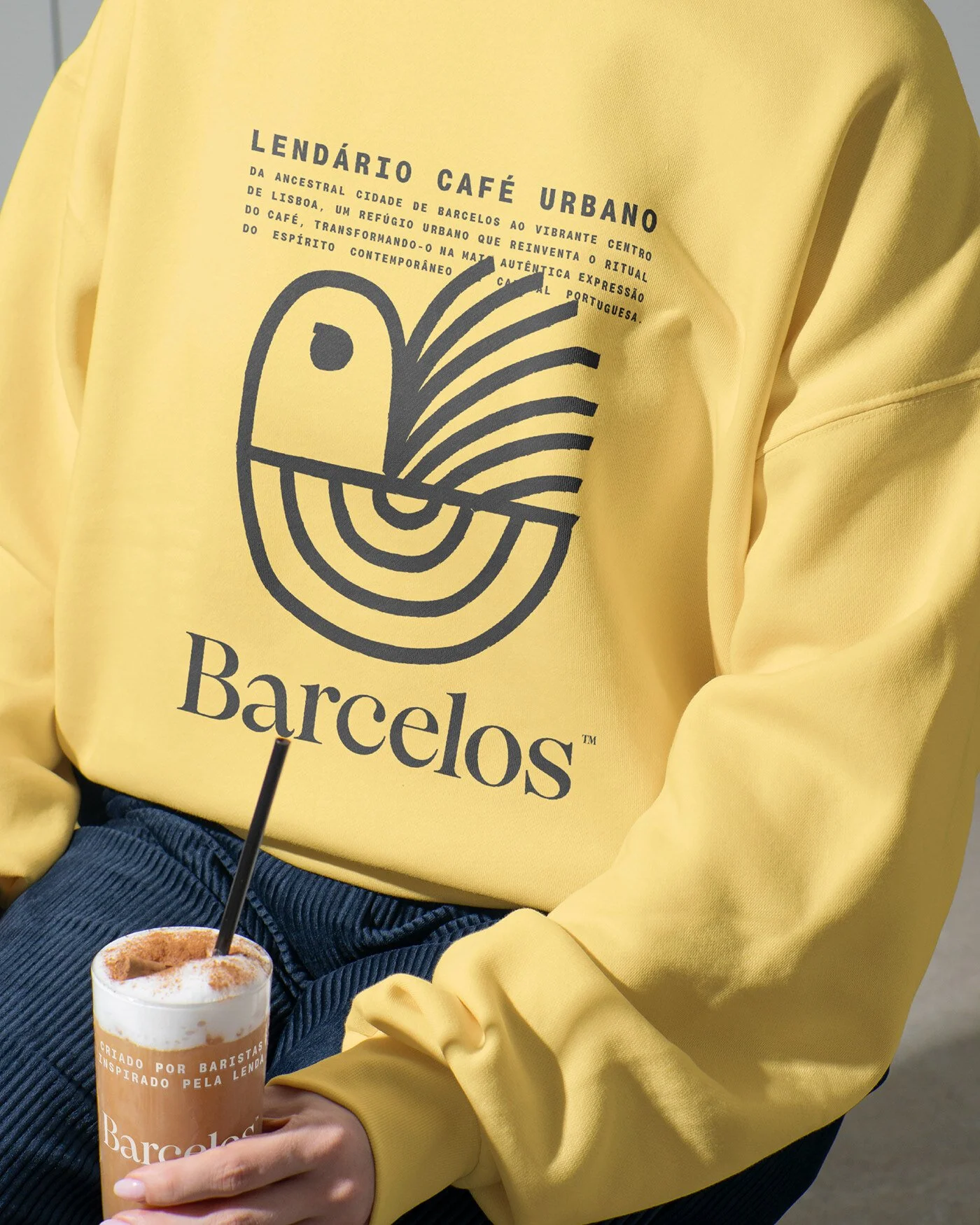
From the cobbled veins of Barcelos to Lisbon’s caffeinated heartbeat, a rooster wakes again. The Galo de Barcelos—the legend etched into every tourist shop tile—finds new plumage through the steady hand of Gustavo Bortoletto and his São Paulo studio. This isn’t a folk souvenir. It’s a brand reborn for the city crowd, stripped of kitsch, sharpened to geometry.
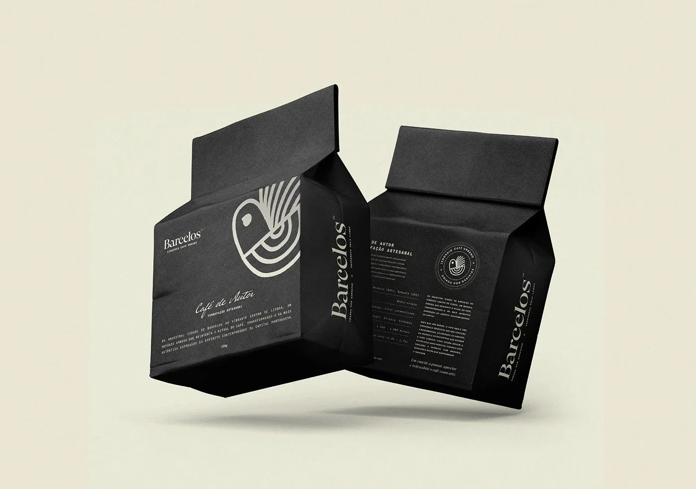
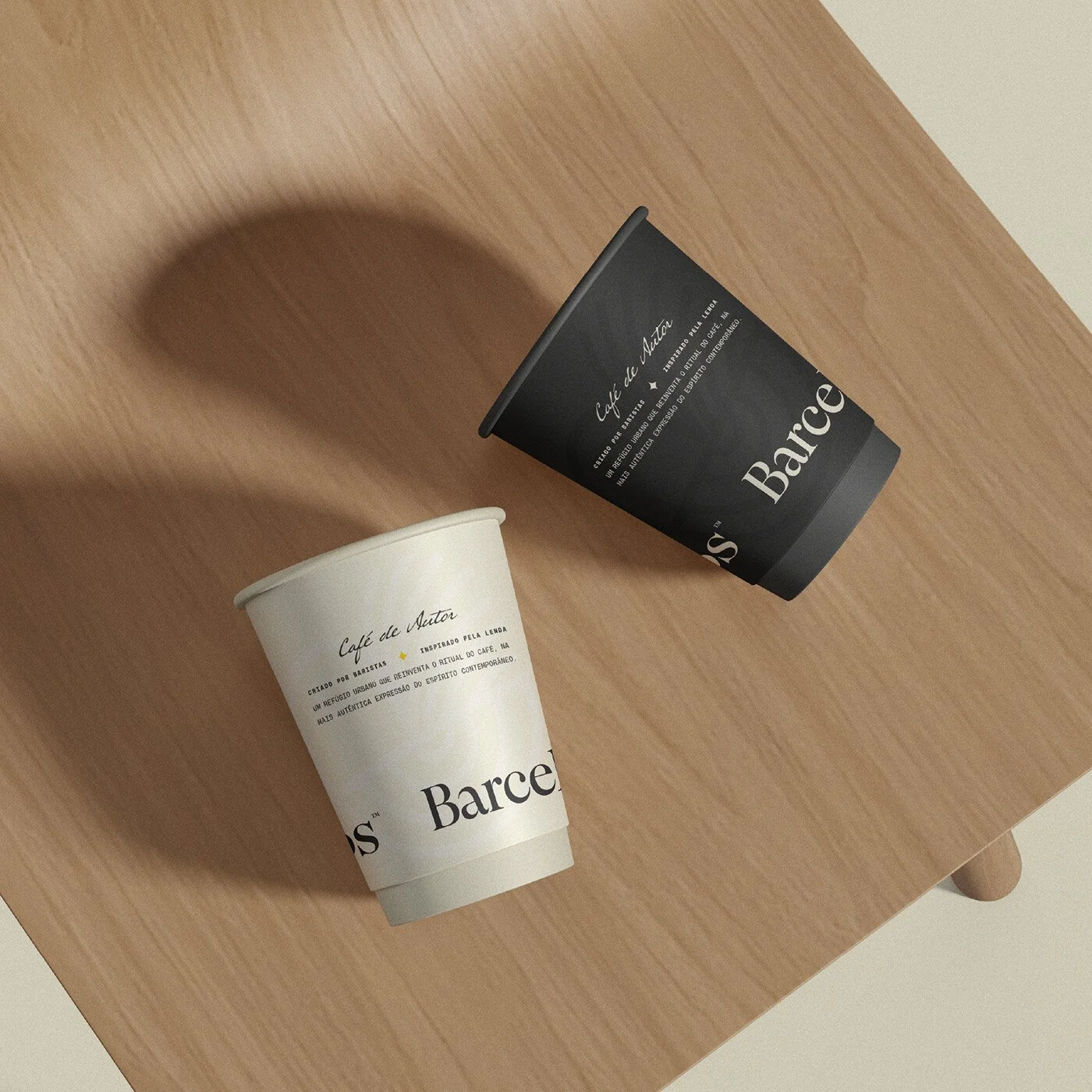
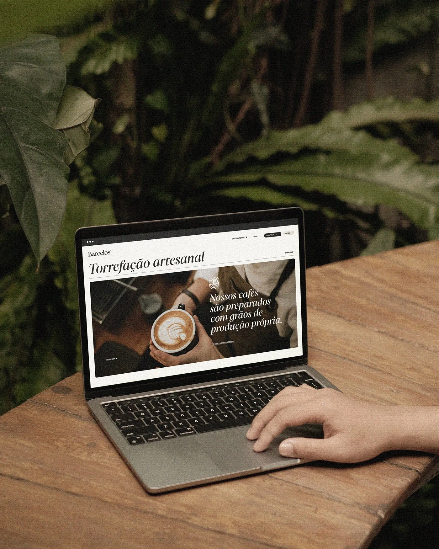
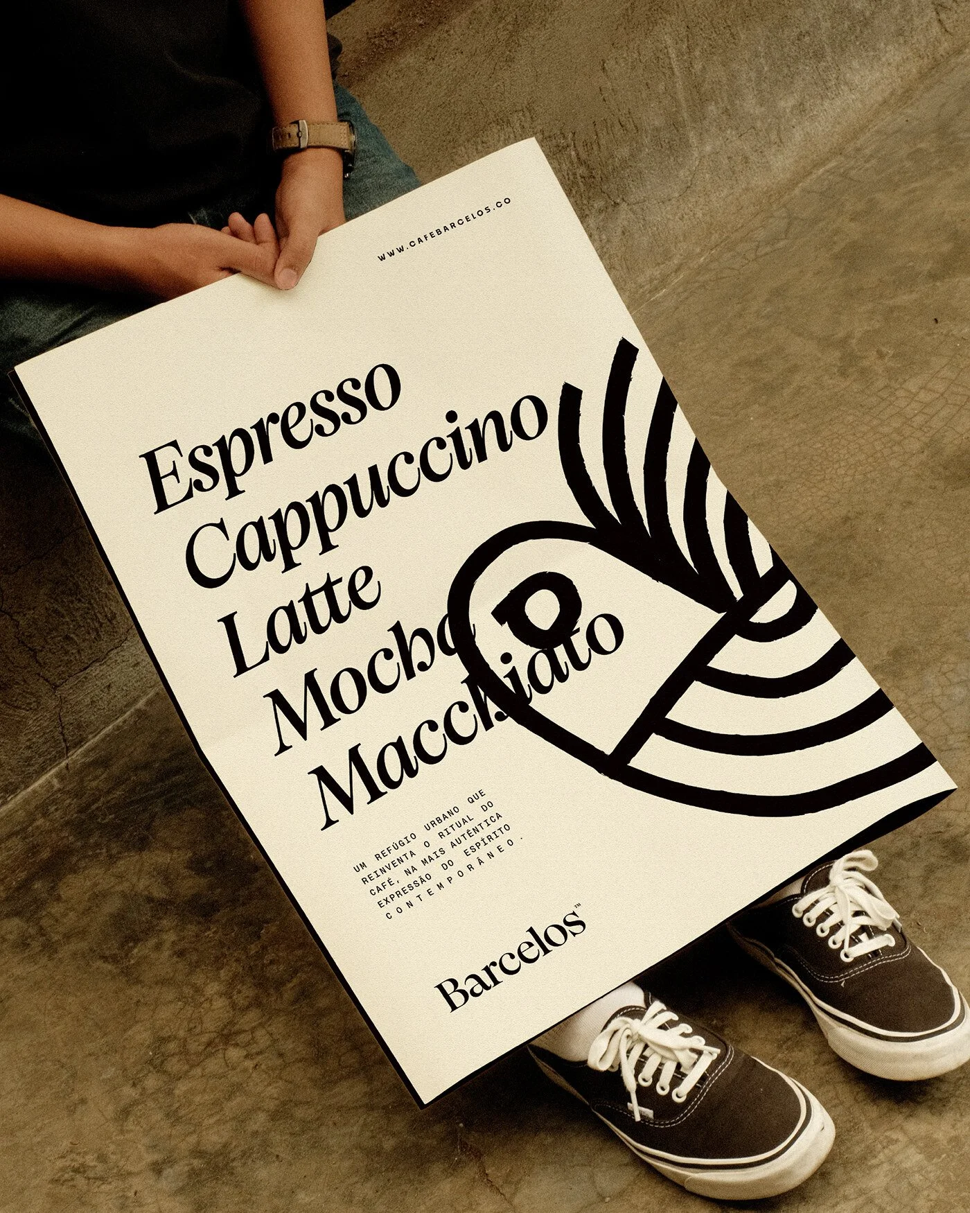
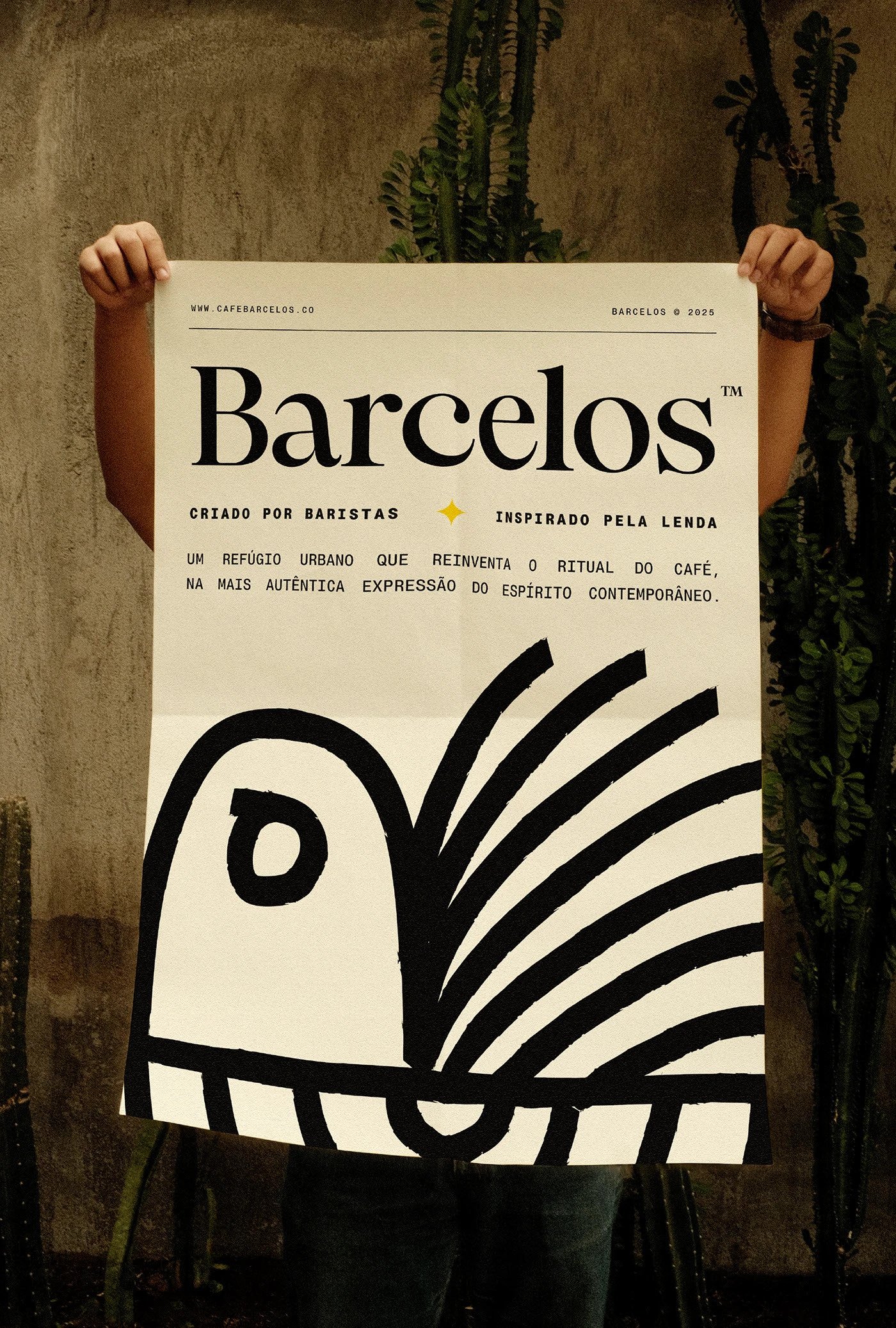
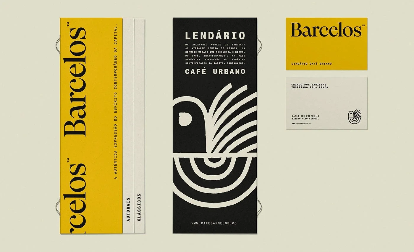
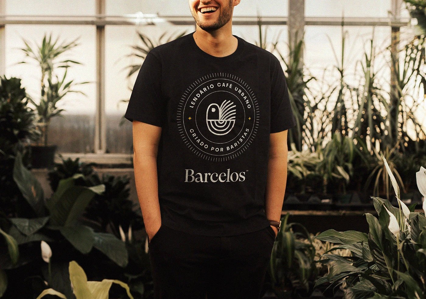
Barcelos Coffee doesn’t try hard. It stands with confidence. The design speaks in two dialects: past and present. A serif that hums with craft and comfort. A monospaced font that clicks like typewriter keys in a Lisbon loft. Together they set a rhythm—heritage in the bass, urban in the treble.
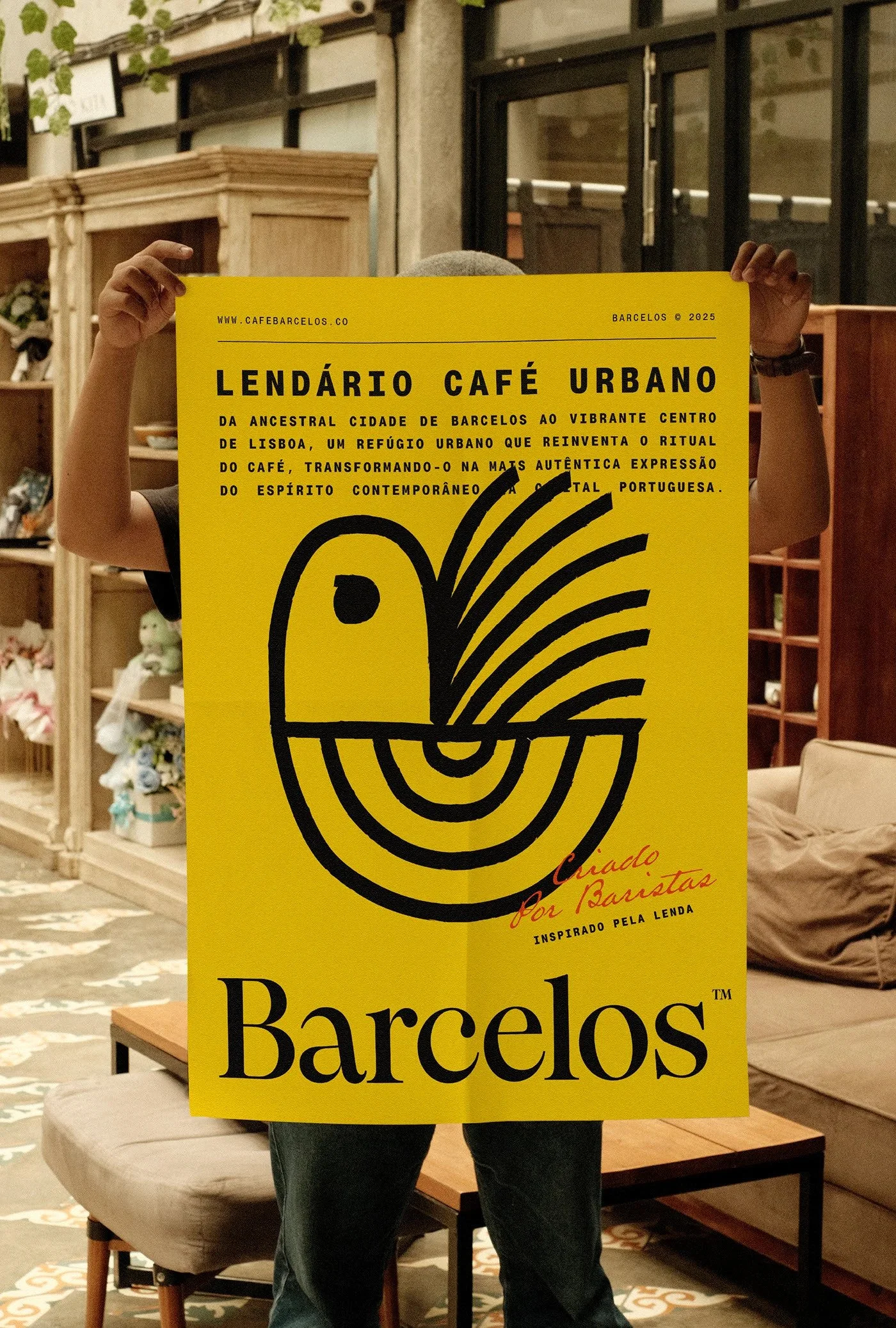
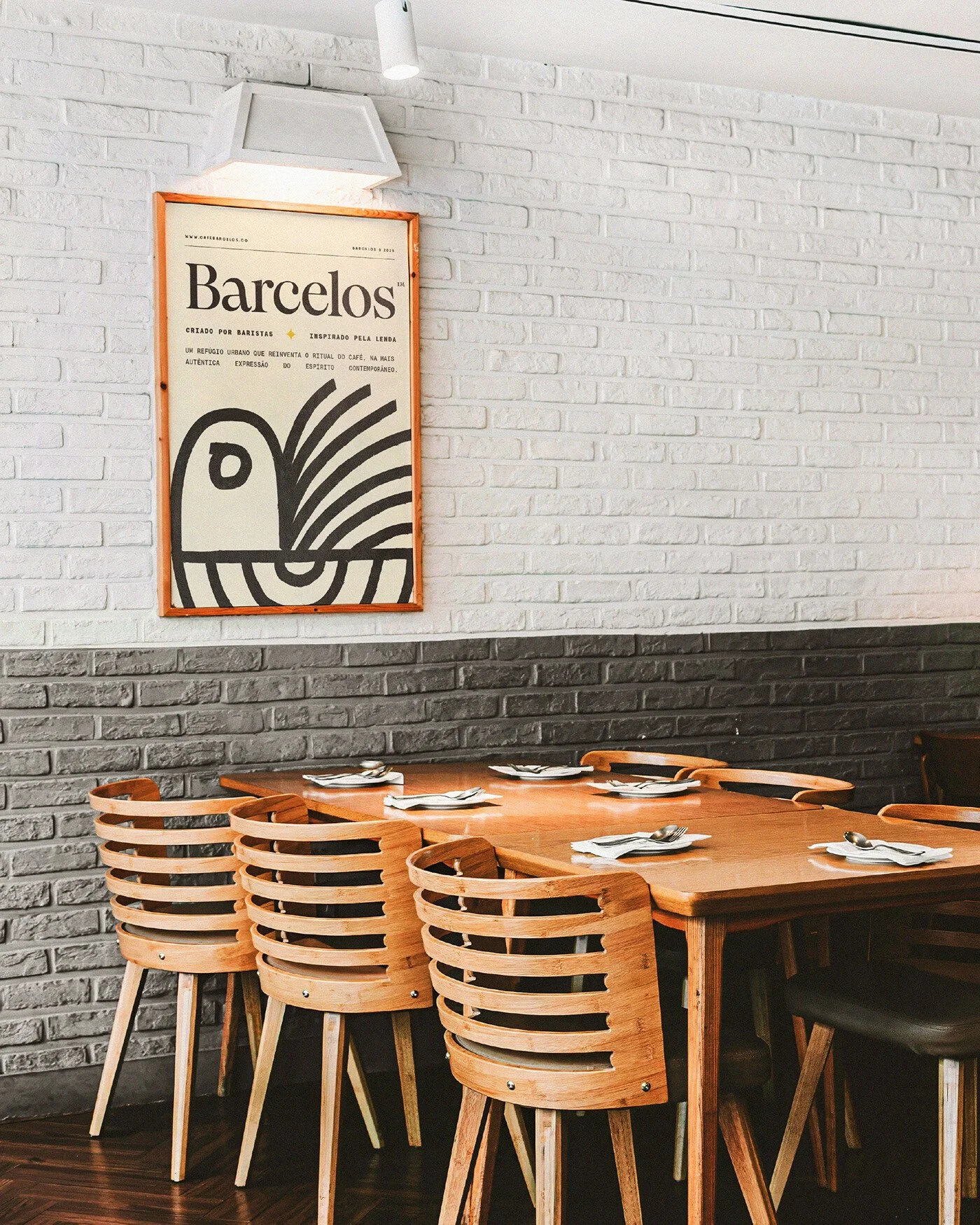
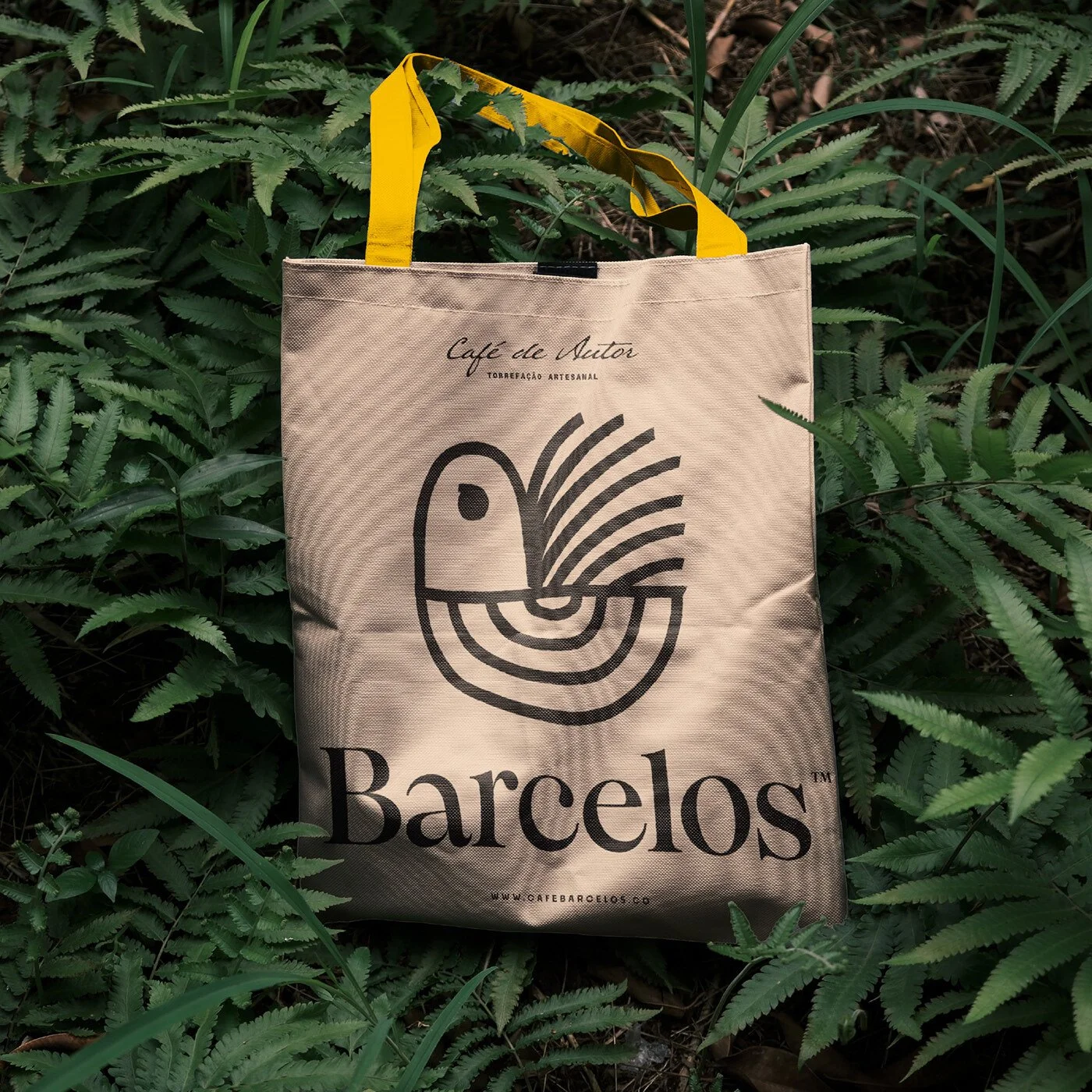
The heart of the identity beats in cultural roots. That rooster isn’t decoration—it’s a narrative trigger. Portugal’s oldest folk icon becomes a symbol of rebirth, minimal and bold. The redesign trades ornate feathers for clean lines. It’s still Barcelos, but with the noise tuned out. That clarity gives the brand something few coffee houses manage: authenticity without nostalgia. It honors origin without getting trapped in it. The mark feels inevitable, as if it was always meant to look this way.
Typography does the heavy lifting here. Foundry Pangram’s serif and monospace fonts form a deliberate tension. One feels warm, organic, hand-ground. The other—mechanical, urban, efficient. The contrast builds structure into the brand. Every line of type carries the story: handmade craft meeting city precision. It’s a smart move. Coffee culture lives in that friction. Between soil and skyline. Between ritual and rush hour. Barcelos Coffee nails that duality without cliché.
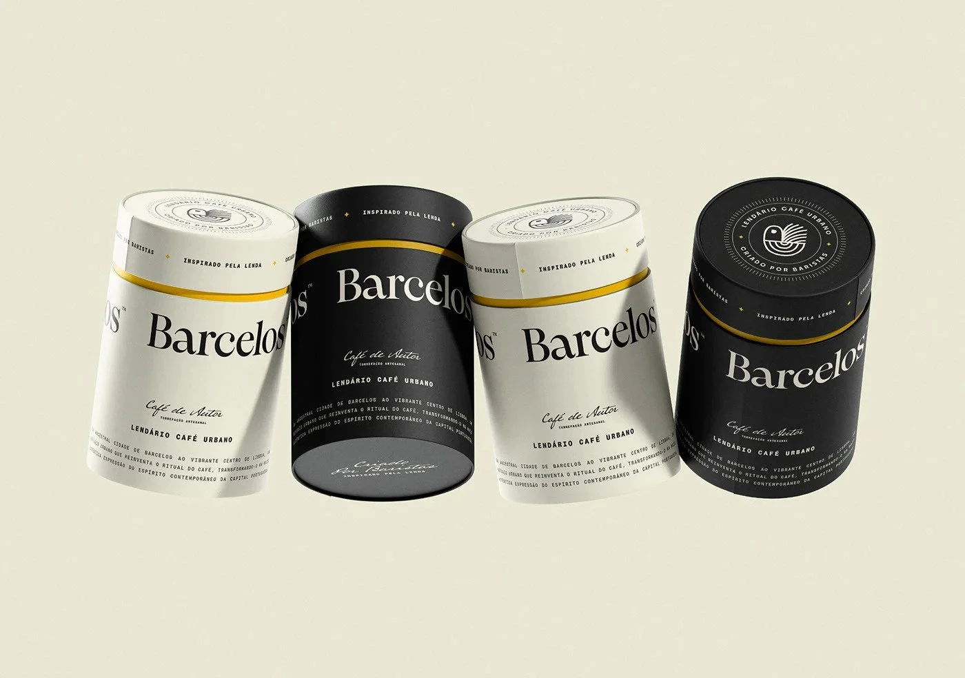
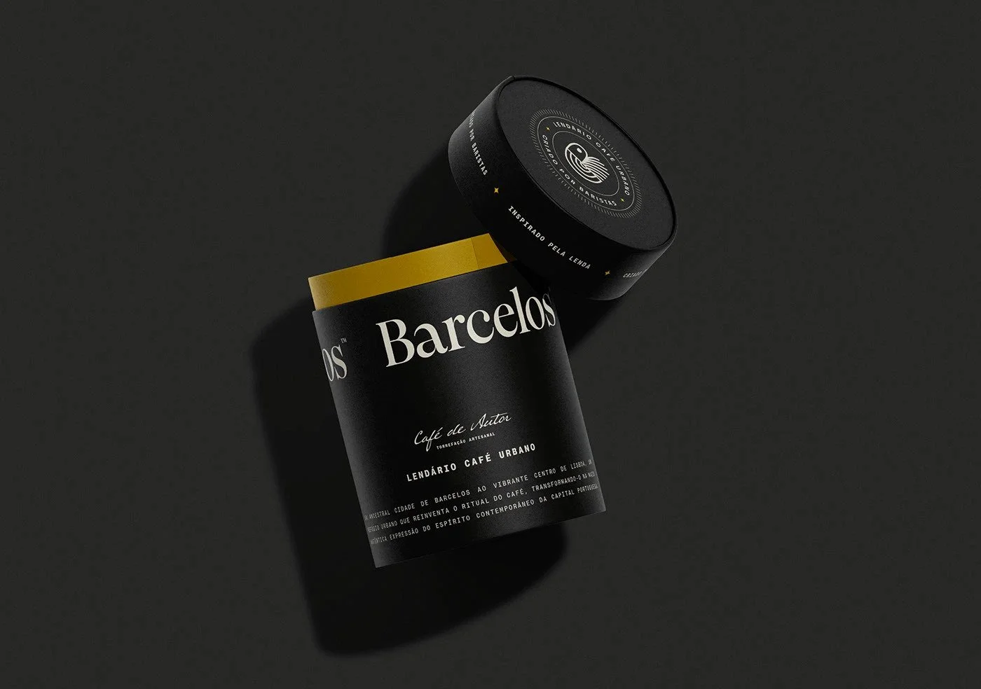
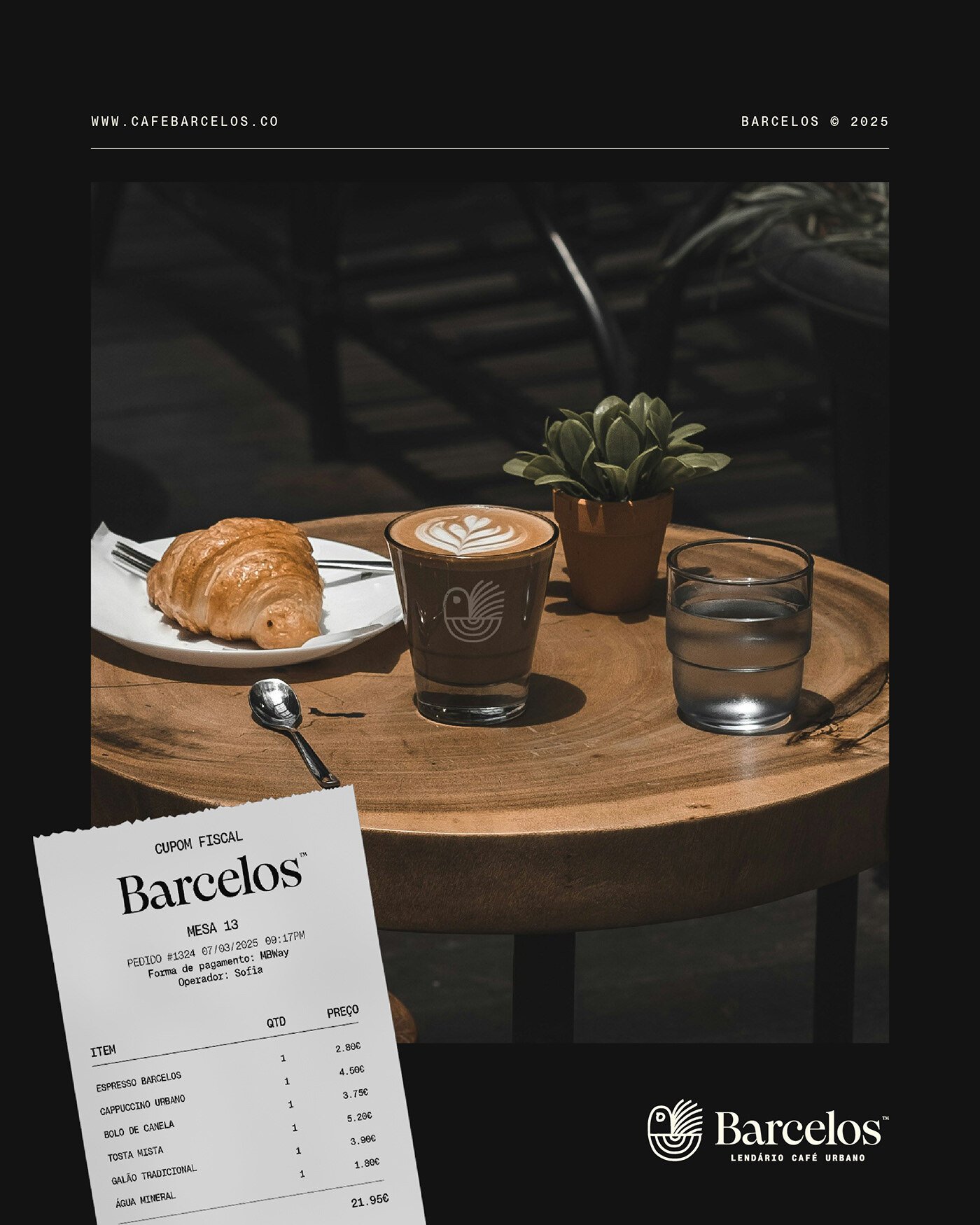
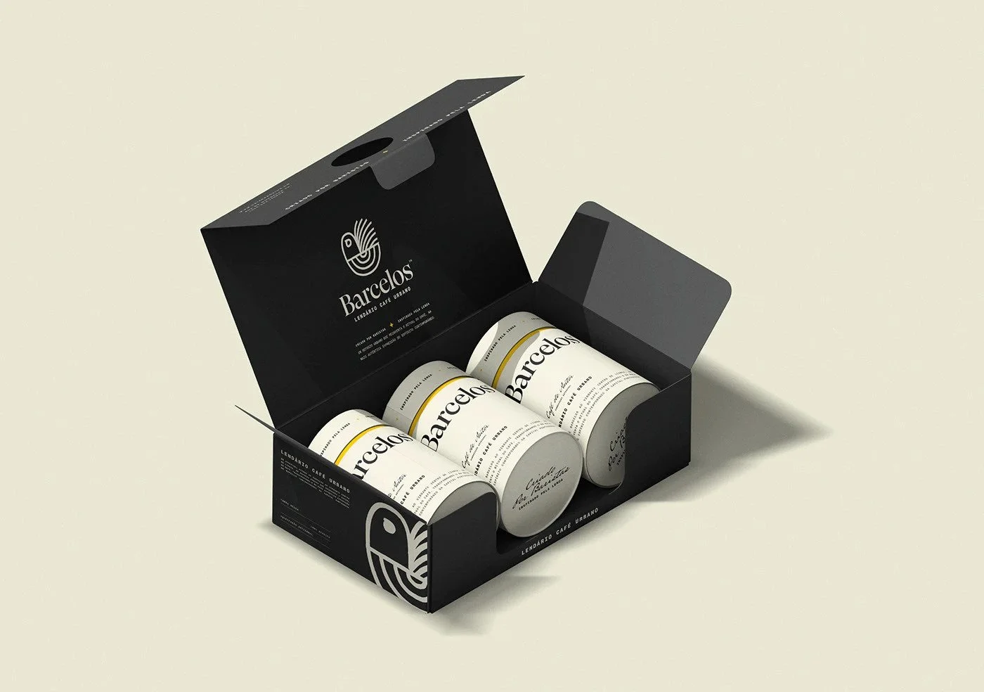
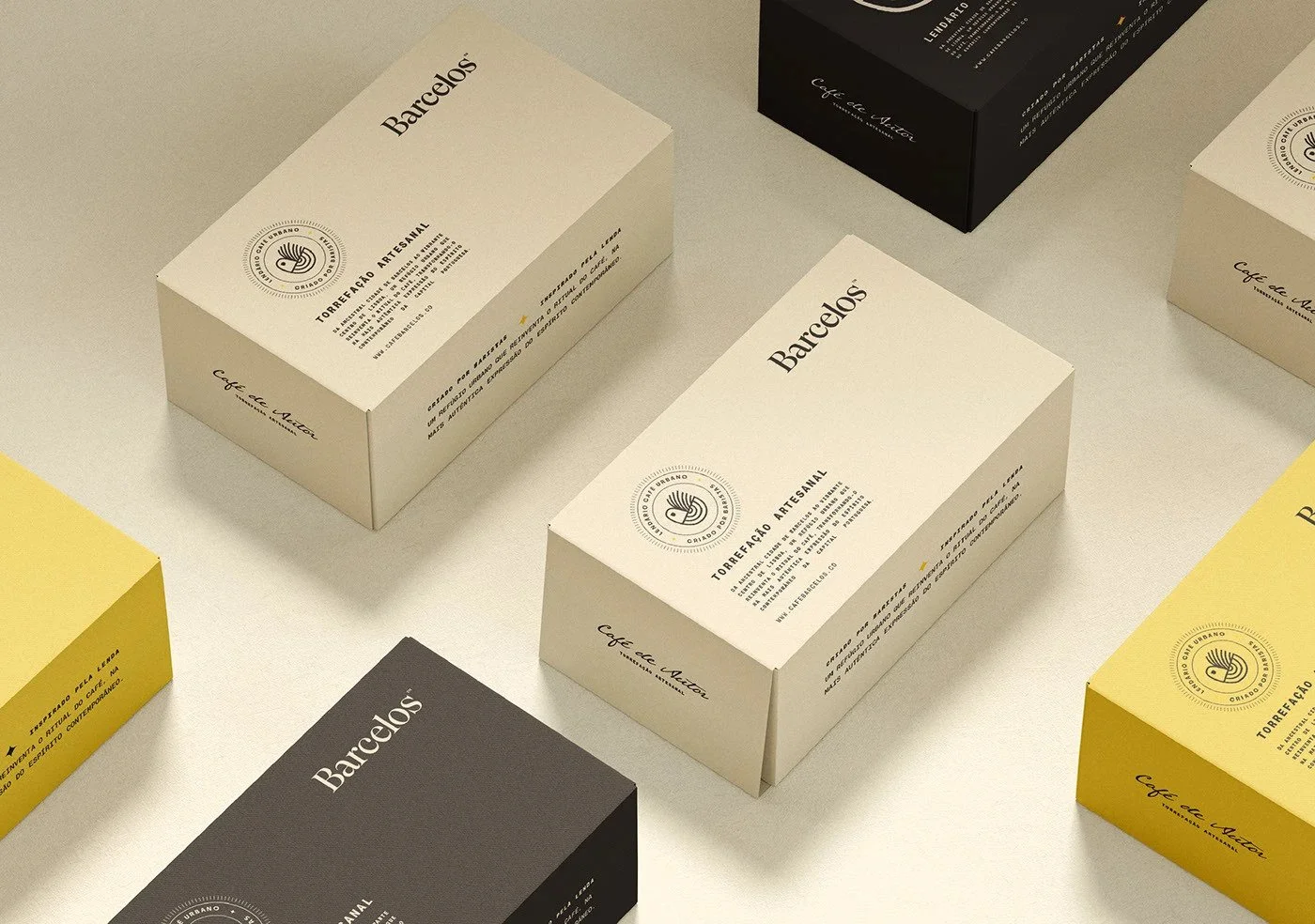
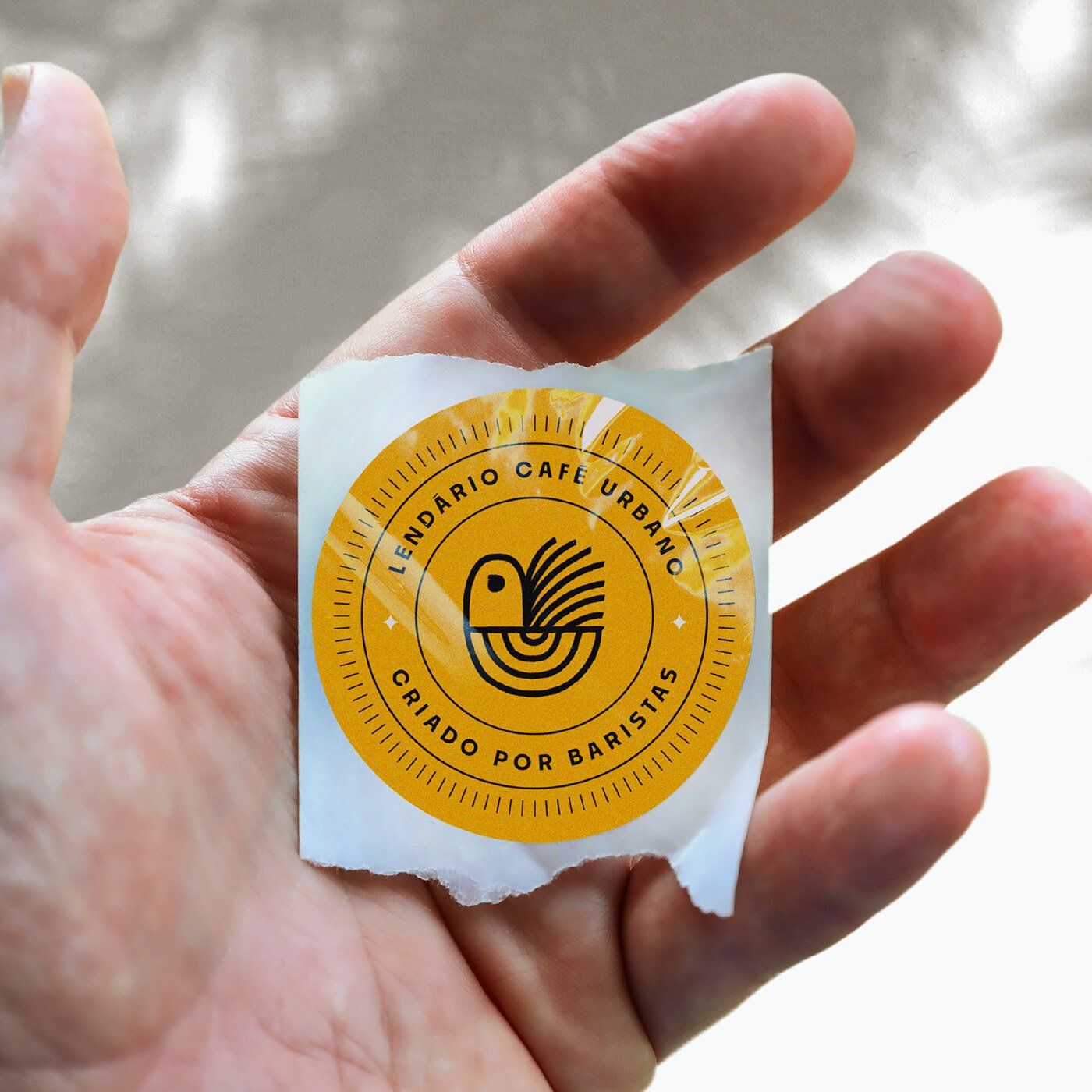
The design system keeps its palette tight. Black. White. A hint of warmth from the rooster’s myth—an ember glow of orange or red. It gives the visuals space to breathe. That restraint telegraphs confidence, signaling premium positioning. But a coffee brand with this much story might need more chromatic storytelling—subtle browns, muted earths, light-washed neutrals. Shades that smell like roast and rain on tile. The minimalism works for launch, but a broader palette could fuel the brand’s evolution into packaging, signage, and digital screens.
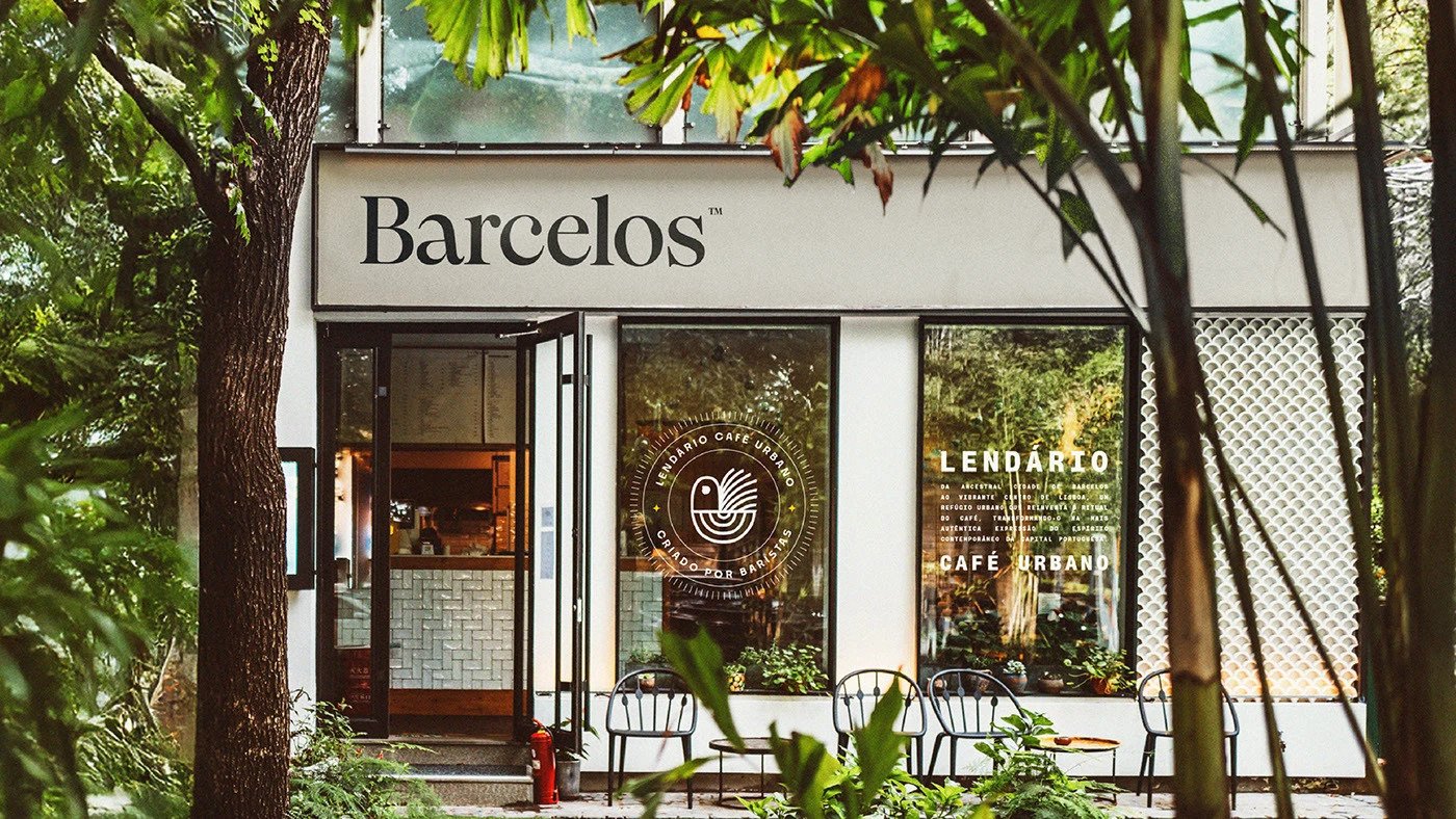
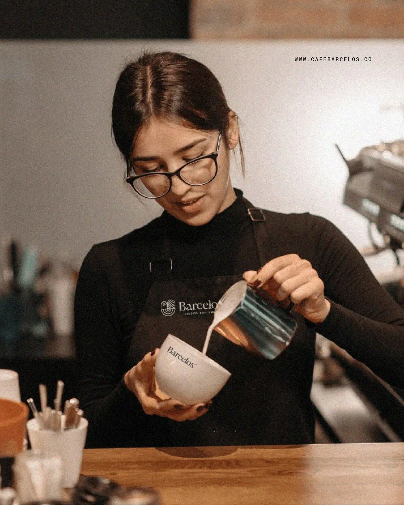
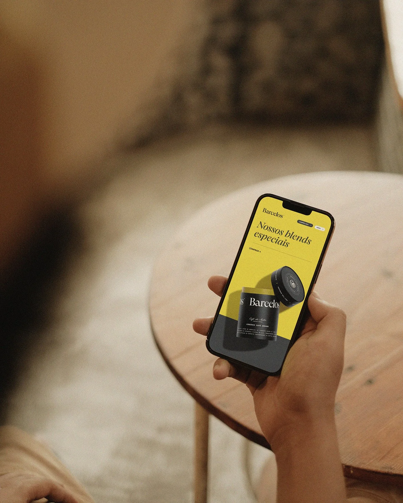
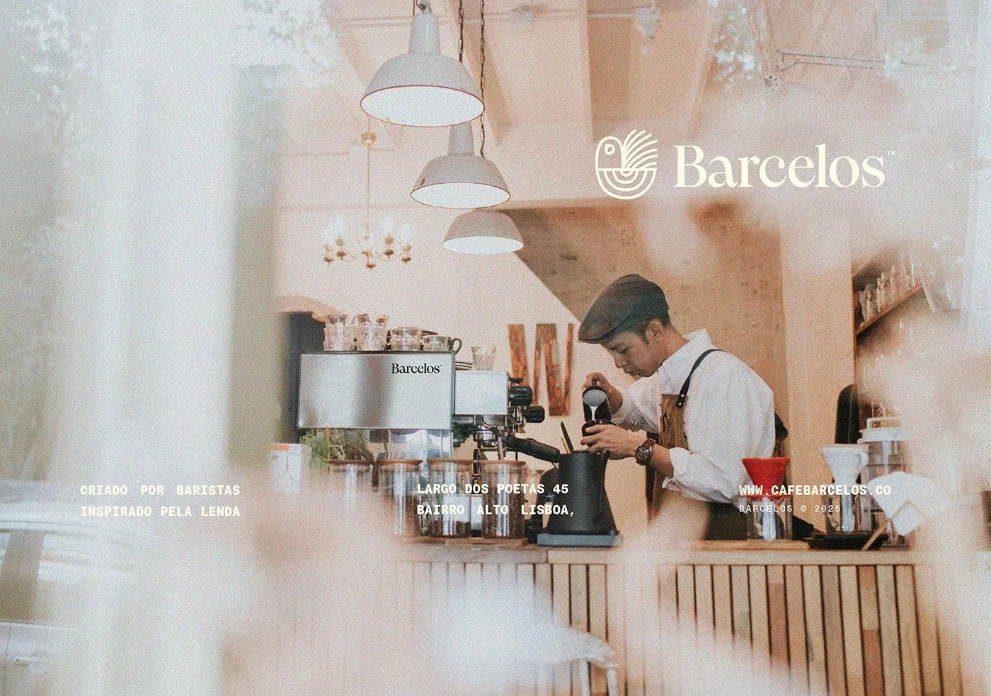
The Behance presentation is tight. The mockups—cups, bags, signage—are sleek and believable. Yet what’s missing is context. How does this identity live in space? What happens when the mark hits sunlight through a café window, or when the logo glows above a Lisbon sidewalk at midnight? The brand story promises a “dynamic and vibrant coffee culture.” To prove that, we need motion, noise, human presence. Future rollout should show the system in use: menu boards, signage, digital interfaces. That’s where good design becomes a living culture, not just a polished artifact.
This project sits firmly in the modernist-minimalist movement. Think Scandinavian composure spiked with Iberian soul. Clean typography. Monochrome restraint. A symbol distilled to essence. It’s part of a global trend—craft brands finding identity through subtraction—but here it carries the weight of a national myth. That’s what makes Barcelos Coffee worth a long look. It’s not just another specialty café with Helvetica dreams. It’s a study in how cultural symbols can survive the sanding of modernism and still feel human.
Barcelos Coffee’s identity is precise, proud, and patient. It’s a design that doesn’t chase trends—it builds its own gravity. The rooster stands as a bridge between Portugal’s past and the city’s caffeinated present. The typography hums with balance. The visuals breathe with confidence. What it needs now is depth—an expanded palette, a lived environment, the smell of real espresso under its wings. If the rollout keeps the discipline and adds the life, Barcelos Coffee won’t just be another café. It’ll be a new chapter in Portugal’s design language.
Credits
Brand, Art Direction & Design: Gustavo Bortoletto
Studio: Bortoletto® Studio
Lcation: São Paulo, Brazil