The SEnse cafe branding

Chengdu hums with heat and butter. Somewhere between its alleys and espresso machines sits THE SENSE, a brand stitched from coffee and croissants, designed by Paper Play. The project reads like jazz on a grid—sharp, rhythmic, alive. No fluff, no sweetness overdose. Just a confident play between geometry and grain.
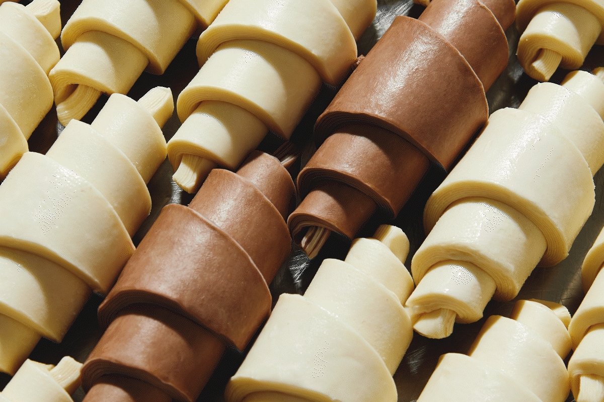
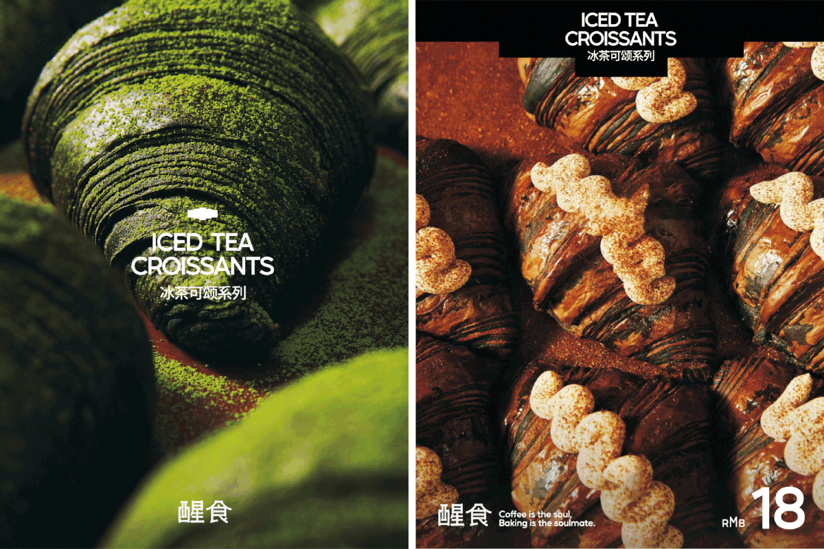
The mark hits first. That abstract croissant, fractured into clean geometry, is a revelation. Most cafés go literal—beans, steam, a loaf outline. THE SENSE goes conceptual. It turns the act of baking into mathematics. The curve of pastry becomes architecture. It’s not about what the bread looks like but what it feels like: constructed, deliberate, balanced. That shape carries memory. You see it once and it sticks, like the aftertaste of good espresso.
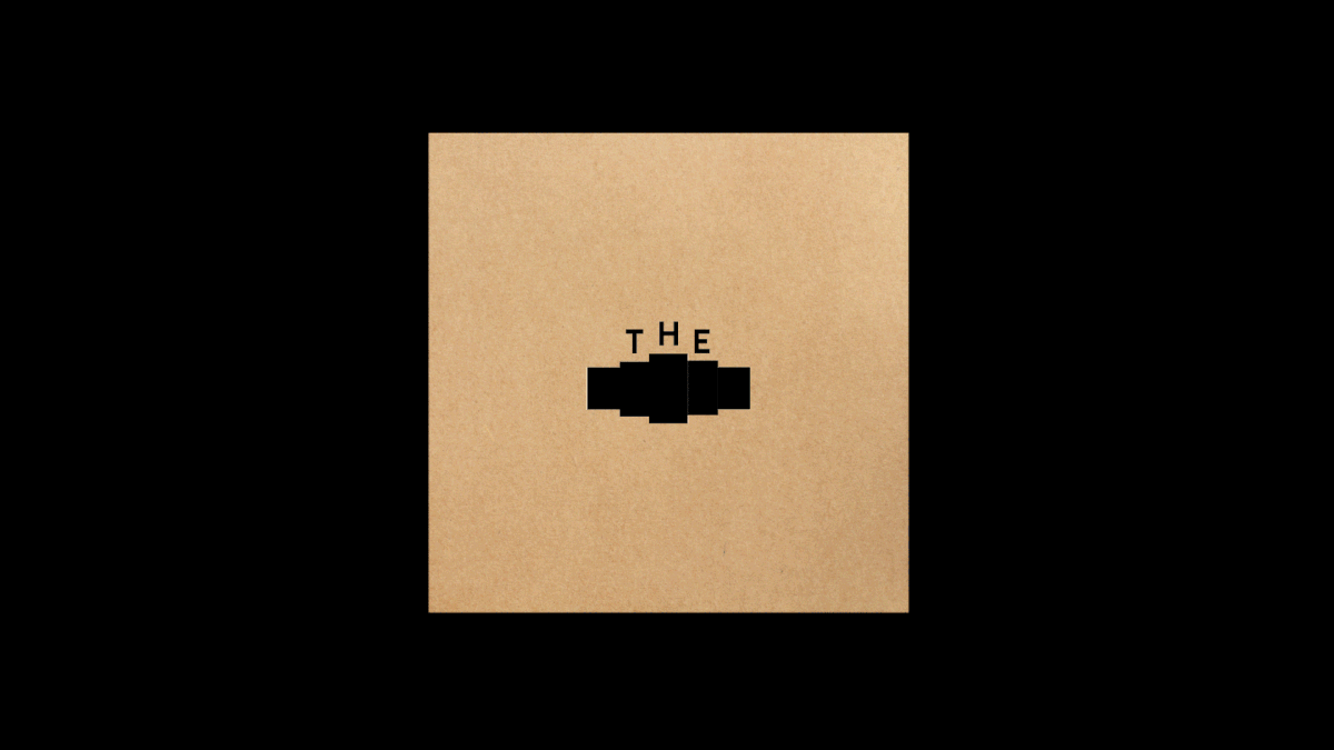
Typography tightens the brand’s backbone. All caps. Assertive. Every letter marching in rhythm with the symbol beside it. “THE SENSE” isn’t shouting—it’s holding its ground. The designers talk about “enhancing recognition” by giving the capitals rhythm. That’s visible. The wordmark doesn’t rely on kerning tricks or faux minimalism. It’s pure grid and weight. The Chinese character “醒” gets the same modernist discipline. Simplified strokes. Balanced proportion. Everything breathing the same air.
Colour sits quiet. Black. White. A whisper of cream. The restraint forces focus. Product and light carry the story, not pigment. You feel the confidence of a brand that doesn’t need to decorate itself. It knows the croissant’s green matcha fold will do the talking. It’s a visual system that values silence over chatter—a rare move in a market addicted to pastel overload.
But what really pulls you in is the story behind the form. The brand defines itself around “coffee as soul, baking as soulmate.” That idea drives every design decision. There’s chemistry here, not category. Bread and coffee intertwined as daily ritual. The design reflects that relationship: geometry meeting warmth, structure meeting flavor. You sense the human pulse behind the precision.
Still, there’s a tightrope to walk. The identity leans cold by nature—geometric, calculated, clean. The danger is sterility. Bread needs warmth. The tactile side of the brand—the packaging textures, the café interiors, the photography—has to bleed humanity to balance the cool math of the mark. That tension, if maintained, could keep THE SENSE from becoming another design-for-design’s-sake café.
Scale could be its next challenge. The mark’s beauty lives in the details—the negative space, the alignment. Shrink it too small and the nuance dies. The Behance project shows packaging and signage, but you wonder how it lives on a business card corner, a cup sleeve, a phone app icon. Great identities stretch. This one deserves to.
There’s also the question of expansion. The palette’s restraint works now, but as THE SENSE evolves—limited pastries, seasonal drinks, collaborations—it might need an accent system. A color voice that can evolve without breaking the brand’s spine. Think subtle gradients, material tones, foil reflections—ways to stay minimal without becoming monochrome.
THE SENSE belongs to a movement rising quietly through F&B branding: geometric minimalism with emotional undertones. It’s Swiss discipline infused with cultural storytelling. Less farmhouse nostalgia, more urban calm. The kind of design that doesn’t beg to be liked but earns respect through composition and control.
What Paper Play built isn’t cute. It’s confident. It carries that air of design that knows exactly who it’s for. Every croissant curve turned into logic. Every letter standing tall. Every space intentional. It’s rare to see a bakery-café identity that feels like architecture. That’s what makes it worth studying.
Credits
Agency: Paper Play
Location: Chengdu, China


Credits
Agency: Paper Play
Location: Chengdu, China