Eliquor Snake Wine Branding
There are few branding assignments more interesting than selling something people might instinctively recoil from. Snake wine certainly qualifies. Traditionally, the snake sits right there in the bottle, dead, preserved and impossible to ignore. That spectacle carries history, ritual and folklore, but it also creates a fairly obvious barrier for anyone who doesn't find reptilian remains particularly appetizing.
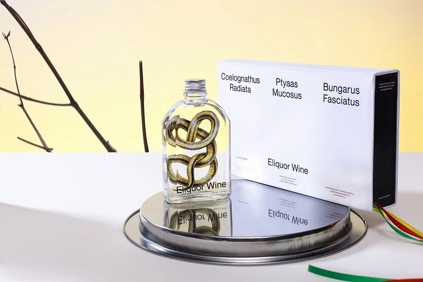
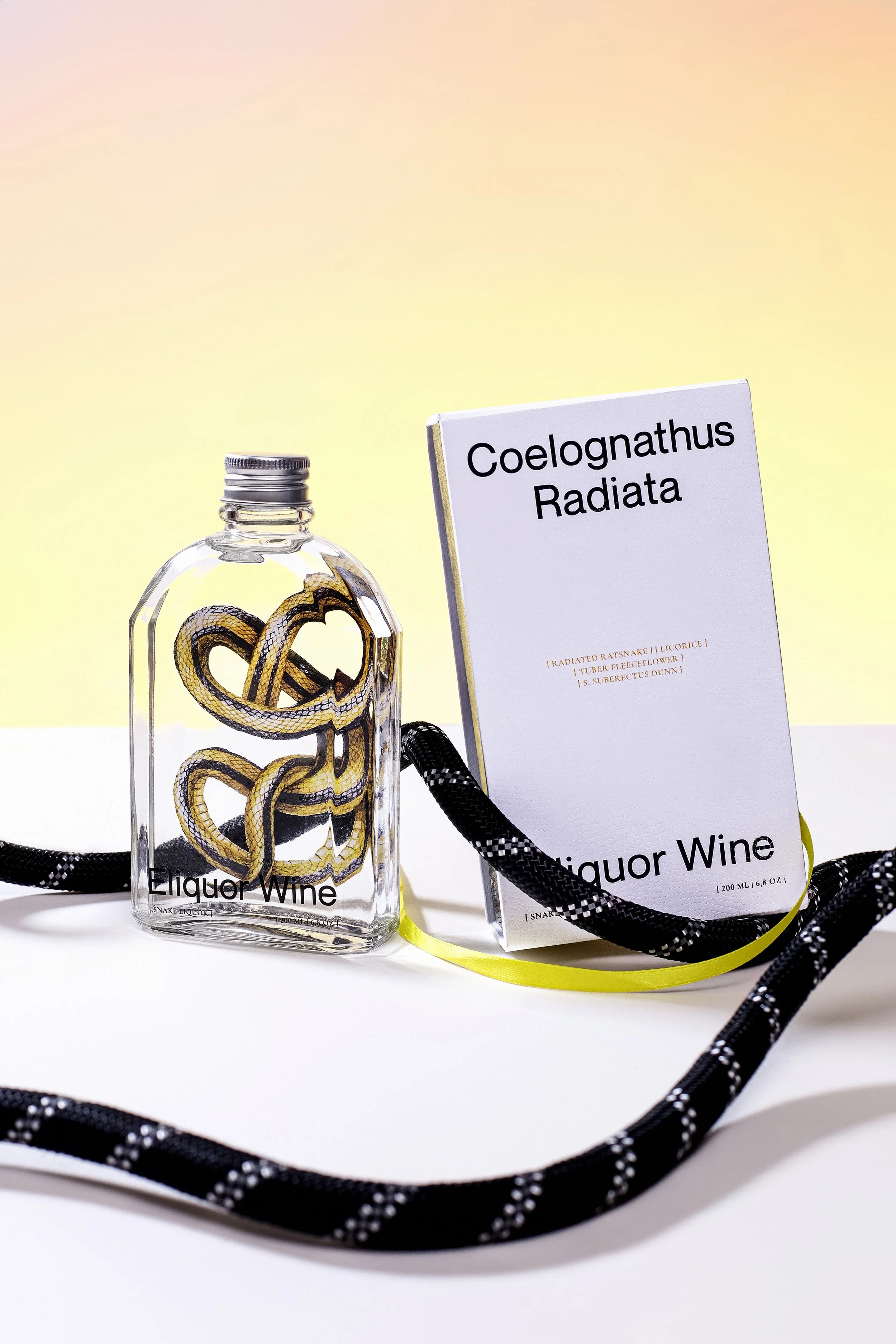
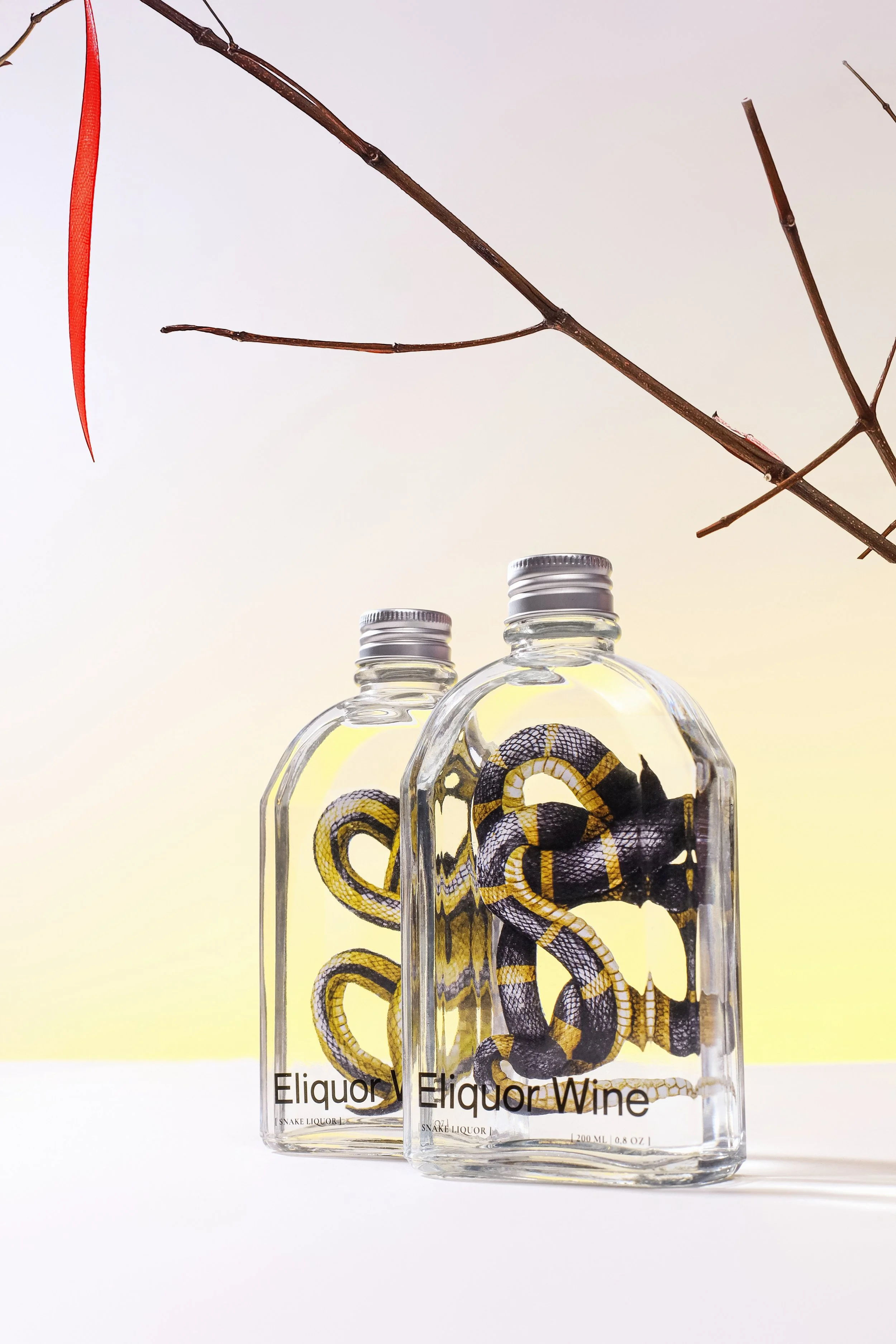
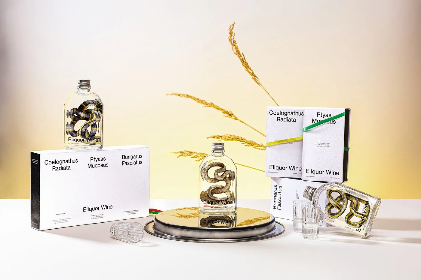
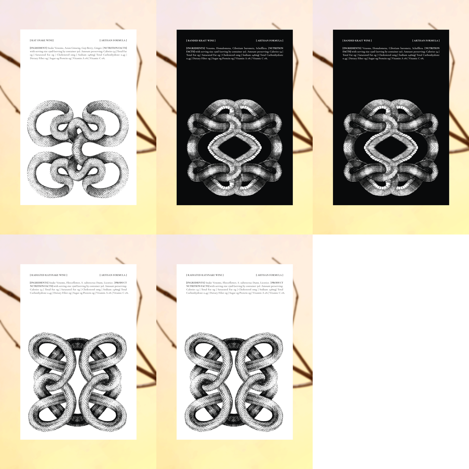
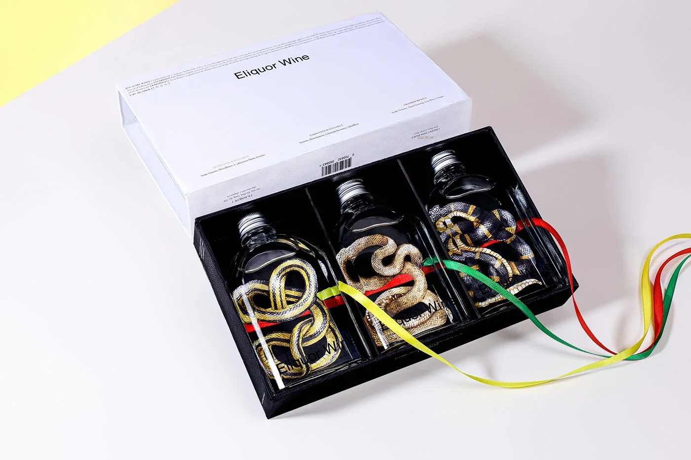
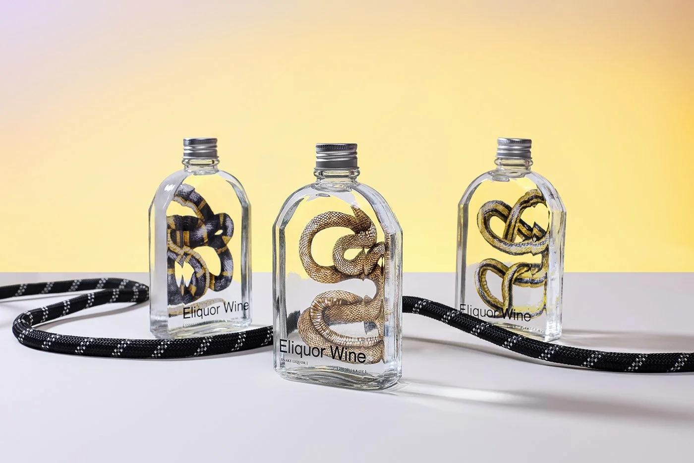
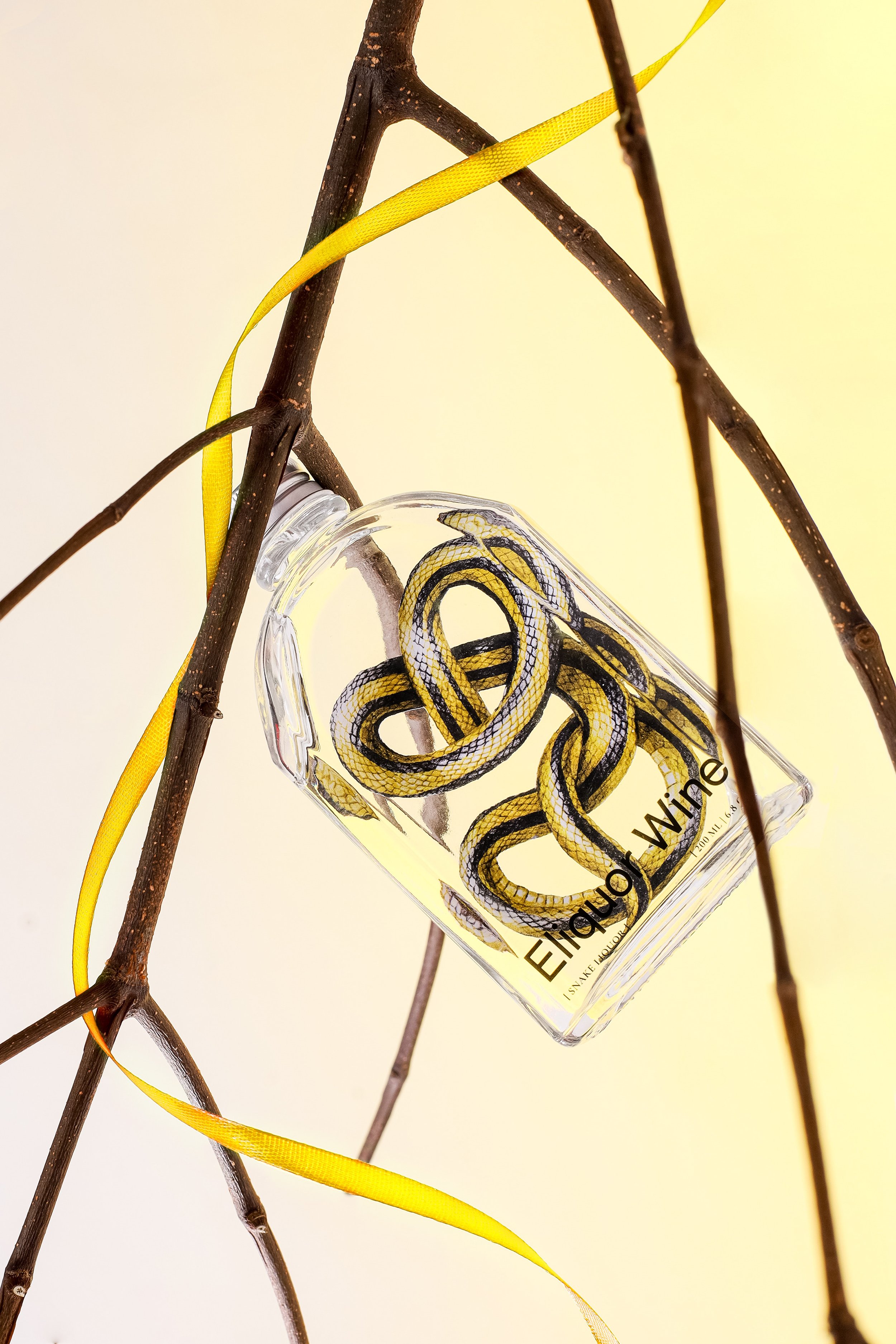
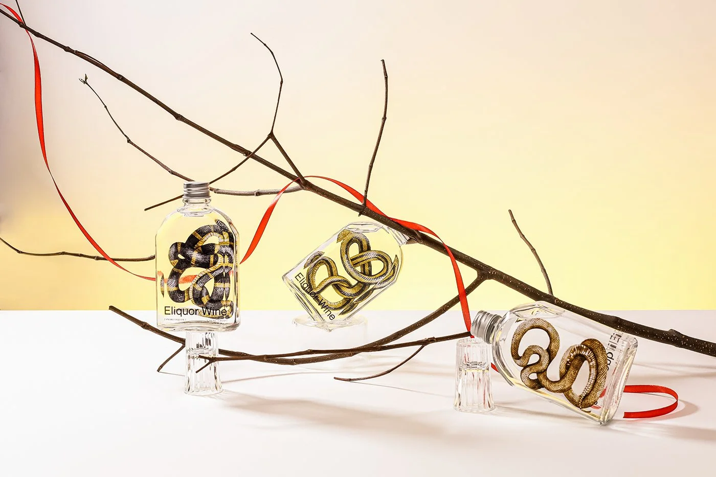
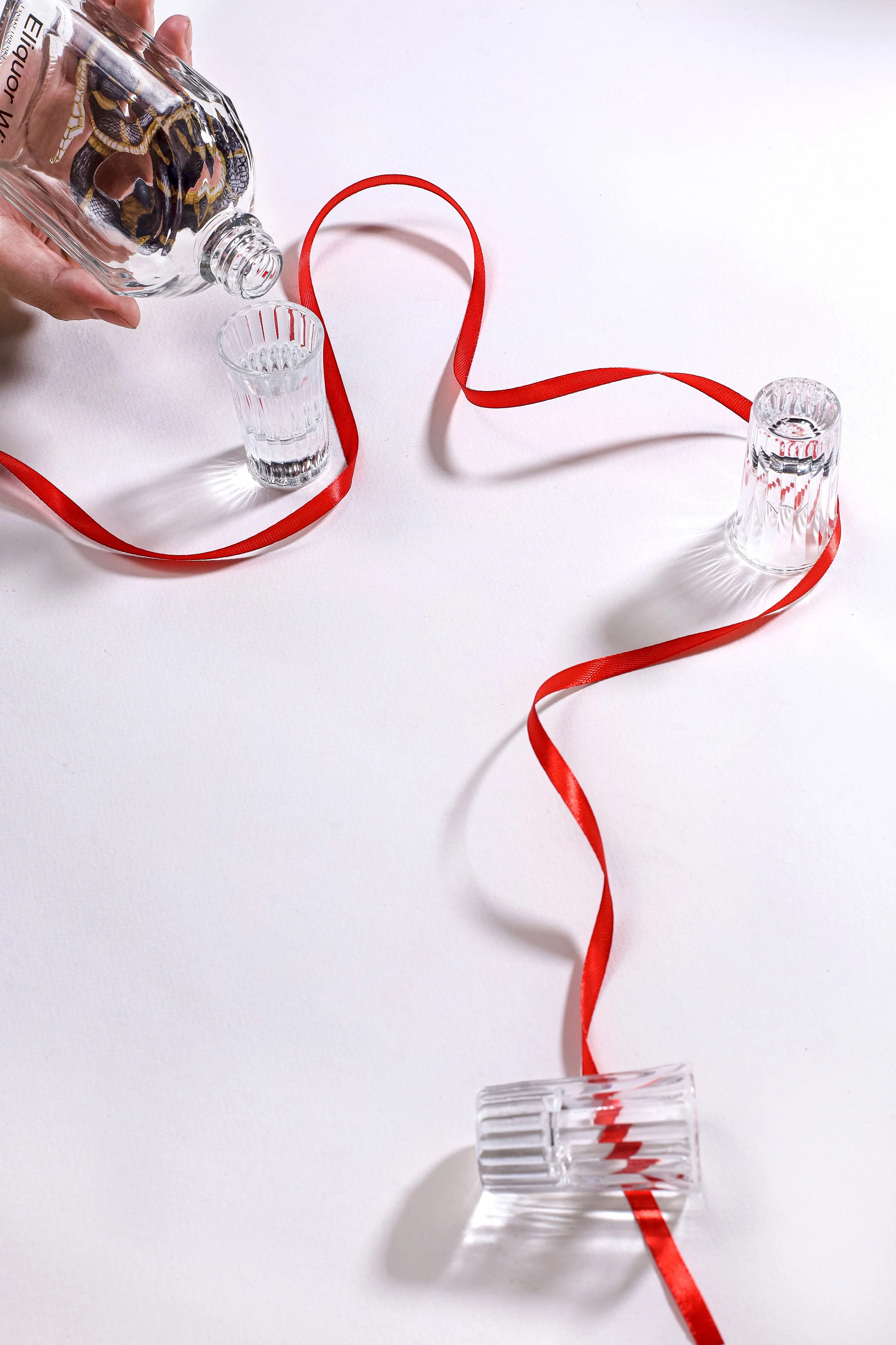
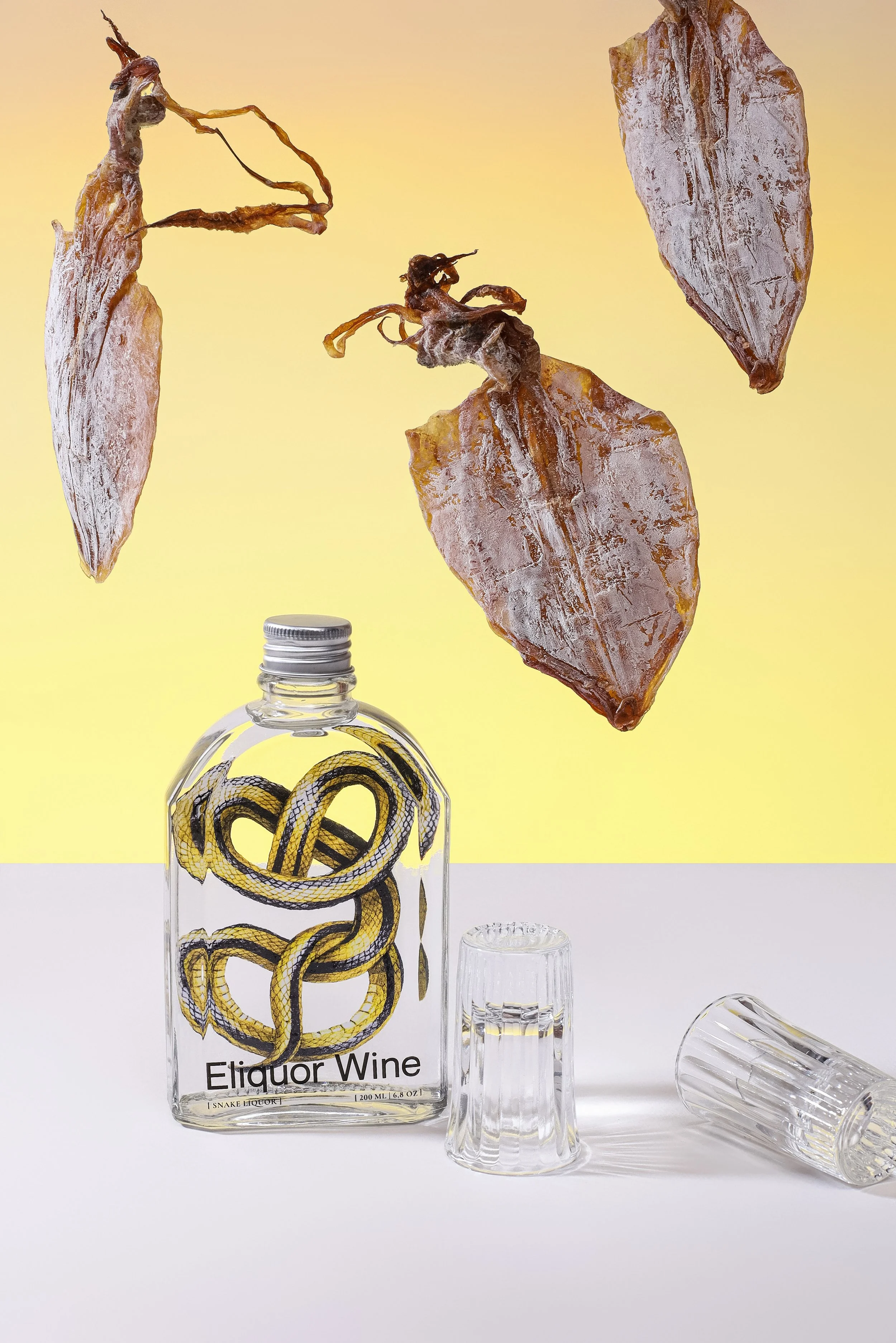
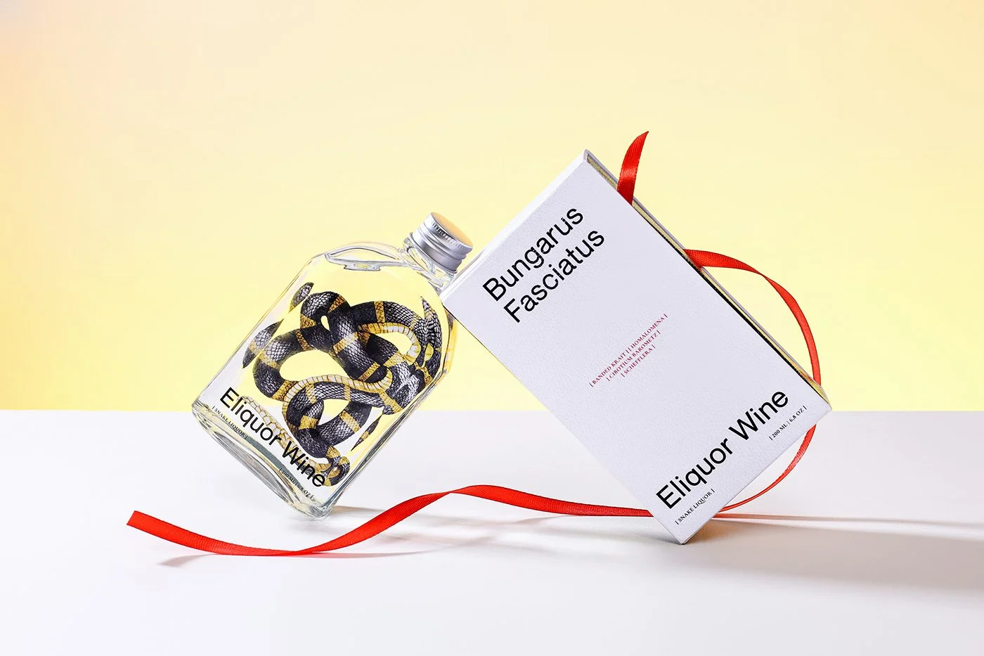
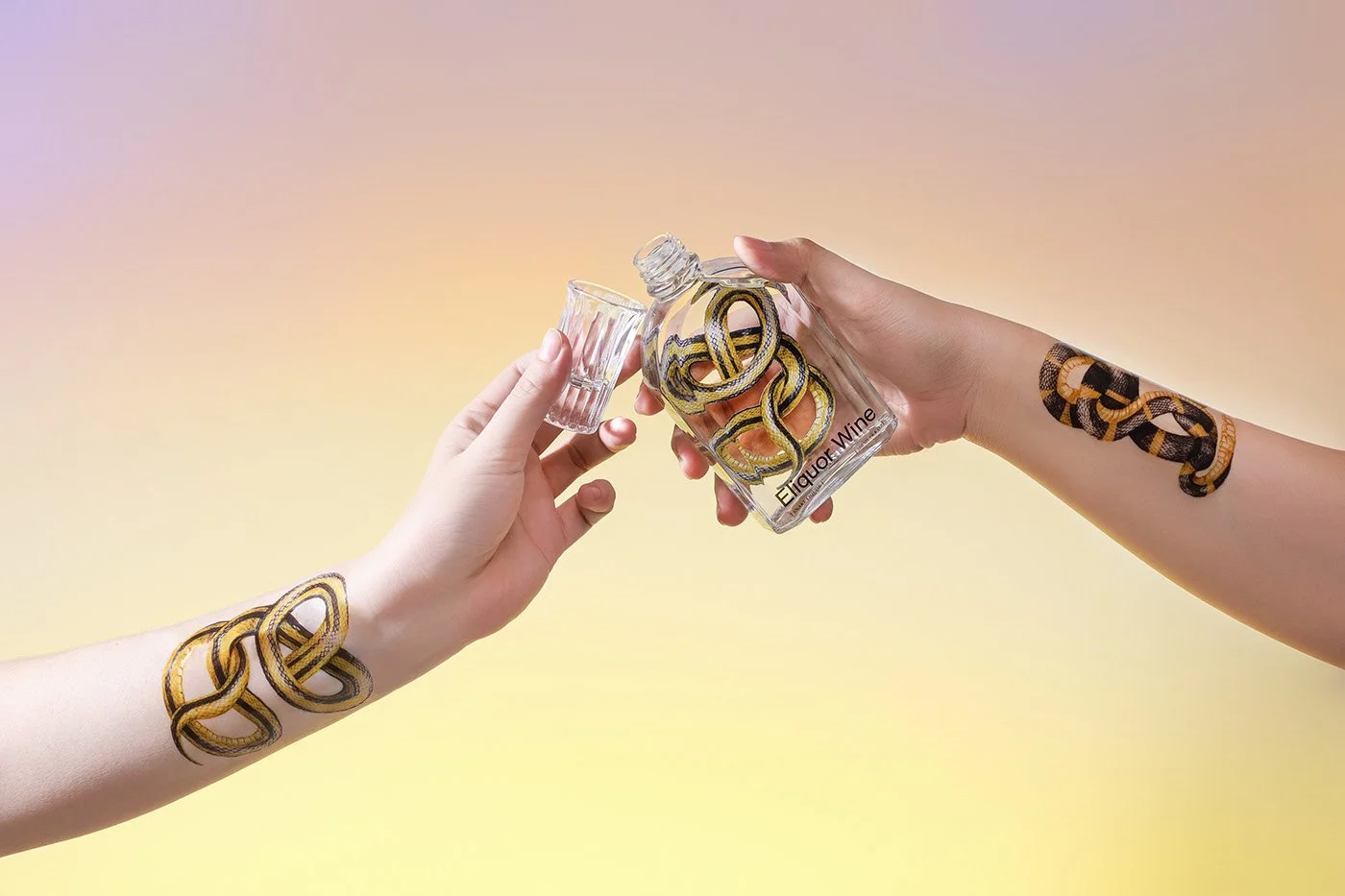
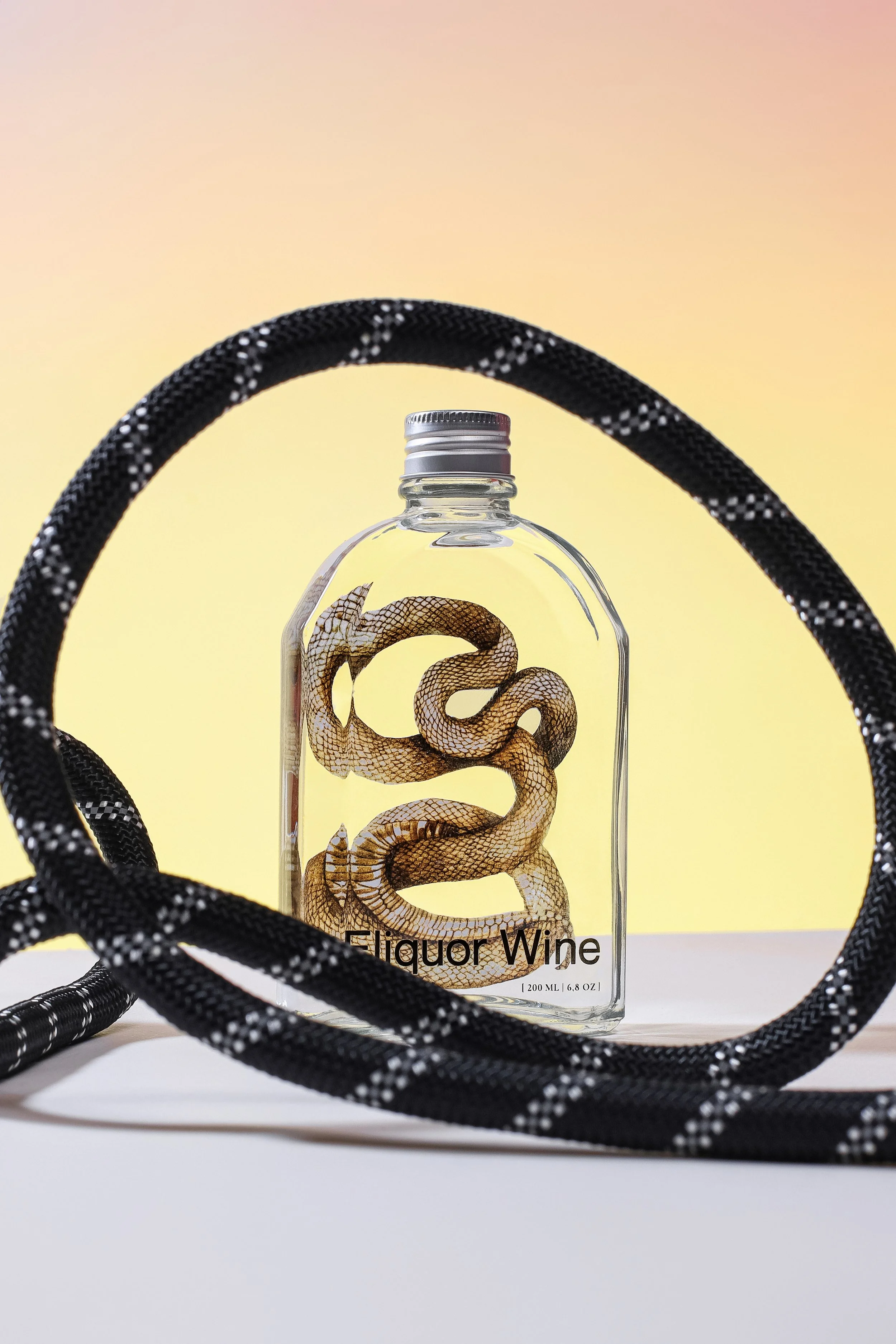
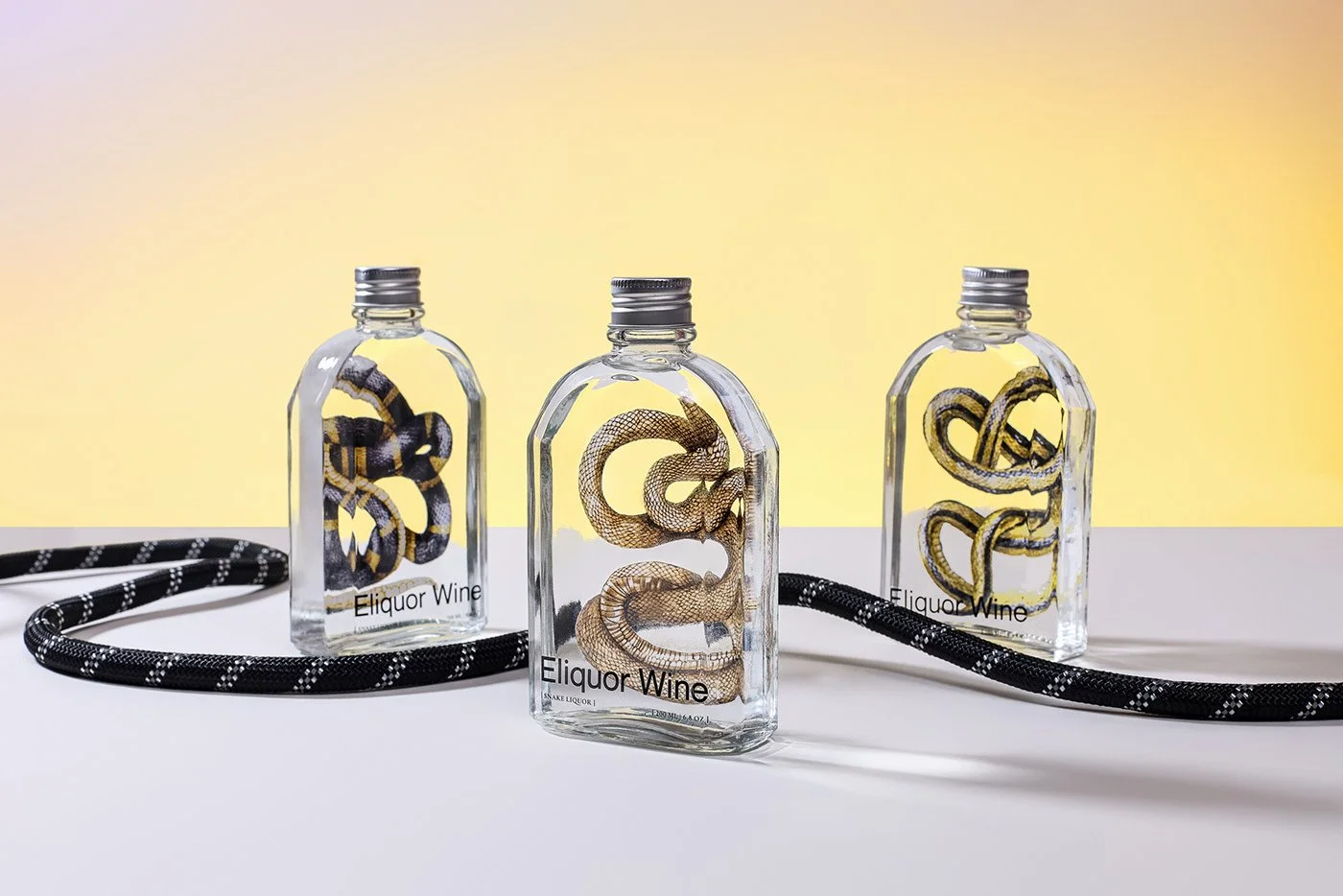
Layơ Lab, a creative studio in Ho Chi Minh City, Vietnam, found a remarkably clever way around the problem with Eliquor Snake Wine. Rather than removing the snake from the brand, they changed the way we encounter it. Scientific illustrations sit behind transparent bottles, creating the illusion of a specimen suspended in the liquid. The snake remains the hero, but the visual language shifts it from carcass to artifact.
That distinction drives the power and impact of the work. Branding has an unfortunate habit of polishing away whatever makes a product strange, especially when the goal is reaching a larger audience. Restaurants do this constantly as they grow, sanding down regional language, peculiar rituals, unusual ingredients and old visual quirks in pursuit of broader appeal. Eventually, the very things that made the brand memorable are gone.
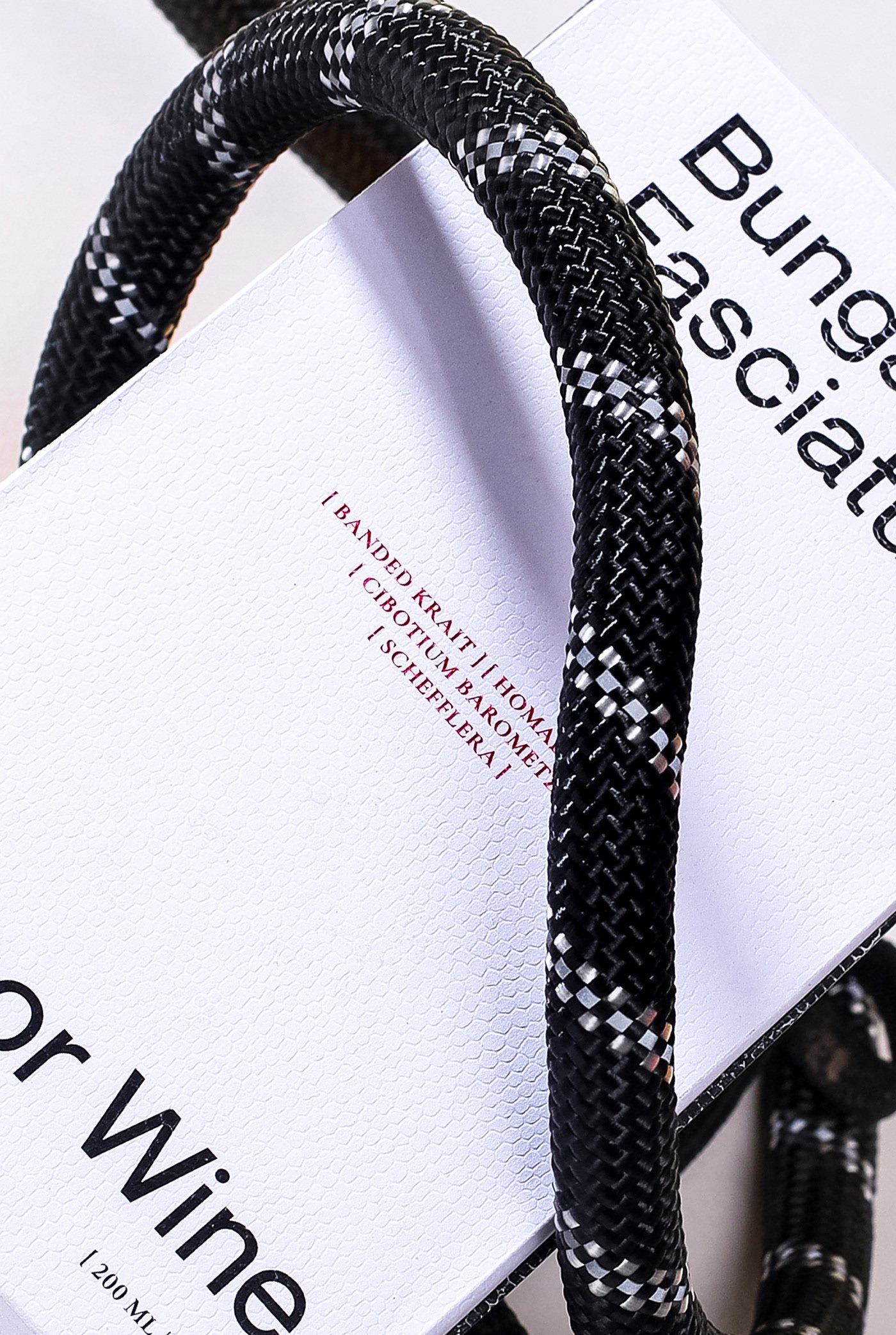
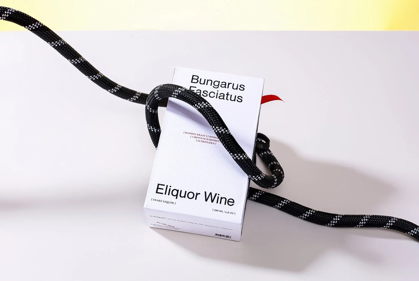
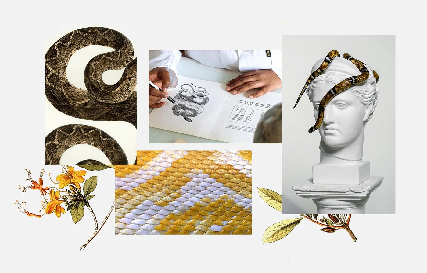
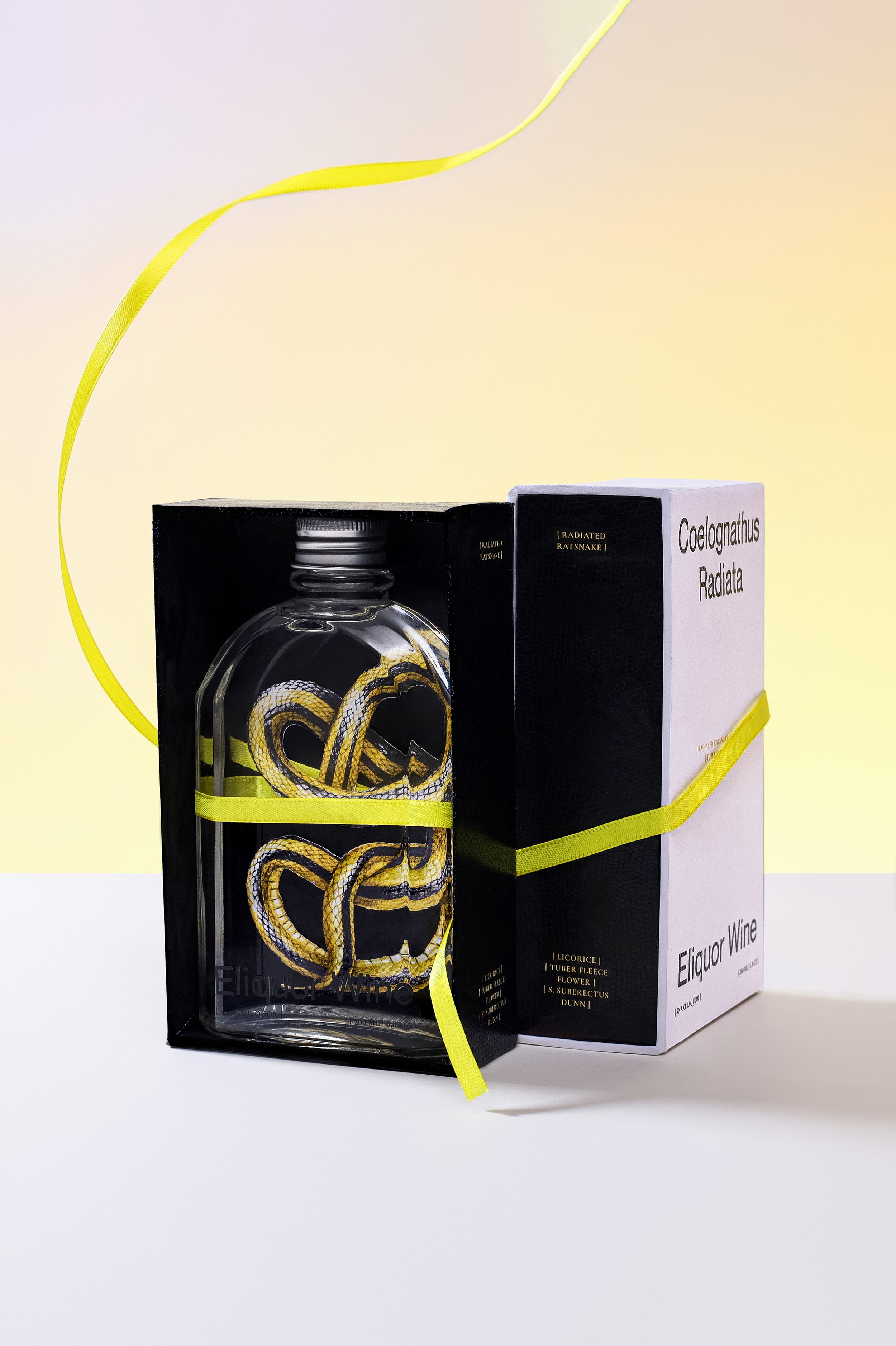
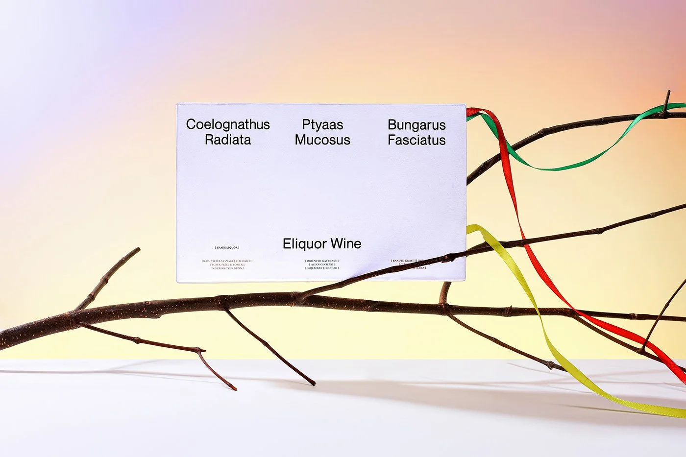
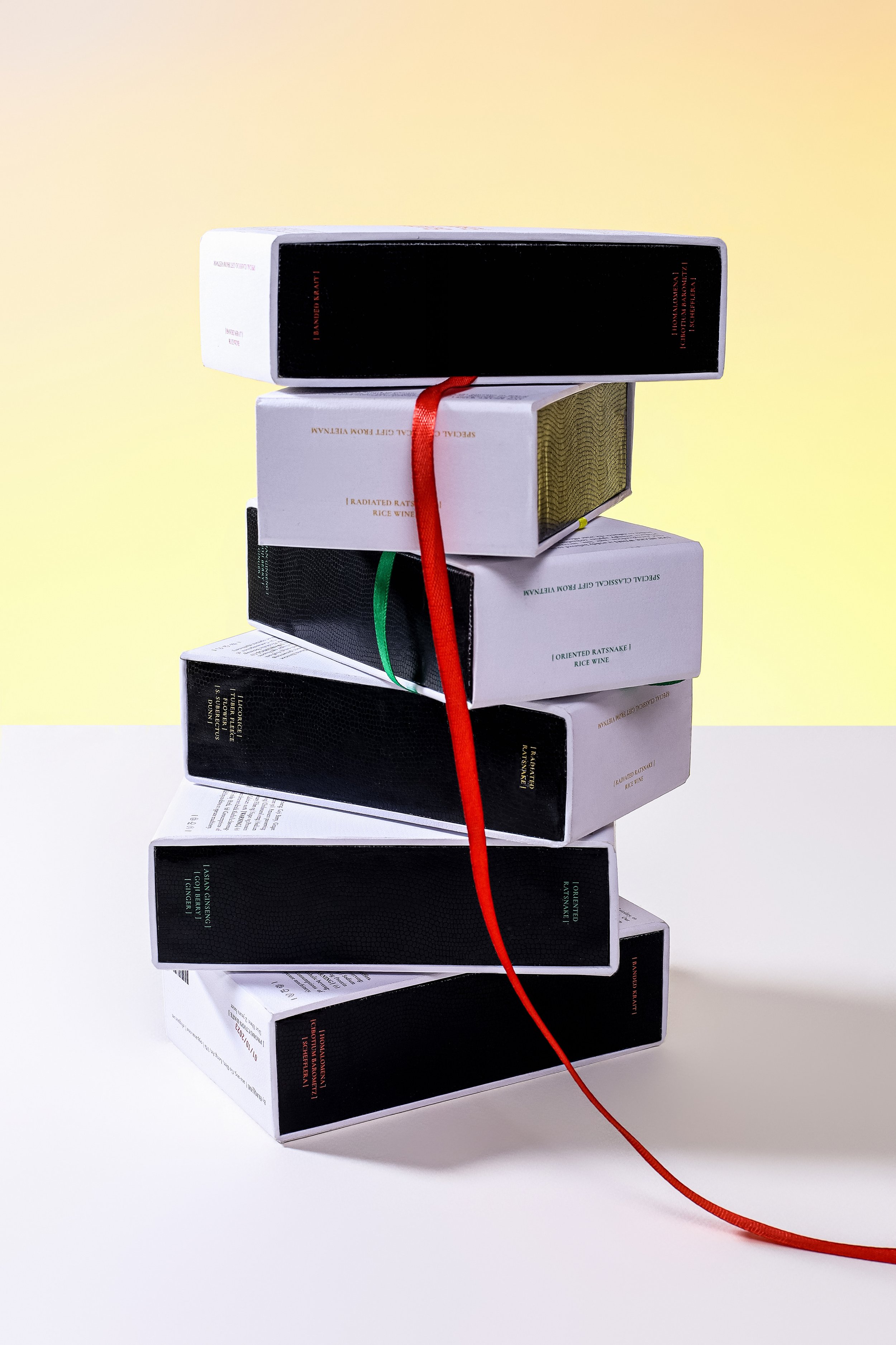
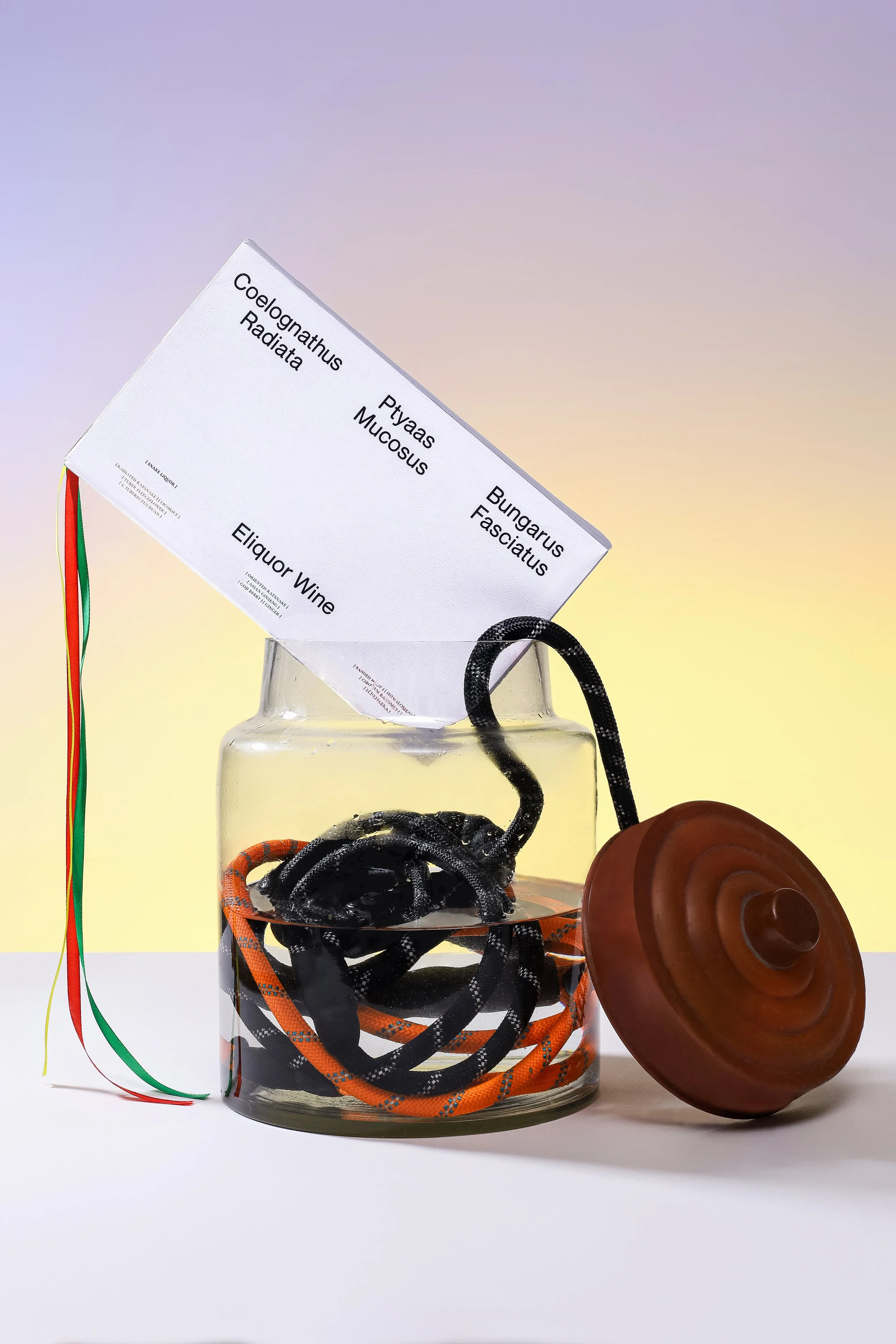
Eliquor takes the better route. The designers recognized that the uncomfortable part was also the interesting part. They kept it, then reframed it through natural-history illustration, restrained typography and packaging that borrows subtly from snake scales and movement. There's enough theatricality to make the bottle intriguing without wandering into the predictable world of fangs, venom, black bottles and faux-dangerous luxury.
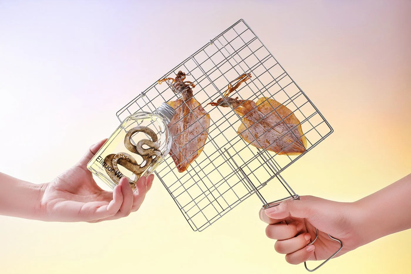
The best design decision may be putting the illustration behind the bottle. You have to look through the product to see the identity, which turns the packaging into an experience rather than a decorated container. You want to pick it up, turn it around and figure out what's happening. Hospitality brands should pay attention to that instinct. Great environments and packaging reward curiosity because discovery creates a small sense of ownership between the patron and the brand.
I'd push the language harder. The design treats the subject with sophistication while some of the supporting copy leans toward novelty, describing the experience as scary, spooky or fascinating. The concept deserves greater confidence. Species, origin, ingredients, extraction, process and history would create more intrigue than adjectives ever could. The traditional health claims around snake wine also require careful handling; they're culturally interesting, but any suggestion of contemporary medical efficacy needs evidence rather than folklore dressed as fact.
What Layơ Lab ultimately accomplished is deceptively simple. They identified the one thing the product couldn't afford to lose and changed its meaning instead. That's a lesson worth carrying into restaurants, hotels and virtually any hospitality concept with ambitions to grow. The strange ingredient, old sign, regional expression or peculiar ritual everyone wants to clean up may be carrying more brand equity than the logo.
Distinctiveness often lives dangerously close to discomfort. Good designers know when to clean something up. Great ones know what they shouldn't touch.