Marrowe tea house restaurant branding

Most tea brands lean light. Soft greens, floral motifs, vaguely Eastern typography. The default is gentle. Predictable. Forgettable.
Marrowe Tea House isn’t any of that.
This identity plants a flag—firm, angular, and entirely outside the trend cycle. Built around an obscure Chinese legend where wild monkeys harvested tea for monks on perilous mountain cliffs, the brand uses that myth as its foundation, not garnish. The result is a system that’s both functional and symbolic, crafted to carry story, not just product.
The core mark—a geometric monkey crouched over a tea sprig—is instantly memorable. It rejects the common tropes of hospitality logos. There’s no steam swirl, no delicate leaf, no nod to European tea service. Instead, it’s a figure that feels unearthed, like a symbol etched into stone centuries ago. It’s static, but filled with action. Unmoving, but braced for climb.
What makes it work is context. The legend isn’t just referenced—it’s baked into the identity. Marrowe’s tagline, “Tea gathered by legend,” ties the brand to its source myth with clarity. It’s not marketing spin. It’s the platform.
Visually, Marrowe operates in a space between brutalist clarity and folk-art symbolism.
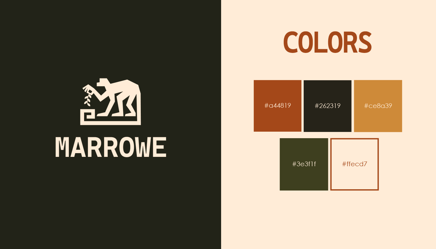
The palette avoids the common trappings of the wellness sector. Instead of pale greens and whites, we get autumnal warmth: rust, olive, mustard, black, and parchment. It’s a grounded, tactile spectrum that aligns with the brand’s handcrafted, natural positioning. Not cozy—earned.
Typography is straightforward and slightly off-standard, enough to feel intentional but not forced. The wide-set sans serif gives the brand room to breathe while still holding authority across signage, menus, and packaging.
Supporting illustrations and stickers reinforce the brand’s hand-hewn sensibility. Spirals, leaves, sunbursts, and flora elements are blocky and imperfect, expanding the mythology without diluting the tone. They’re functional assets with emotional pull, flexible enough to be used across merchandise, packaging, and promotional material.
Marrowe’s packaging execution is one of the brand’s strongest applications. The mountain and sun motifs, paired with oversized logotype, don’t just hold visual space—they establish geography. They root the product in a specific, story-rich place.
It’s rare to see food packaging that balances storytelling and visibility at this level. Marrowe pulls it off cleanly.
The tone of voice holds across most applications. The tagline is pitch-perfect. But some messaging—like the sidewalk sign that reads, “Your therapist called. They said you need tea.”—veers toward internet casual. It’s a light touch, but one that risks undercutting the mythic weight the brand works hard to build elsewhere.
The humor isn’t the issue. It’s the register. If the brand’s foundation is legendary and reverent, its tone should reflect that with consistency. That doesn’t mean solemnity. It means precision.
The identity system is strong, but a few areas need consideration before scale:
Small-Scale Readability: The monkey mark is dense. At small sizes—social icons, stamps, seals—fine details could collapse. A simplified variant may be necessary.
Motion Design Absence: In an increasingly animated world, we see no evidence of motion behavior. How does the monkey move? How does the sun rise? How do these elements transition on screen?
Product Line Extensions: Currently, the brand system doesn’t show how it adapts to seasonal SKUs or tiered product lines. Marrowe Reserve? Winter Forage Blend? There’s room to develop a clear sub-brand strategy.
Marrowe Tea House is a standout example of narrative-first branding. The team behind it understood the difference between decoration and direction. From mark to message, everything exists to reinforce the core idea: this is tea rooted in legend.
The result is a system that’s hard to confuse and easy to remember.
For a category obsessed with comfort, Marrowe chooses conviction. And that choice makes all the difference.