Duke’s Restaurant branding

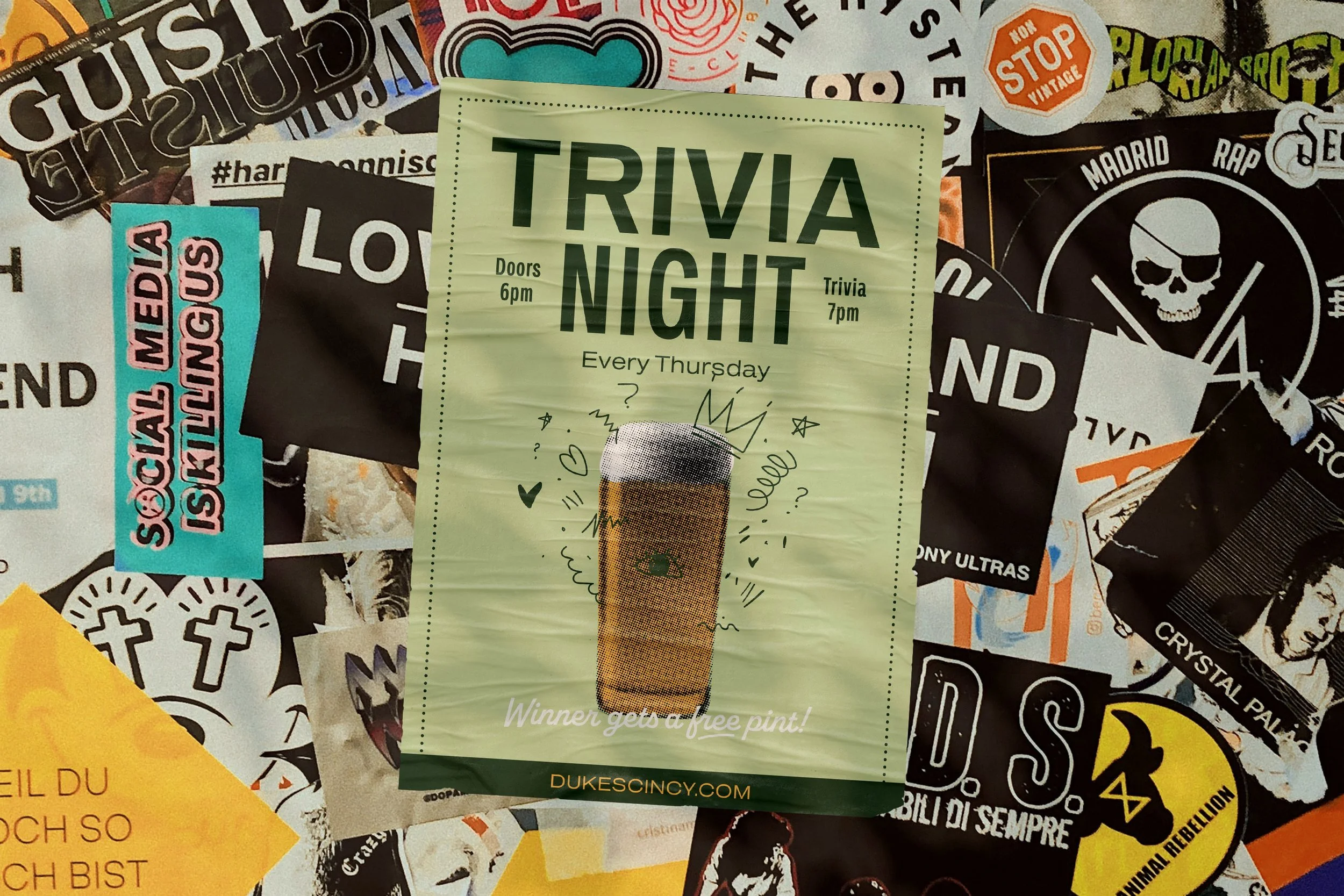
Vicarel Studios nailed the brief of “make this feel like it’s been here forever, but it’s new” (their words). The use of a restrained palette (forest green, mustard/gold, muted off-cream, accent light green) gives the brand a warm, lived-in feel rather than a neon-flash startup look. The typography is solid: a bold condensed sans for the main wordmark (“DUKE’S”), paired with script/hand-style for taglines (“Hot Chicken · Cold Drinks · Good Times”). That pairing reinforces approachability and fun without sacrificing backbone.
The visual motif of the rooster/rocket or rooster with motion lines is clever: it hints at “hot”, “fast”, “heated chicken” and lifts the logo beyond generic. The identity system is robust: you see logos, secondary marks, patterns, social graphics, swatches—all well-thought-out. The menu layout shown uses strong hierarchy, adequate fear-white space, vintage cues (halftone style dots, skyline illustration) and the copy (“Hot chicken, cold drinks & good times in Cincinnati, Ohio”) hits tone: local pride, simple promise, community hangout.
Branding across collateral (T-shirts, hats, wrappers, social assets) stays consistent. The “This shit rips!” tagline (yes they went there) injects attitude fitting for hot-chicken culture and younger demographic. The pattern of lightning bolts, glyphs, and the “D” crest allow for flexible branding without losing core identity.
In terms of positioning: They claim “priced low enough for lunch, nice enough for dinner” and the identity supports that. It isn’t overly high-luxury, nor is it fast-food gimmick. It lands in the middle — accessible but not cheap.
While the vintage-craft casual aesthetic is well executed, it’s somewhat safe and familiar within the restaurant branding space. The “heritage feel yet new restaurant” trope is pervasive; the risk is blending into the crowd of independent eateries trying the same signal. If Duke’s truly wants to own “hot chicken in Cincinnati” it might lean harder into a more distinct visual twist — for example stronger narrative around local Cincy culture, or more experimental typography or motion.
The secondary marks and glyphs are many and varied; from a brand strategy lens that multiplicity can dilute clarity. When you have 6-8 versions of the wordmark, crest variations, glyphs, pattern bits, script tags — execution gets heavier and the system becomes harder to maintain consistently across channels. Especially for a restaurant (with outrun, packaging, signage, digital) there is a danger of fragmentation.
The palette, while warm and effective, leans rather muted for “hot chicken” — the colour cues of fire, heat, spice aren’t front-and-centre. The mustard/gold is subtly nodding at warmth but not virulent or fiery. If the food is genuinely bold/spicy the branding might under-promise in visual heat. They could consider a punch accent (red or flame-orange) to heighten that flavor signal.
Finally, the tagline “Hot Chicken · Cold Drinks · Good Times” is clean but generic. It signals what they do but not quite how they do it differently. If the brand strategy is “the neighbourhood hangout with timeless roots” then we’re missing a stronger story of origin, character, local legend, personality. The identity communicates familiarity, but the brand story could dig deeper to create a more unique narrative hook.
Duke’s, as branded by Vicarel Studios, is a strong execution of the neighborhood-restaurant identity: warm, familiar, craft-casual, well systematized. The design supports trust and approachability, while the visuals have enough edge to appeal to younger diners. From a brand strategist’s lens this ticks major boxes: clear positioning, strong system, consistent look.
But to rise above the clutter in the fiercely competitive hot-chicken and casual-dining space, Duke’s could push further: amplify distinctive cues (spice, heat, local flavor), simplify the mark system for tighter consistency, and tell a deeper brand story that anchors the identity beyond the aesthetic. If they do that, the brand won’t just look like it’s been there forever — it’ll earn being remembered.