JÔJI sushi restaurant branding
Joji Sushi hits like a drumline in a quiet market. The identity walks the knife-edge between heritage and street heat—Japanese formality bent through a South American pulse. The result is visual umami: bold, savory, and a little reckless.
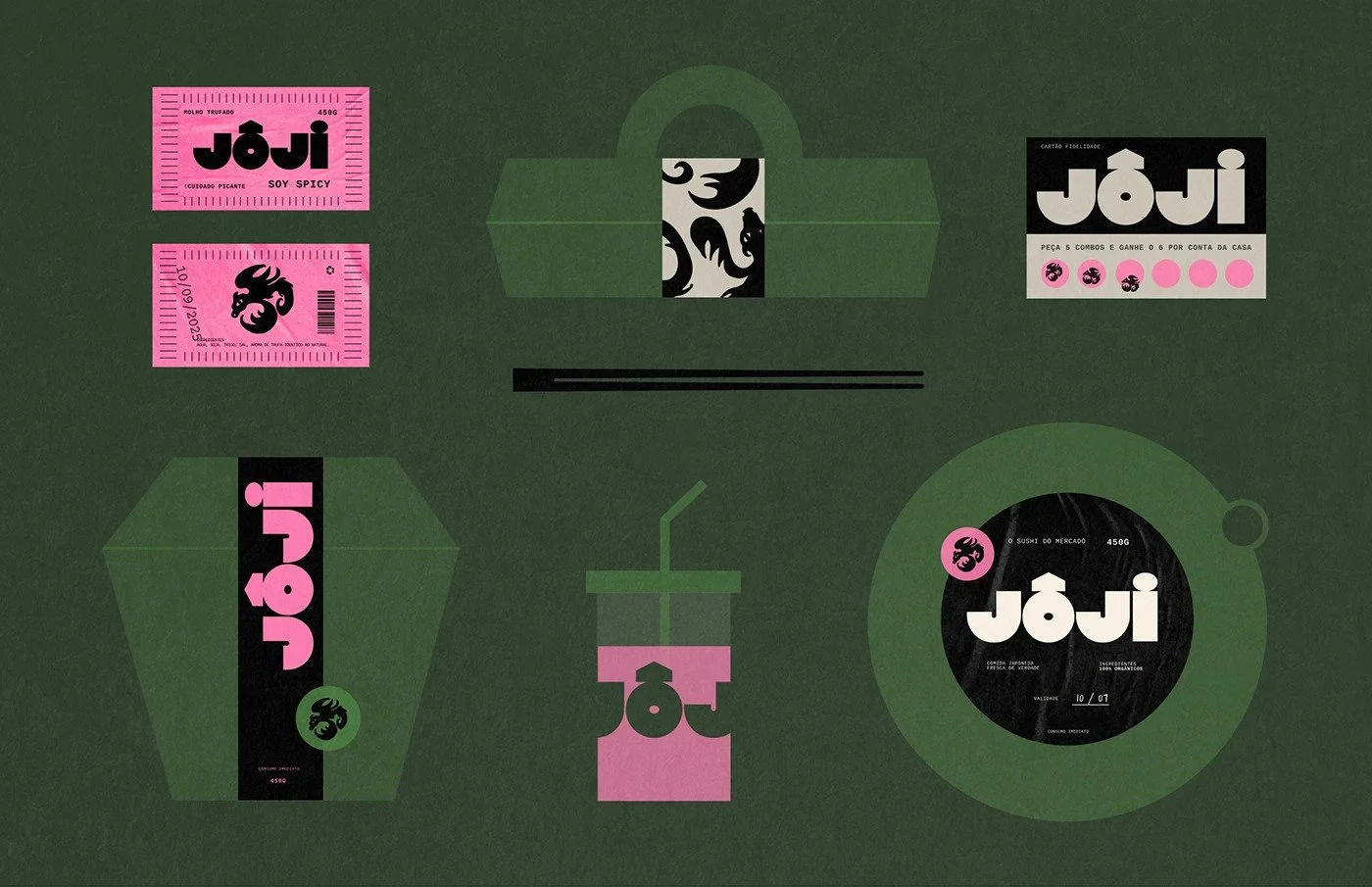
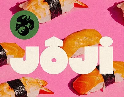
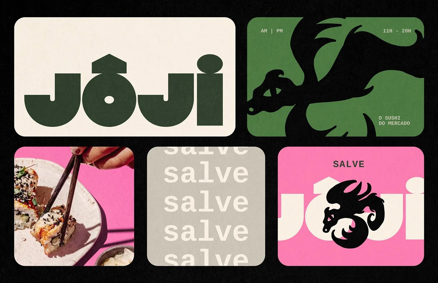
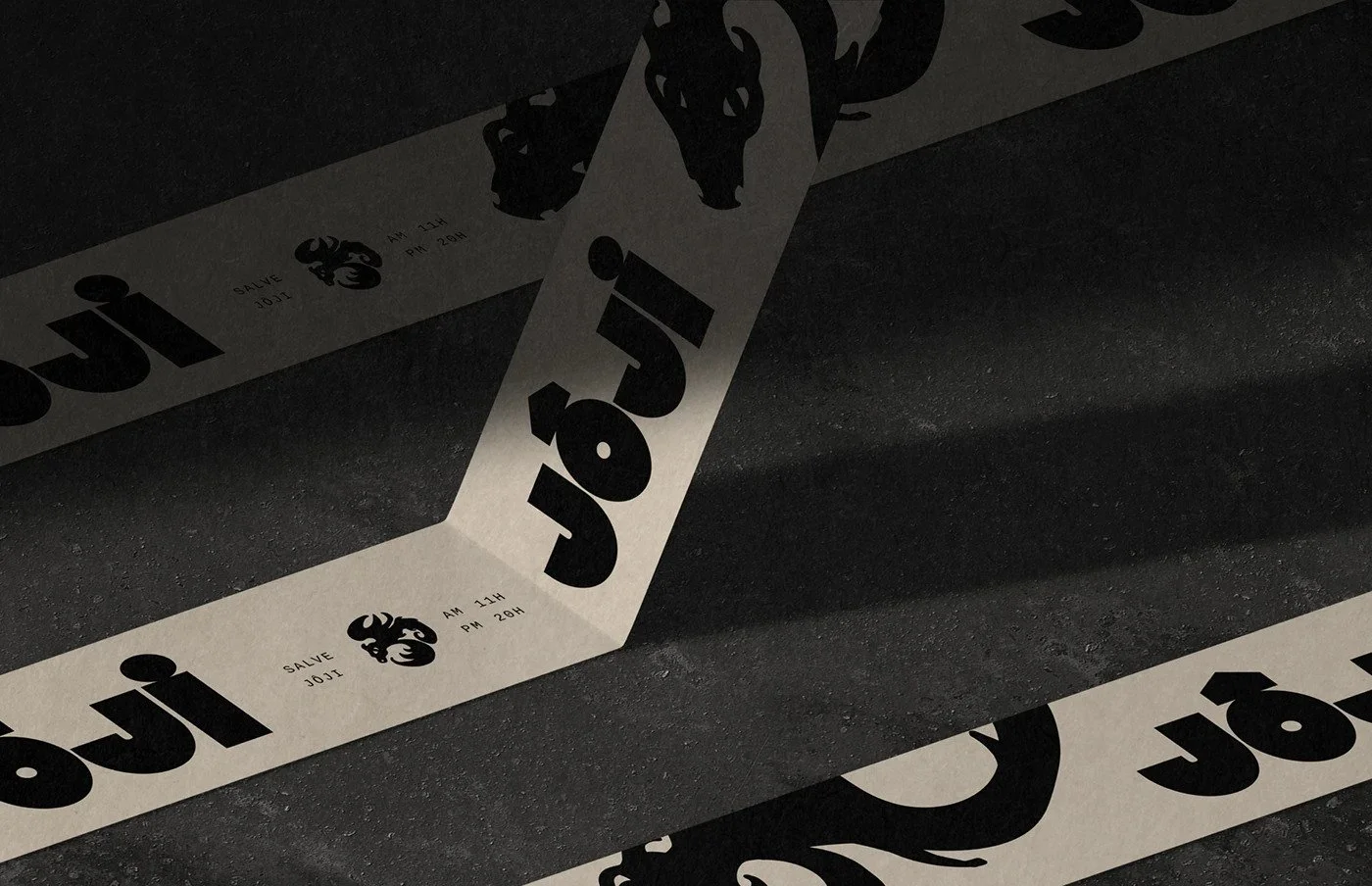
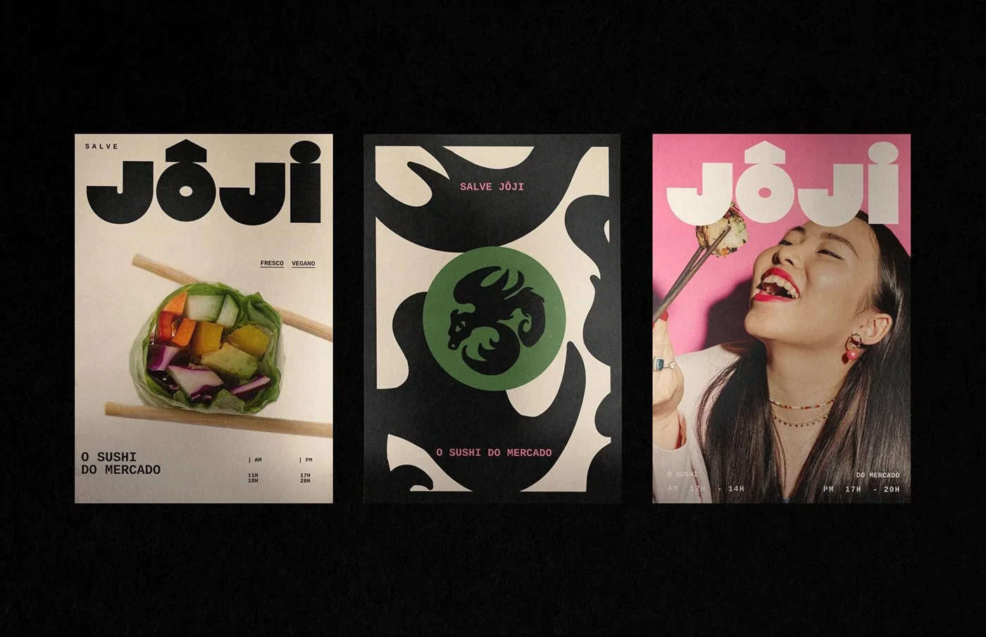
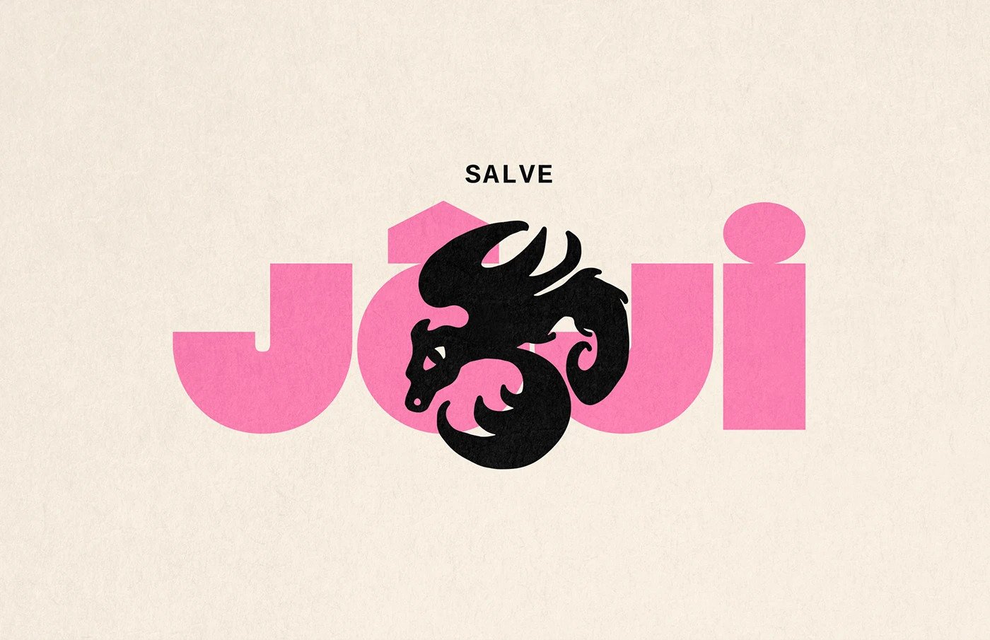
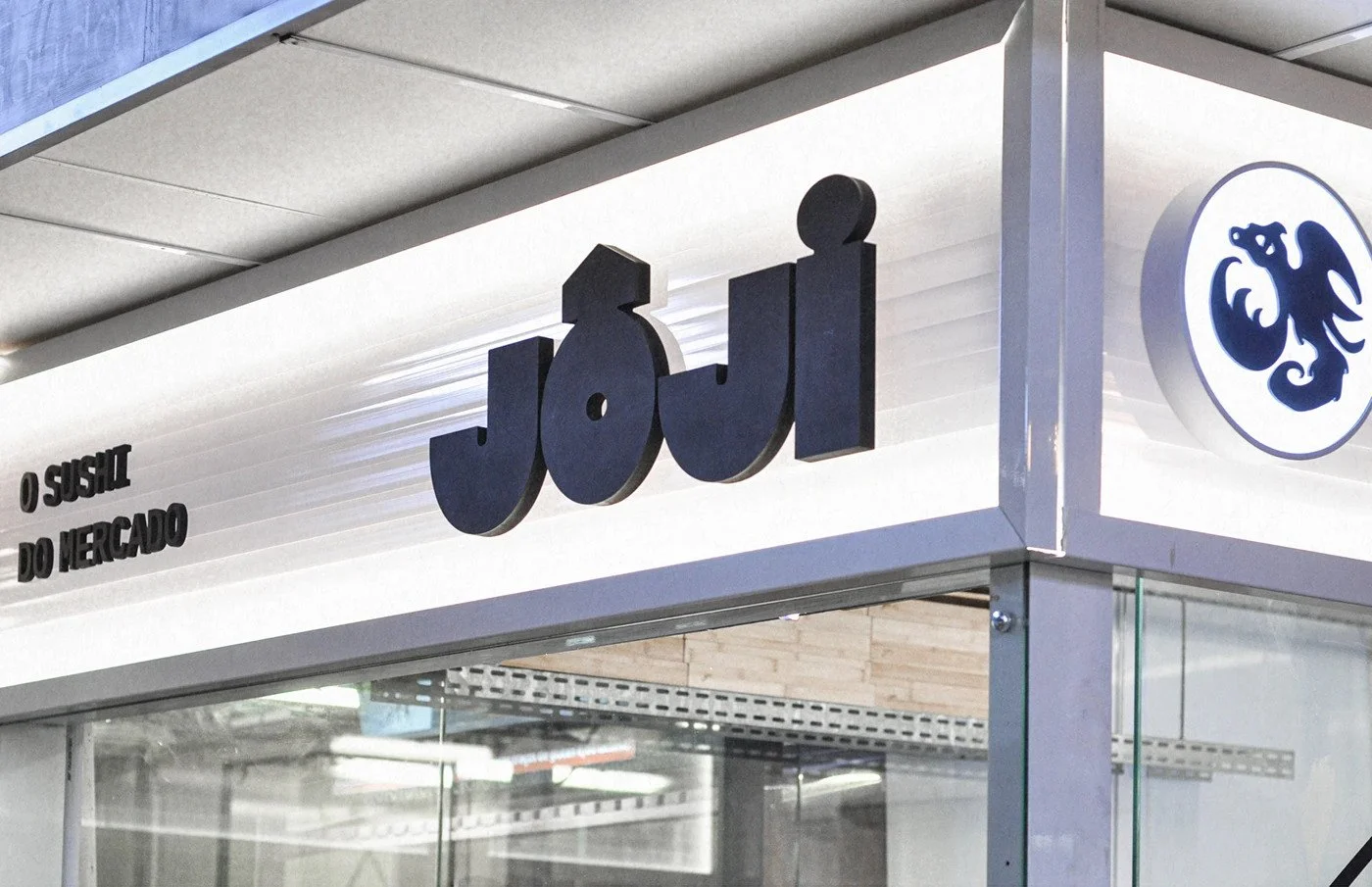
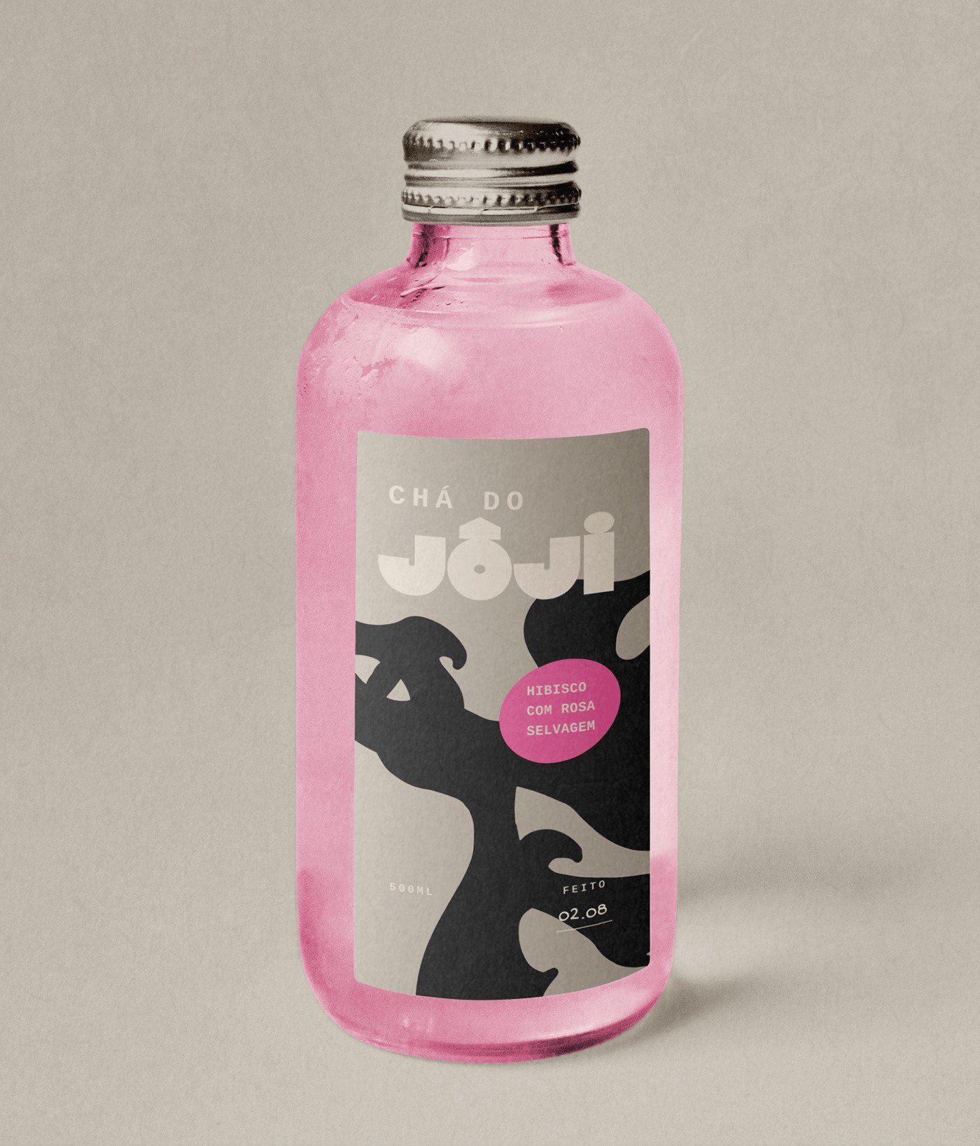
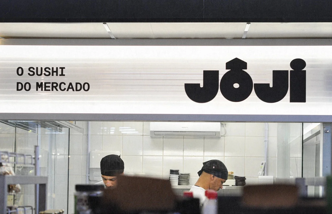
The logo does the heavy lifting. Those massive geometric letters carry weight, like slabs of stone carved for a new culinary cult. The circumflex over the “O” feels ceremonial, a hat tip to Japanese phonetics, while the circular counterpunch inside the “O” keeps the rhythm playful. There’s balance in that tension. Tradition meets toybox.
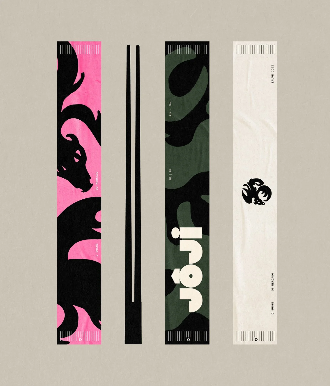
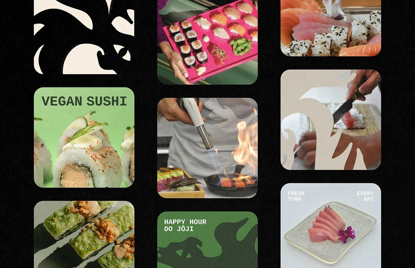
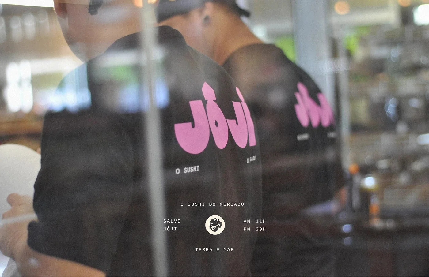
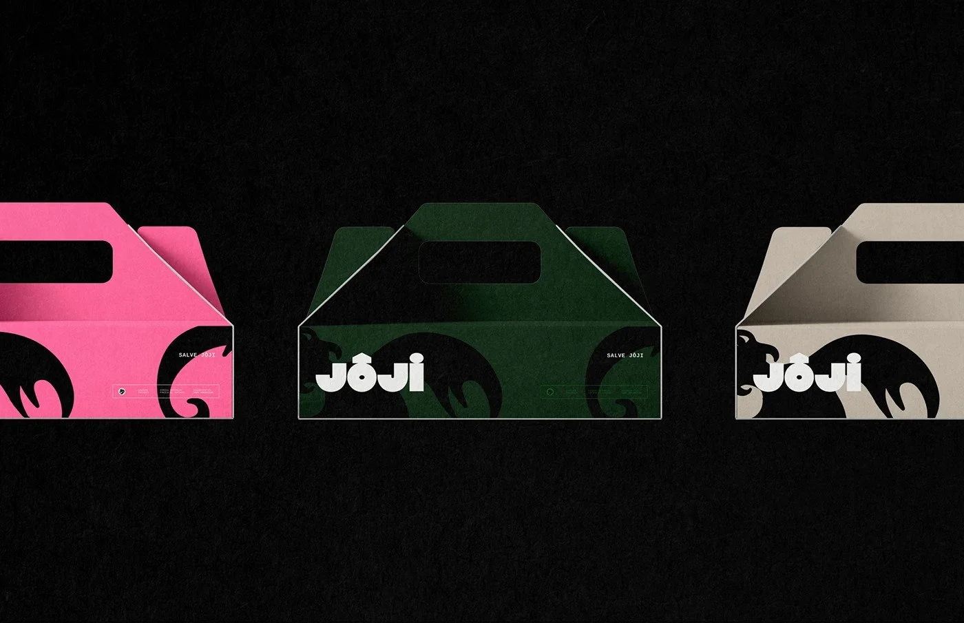
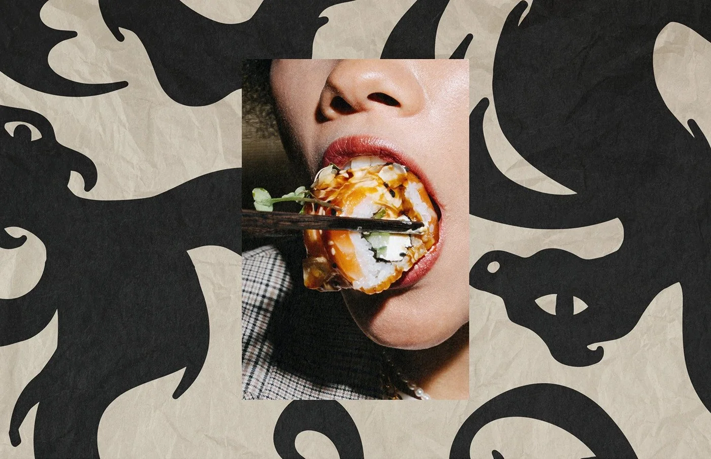
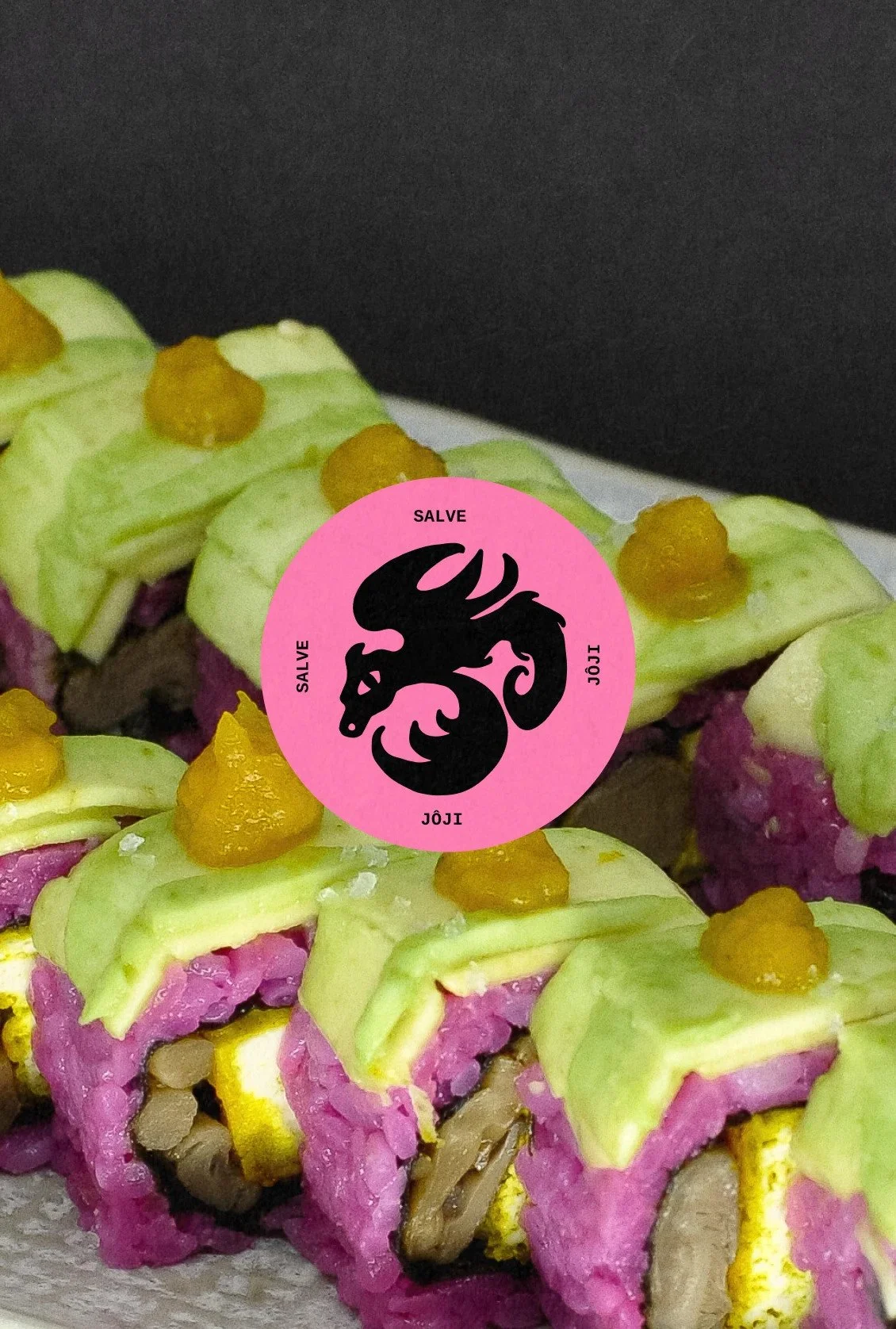
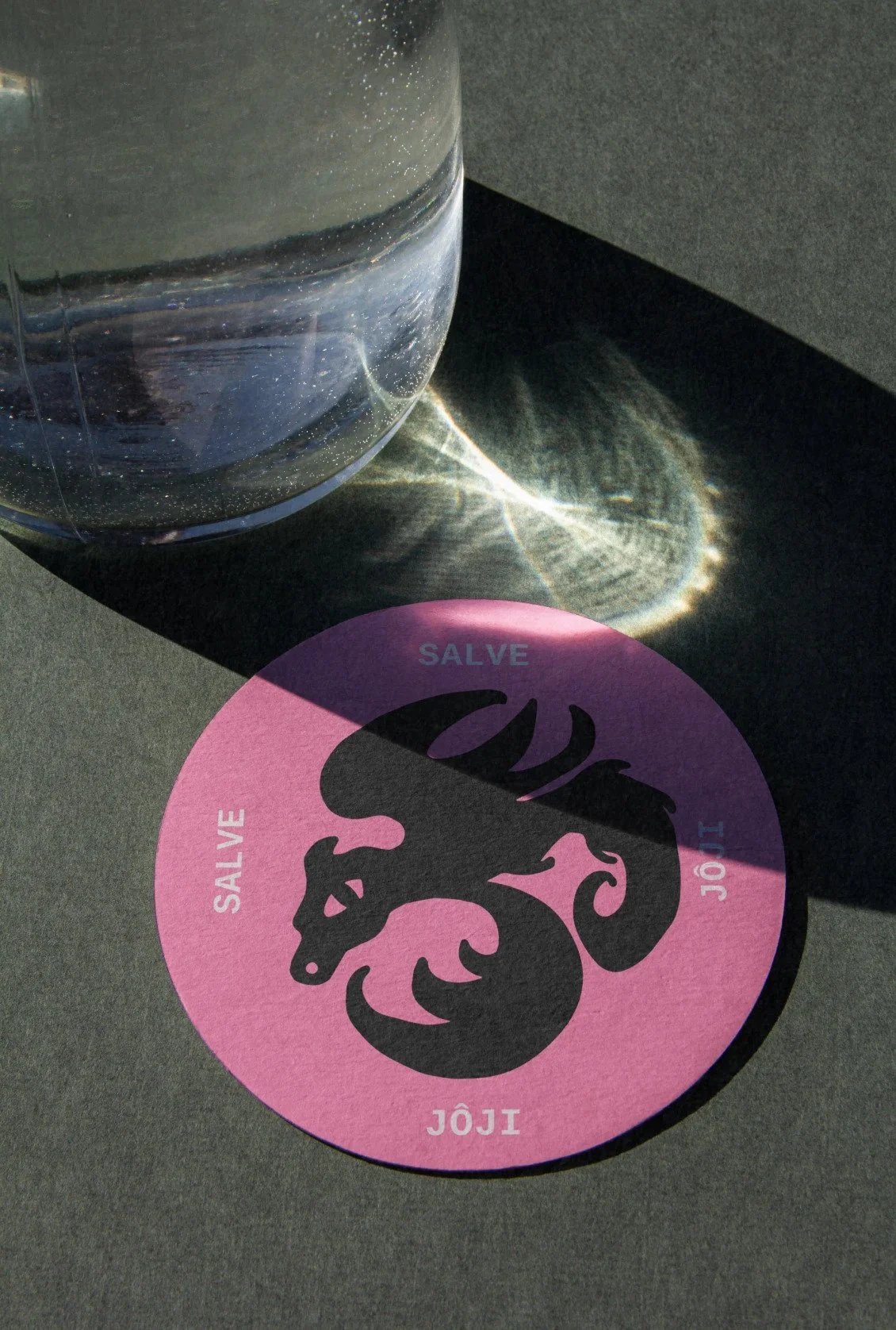
The color palette rips away the clichés. No seafoam or restrained neutrals here. Instead, hot pink, dragon green, and cream grind against one another, each shade jostling for dominance. It’s chaotic, but intentional—the same energy you find behind a sushi counter when knives flash and flames kiss tuna. The dragon motif pushes this further. Not a slick, modern vector dragon, but something rough and primal. It curls and twists like a street mural, a nod to Joji’s tagline: “O sushi do mercado.” The sushi of the market. Earthy. Accessible. Alive.
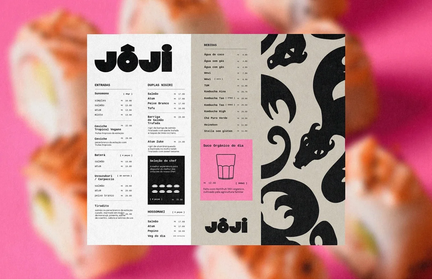
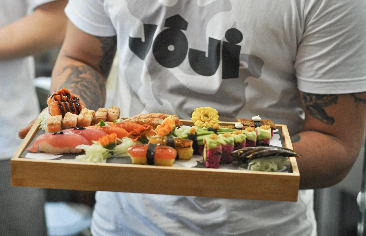
Typography choices echo that muscle. Big, chunky letterforms for the wordmark contrasted by small, clinical sans-serif type for menu listings. That micro-macro tension builds hierarchy and gives the brand texture. It’s not afraid of space. It lets the logo breathe while the copy hums underneath, clean and utilitarian. The type system feels built for print—menus, packaging, tickets, loyalty cards—each item a miniature poster that could live just as comfortably on a wall as in a takeout bag.
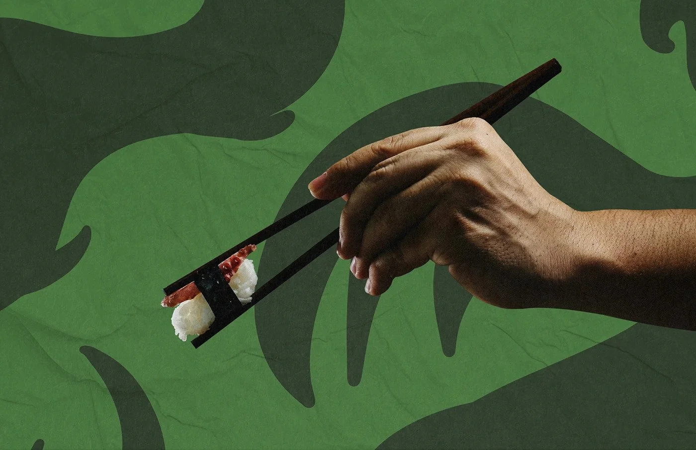
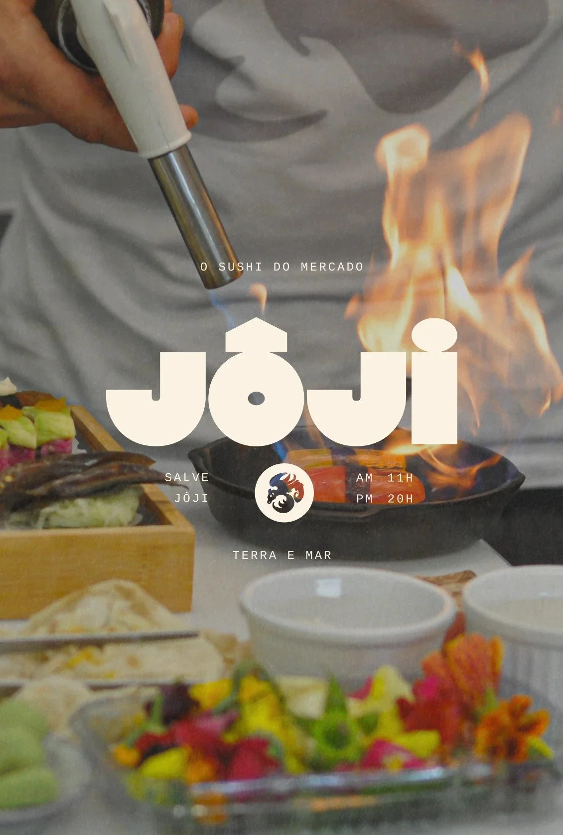
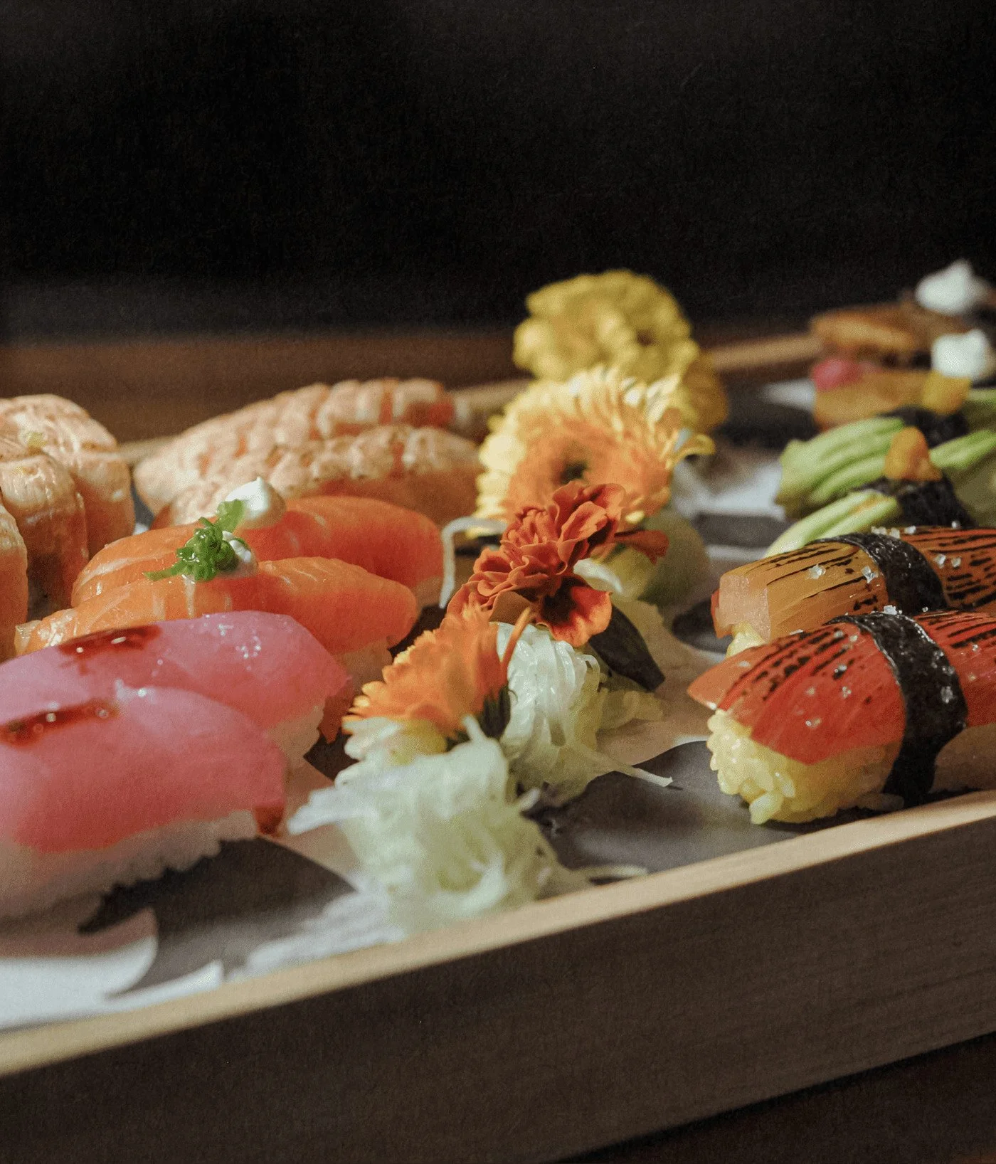
Where this brand really earns its edge is in the art direction. Photography catches moments mid-motion: hands gripping chopsticks, flames licking pans, sushi against bold backgrounds. It doesn’t aim for serenity or minimalism. It’s about the craft and grit of working the market stall, where the product is elevated through hustle, not ceremony. That honesty makes it magnetic.
If there’s a crack in the armor, it’s in the consistency of tone. The dragon pattern and hot-pink chaos dominate in some applications but fade into restraint in others. The energy should carry through every touchpoint with equal weight. When it does, Joji feels like a rebellion wrapped in rice. When it doesn’t, it slips back toward trend-driven design—a risk when a brand’s voice is this bold.
Still, this is the kind of work that stands up and shouts in a crowded F&B scene. It’s confident, graphic, and unafraid to flirt with danger. Joji isn’t just a sushi brand. It’s a love letter to fire, flesh, and form. The market’s heartbeat with a Japanese accent.
Credits
Agency: Bolden Branding
Location: São Paulo, Brazil
Designers: Bolívar Nunes, Gabriela Balza, Paula Nunes, Marcella Fontes, Bruno Krazler