Roastory coffee branding
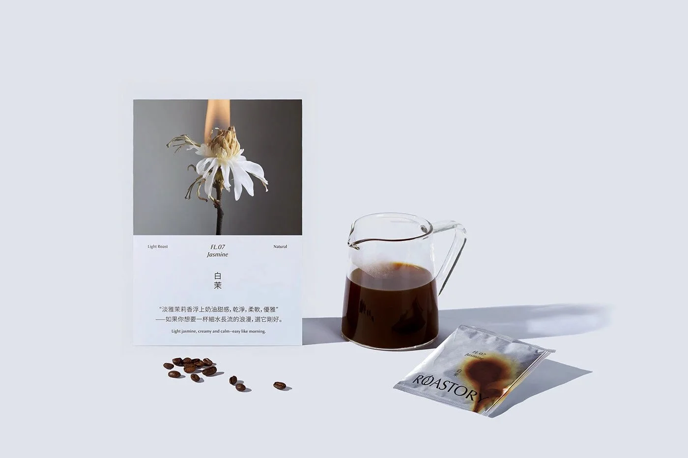
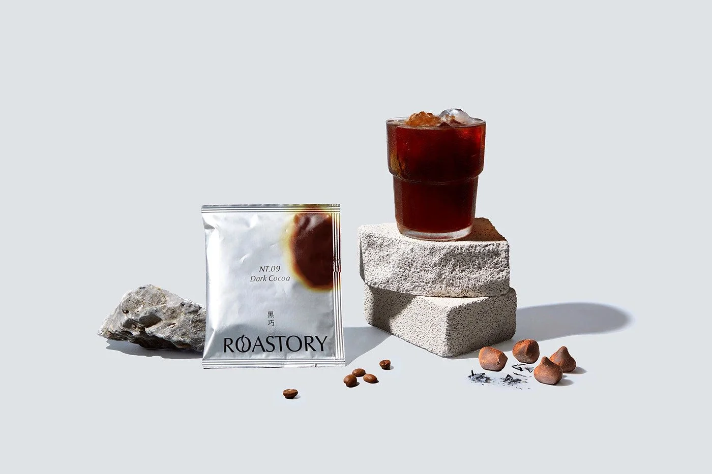
Roastory steps forward with the kind of composure you only get when a designer trusts their own restraint. The layouts breathe. White space stretches confidently across every panel, giving the typography room to carry the melody instead of fighting for attention. Nothing is overbearing. Nothing clutters. It feels like the work of someone who knows exactly when to stop—and that’s half the battle in coffee branding, where everyone else seems to be doing handstands on their packaging just to get noticed.
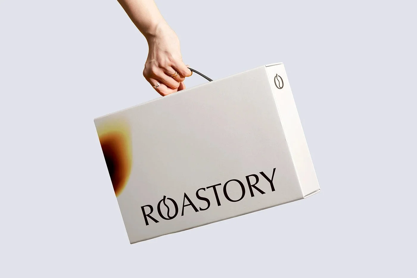
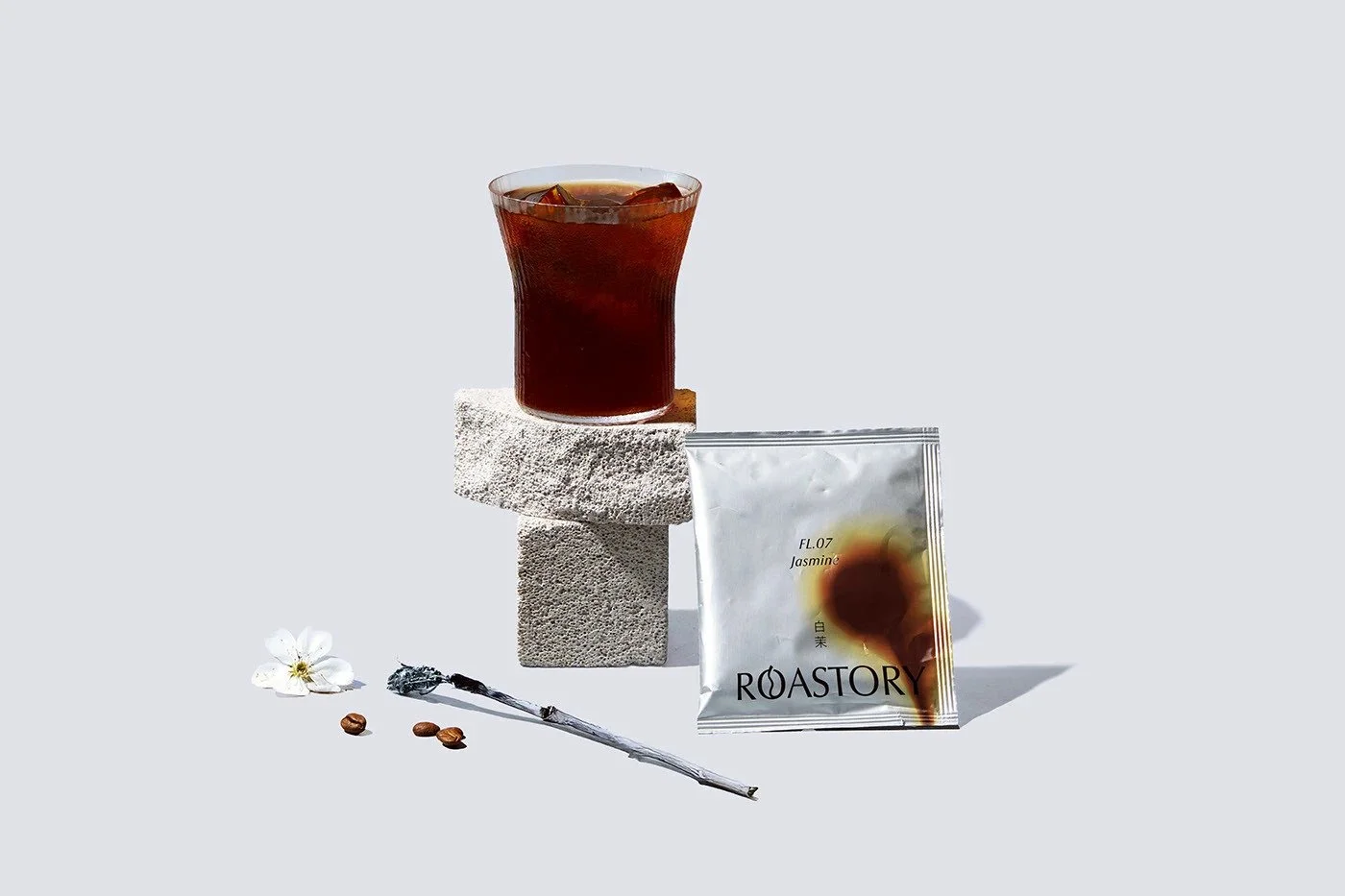
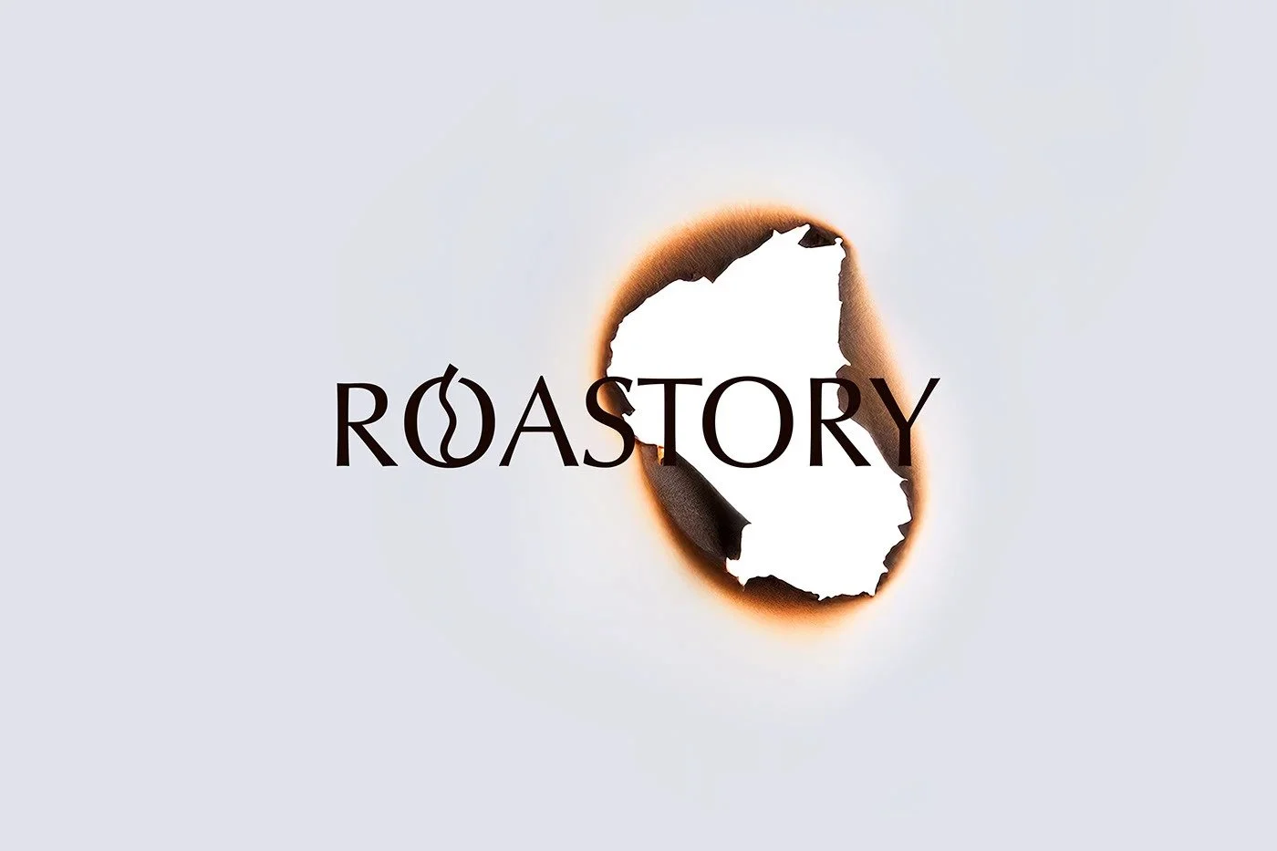
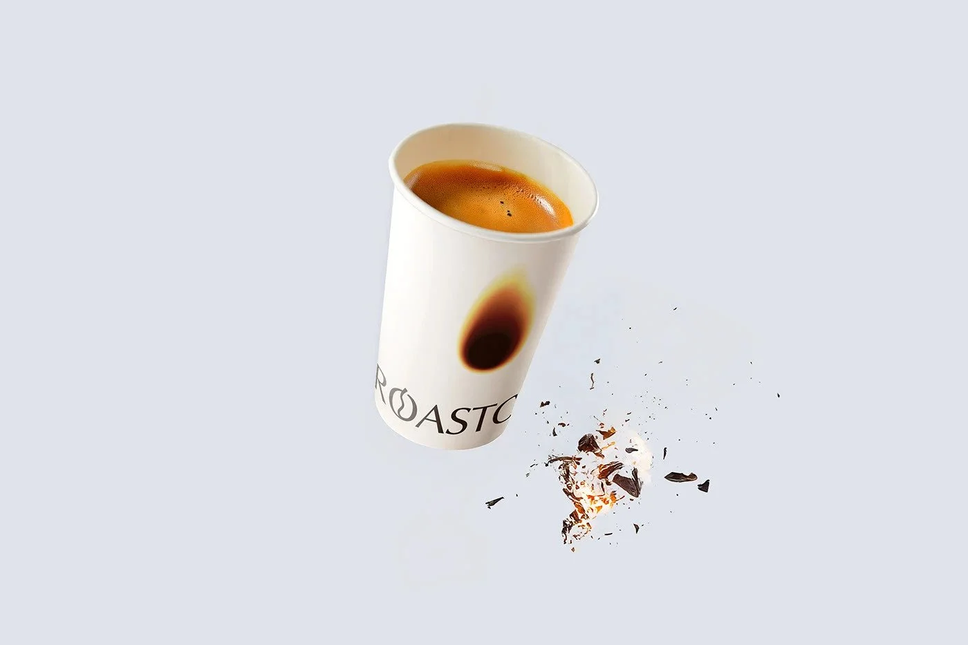
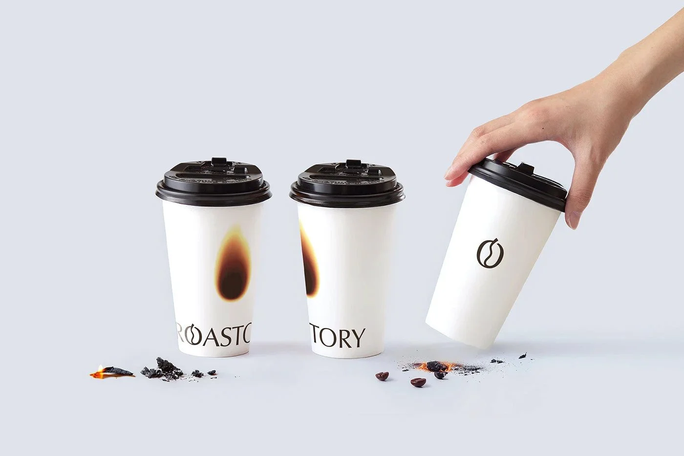
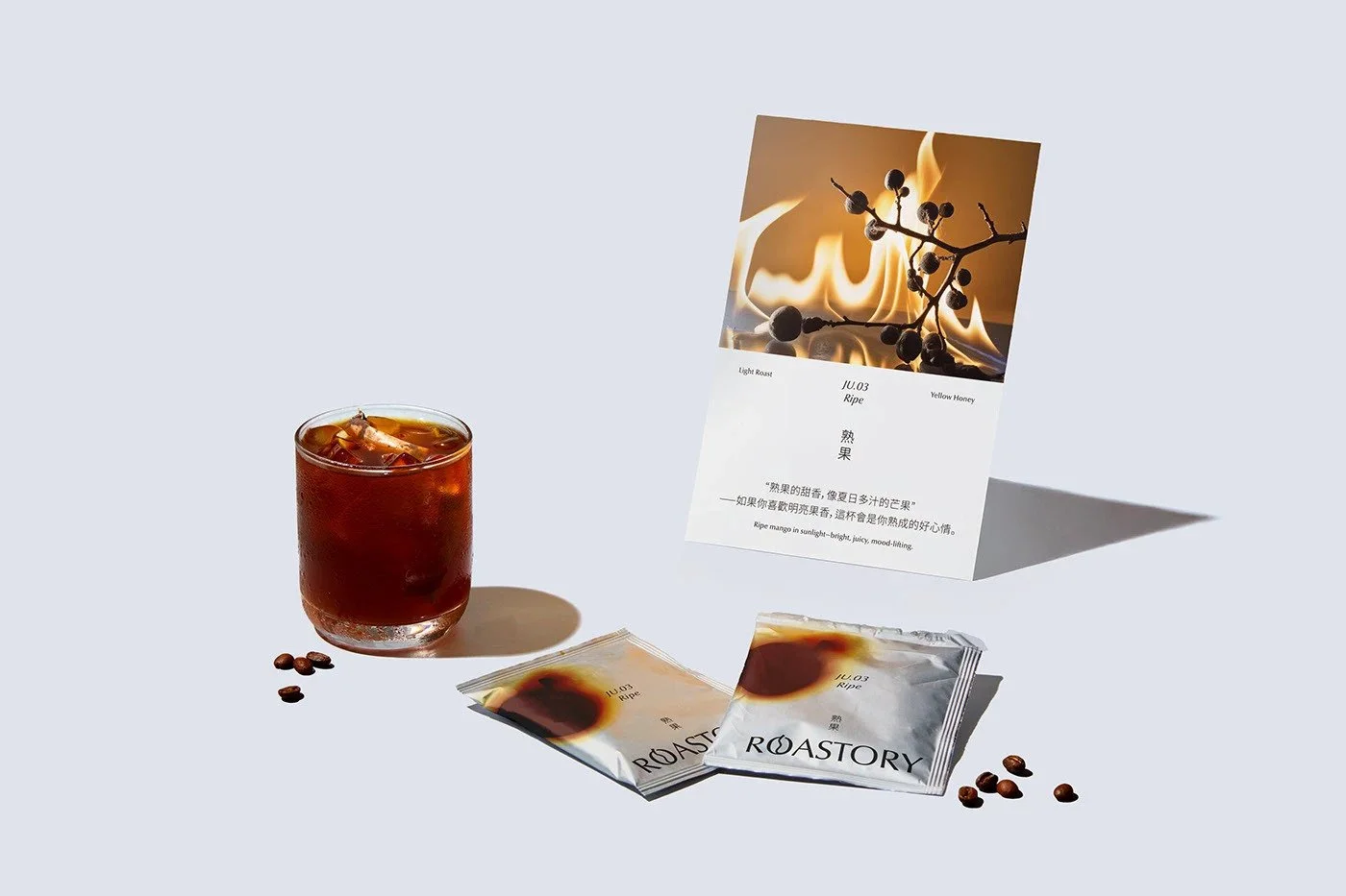
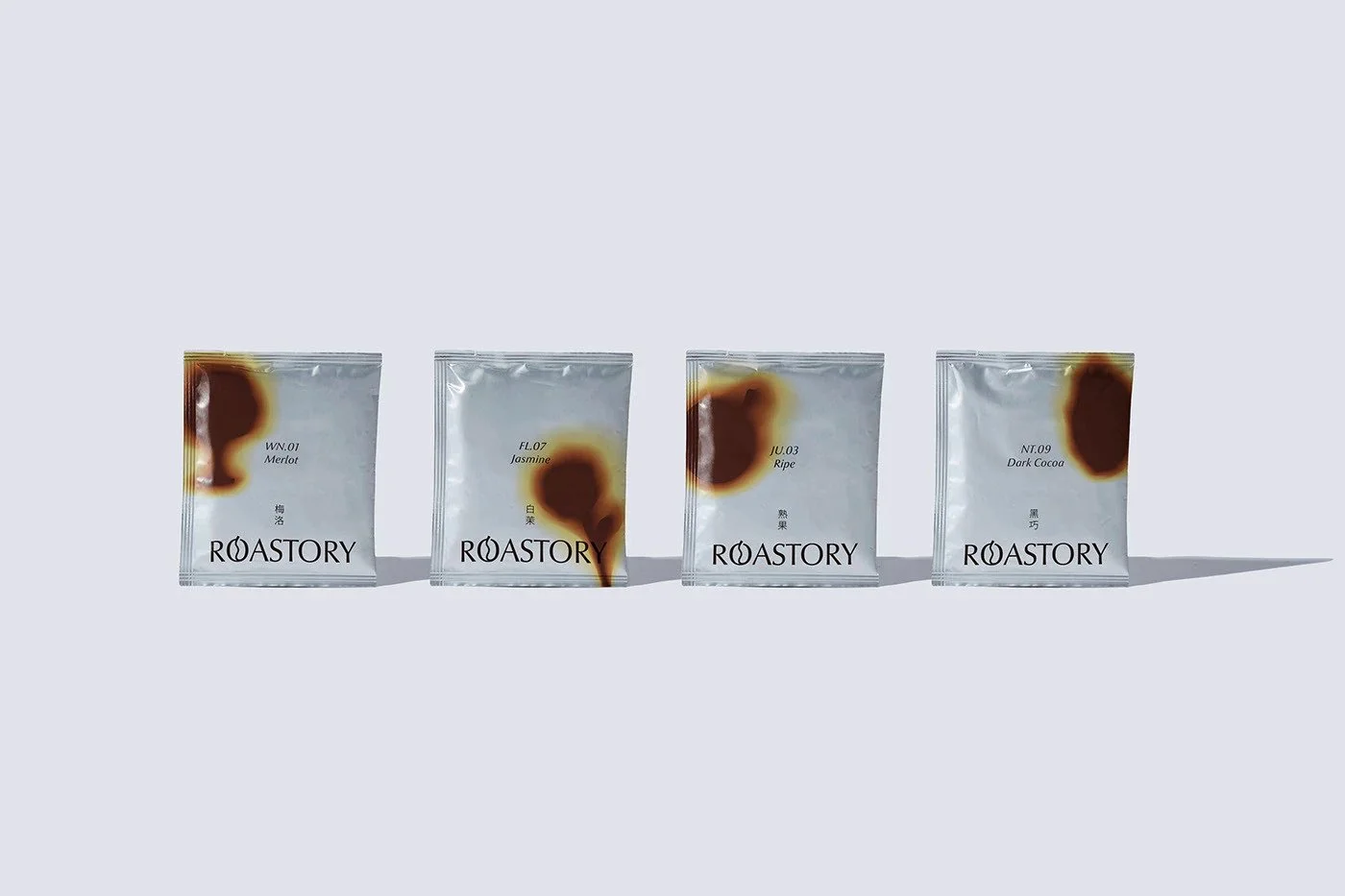
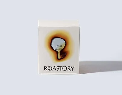
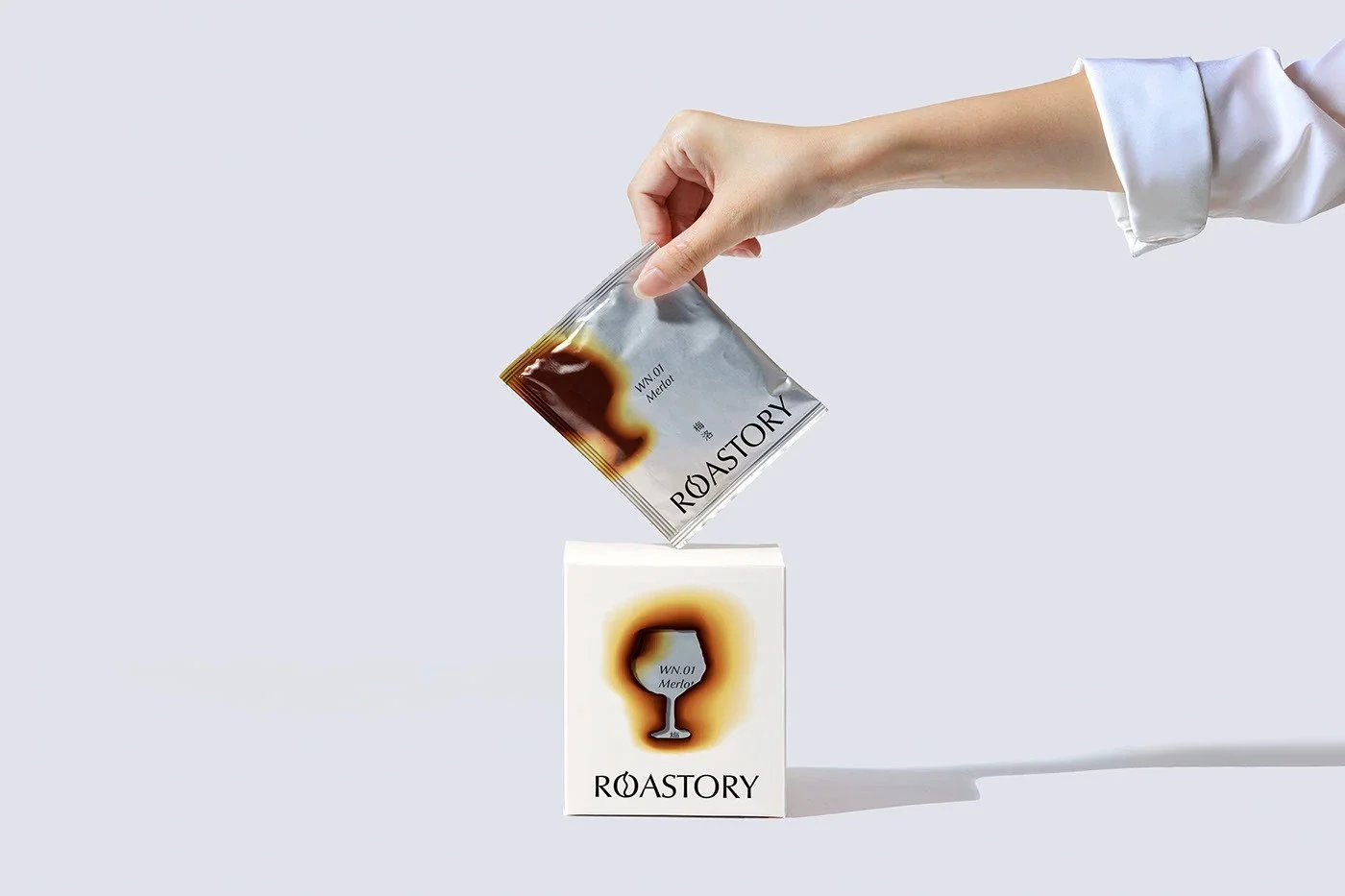
The simplicity becomes a stage for one clever, grounding idea: using actual burn marks as the visual signature. It’s a small gesture with disproportionate impact. The heat of roasting translated literally, not through illustration or metaphor, but a physical scar that interrupts the perfection just enough to make it human. It’s rare to see tactile imperfection deployed this intentionally. It gives the brand a hint of grit, a reminder that coffee is shaped by fire, hands, and attention—not just marketing polish.
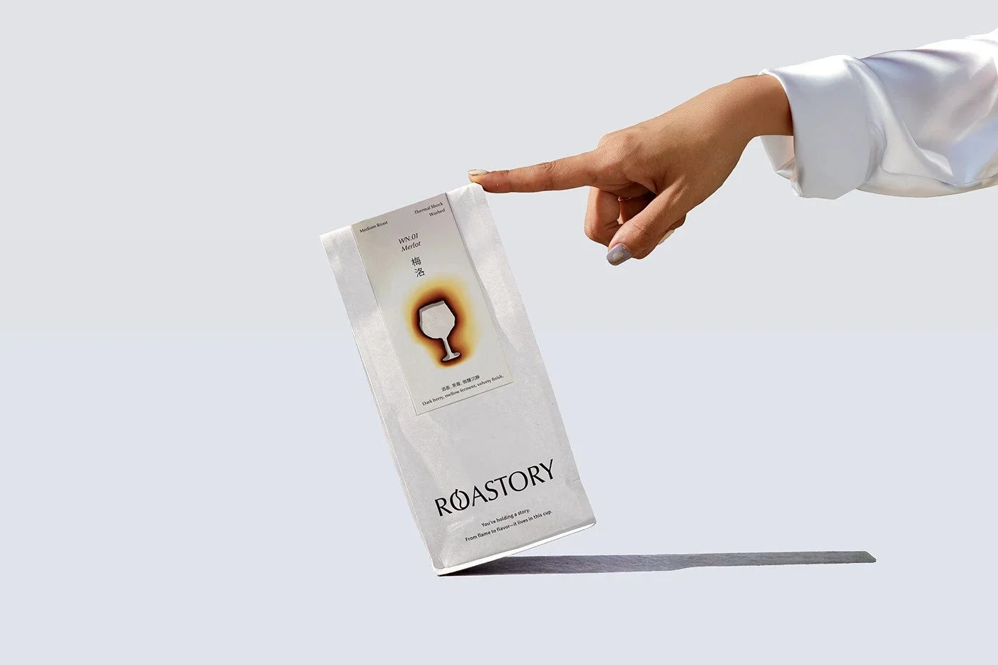
Chinese characters thread through the system with the same typographic discipline as the Latin letters. They don’t sit like ornamentation or cultural seasoning sprinkled on top. They’re integrated with structure, balance, and rhythm. It’s difficult to harmonize languages without one overpowering the other, but here they lock into place, each supporting the composition without demanding applause.
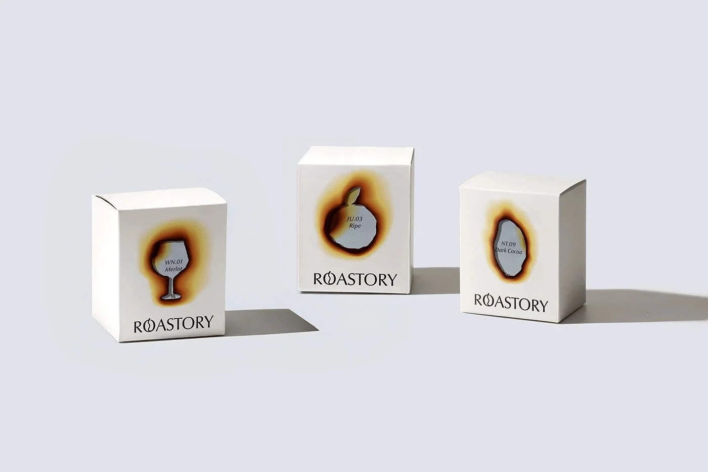
The packaging architecture itself is clever in an understated way. One bag form for all SKUs, with differentiation handled through affixed cardboard labels. It’s cost-smart, tactile, and flexible. The cardboard adds a material contrast that feels crafted without drifting into the folksy territory so many coffee brands fall into. It lets the brand scale variety without bloating print budgets—a rare pairing of practicality and charm.
Even well-built systems develop soft spots, and Roastory has a few worth noting.
The logo feels like it’s trying a little too hard to be clever. The bean-shaped “O” lands clunky, like a concept that never got the refinement it deserved. Instead of giving the brand a signature quirk, it interrupts the otherwise confident geometry. Not a fatal flaw, but the one place where the restraint breaks—and not in a good way.
The packaging suite, for all its discipline, starts to blur when you zoom out. Cohesion is usually a strength, but here it teeters toward monotony. The burn mark adds a nice touch of unexpected texture, yet the roasts and styles still fight to differentiate themselves in a lineup. Coffee drinkers navigate by micro-cues—color shifts, structural changes, pattern differences—and this system doesn’t give them quite enough. It’s elegant, but sameness creeps in.
Still, Roastory earns respect. The designer approached the system with intention, clarity, and a level of quiet confidence that’s rare in a category drowning in decorative noise. This is contemporary craft minimalism with a tactile twist—modern grids, calm typography, honest materials, and a single disruptive detail used to highlight the brand’s core story. It honors the nature of roasting—heat, patience, precision—without resorting to cliché visuals or overworked metaphors.
Even with its rough edges, the identity holds strong. It’s grounded, disciplined, and built with a designer’s steady hand rather than a marketer’s jitters. A brand that doesn’t shout, but doesn’t need to.