Domino’s pizza rebranding
Domino’s just pulled off something few legacy chains dare to do: evolve, without apology. No gimmicks. No winks. Just a straight-faced brand overhaul with real teeth. After over a decade of staying visually stagnant, the pizza giant handed the creative reins to WorkInProgress, their agency of record, and dropped a rebrand that slices straight to the gut.
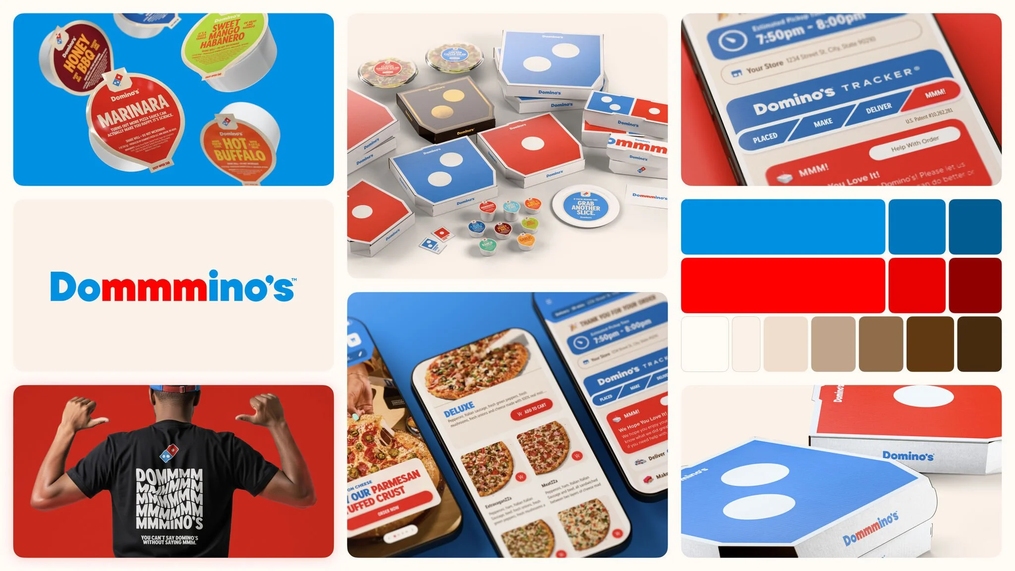
At first glance, it’s cleaner. But not sterile. Bold, without screaming. The color blocks are sharp and unapologetic. Red and blue dominate, anchored by Domino’s iconic tile, now unshackled from text-heavy packaging and left to breathe on fields of color. The boxes feel more like objects — minimal, tactile, almost collectible. It’s the kind of clarity most fast food brands wouldn’t dare chase.
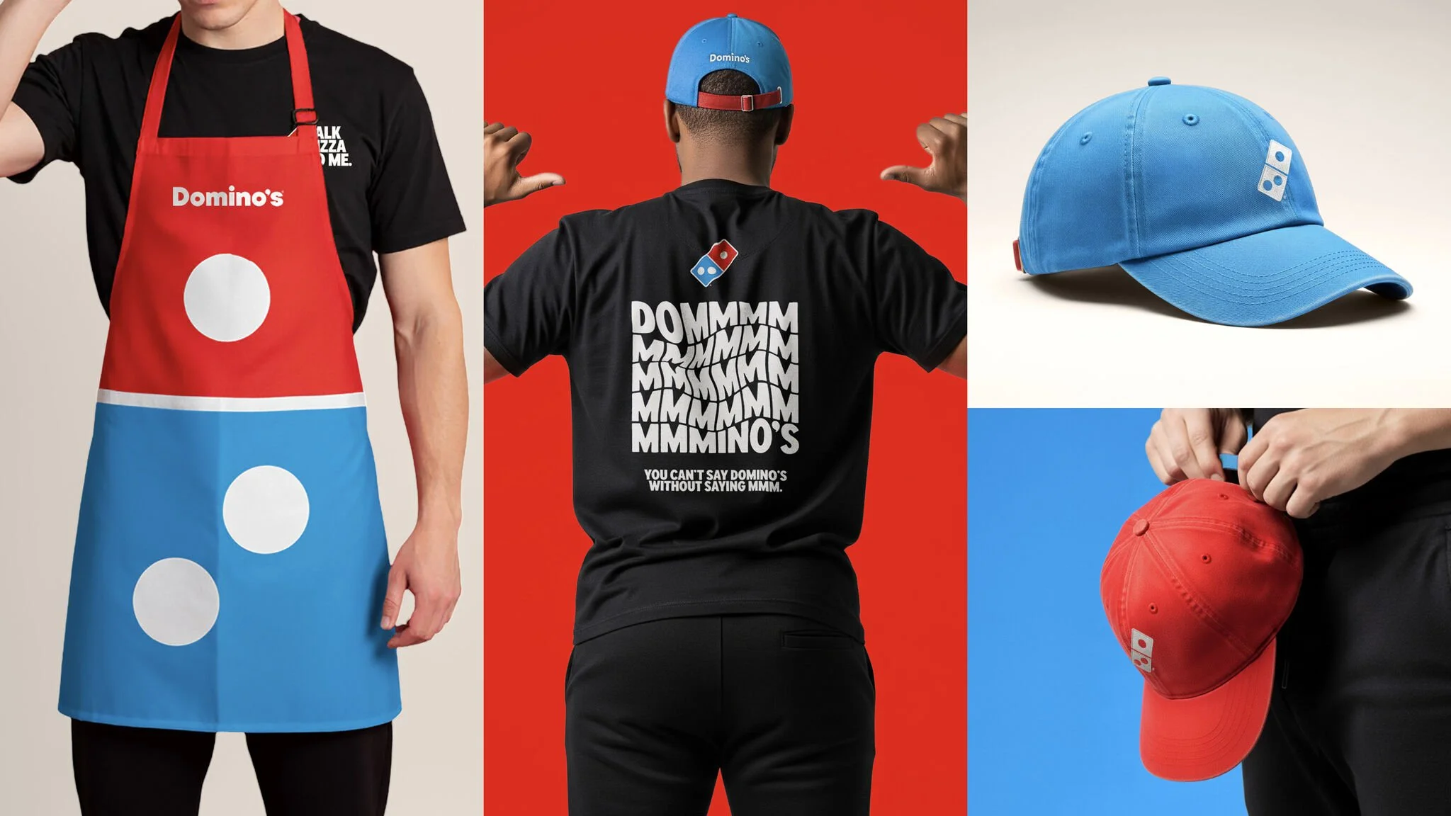
The real flex? The “Cravemark.” That’s the stutter-step of “mmm” buried in the new logotype. “Dommmino’s.” It’s cheeky. It’s crave-coded. And it unlocks the core truth of what this food is trying to be: visceral. You’re not just ordering dinner. You’re chasing that sound your mouth makes when pepperoni meets melted mozzarella. Domino’s leans into it hard — across merch, social, and even audio with a new jingle by Shaboozey.
Typography got the massage it needed. The new wordmark is rounder, warmer, more dough-forward. There’s bounce in the letters. It pairs perfectly with the giant dot visuals that dominate the packaging system. It feels like pizza — soft, hot, a little indulgent. And just sharp enough to be remembered.
Not everything is fire-roasted perfection.
That new type? Perilously close to Papa John’s. If you’re gonna risk visual overlap with a rival, it better be intentional. This feels like unintentional symmetry. In a category where differentiation is survival, that’s a red flag. It doesn’t help that other QSR brands are also leaning into minimalism and primary palettes. Domino’s may have executed well, but they’re not alone in the look.
There’s also a risk of leaning too hard on the “mmm” gimmick. It’s a smart hook. But hooks get old. If every future touchpoint keeps hammering “mmm” like it’s gospel, the brand could wear thin. The best sensory branding works in layers. Not loops.
Still, the premium tier move — matte black boxes with metallic gold dots — is a masterstroke. It signals value without shouting “luxury.” It lets Domino’s elevate select products without disrupting the broader system. Smart brand architecture. Clean execution.
And let’s be honest: the challenge here isn’t the rebrand. It’s the rollout. Uniforms, mobile UX, signage, app interfaces, delivery bags — the system is massive. If consistency slips, the impact fades. The strength of this refresh will be tested not in a design deck, but in a thousand franchise handoffs. Pizza at scale leaves no room for sloppy detail.
So what’s the takeaway?
Domino’s didn’t chase cool. They chased crave. They found a language that isn’t trying to be artisanal or ironic. It’s immediate. Tactile. And most importantly, it still feels like Domino’s. Just sharper. More self-aware. More snackable. The kind of brand work that knows its place in your life and owns it.
Credit
Agency: WorkInProgress
Location: Boulder, Colorado


