hotel cavallé branding
The identity for Cavallé Hotels by Yasser Elyamni presents a refined and tightly controlled study in contemporary luxury minimalism. The system orbits around a disciplined palette of desaturated teals, soft neutrals, and architectural gradients that evoke alpine air and coastal clarity. The work draws from International Typographic Style, contemporary editorial minimalism, and the restrained elegance associated with modern European boutique hospitality. These influences shape a brand presence that privileges order, quiet confidence, and an almost monastic sense of calm. The project understands serenity as a luxury asset and frames the hotel as a sanctuary for intentional living.
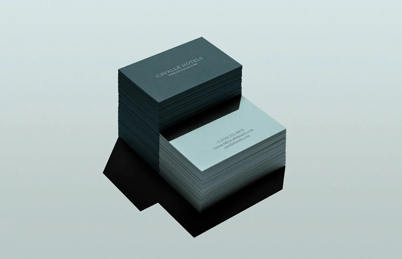
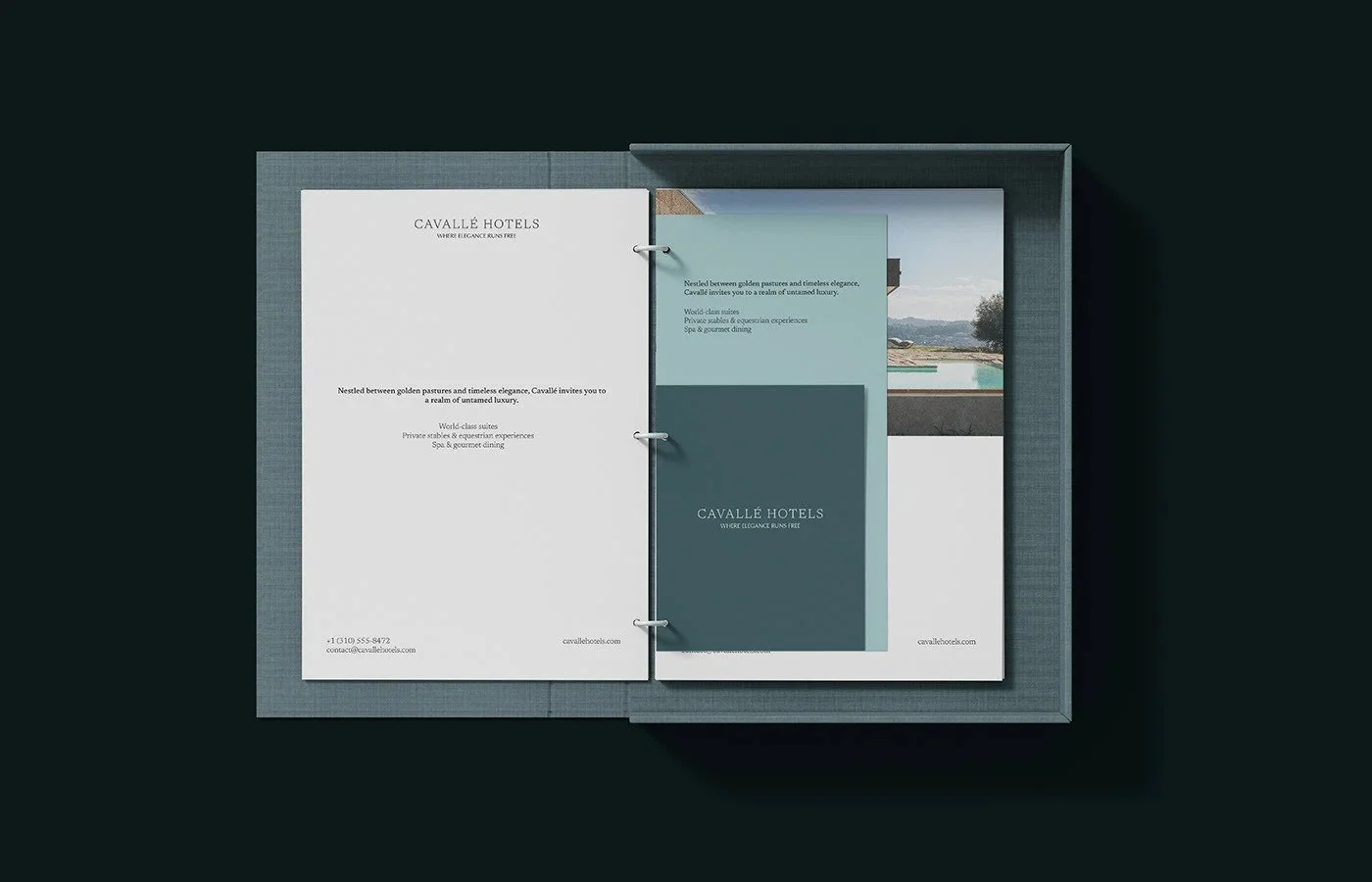
The typographic voice performs with precision. A transitional serif with high contrast brings an aristocratic elegance that recalls European heritage hotels. Its spacing, scale, and alignment follow the logic of Swiss Modernism, which produces a feeling of measured composure across every touchpoint. The typography communicates emotional distance in a deliberate way. It positions the brand as a calm observer rather than an expressive host. This tone suits destination luxury where privacy and discretion are status indicators. The type system creates visual hierarchy with clarity. Sentences breathe. Information flows in linear progression. The aesthetic delivers a sense of authority without theatricality.
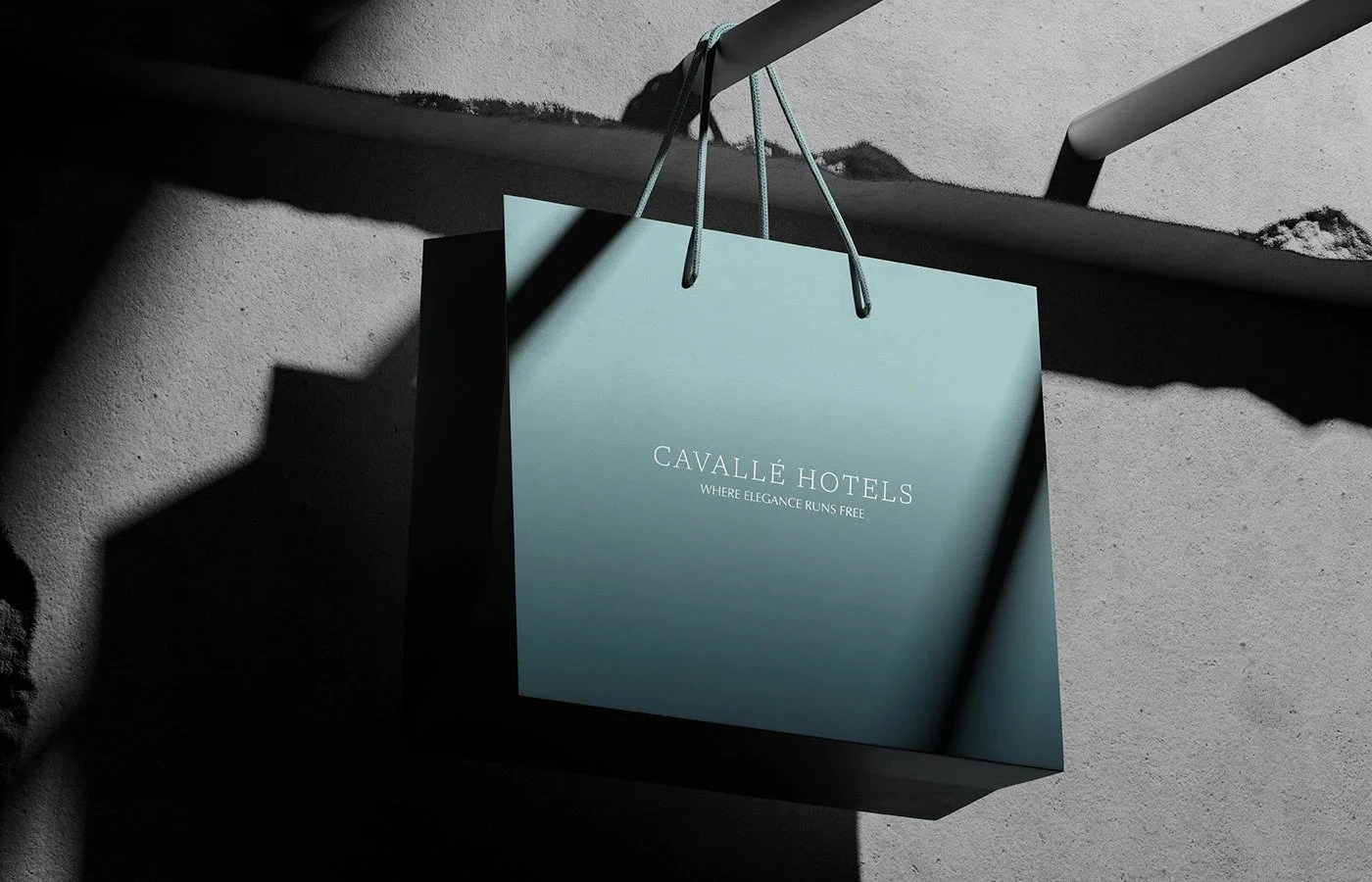
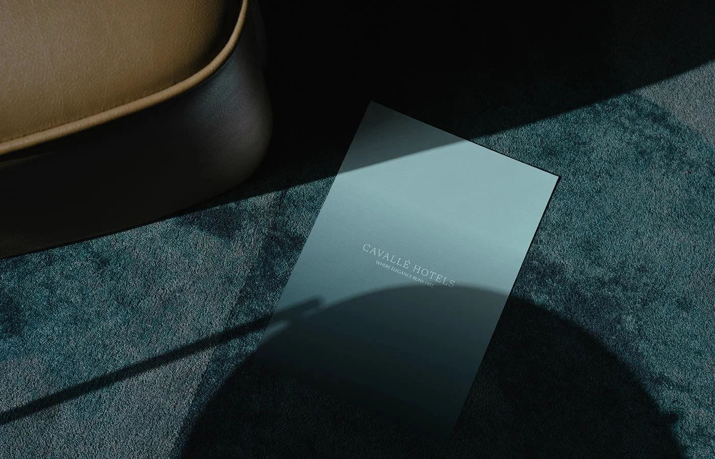
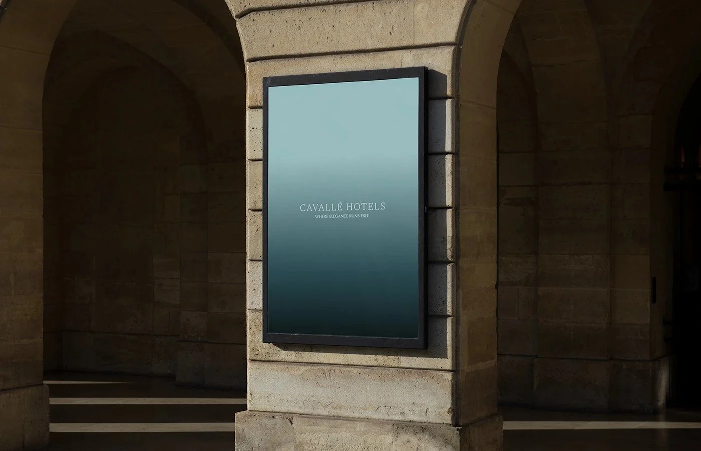
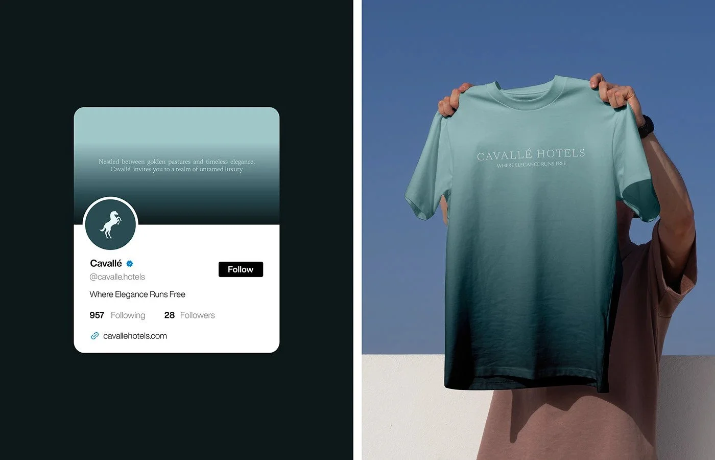
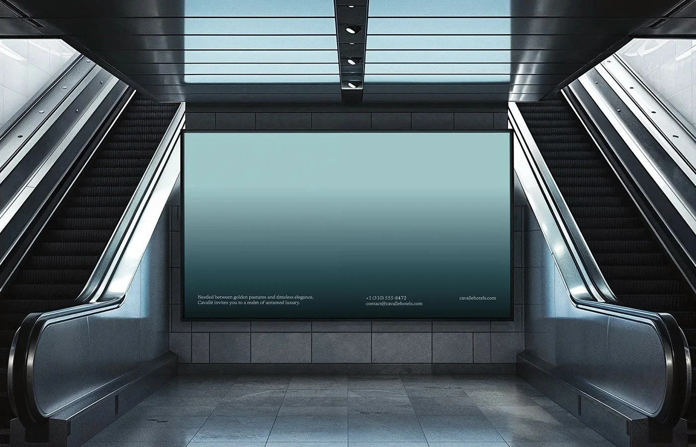
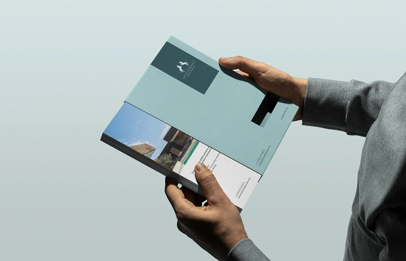
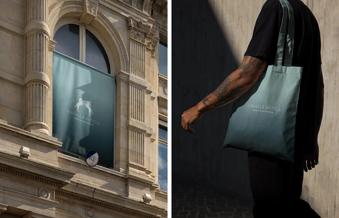
Color serves as the protagonist in this identity. The tonal gradients that shift from pale mineral blue to deep green teal carry strong references to horizon lines, water depth, and open air. The gradients behave as emotional signals and give the system an atmospheric quality. This creates a sense of expansive escape that feels strategically aligned with a hotel brand built on elegance and equestrian freedom. The consistency of this gradient across print, digital, advertising, and merchandise strengthens recognition. In some frames, the gradient feels almost painterly which introduces a poetic counterbalance to the strict typography. This duality generates aesthetic depth and marks a confident brand stance.
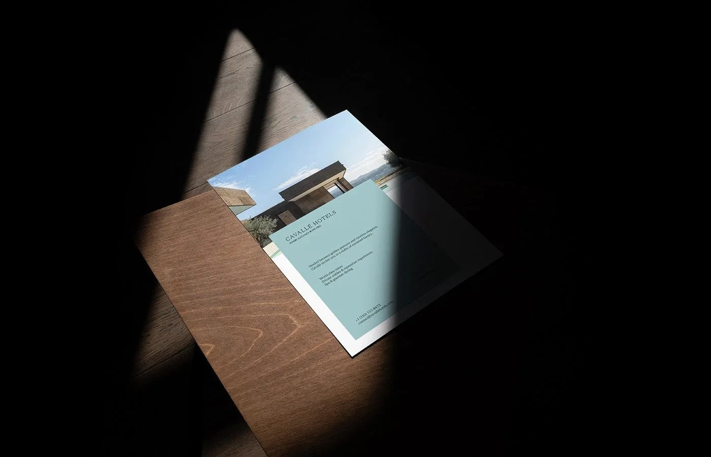
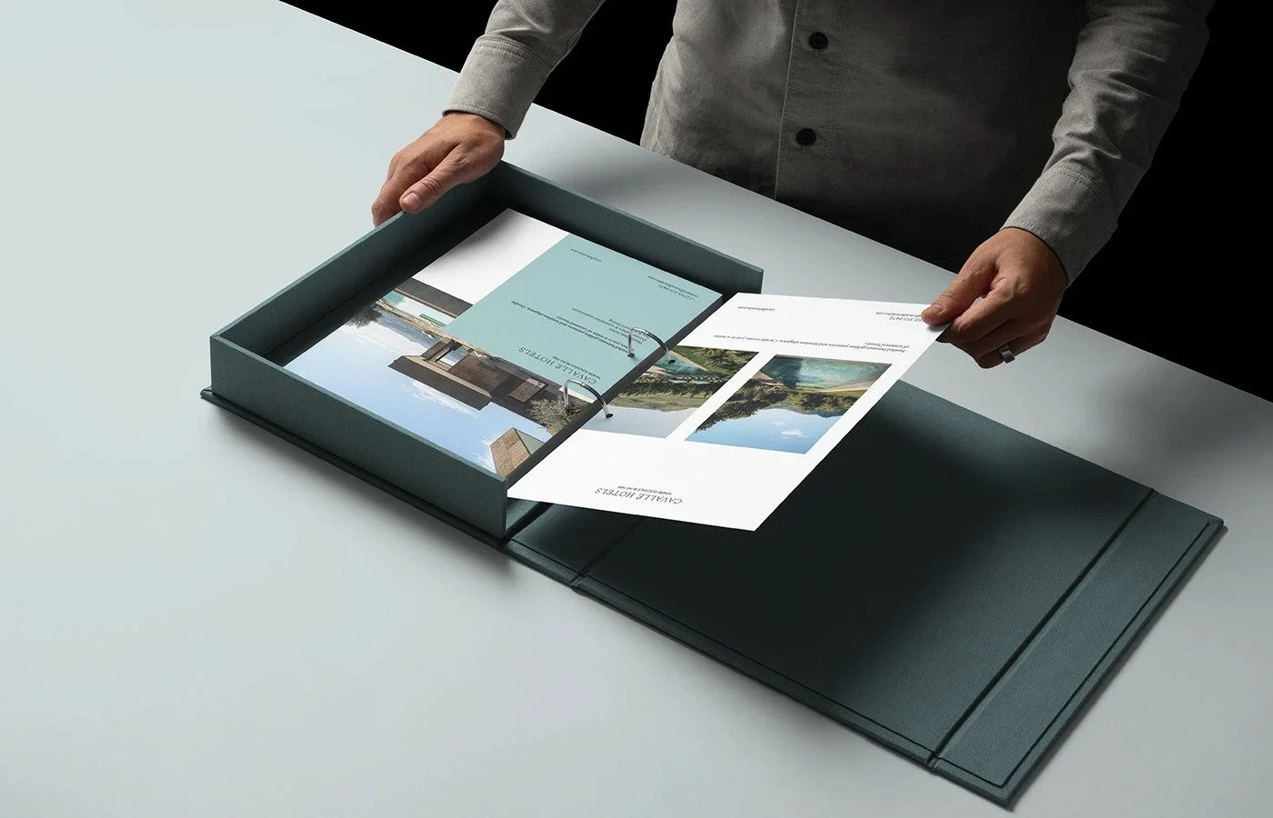
The compositional structure across collateral demonstrates a strong mastery of spatial moderation. Negative space is treated as a luxury material. The layouts allow information to float without crowding. The rigid grid brings stability and trust, which are core attributes for high end hospitality brands. The presentation box and printed leave behinds communicate high touch experiential signals that would resonate with travel agents, investors, and affluent guests. The deliberate pacing of elements within the binder inserts models a hospitality mindset where the brand guides the viewer through a slow and intentional unveiling.
The work is strongest in its restraint. The brand feels cohesive because every decision respects the same tonal register. Nothing competes for attention. Every surface carries the same quiet confidence. The scale shifts between macro and micro moments are particularly effective. A large format poster becomes a color field meditation. A business card becomes a miniature study in typographic finesse. These oscillations create sophistication that feels fully resolved.
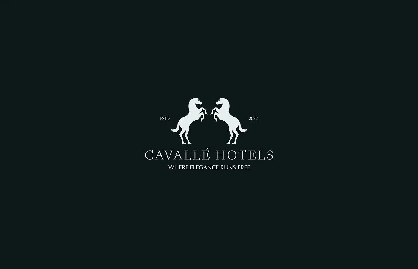
There are opportunities to enrich the system. The brand voice leans heavily into understatement which risks blending into the anonymity of contemporary luxury. The system could introduce a more distinct signature element beyond the gradient. A motif, a typographic gesture, or an equestrian reference with more conceptual depth could support long term distinctiveness. The horse icon seen on social feels secondary and lacks the symbolic richness that the rest of the brand achieves. A more developed illustration or symbol program could strengthen the narrative of elegance and freedom. Additionally, the gradient occasionally dominates to a point where functionality is stress tested, particularly in large format outdoor placements where ambient lighting may diminish legibility. A stronger typographic lockup or a contrast strategy could enhance clarity in those conditions.
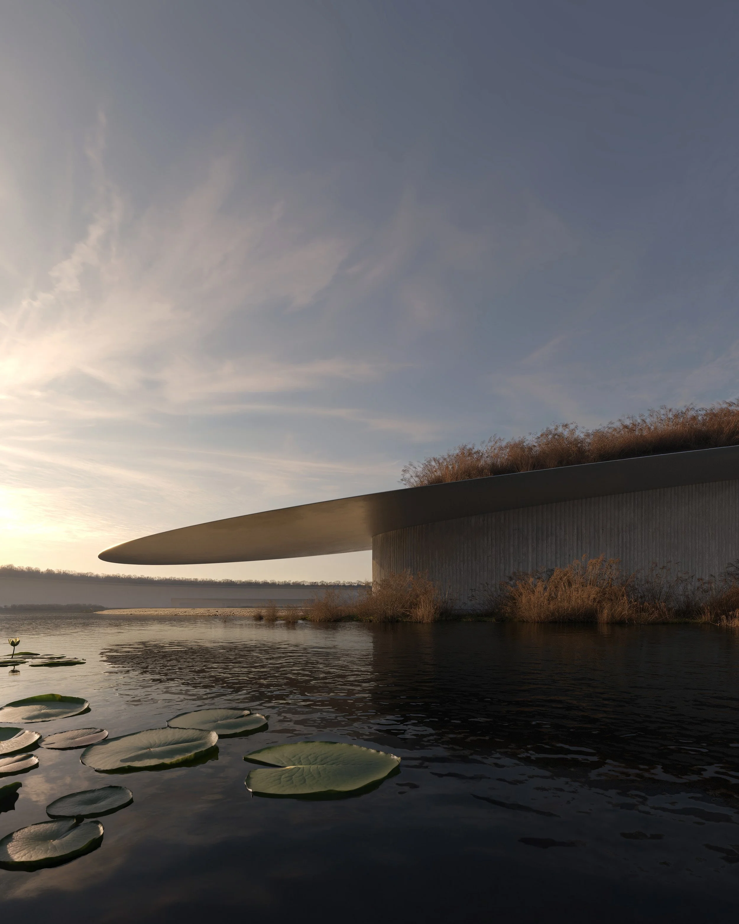
Photography plays a service role within the system. The work shown features minimal photography and uses architecture and landscape primarily as contextual reinforcement. While this maintains the minimalist agenda, a more robust art direction system could help express the experiential dimensions of the hotel. Luxury guests respond to tactility and sensory cues. A considered photographic language could support this without disrupting the refined aesthetic. Atmospheric, architectural, and portrait photography with consistent lighting and compositional principles would deepen the hospitality narrative.
Overall, the identity demonstrates a sophisticated understanding of contemporary luxury branding. It merges European editorial sensibility with atmospheric color studies and typographic rigor. The system delivers clarity, poise, and emotional stillness. It positions Cavallé Hotels as a serene refuge shaped by disciplined design. The work carries both functional usability and aspirational tone. With further enrichment in symbolic language and photographic depth, the brand could evolve into an even more distinct and culturally resonant hospitality identity.
Credits
Location: Morroco
Creative Direction and Design. Yasser Elyamni