Coco Japanese restaurant branding

COCO doesn’t whisper Japanese minimalism. It seduces. The name alone rolls like silk on glass — short, sensual, international. But the visuals? They go maximal. Where most “modern Japanese” brands chase restraint, COCO flirts with theater.
The signboard sets the tone: clean serif typography caught in a marquee of white bulbs. A stage light for the wordmark. It announces confidence — a place aware of its own allure. The marble texture beneath adds polish, but the glow border pushes it into cinematic territory. This isn’t sushi in silence. It’s nightlife with soy sauce.
Then the butterfly motif enters, wings wide with eyes embedded in their patterns. Surreal, romantic, slightly erotic. A nod to metamorphosis. The brand builds tension between refinement and fantasy — the Japanese influence seen through a dream, not a manual.
The printed collateral keeps rhythm: emerald greens, blood reds, and golden ginkgo leaves stamped in foil. Each piece feels tactile, designed for the hand as much as the eye. Even the QR code coasters play dress-up — symmetrical, jewel-toned, and ornamental. Someone here understands that print can still seduce in the digital age.
Typography carries the concept across languages. Sharp, elegant forms with a whisper of Deco curvature. It feels cinematic, continental. Not local. Not generic.
The high points:
Tactility and craft. Every element feels handled, printed, layered. Nothing phoned in.
Narrative coherence. From the origami swan insert to the butterfly-covered menu, every touchpoint tells a story about transformation and modern Japanese indulgence.
Visual decadence. It dares to be rich when everyone else is whispering minimalism.
Where it falters:
Risk of over-adornment. The brand teeters on the edge of kitsch. The butterflies, eyes, and ornate shapes occasionally crowd the clean typography’s airspace.
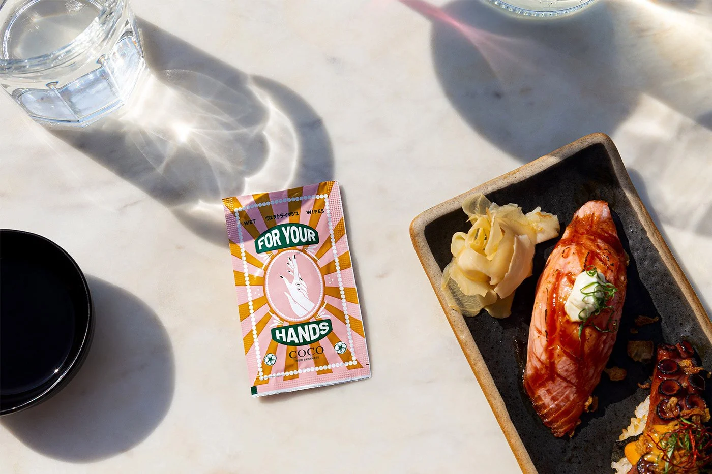
Lack of restraint on smaller items. The “For Your Hands” wipe packaging, for example, leans toward retro Americana — cute but slightly out of tune with the restaurant’s other tones.
Conceptual clarity. “New Japanese” is a bold claim. The brand’s visuals show eclectic sophistication but could tighten the link between its aesthetic richness and the culinary innovation it promises.
COCO thrives when it’s cinematic, not decorative. When it channels fantasy through discipline.
This is branding as performance:the table as stage, the menu as prop, the diner as participant.
It’s the rare F&B identity that invites you to look twice. And when you do, you realize it’s not just about sushi or sake. It’s about spectacle.
Credits
Agency / Studio: Barmaleys Studio (Kyiv, Ukraine)
Art-Director: Andrei Barmalei
Designers: Dmitry Onischenko & Christina Vlasenko
Photographer: Julia Vdovychenko