Petali beverage branding
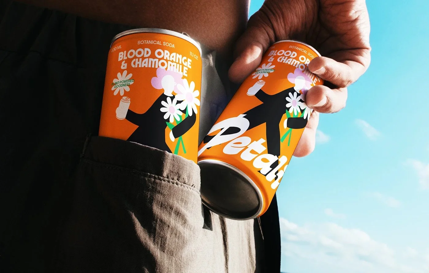
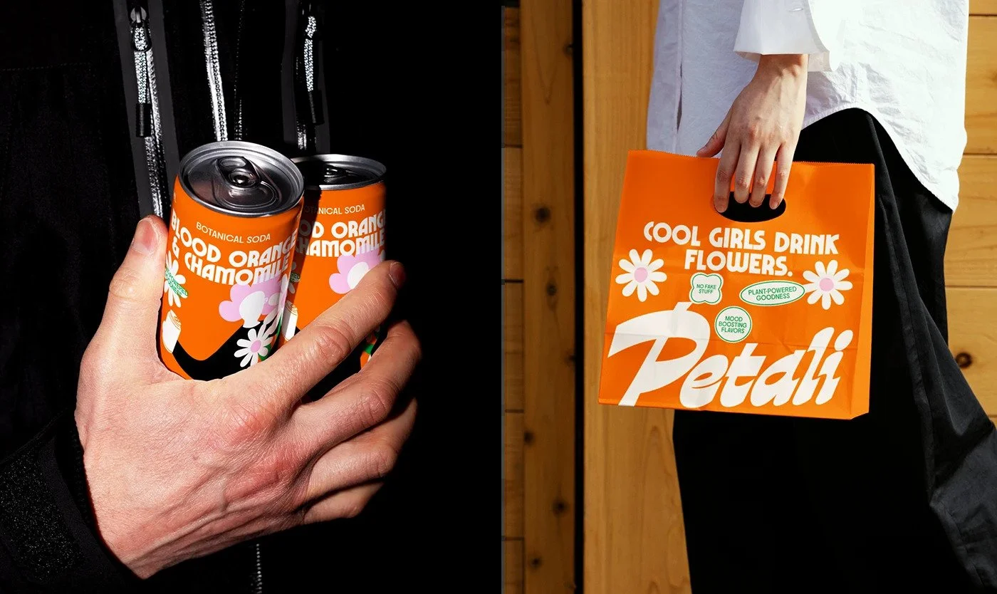
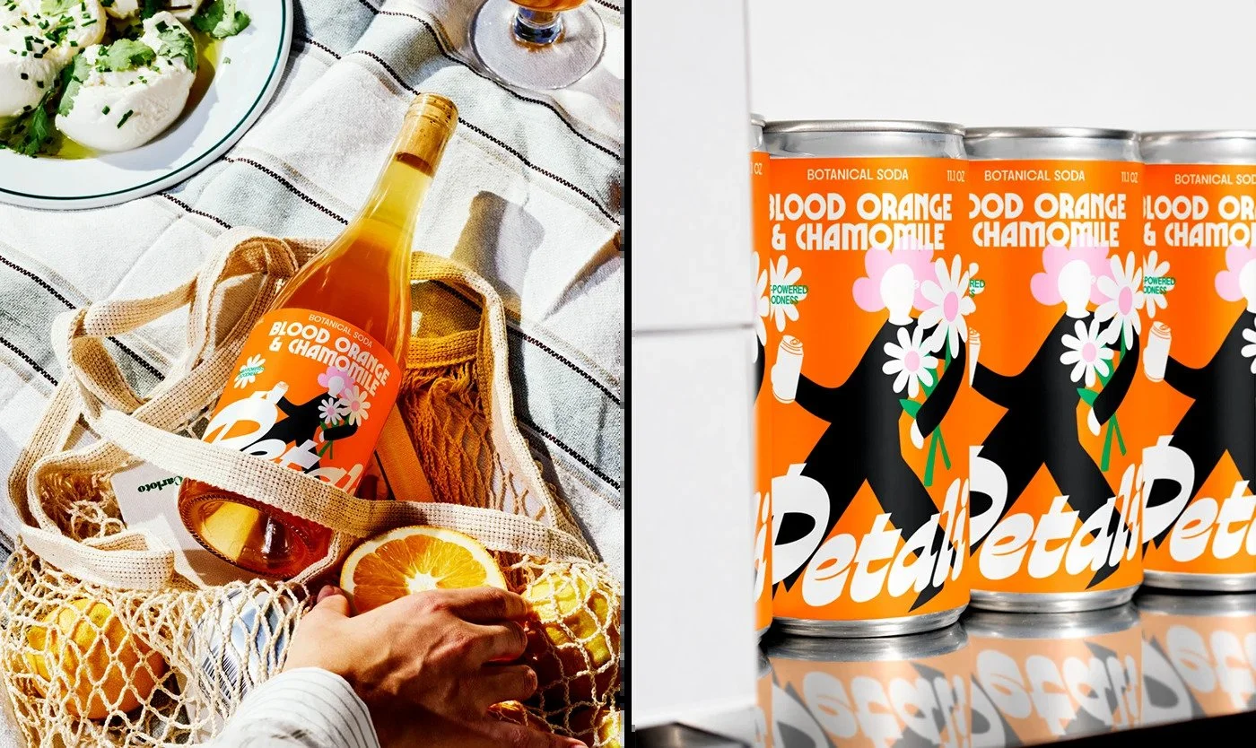
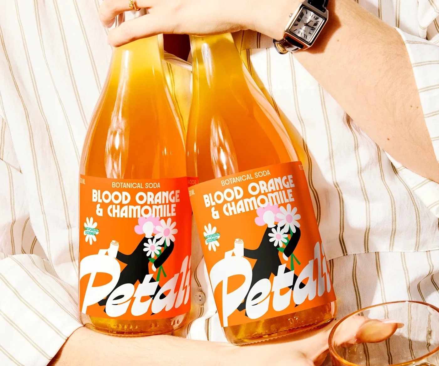
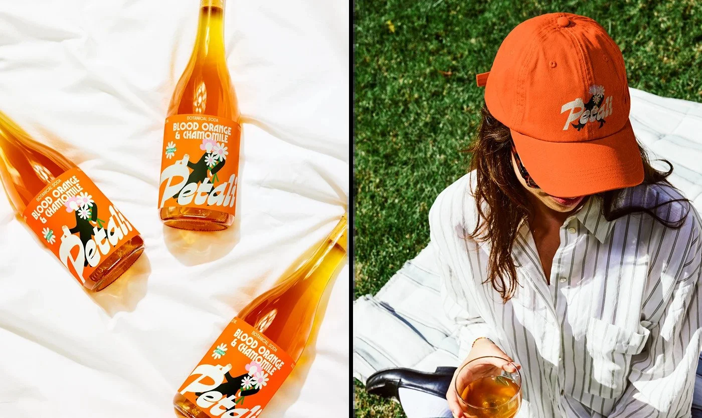
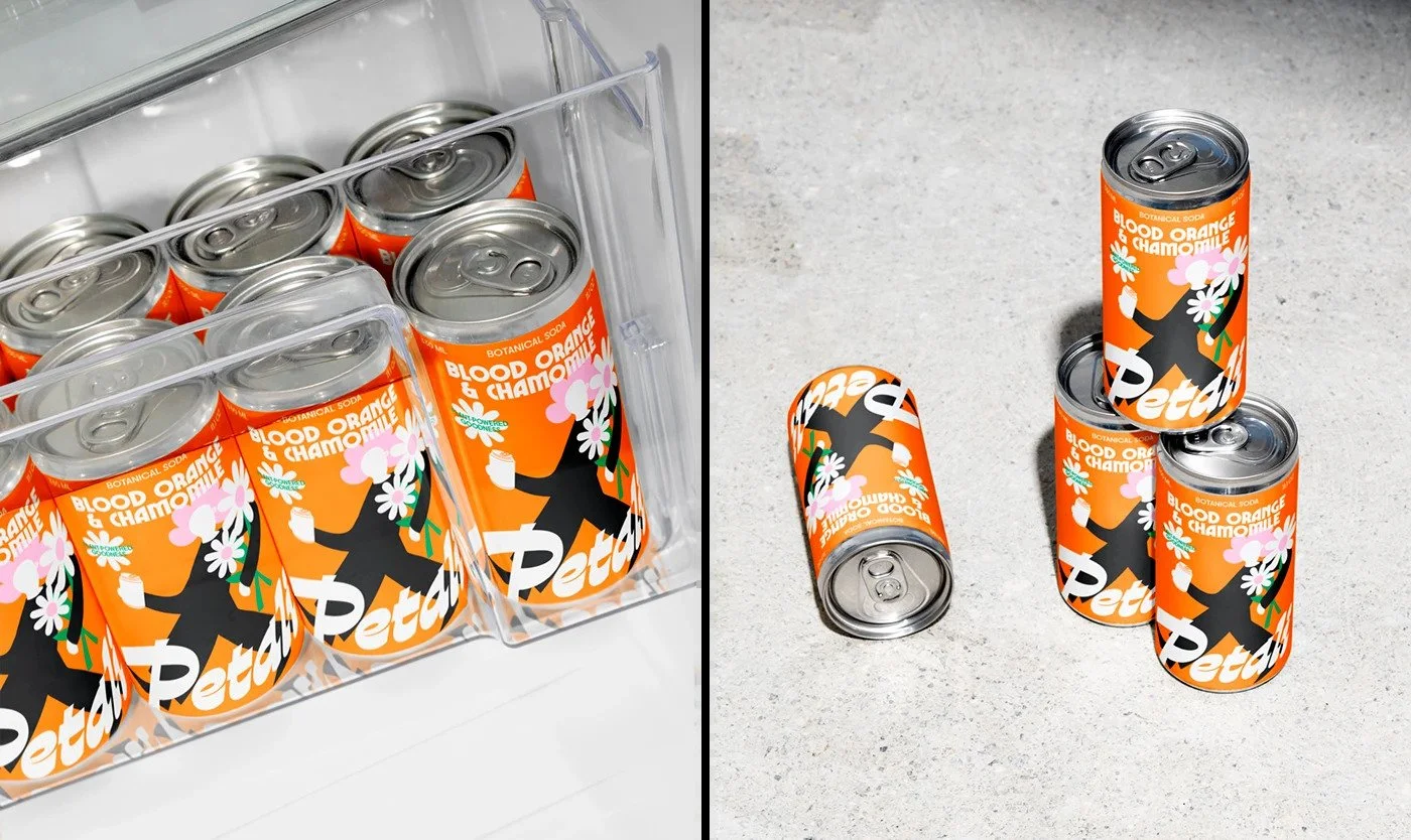
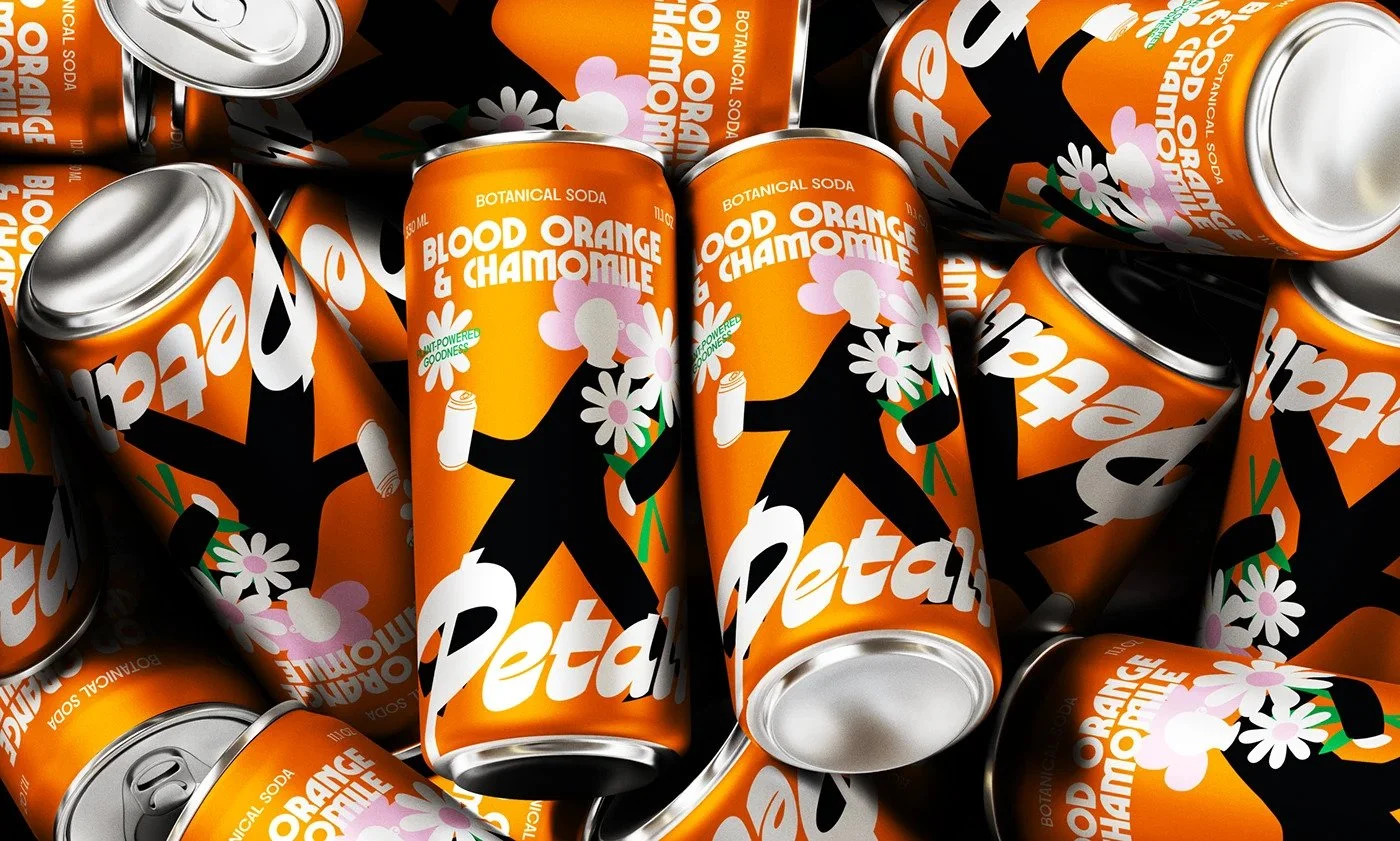
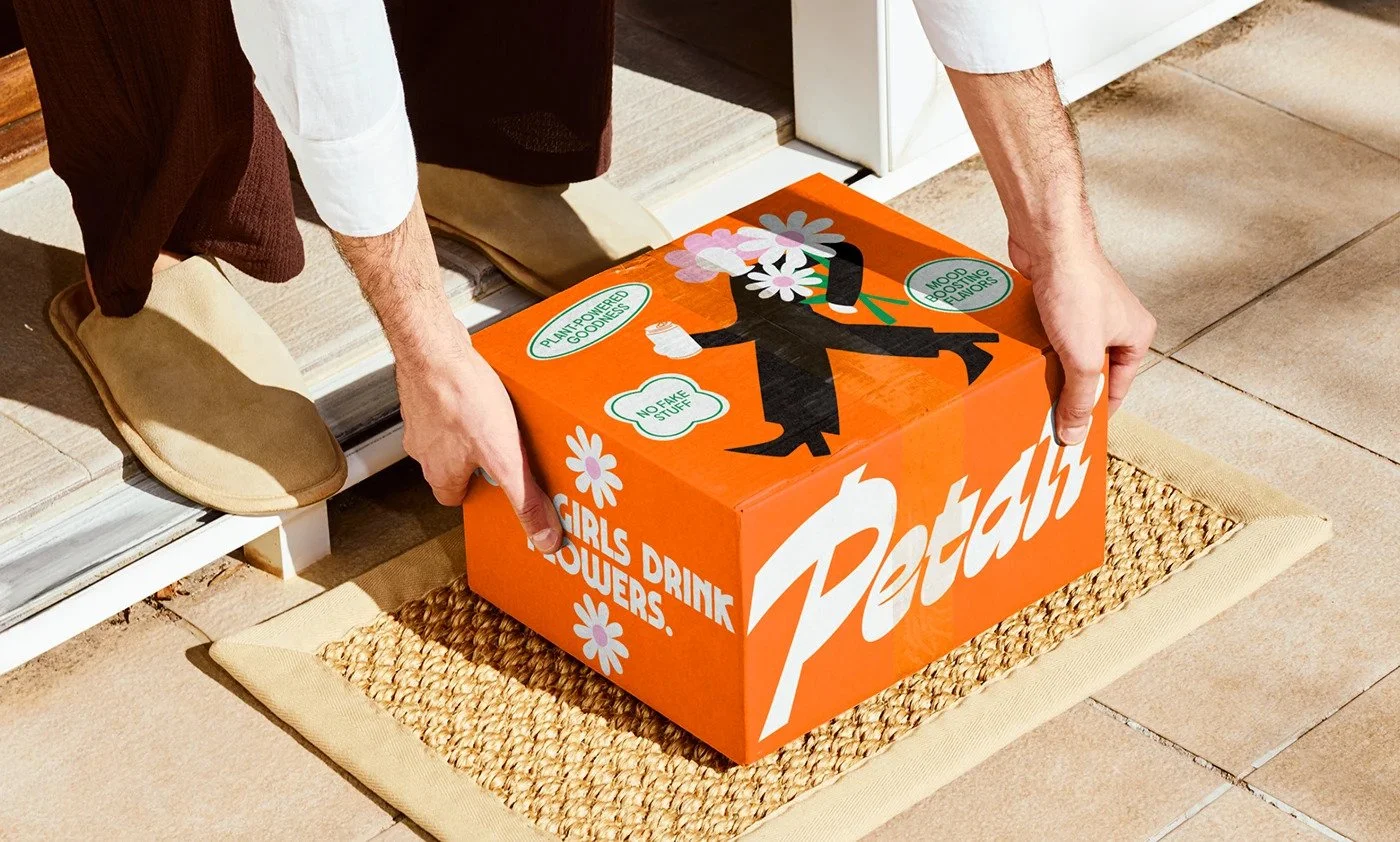
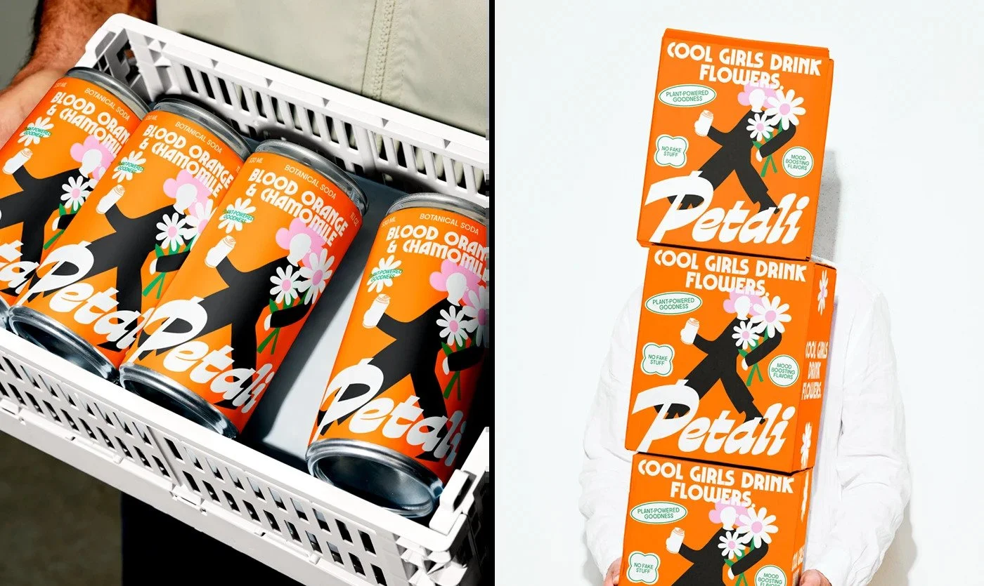
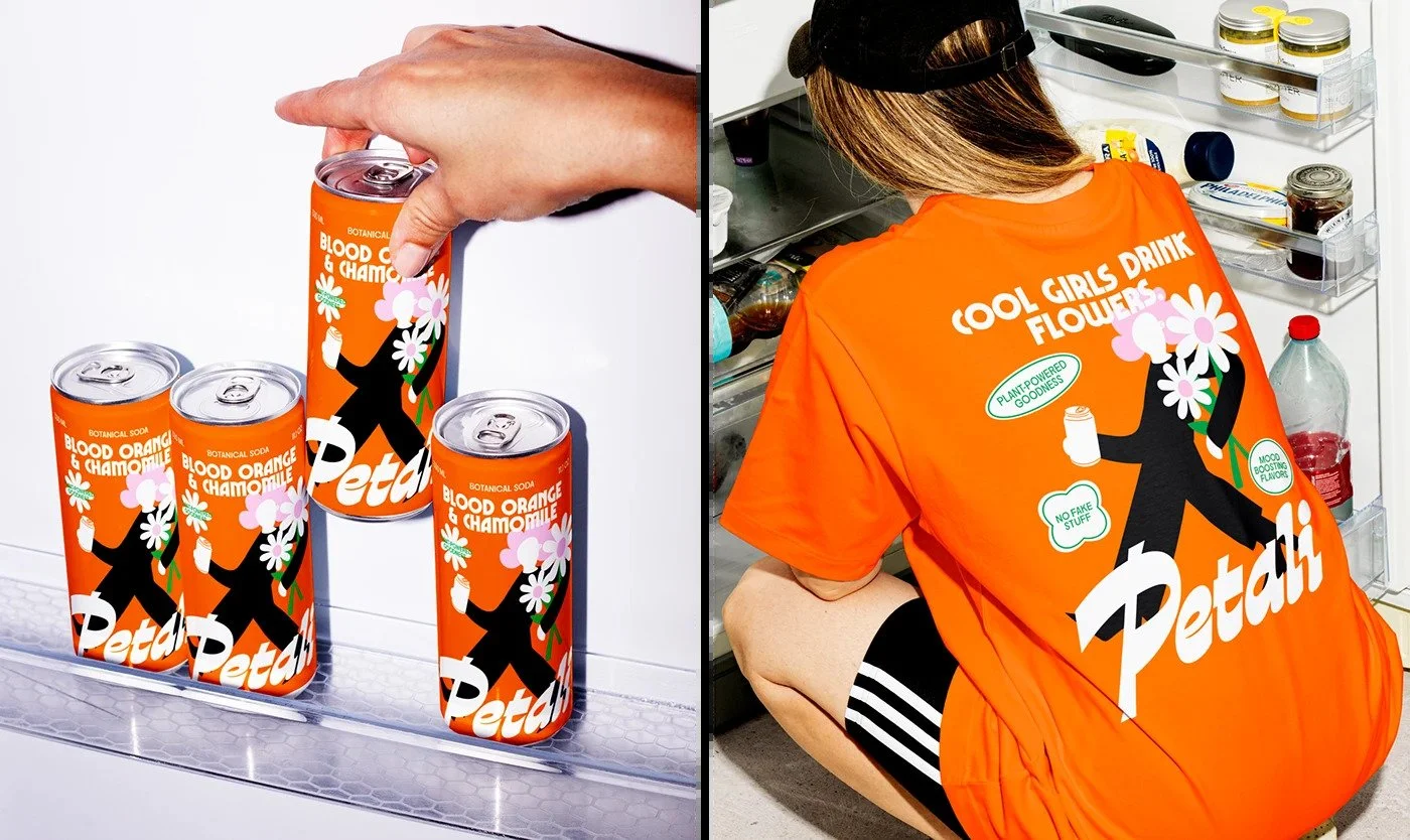
The can doesn’t whisper wellness. It shouts. Loud orange. Bubble-letter script. A faceless figure striding across the label like a runway model late for golden hour. Petali turns the tired tropes of botanical beverages into something you might actually want to be seen holding.
This is the work of Yuliia Hrabynska, an independent designer whose hand shows discipline in chaos. She’s taken the language of health drinks—soft pastels, watercolor botanicals, lowercase humility—and torched it. What’s left is attitude. Sweat-slick optimism with a floral kick.
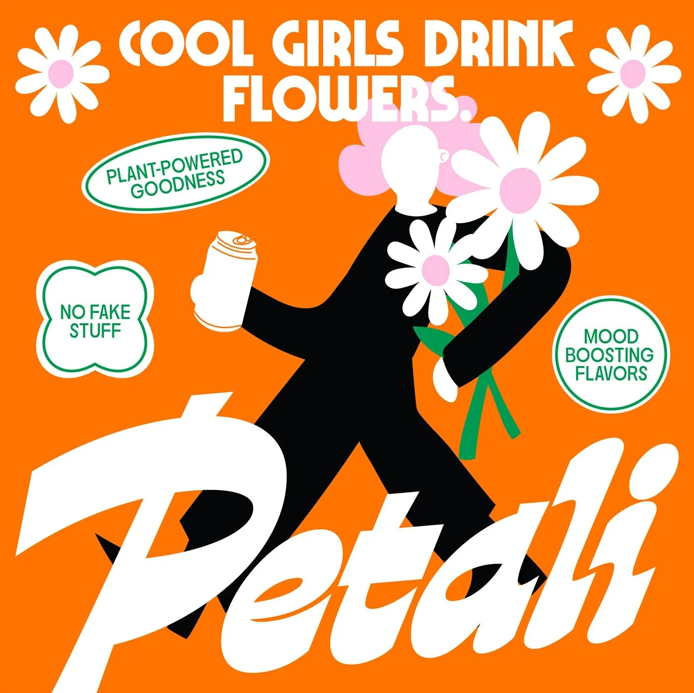
Petali lives in the intersection of Y2K revival and neo-pop minimalism. Think 1970s Italian soda posters reimagined for TikTok. Flat illustration. Block color. No gradients. The typography flexes in contrast: a bulbous, racing-style wordmark under a strict sans-serif headline. The line “Cool Girls Drink Flowers” pins it all together—equal parts manifesto and dare.
The movement here is Retro Futurism meets Feminine Bold. Less Coachella fairy dust, more Fiorucci in a health aisle. It carries the swagger of streetwear and the tone of self-care culture without tipping into parody.
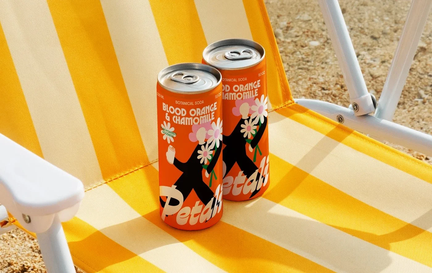
Orange dominates. Not citrus. It’s confidence. It cuts through the beige noise of kombuchas and botanical elixirs. The faceless character—a silhouette wielding daisies like power tools—bridges lifestyle and product. It tells you who the drink is for without spelling it out.
There’s rhythm in the hierarchy. From the sharp “Blood Orange & Chamomile” line to the sweeping Petali mark, your eye dances across the can like a headline carousel. Everything feels kinetic. That’s rare in a category obsessed with calm.
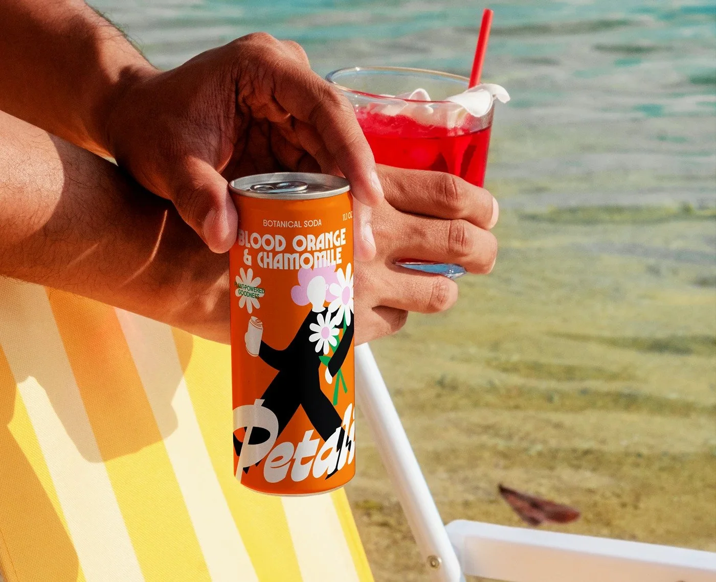
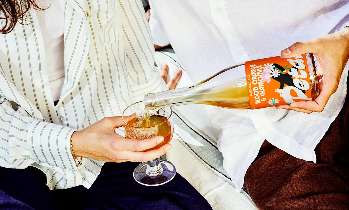
The photography amplifies it. Cropped hands. Pocket shots. Human texture. You can feel the carbonated bite before opening it. It’s brand theater—played small but performed loud.
The tone walks a knife edge. “Cool Girls Drink Flowers” hits with punch, but also risks alienating anyone who doesn’t self-identify as a “cool girl.” That tagline sharpens the personality but narrows the audience. If this brand ever scales, the language might need evolution—something with equal verve but more inclusivity.
The illustration system, while iconic, could age fast. The faceless figure is strong now, but repetition without adaptation risks turning signature into shtick. The trick will be evolving the motif seasonally—new poses, colors, scenes—keeping the character alive.
Petali sells a lifestyle before it sells a sip. It doesn’t hide behind “organic” or “crafted.” It doesn’t need craft-paper minimalism to signal quality. It’s design that behaves like a personality. That’s where the future of F&B branding is heading—toward voice, not virtue.
Petali feels like the soda that would be served in a concept café in Milan, photographed for a Seoul mood board, and stocked in a Brooklyn boutique. It’s global cool distilled into aluminum.
Credits
Designer: Yuliia Hrabynska
Location: Ukraine