Siasto Coffee branding

Café branding often falls into one of two camps: hyper-traditional and artisanal with beige-on-beige craft aesthetics, or trend-chasing minimalism that strips personality in favor of sterile polish. Siasto Café Society doesn’t play in either lane. This identity, crafted with a confident hand, borrows from Brutalist typography and injects it with a bubblegum pop sensibility that feels equally rebellious and approachable.
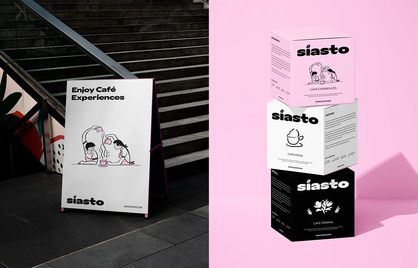
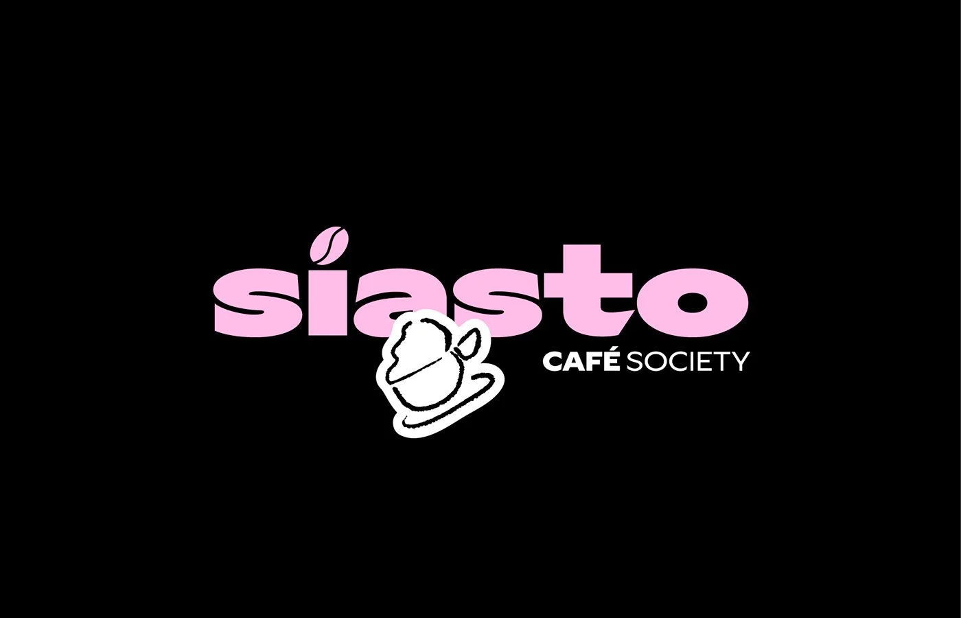
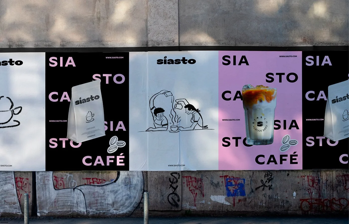
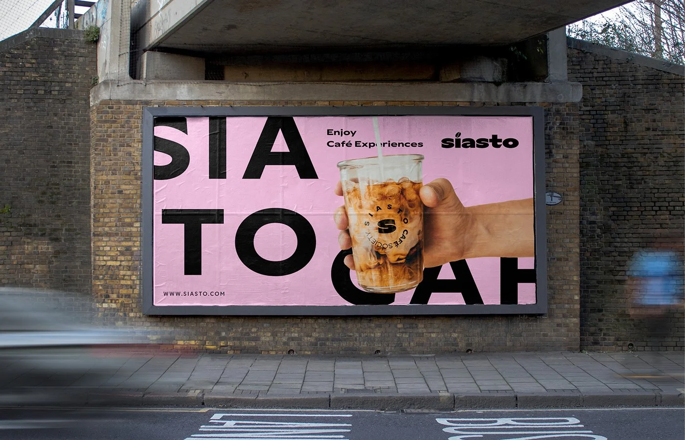
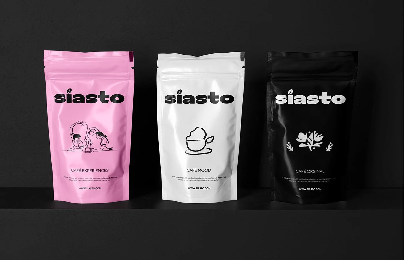
The logotype commands attention. Heavyweight, geometric letterforms lean toward late 20th century Brutalism, but the subtle insertion of a coffee bean above the “i” softens the rigidity. It’s the kind of detail that signals design intelligence: functional without being fussy, playful without becoming cartoonish. Supporting illustrations, drawn in a loose and almost naïve line style, stand in stark contrast to the dense typographic block. They breathe life into the system, reminding us that coffee isn’t a grid-perfect ritual, it’s social, messy, human.
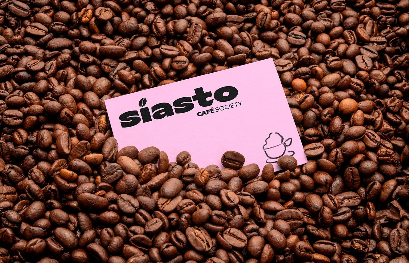
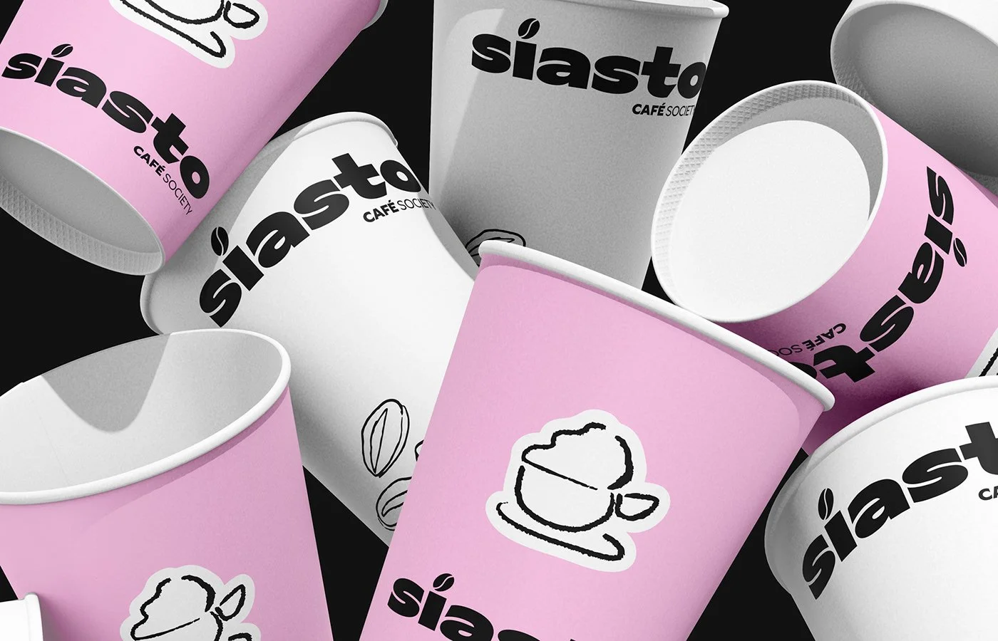
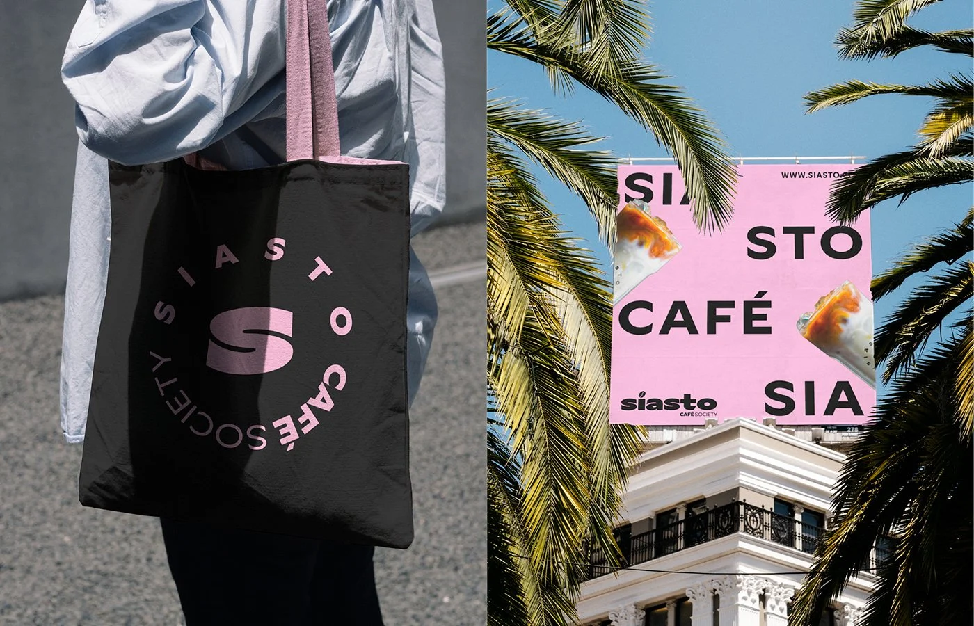
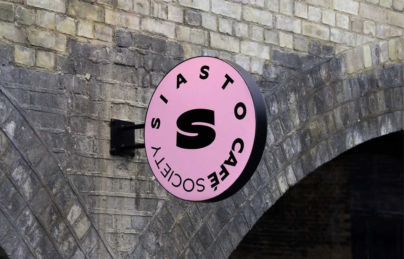
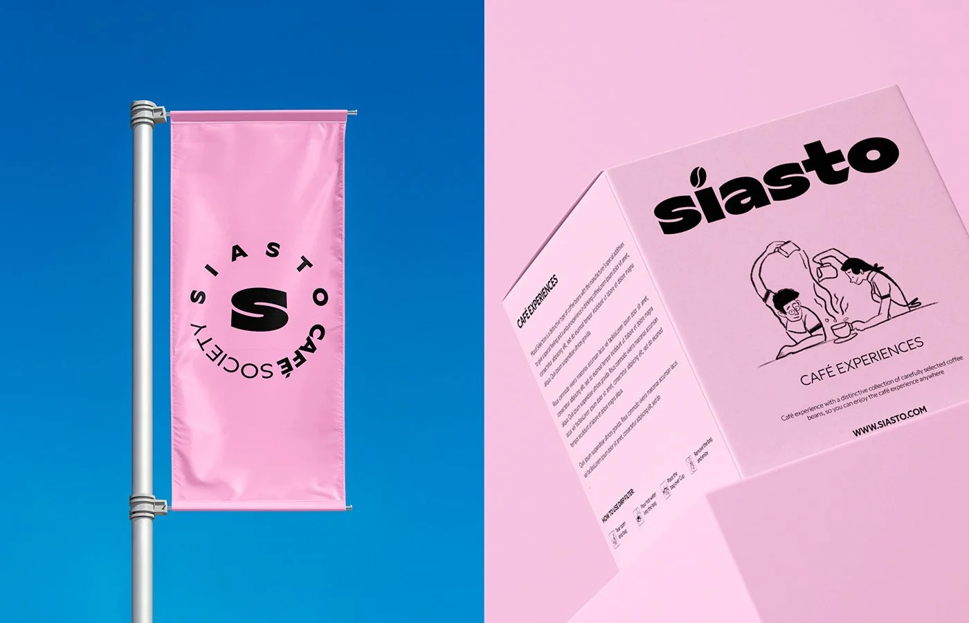
Color plays a starring role. The deliberate use of black and white provides structure, while a saturated pastel pink punches through every touchpoint—from packaging to signage. This pink isn’t timid. It subverts expectations in a coffee world still drenched in dark roasts, mahogany woods, and beige bags. The pink sings against the weight of the typography, creating a dynamic tension that pulls the entire system into relevance for today’s café consumer.
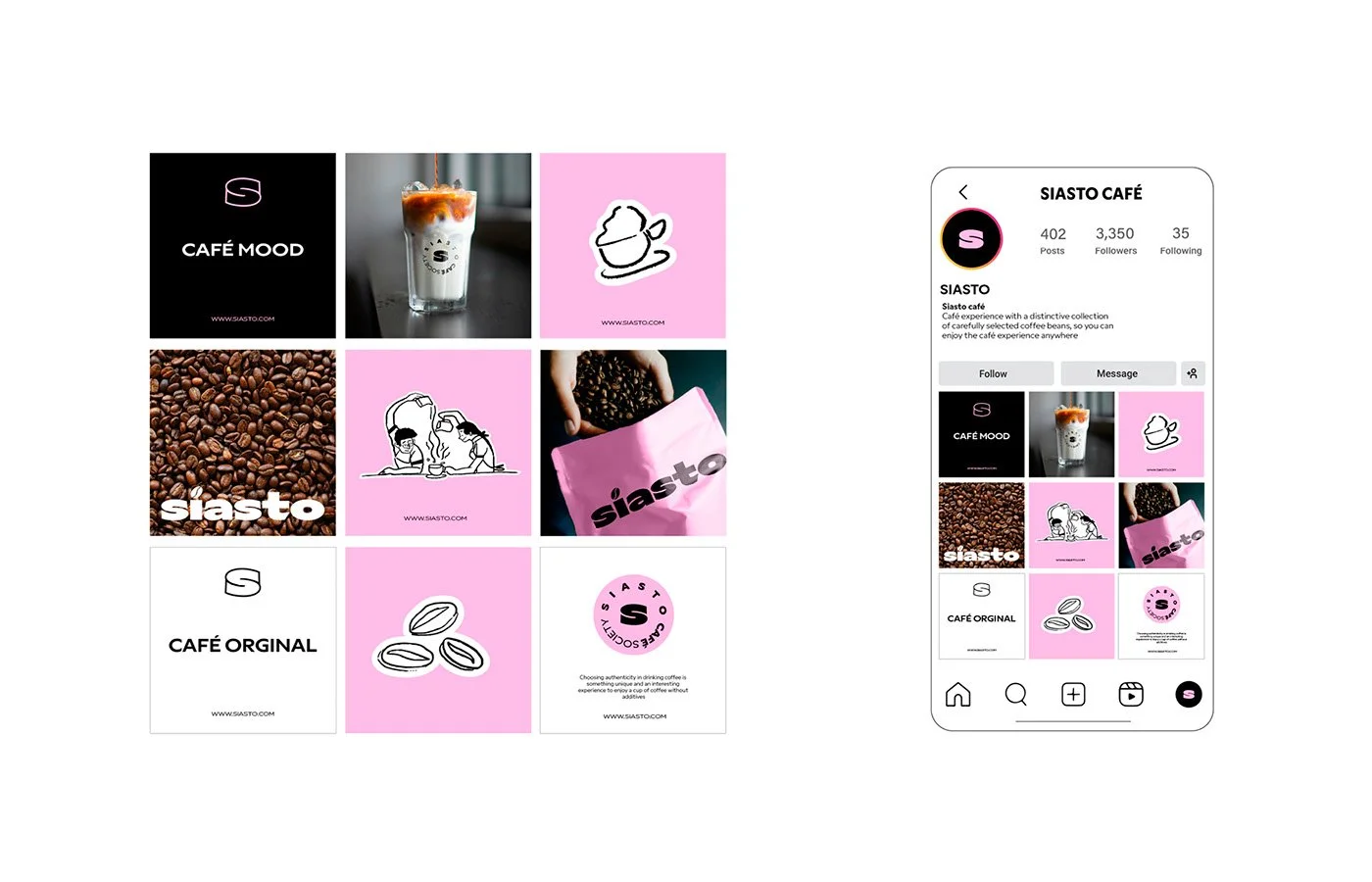
The packaging continues the story. Square boxes, stacked in compositions that feel more art installation than retail shelving, are wrapped in pink, white, and black palettes. They don’t hide on a shelf; they declare themselves. Each box balances dense typographic information with hand-drawn illustrations, producing a visual rhythm that alternates between order and spontaneity. This balance extends to the merchandise, environmental graphics, and digital touchpoints, all reinforcing the brand’s energetic, almost irreverent café society stance.
What’s most unique here is the blend of contradictions: bold and soft, structured and loose, corporate and human. It works because it doesn’t shy away from the clash; it embraces it. The system feels cohesive while remaining flexible enough to thrive across cups, signage, social media grids, and billboards.
Where the system could stretch further lies in its storytelling depth. The identity has the personality to back up a strong cultural narrative—“Café Society” hints at community, ritual, and belonging—but the current visual suite doesn’t fully mine that vein. Imagine expanding the illustrations into more vignettes of café culture, or layering in visual motifs that connect coffee to broader social rituals. That would give the brand a deeper mythos to stand on, elevating it from bold café design to cultural movement.
Still, Siasto lands as a strong study in how to harness graphic weight, color shock, and illustrative warmth in a single cohesive world. It sidesteps cliché, kicks out the beige, and plants a bright pink flag for coffee culture’s next wave.
Credit
Studio / Designer: Fast Studio
Location: Cairo, Egypt