Maricú restaurant branding

Some patisseries lean into the frosting. Others flirt with the frill. Maricú, under the quiet control of Firmalt, does something far rarer. It silences the noise. This brand doesn’t whisper. It commands with a glance.
You don’t stumble into Maricú. You arrive.
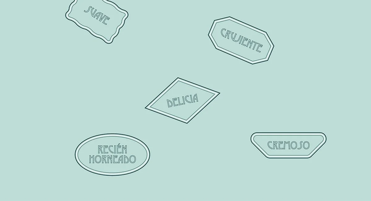
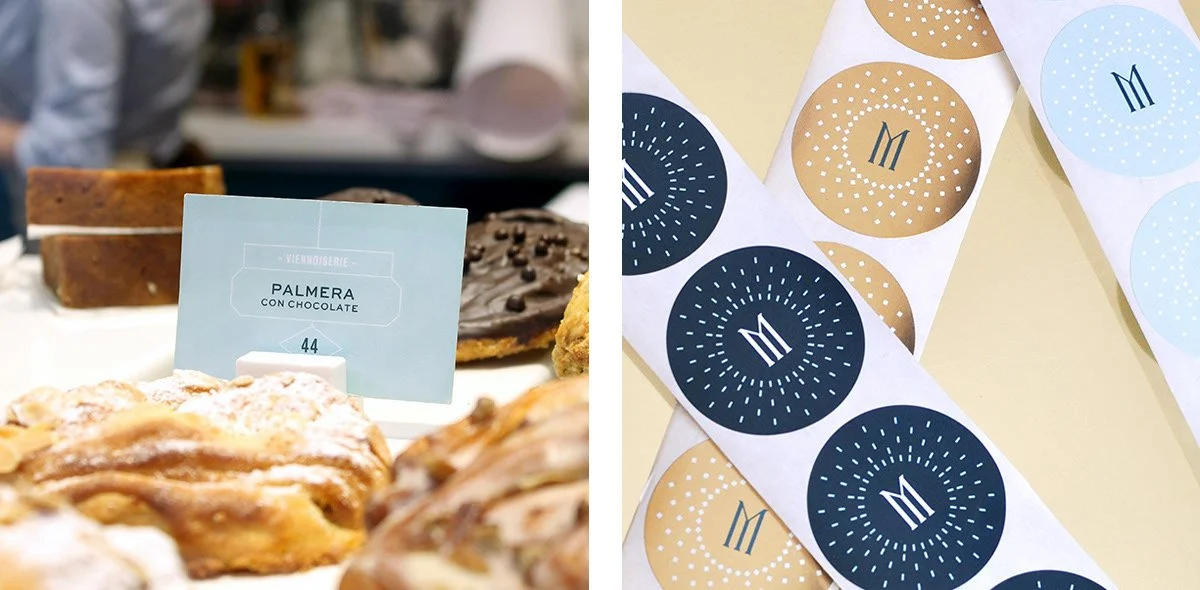
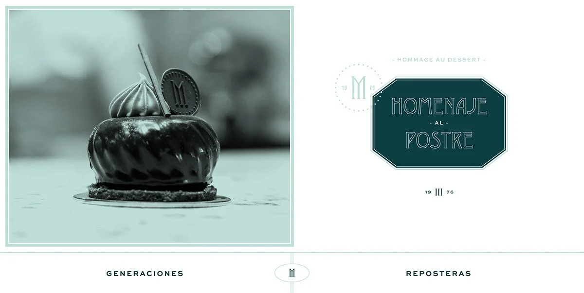
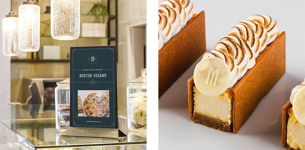
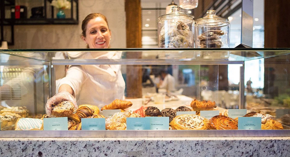
The logo is all posture and poise. Modern serifs with sharp contrast and pronounced terminals offer the tone of a boutique fashion house more than a dessert counter. It’s not trying to be trendy. It’s trying to be timeless. And it succeeds.
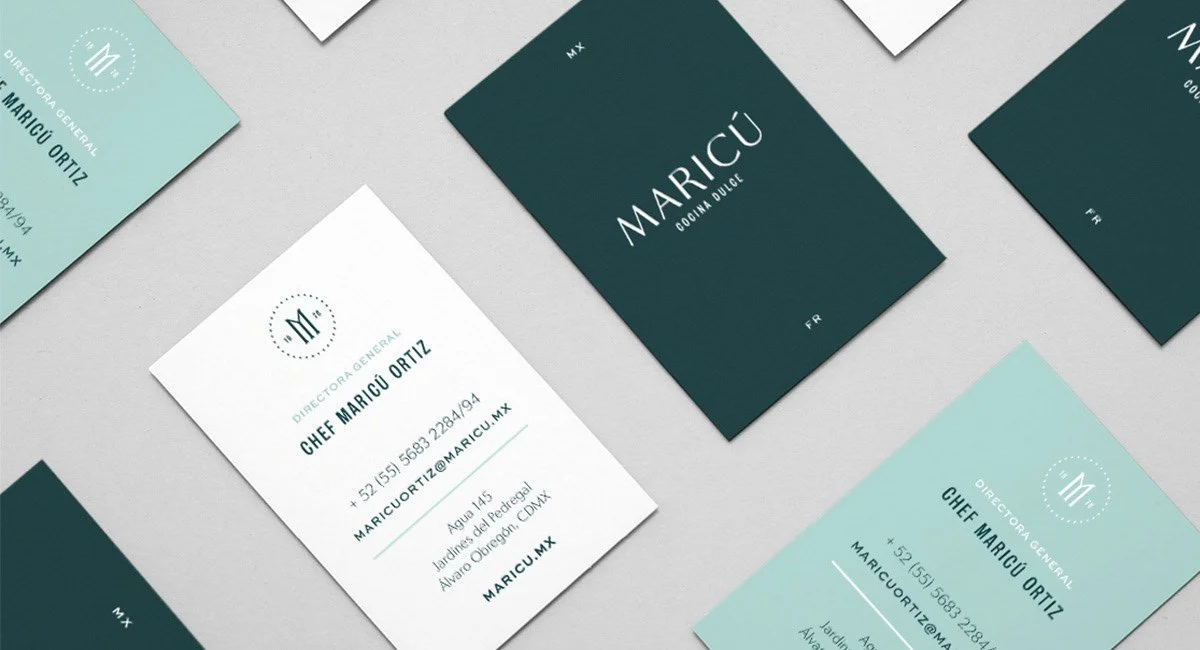
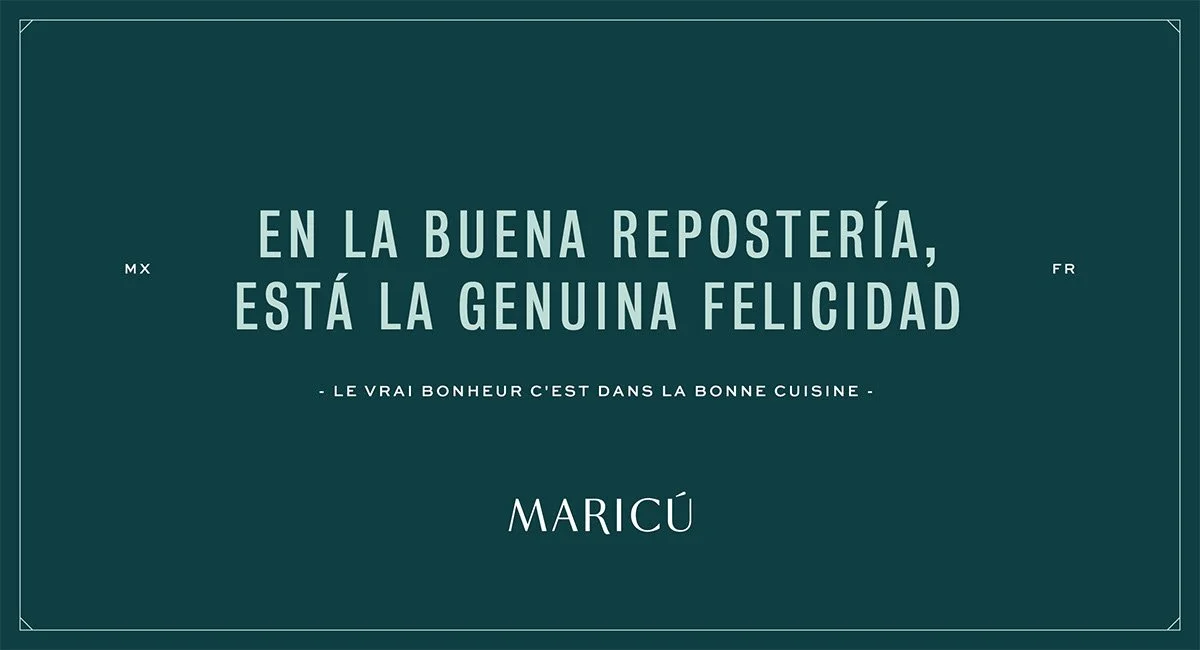
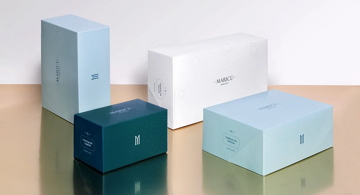
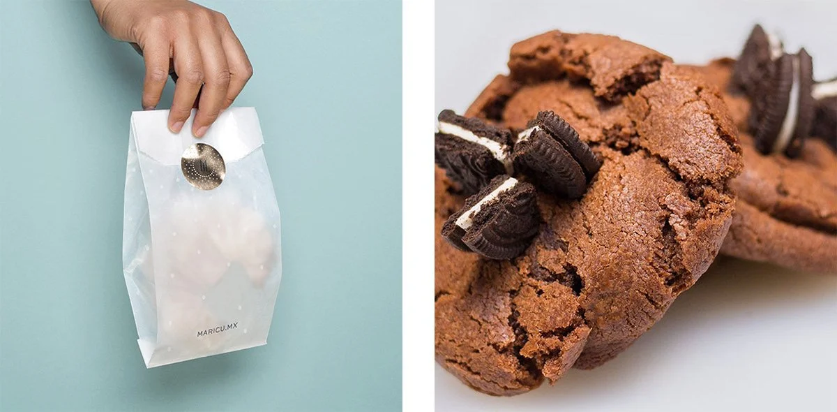
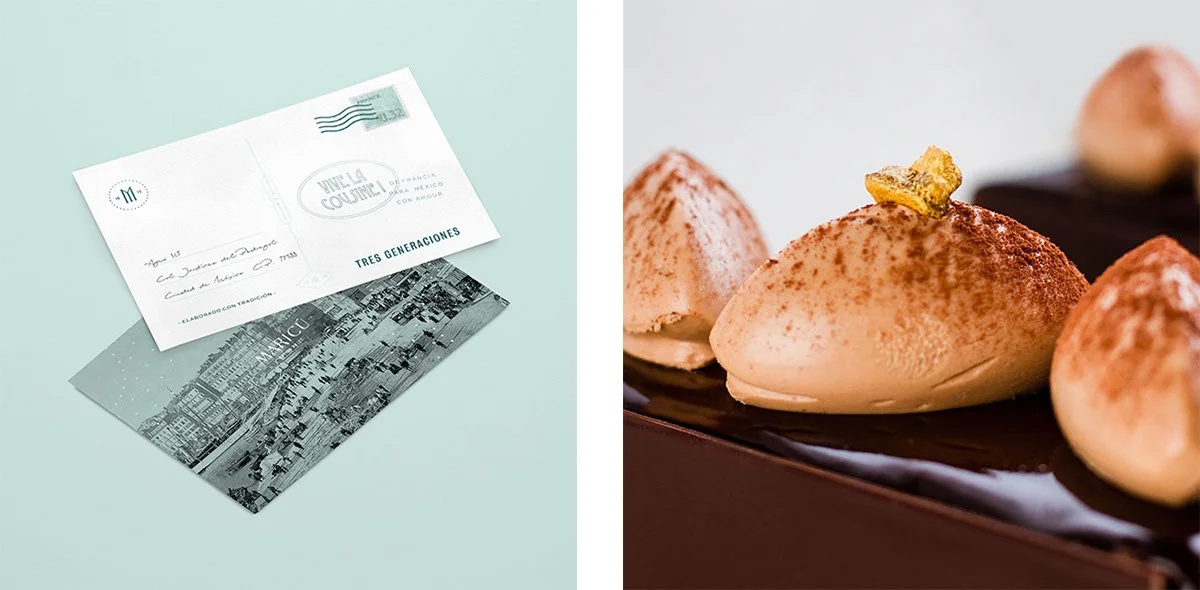
Color does the heavy lifting here. Burgundy like vintage wine. Ivory like unglazed porcelain. Gold accents that feel less like foil and more like inheritance. Firmalt’s palette builds trust before a single bite is taken. You can almost hear the hush of a velvet curtain being pulled back.
Then there’s the structure. Everything is gridded. Everything breathes. Type has the kind of spacing that only comes from obsession. Layouts follow rules but never feel robotic. The brand’s voice is elegant because it never raises it.
But elegance has its edge.
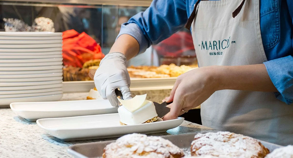
Maricú is so refined it sometimes forgets its own heartbeat. Dessert is emotional. It’s intimate. It’s stolen bites and sticky fingers and laughter too loud for the room. This brand delivers reverence but barely hints at joy. It could use a little swing. A little wink. One stray curl of chocolate on an otherwise perfect plate.
Still, this is what masterful branding looks like when it refuses to play small. Maricú doesn’t want to be your favorite café. It wants to be the name you whisper when you want to impress someone. The pastry box you present with two hands. The logo you recognize without a single crumb inside.