Molusk restaurant branding
Every once in a while, a restaurant brand sinks its teeth deep into metaphor and comes back with something more myth than mark. Molusk, a coastal kitchen in Chelem, Yucatán, surfaces with an identity that feels like a creature rising from the deep—tentacles curling, eyes watching, a sense of humor wrapped in mystery.
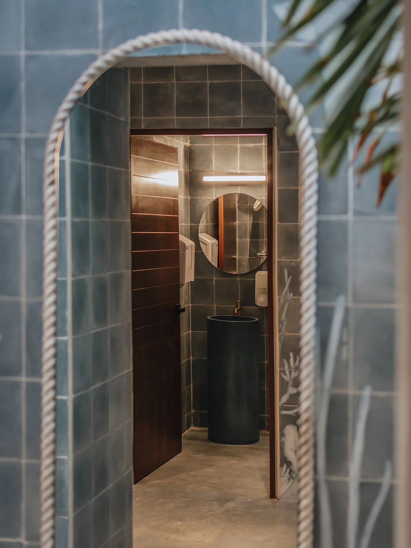
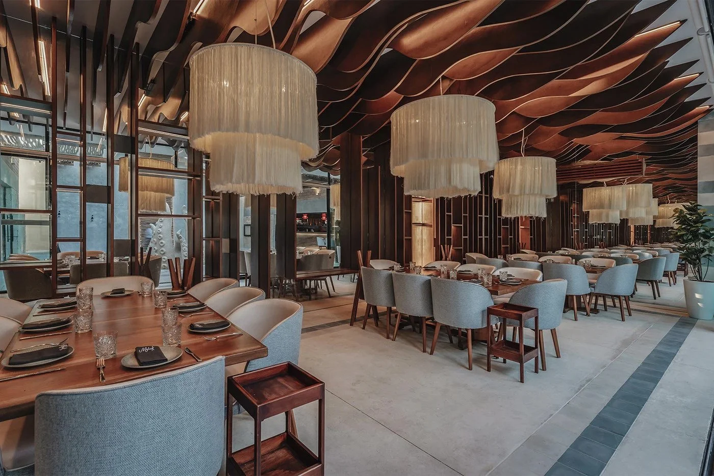
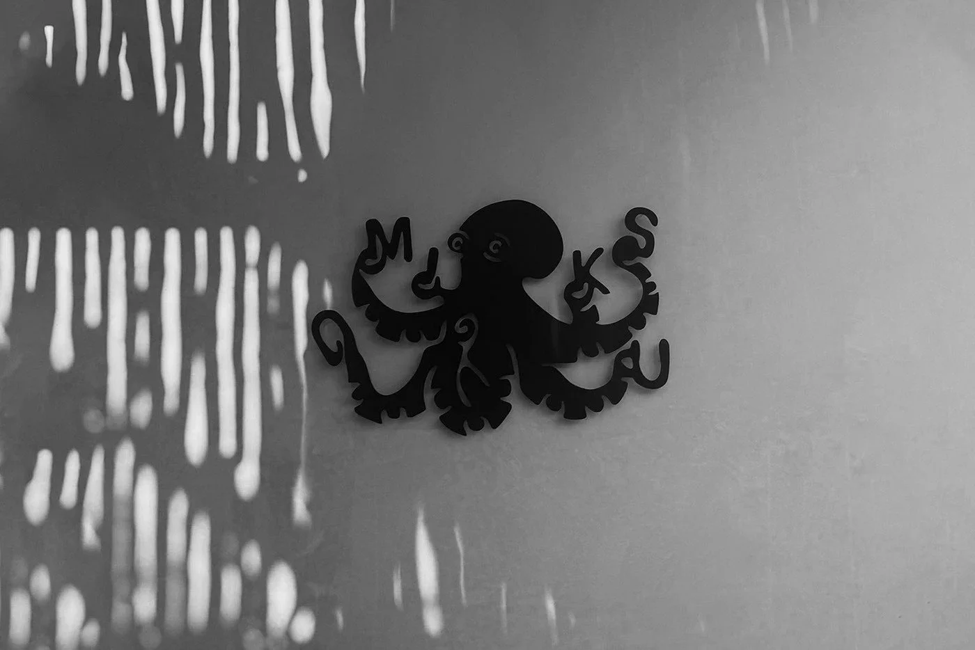
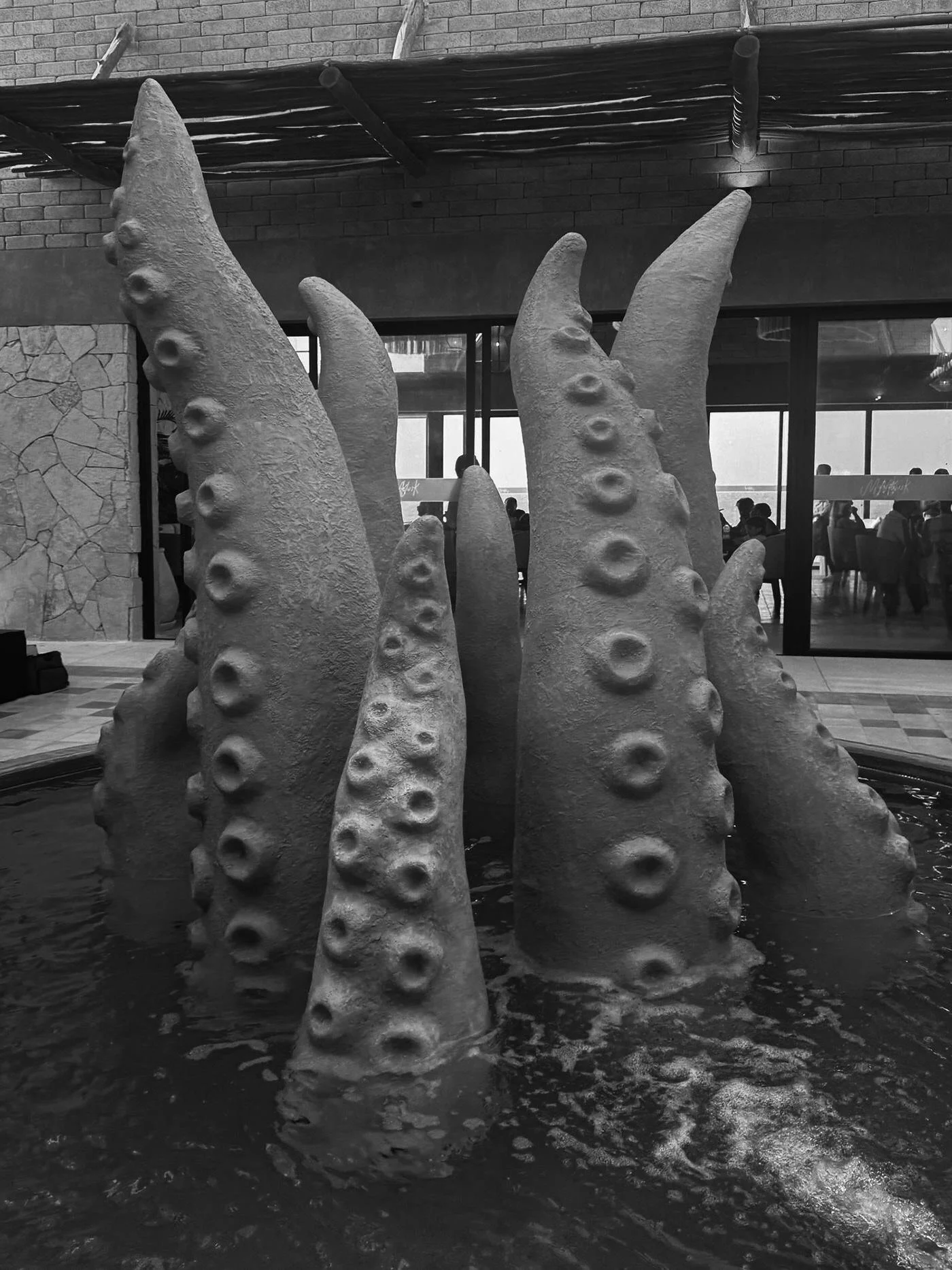
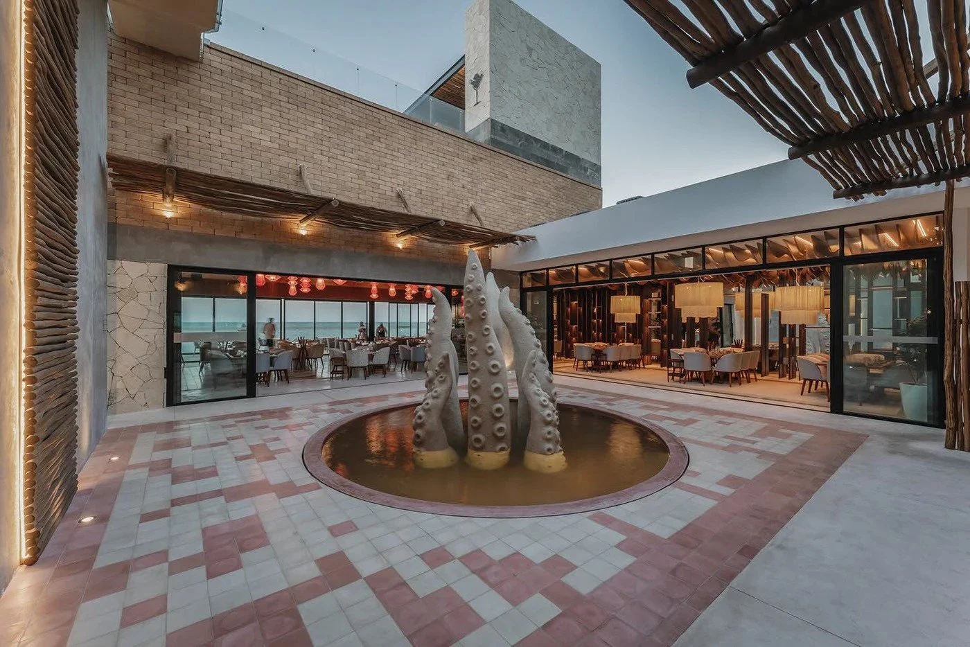
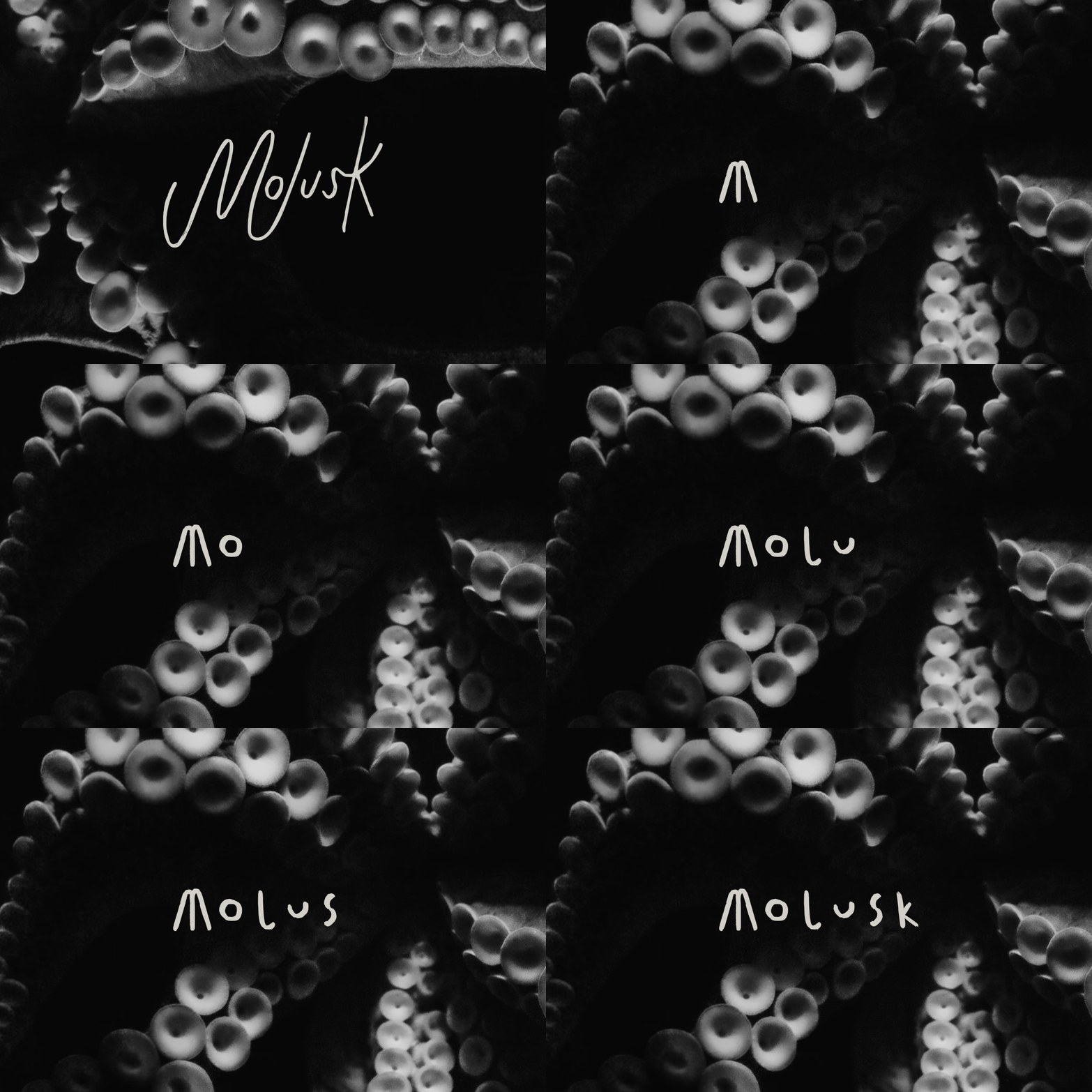
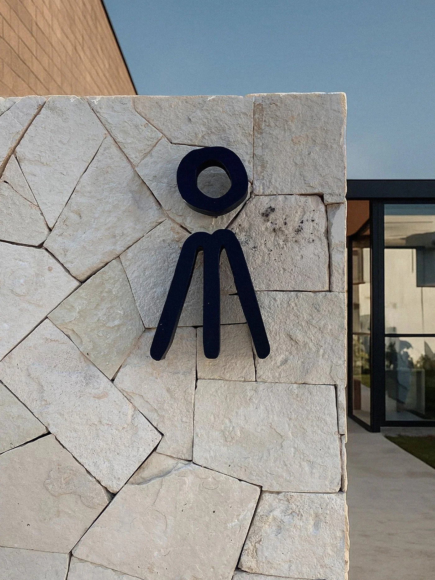
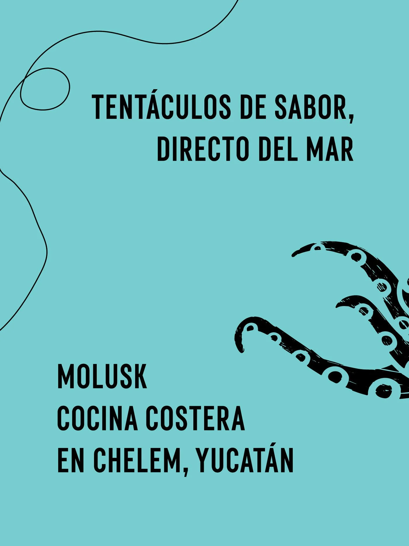
The brand’s octopus symbol anchors the system, not as a flat mascot but as a living character. Its arms extend into letterforms, twisting the name into the anatomy of the beast. This is a smart nod to Surrealism and mid-century illustration, where the line between typography and drawing blurs until the two can’t be separated. The identity isn’t just visual—it’s physical. The fountain installation of giant tentacles erupting from the courtyard pool pushes the concept from brand to environment, merging fantasy with architecture in a way few restaurant brands dare to attempt.
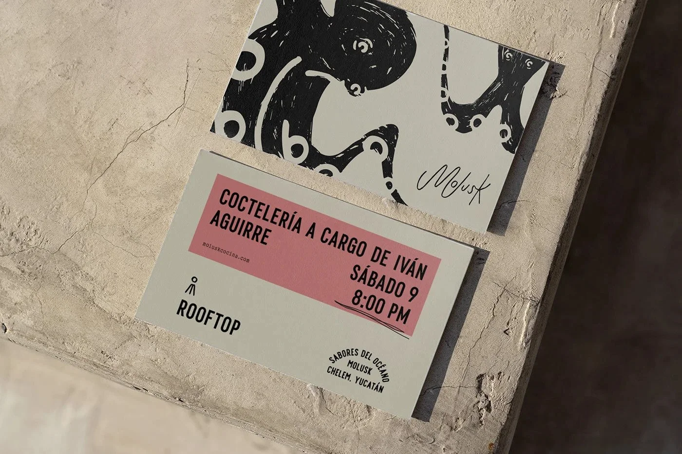
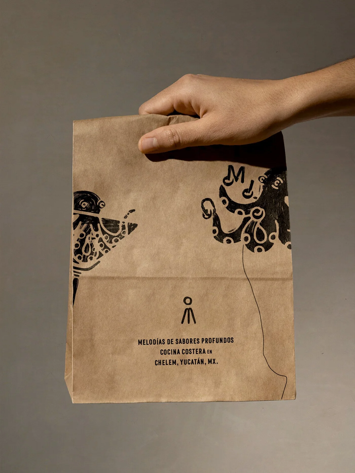
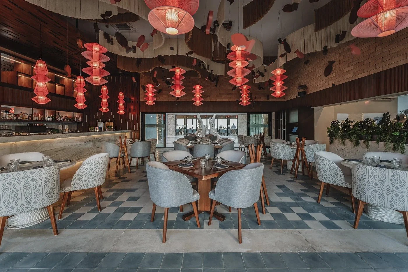
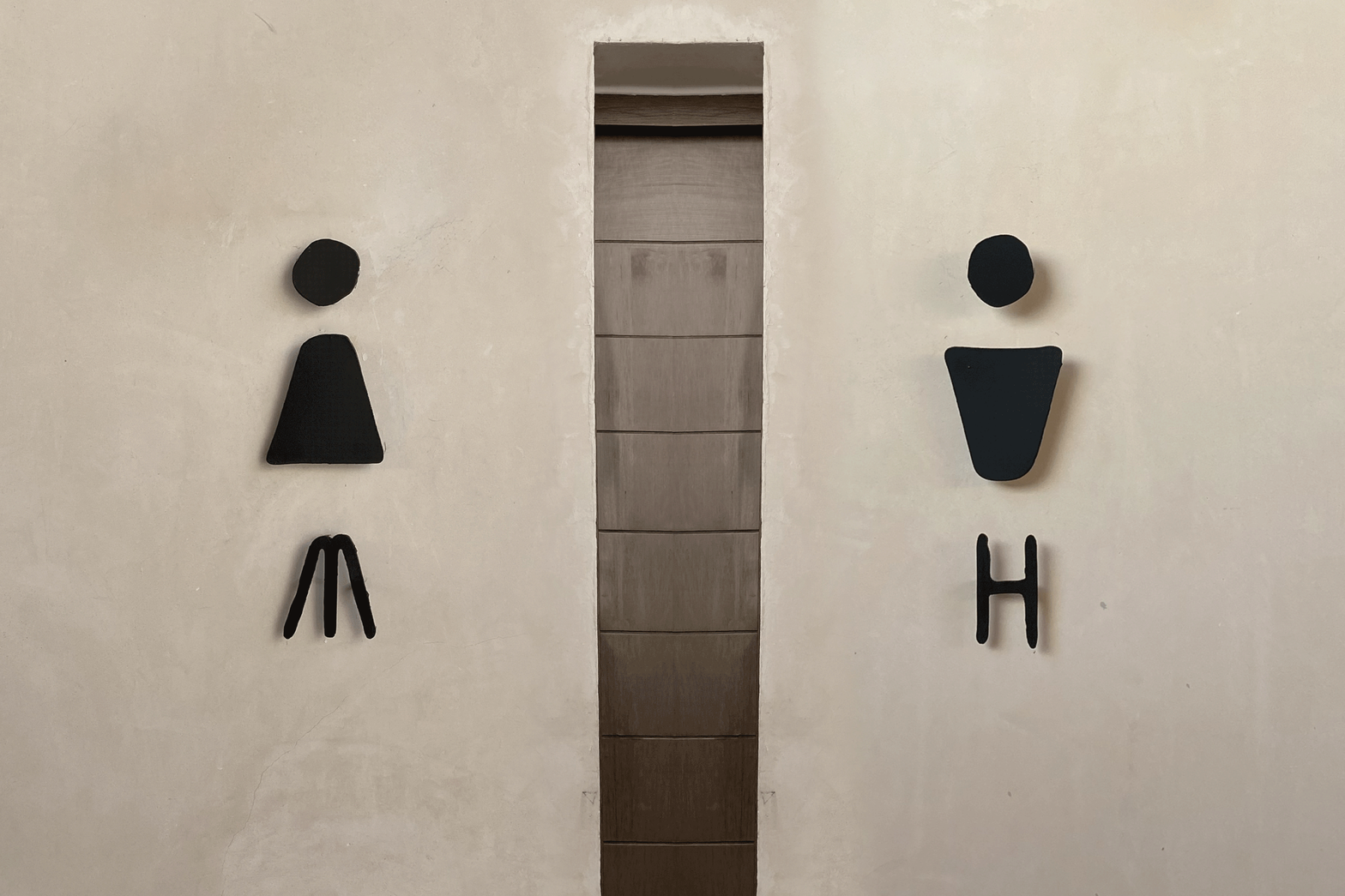
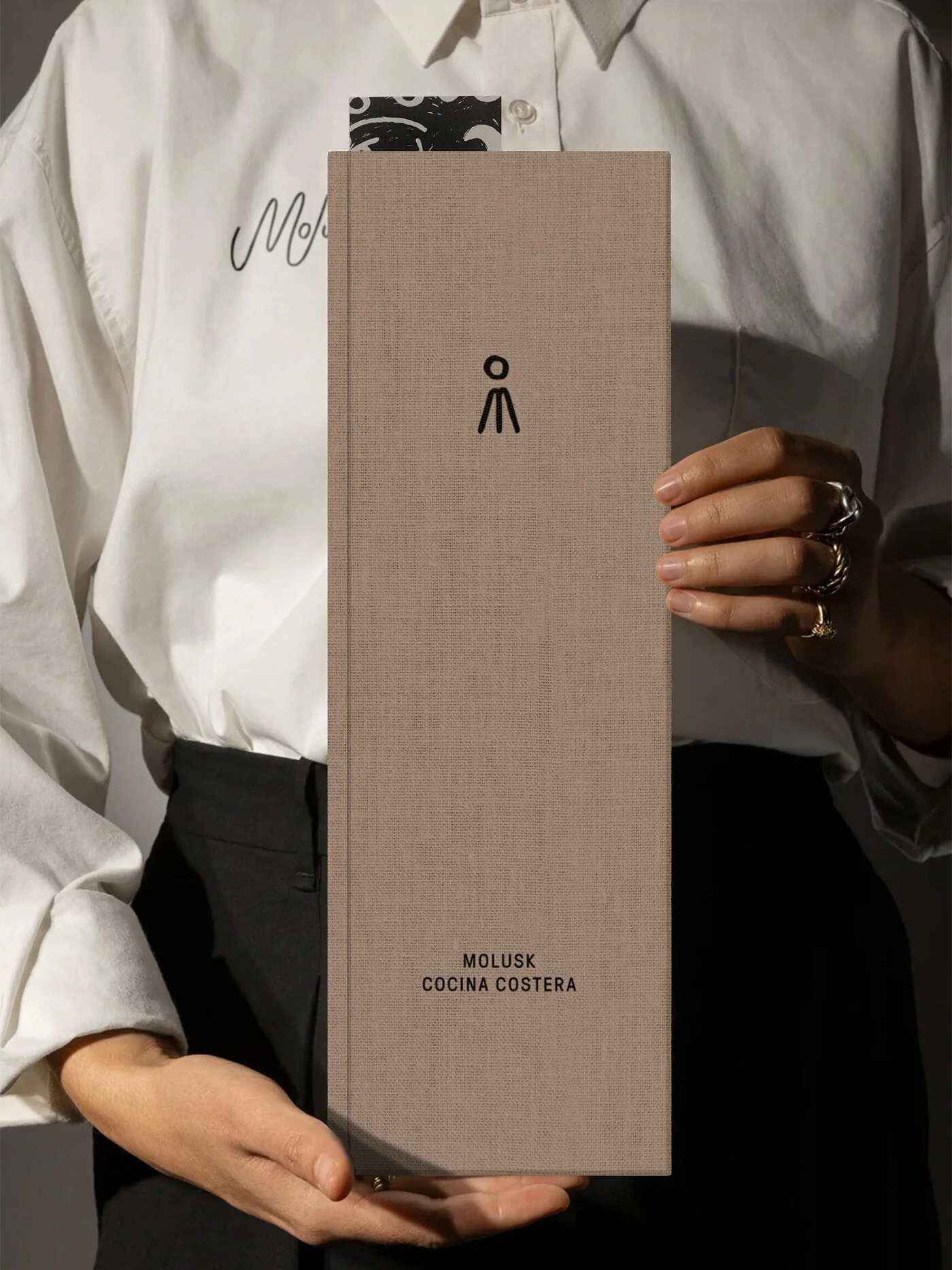
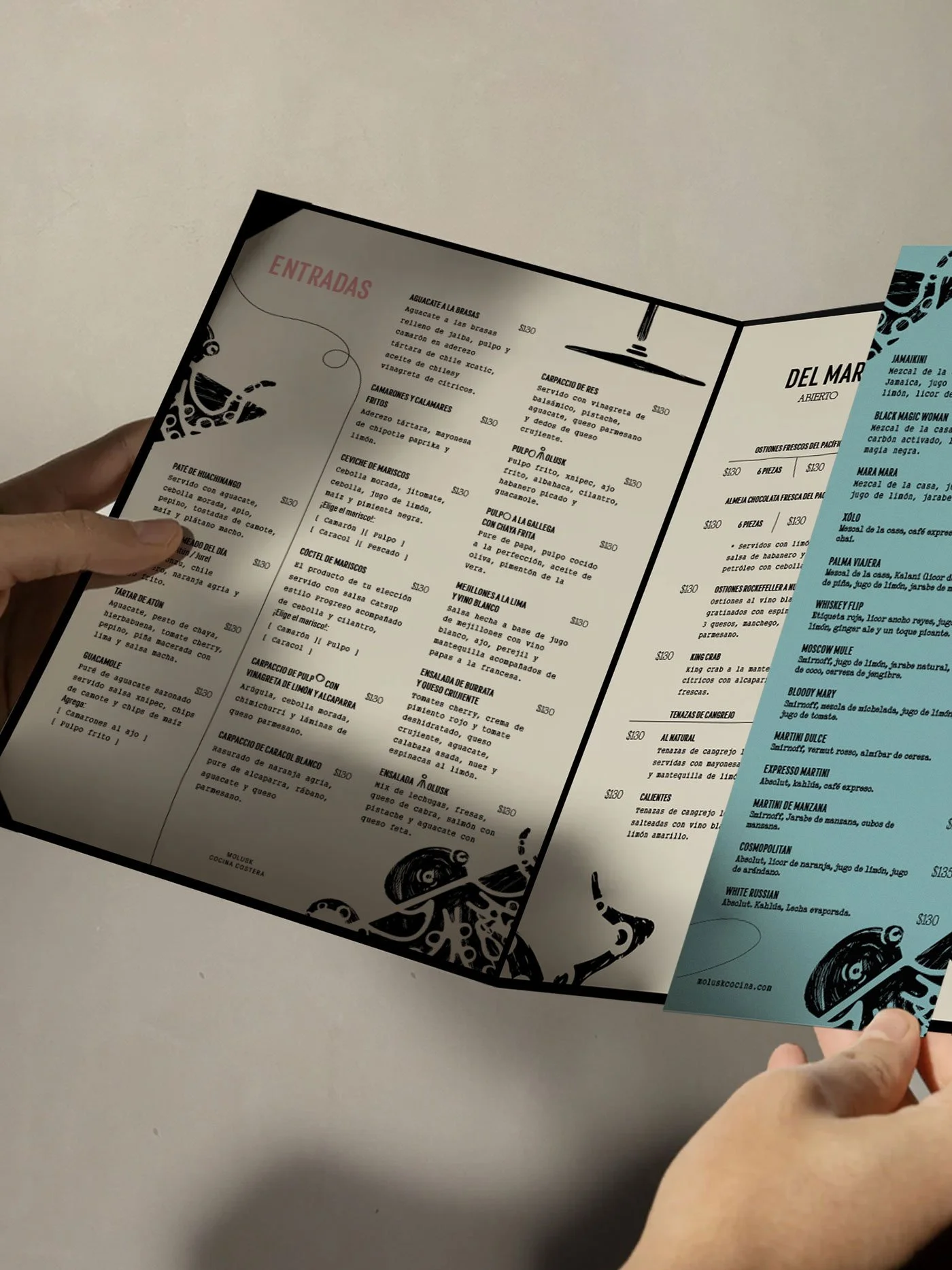
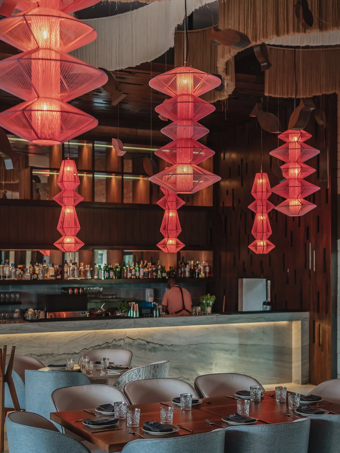
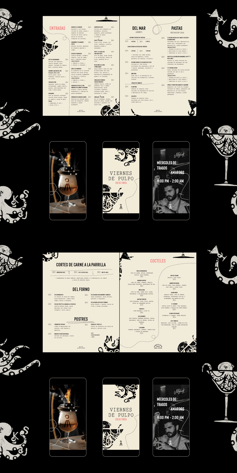
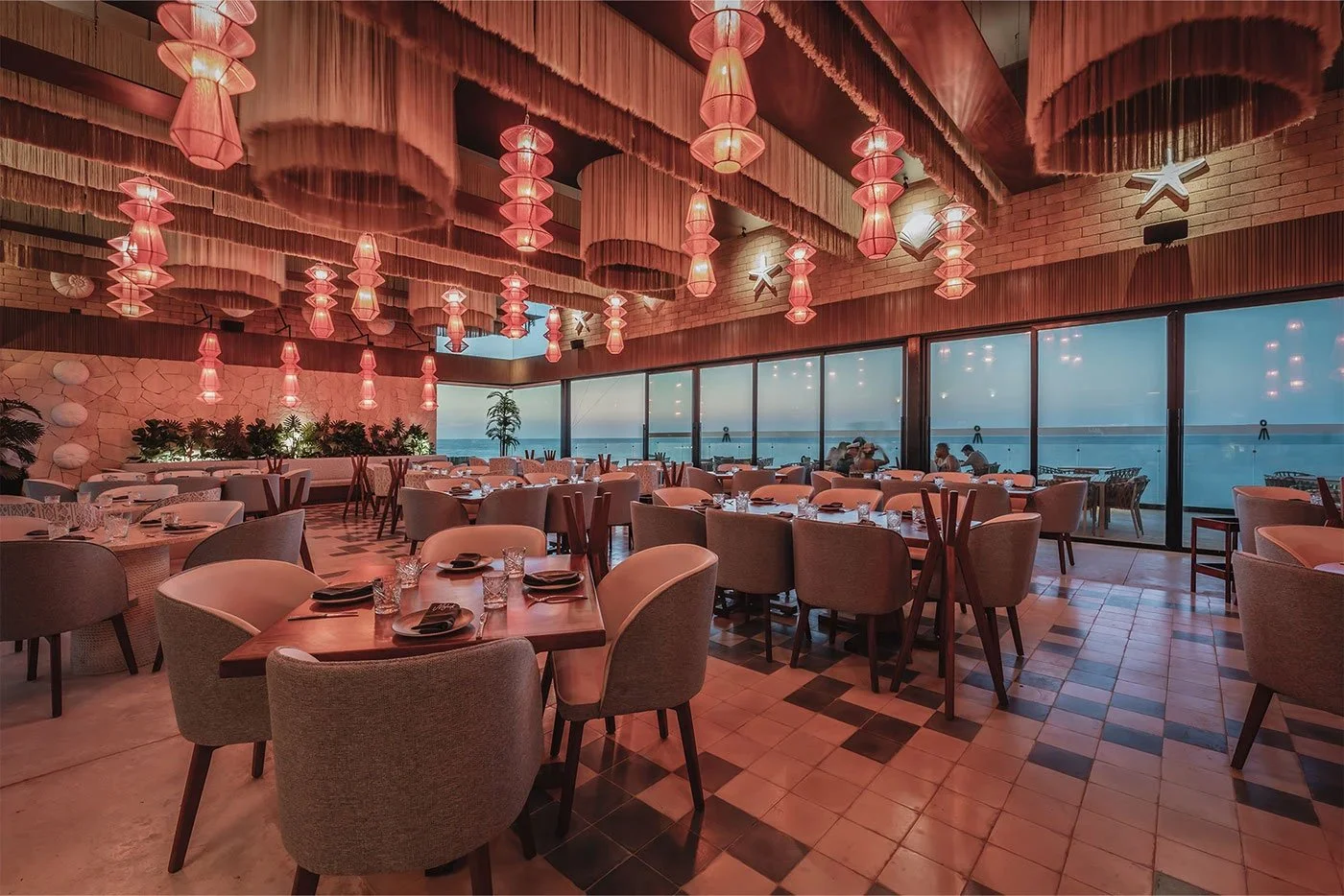
The design system leans on playful contrast. Menus and collateral carry a mixture of crisp, modern typography alongside illustrated tentacle forms that feel hand-etched, almost woodcut in style. The color palette—seafoam blues, coral reds, and soft neutrals—keeps the whole experience grounded in coastal Yucatán. It avoids cliché “seafood shack” tropes in favor of something more elevated, more art-driven. Even the napkin embroidery and terrazzo tabletops hum with a tactile quality that supports the brand’s balance of refinement and whimsy.
What sets Molusk apart is its refusal to stay two-dimensional. Most restaurants are content with a clever logo and a consistent color scheme. Here, the brand becomes a stage set: tentacles in water, shadows crawling across the walls, hand-rendered marks sneaking into menus and posters. It’s immersive in the way good hospitality design should be—giving diners a story to carry with them after the last bite.
If there’s room to push further, it’s in unifying the typography. While the handwritten “Molusk” on napkins adds intimacy, it feels a step removed from the stronger illustrative system. A tighter integration—perhaps weaving that looseness back into the menu type or signage—could create an even more seamless storytelling arc.
Molusk’s identity swims in a lineage of surreal coastal design, flirting with Art Brut and modern Mexican craft while keeping one eye fixed on the contemporary hospitality landscape. It’s bold, memorable, and more than a little mischievous. A brand that doesn’t just sell seafood—it conjures an encounter with the sea itself.
