Vôcảm coffee Branding

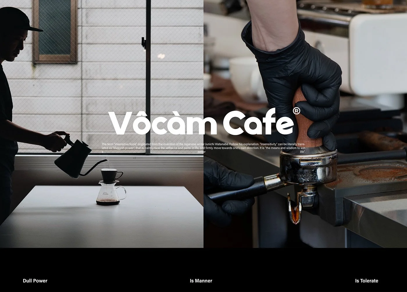
There’s no tiptoeing in here. No cream swirl typography. No artisan script trying to flirt its way into your feed. Vocam Coffee walks in heavy, shoulders squared, ink poured thick. This is graphic brutality—intentionally blunt, unapologetically reduced, and yet profoundly poetic.
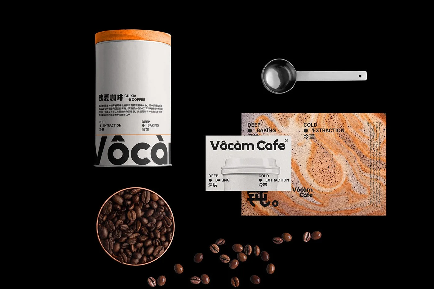
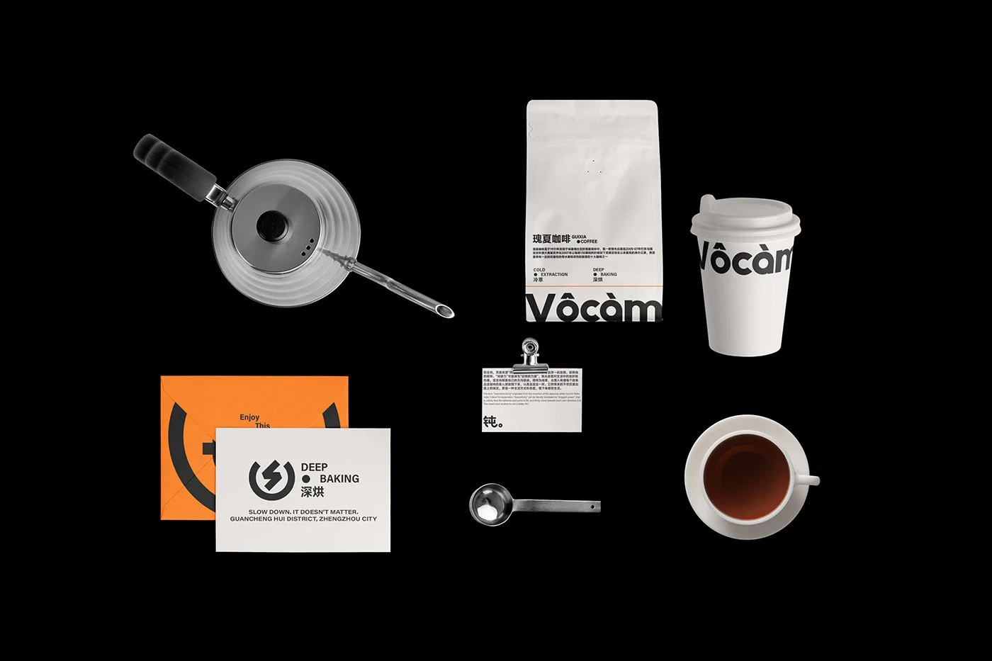
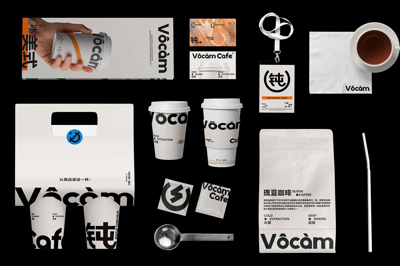
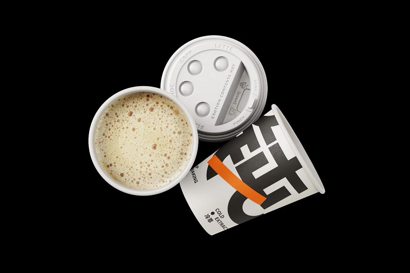
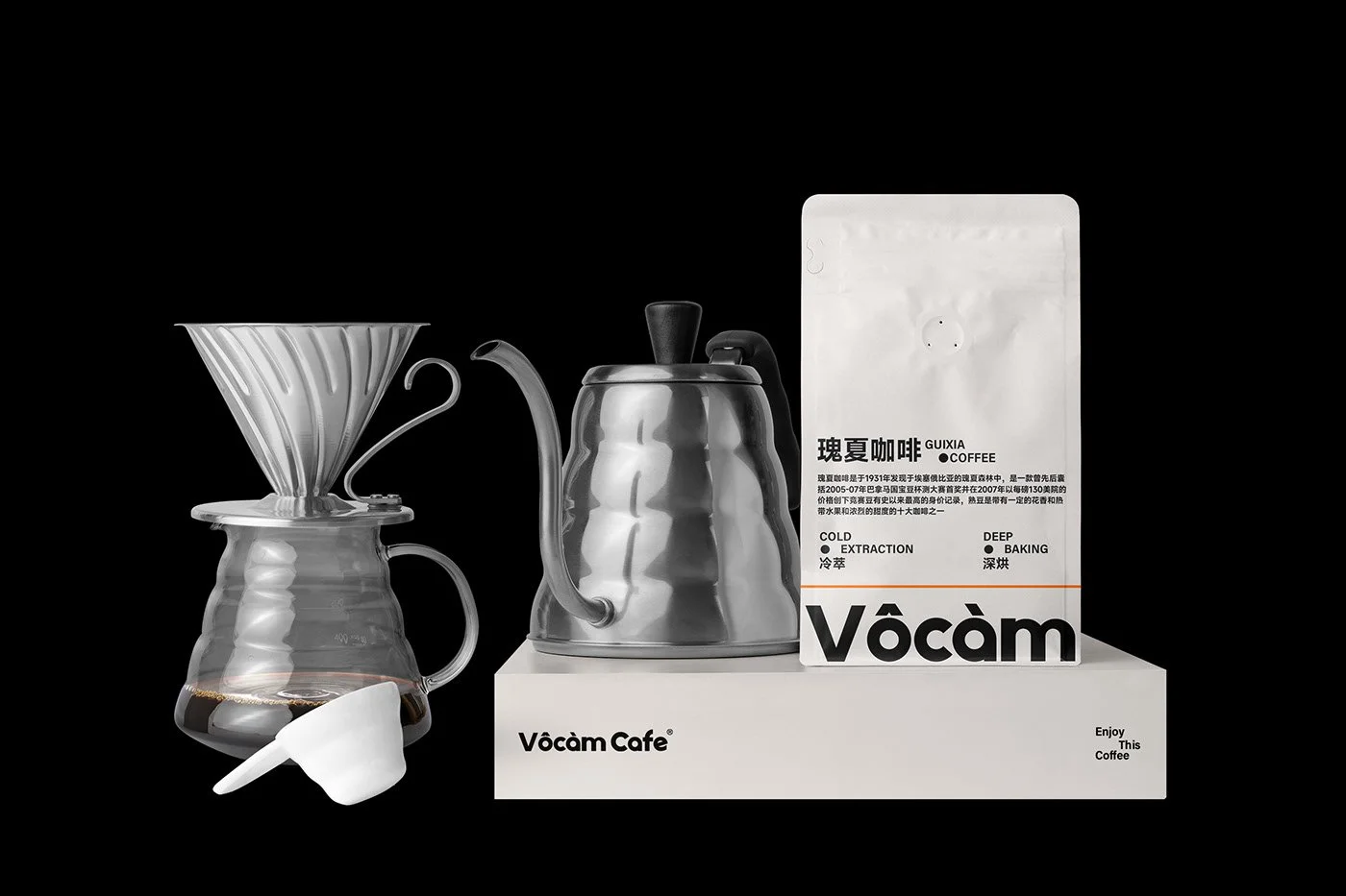
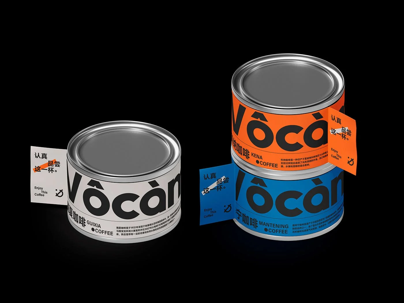
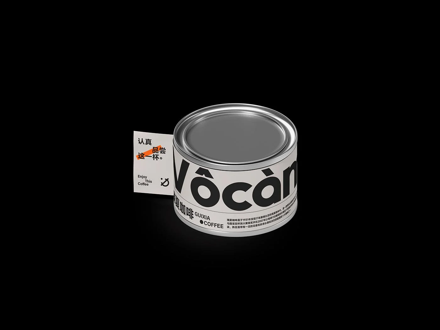
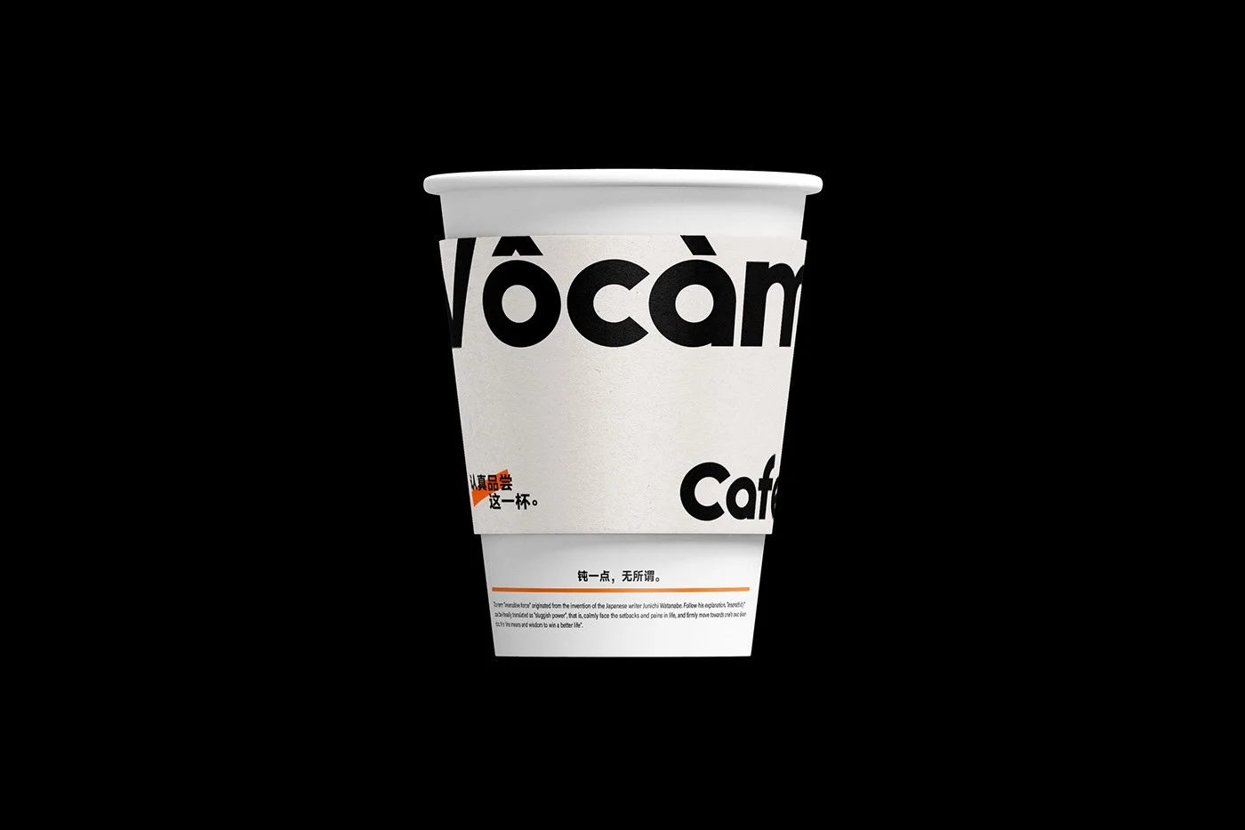
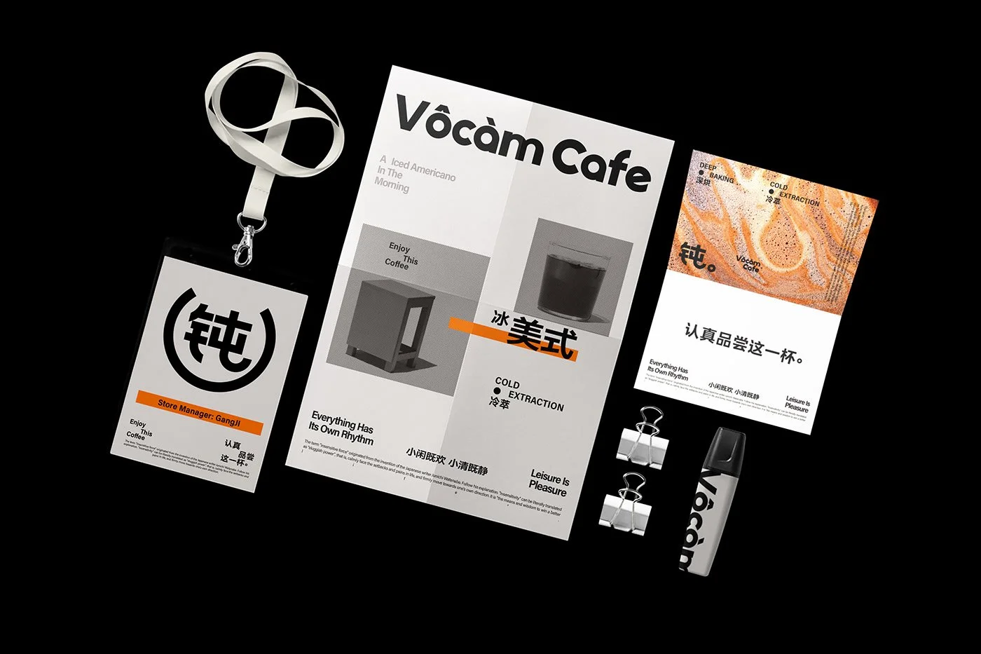
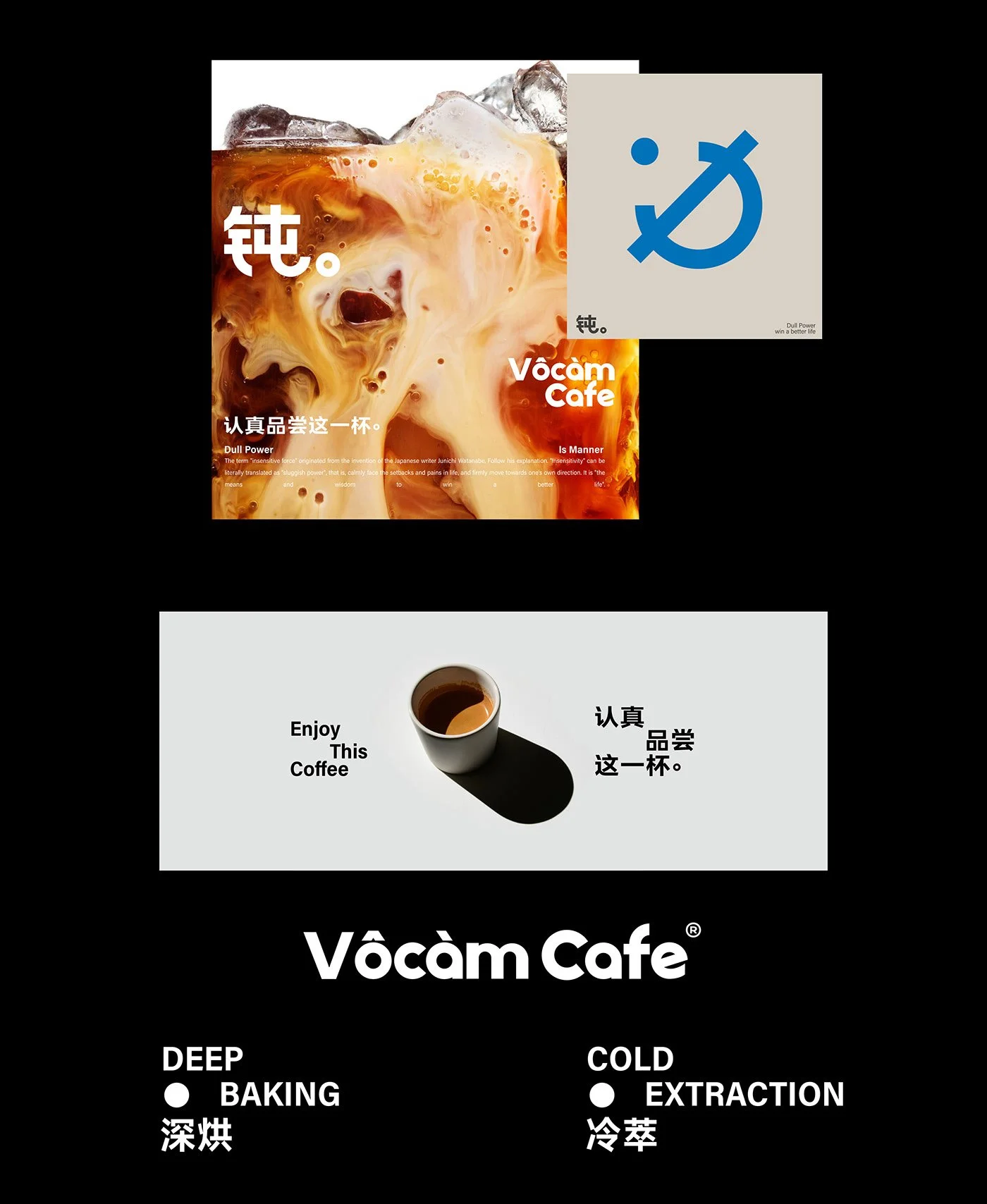
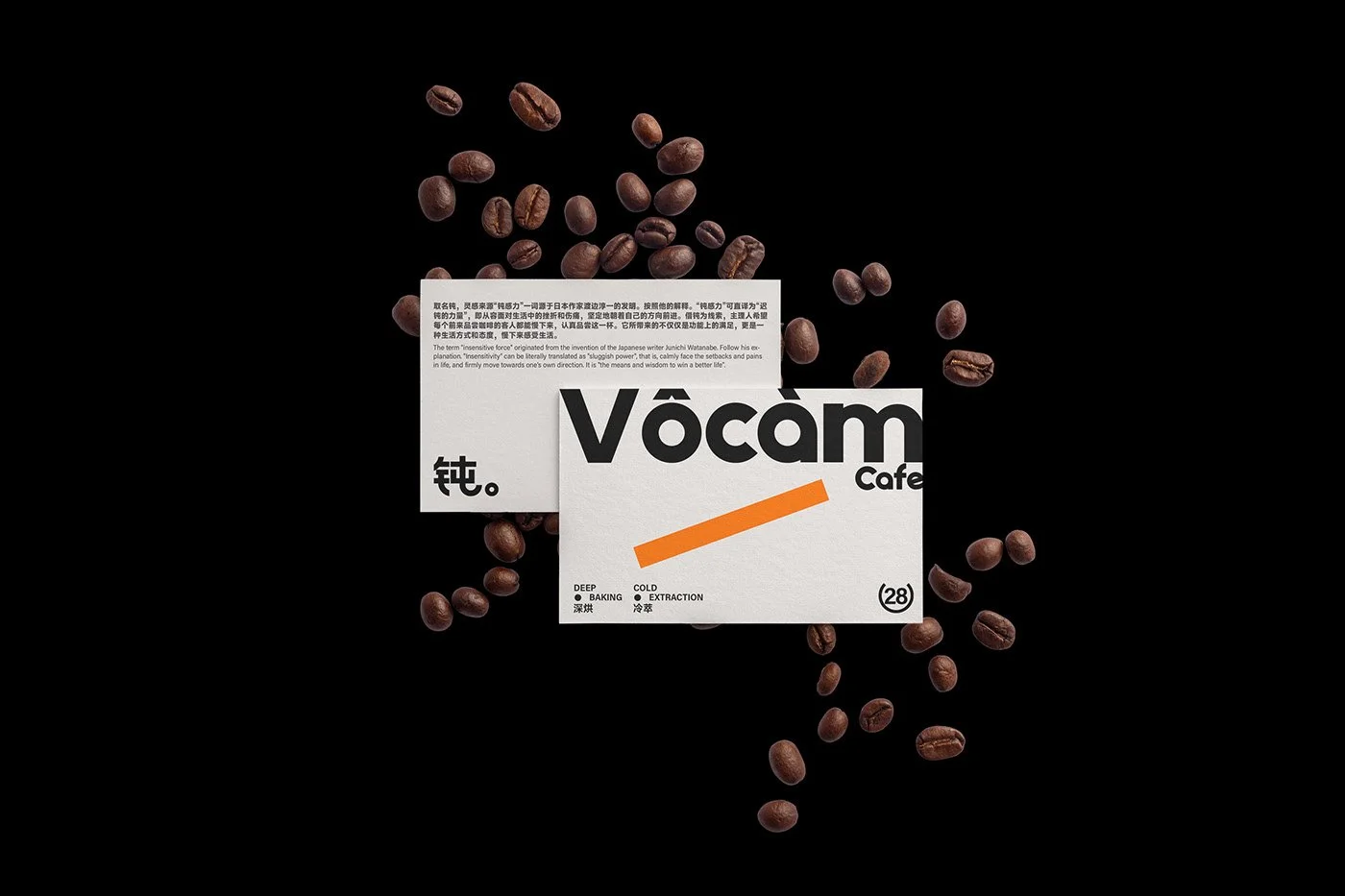
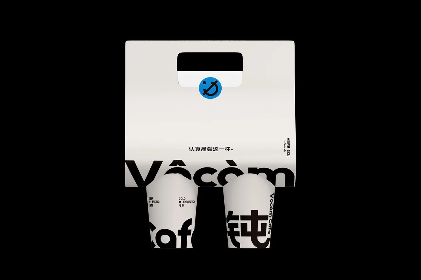
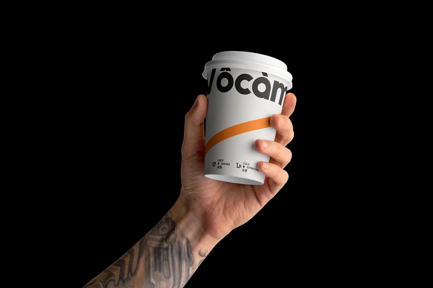
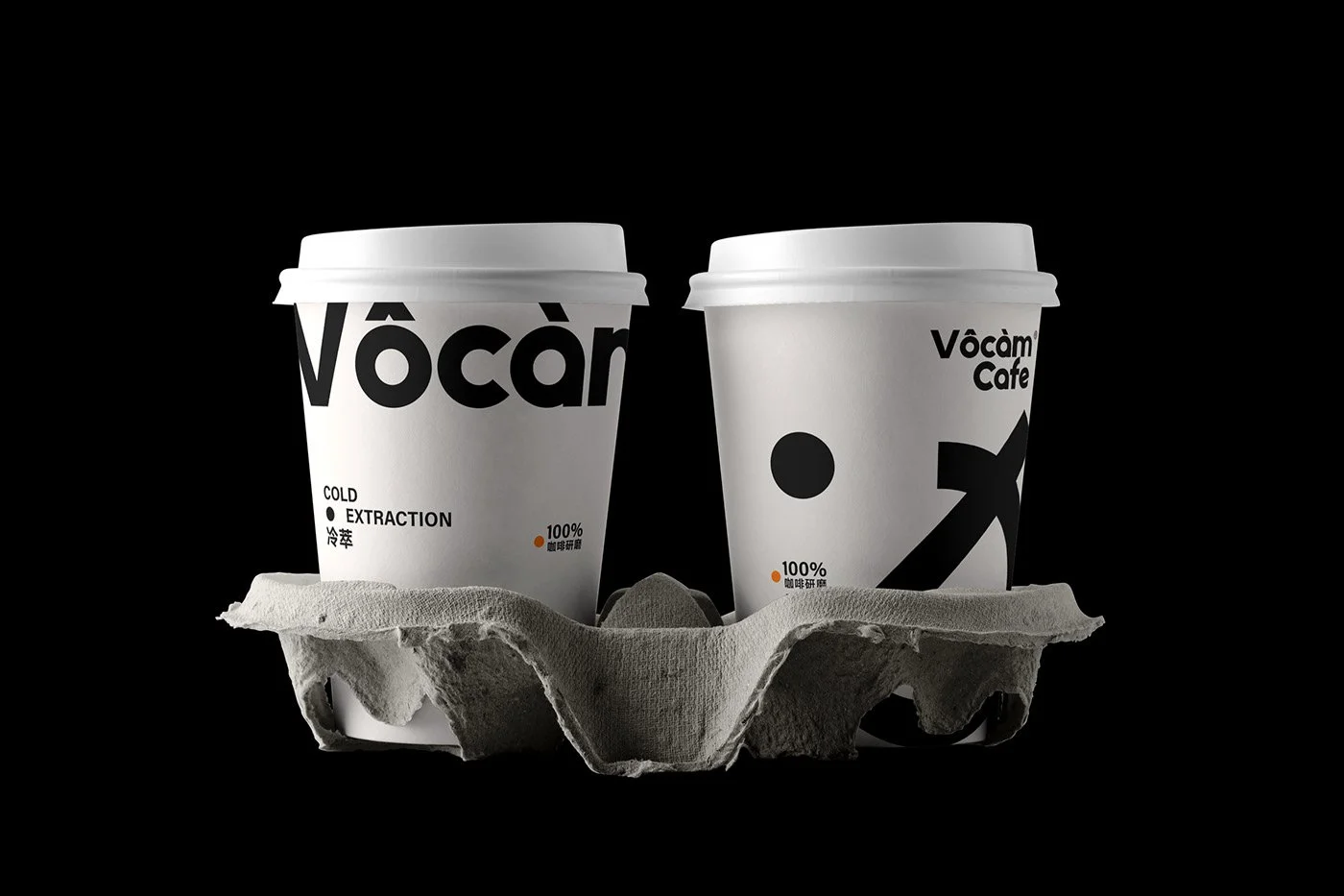
The brand identity, built by designer Gangji Kkkkko, doesn’t whisper its name—it shouts it across every surface it touches. Thick-set black typography crashes against stark white backdrops, a visual jolt that feels almost confrontational. But that’s the point. A single orange slash breaks the monochrome with surgical precision—like an artist’s signature on an otherwise unmarked canvas. The result? Packaging and collateral that double as photographic stages, supporting rather than stealing the spotlight.
This isn’t your Brooklyn Third Wave copy-paste. There’s weight to the story—literally and emotionally.
The name “Vocam” originates from the Chinese name 钝 (Dùn), derived from the Japanese concept of “钝感力” (Donkanryoku), coined by author Junichi Watanabe. Loosely translated: “the power of dullness,” or better—emotional buffering. It’s the ability to remain unaffected by chaos, to slow down, steady your breath, and keep moving forward. This mindset permeates everything Vocam does. Every sip, every stroke of type, every inch of that minimalist canvas urges you: go slow. Be deliberate. Taste what you usually ignore.
There’s soul in the system. The graphic language is ruthlessly consistent—from the tins to the to-go cups to the pour-over setups. But it’s never sterile. It’s honest. And that honesty? It’s rare. Vocam doesn’t want to be everything to everyone. It just wants to be exactly what it is. Sharp. Strong. Clear.
“Slow down. It doesn’t matter,” the brand declares. That’s not an invitation. It’s a dare.
Credits
Brand Identity & Design by: Gangji Kkkkko