Colony house hotel branding

There’s something disarming about the work Longitude Design did for Colony House Motor Lodge. Not in a loud, maximalist way. Quite the opposite. It’s a warm pull, like a glint of chrome on a sun-drenched highway, whispering that simpler times might still exist somewhere in the cracks of the present.
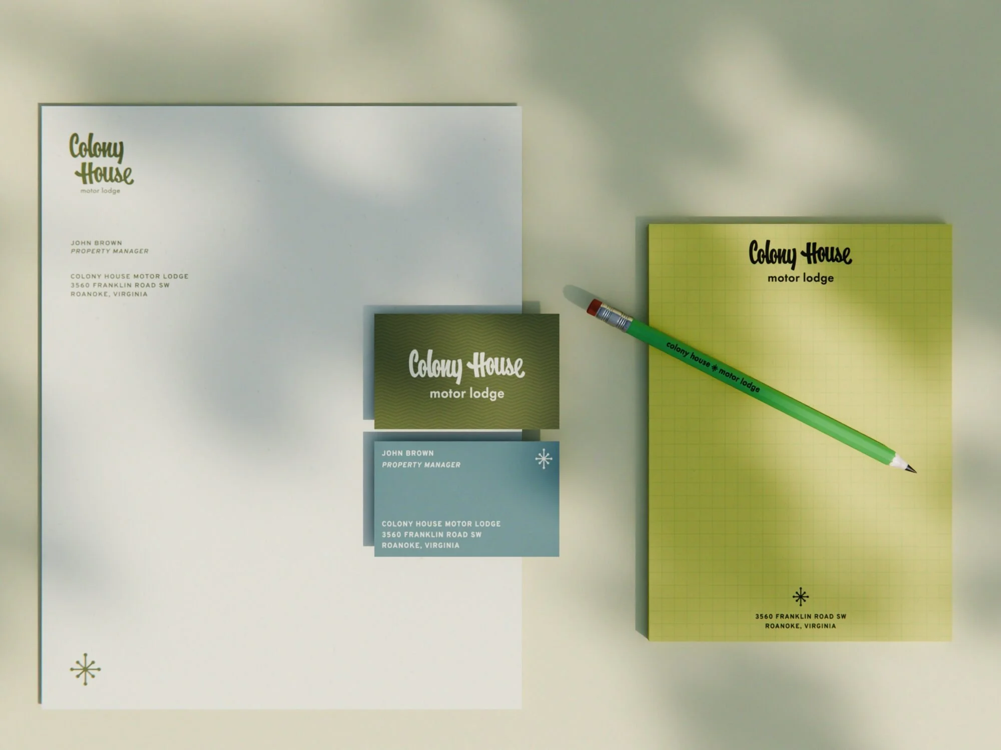
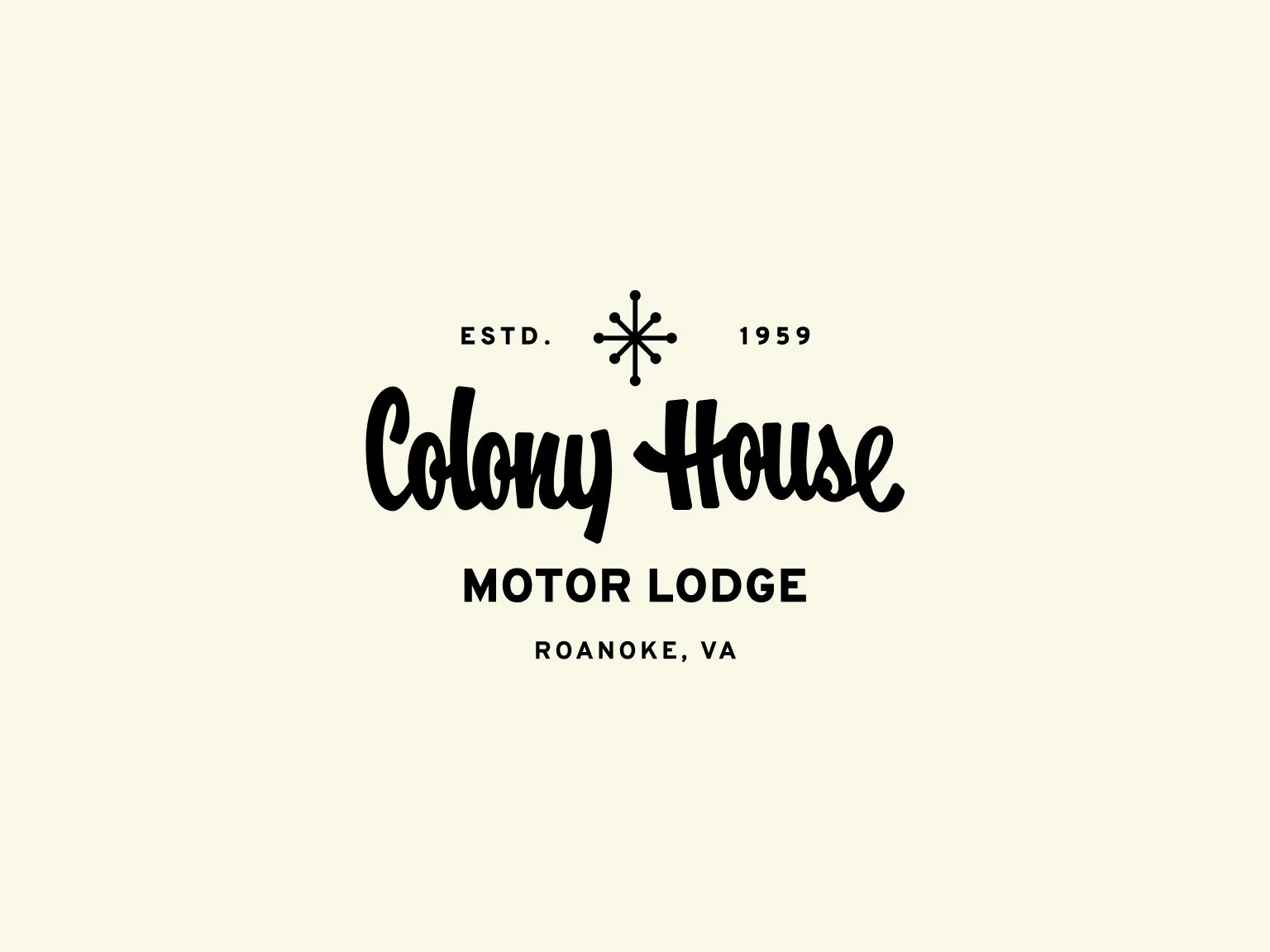
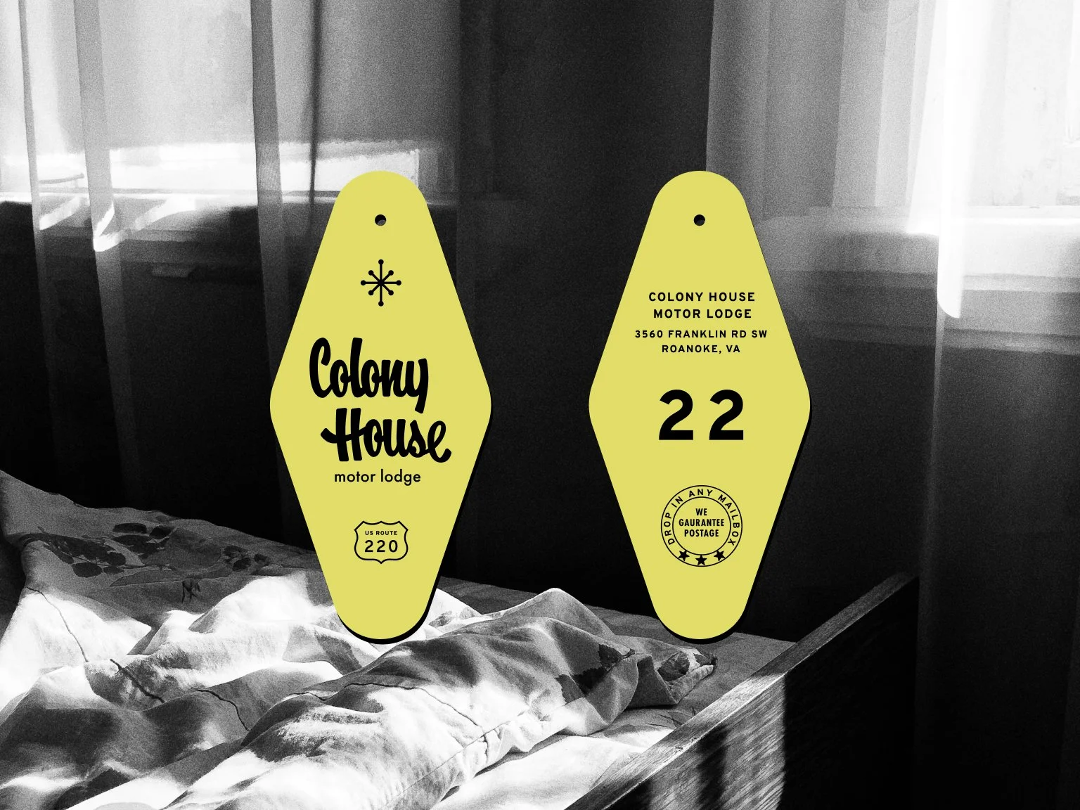
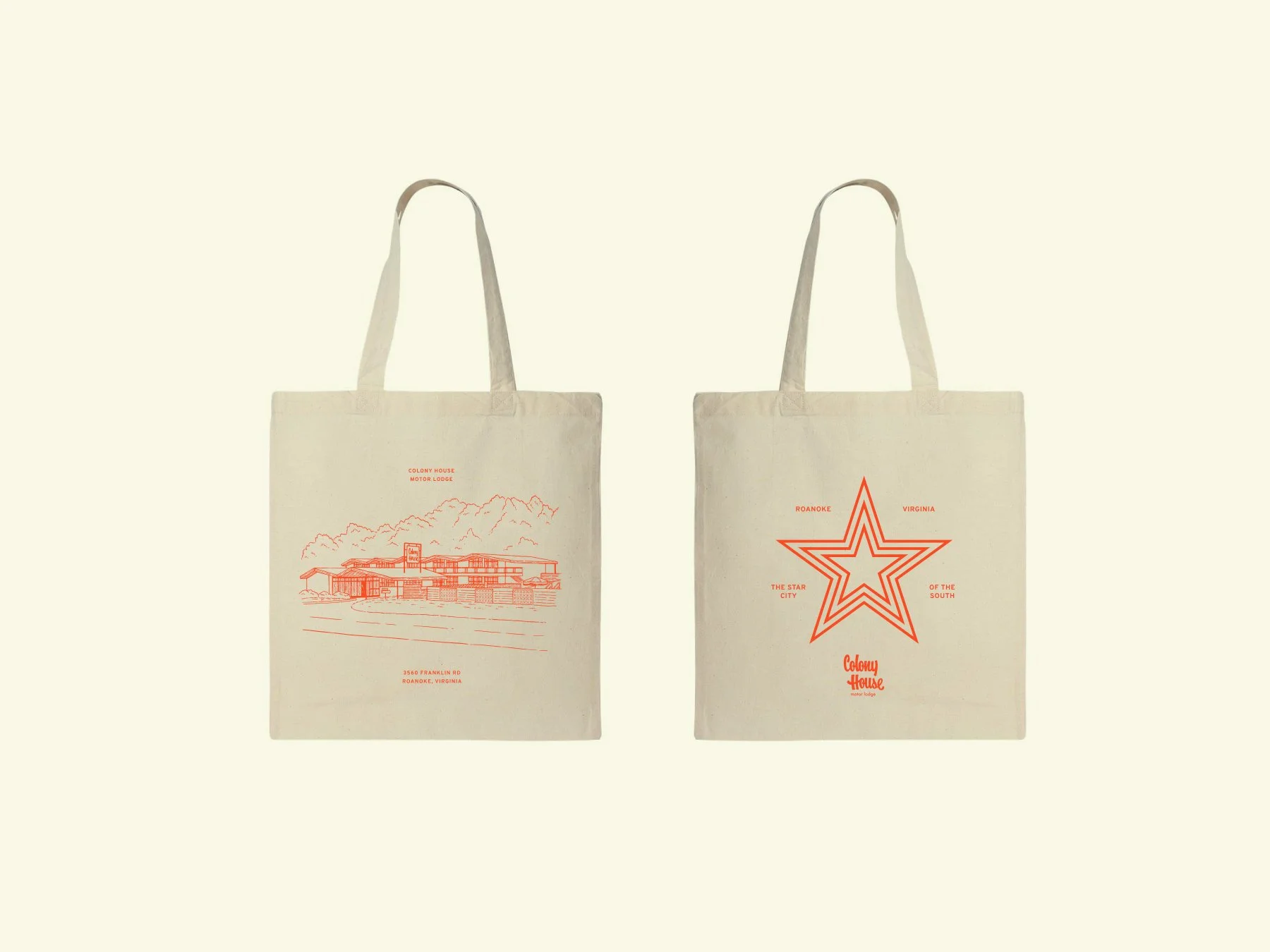
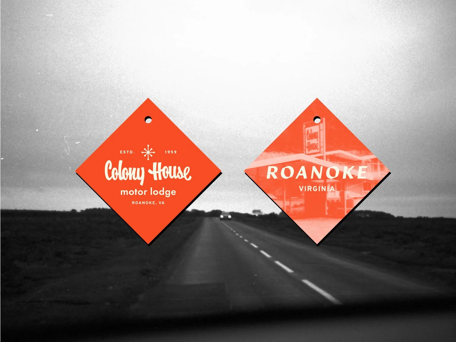
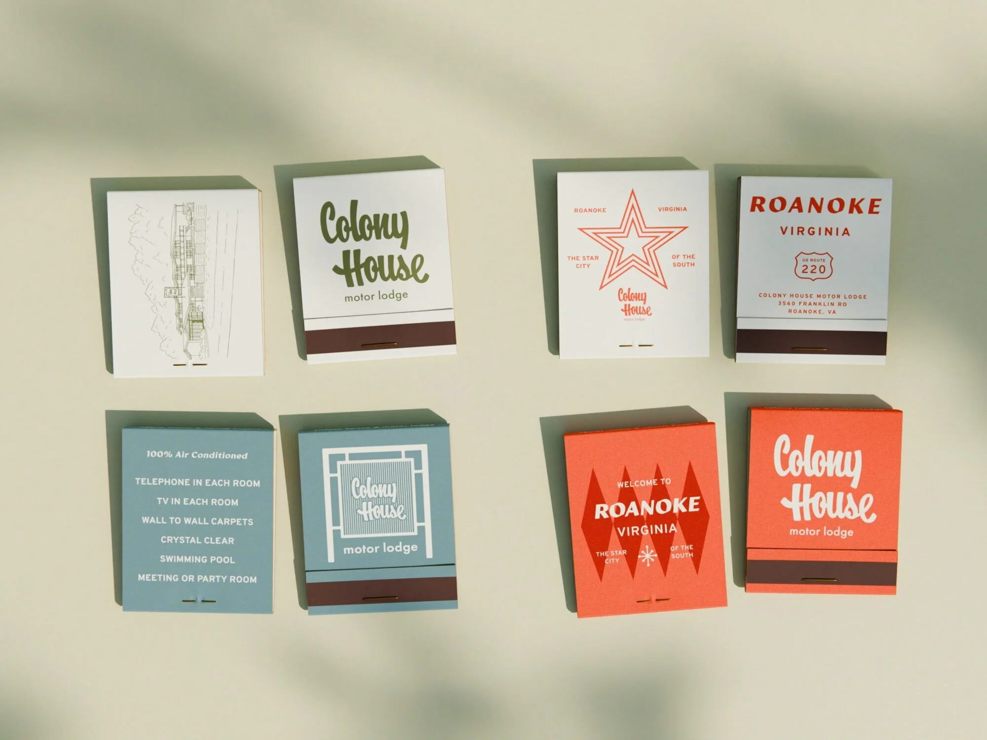
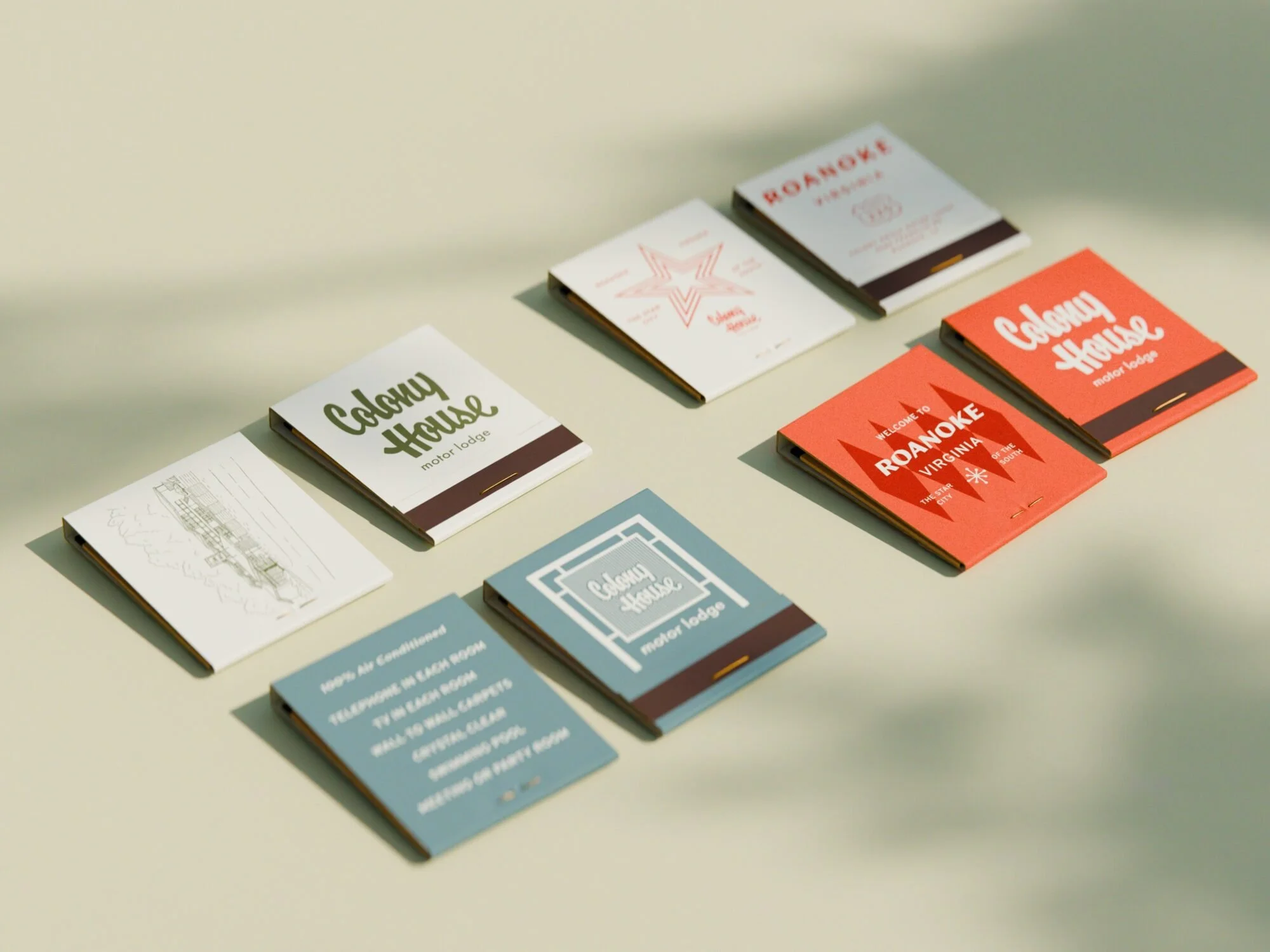
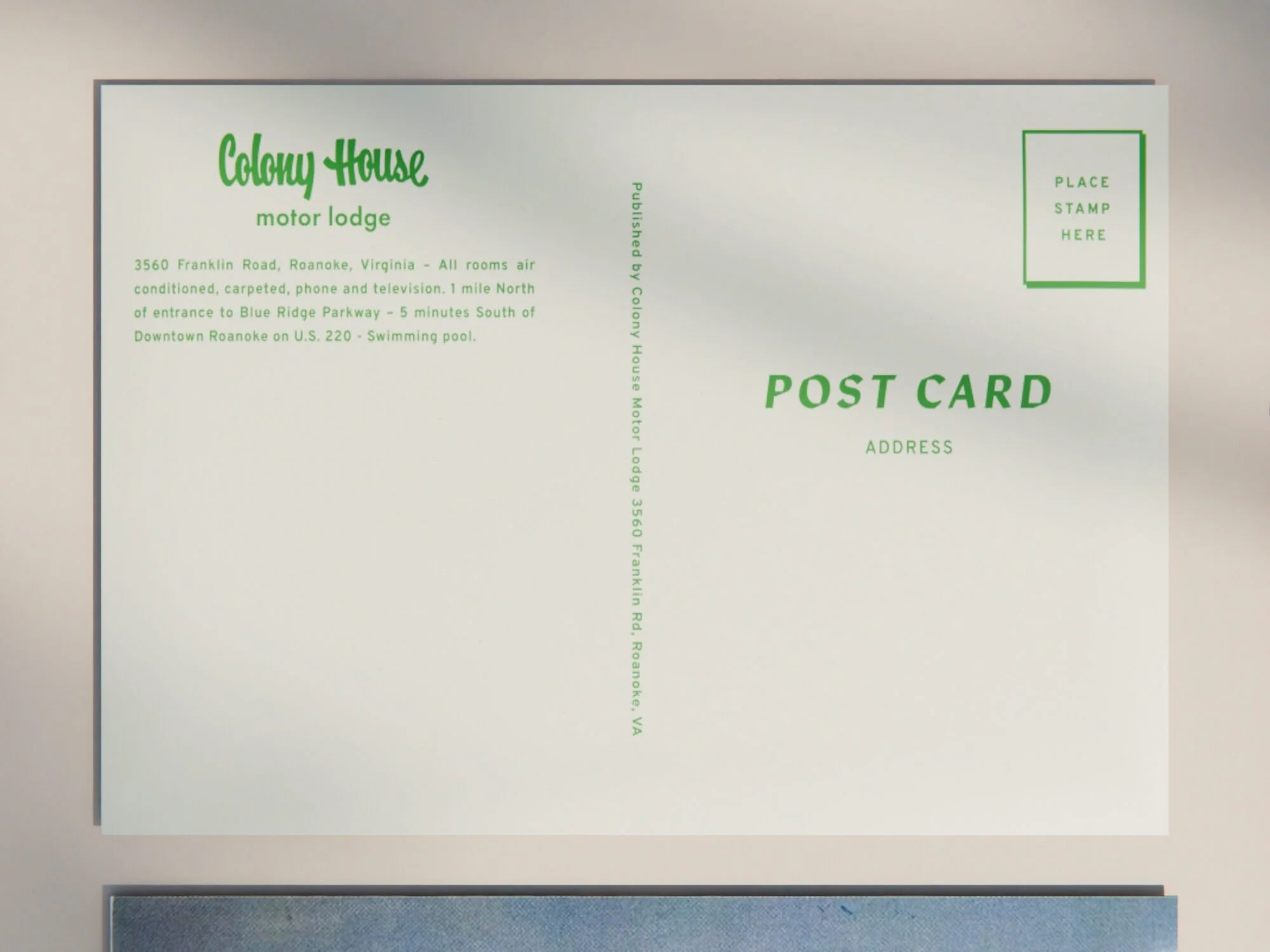
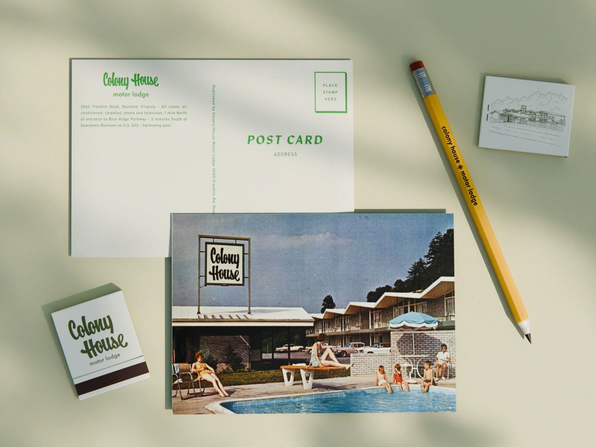
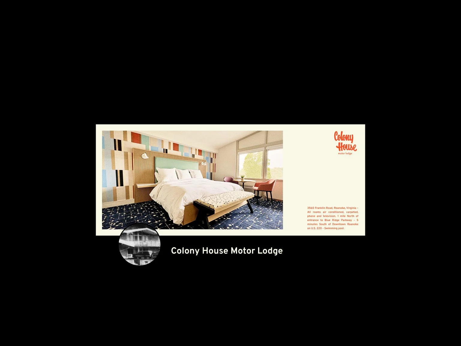
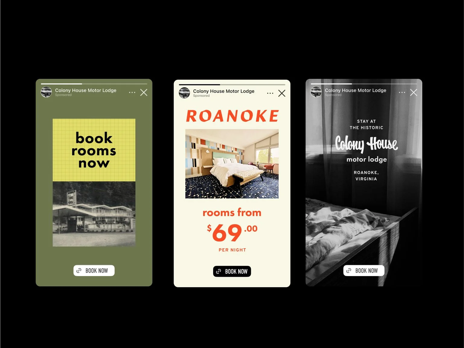
This is revivalism done right—not a costume, not a parody. Colony House doesn’t cosplay the 50s and 60s. It remembers them. It resurrects the vibe without embalming it. The typography alone is enough to make you want to check in, drop your bags, and take a Polaroid. Custom letterforms full of mid-century charm play elegantly across the brand, paired with quiet restraint in layout and tone. It’s signage you want to touch. A logo you want on a keychain.
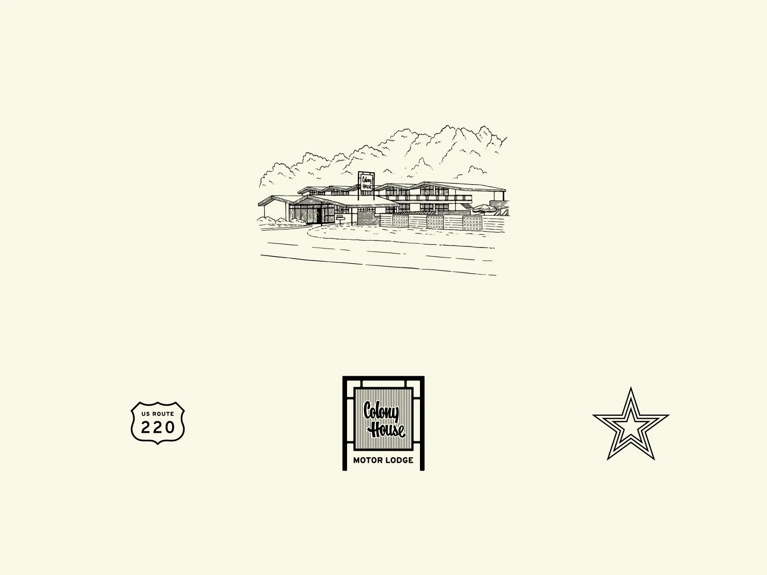
But the soul is in the illustration work. Vintage-style renderings—not overdone, not too kitsch—give the place a storybook quality. They evoke postcards from the heyday of American motoring. Back when road trips had glamour. Before roadside became roadside again.
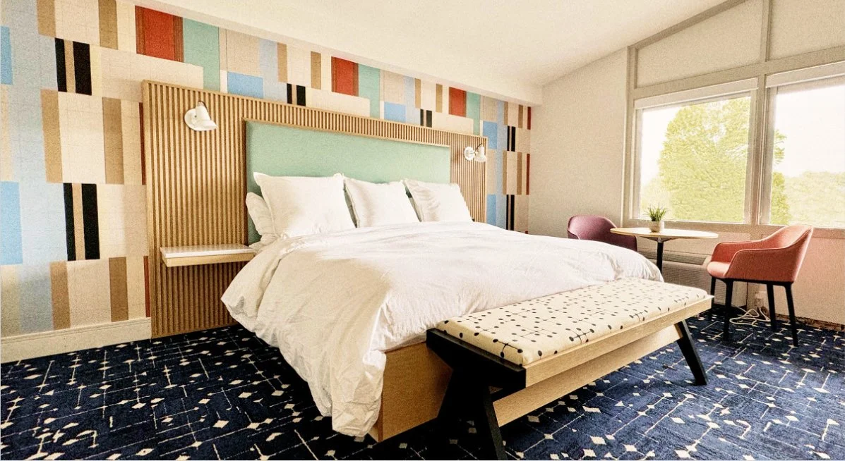
What makes this project shine is what isn’t there. No cheap retro filters. No overreliance on grain or sepia. No gimmicks. Just considered choices—colors that feel like faded filmstock, iconography with backbone, and messaging that knows exactly where it’s going.
Colony House is nostalgia reimagined with clarity. It’s a roadside Americana reboot that doesn’t beg for attention. It earns it.
Credits
Design by Longitude Design