La Condesa restaurant branding

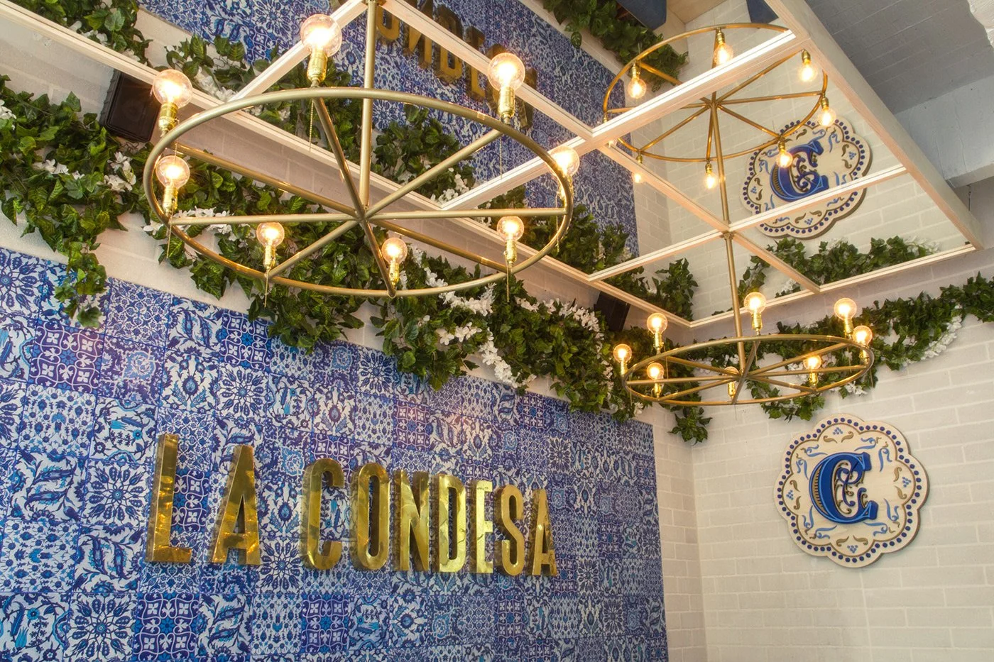
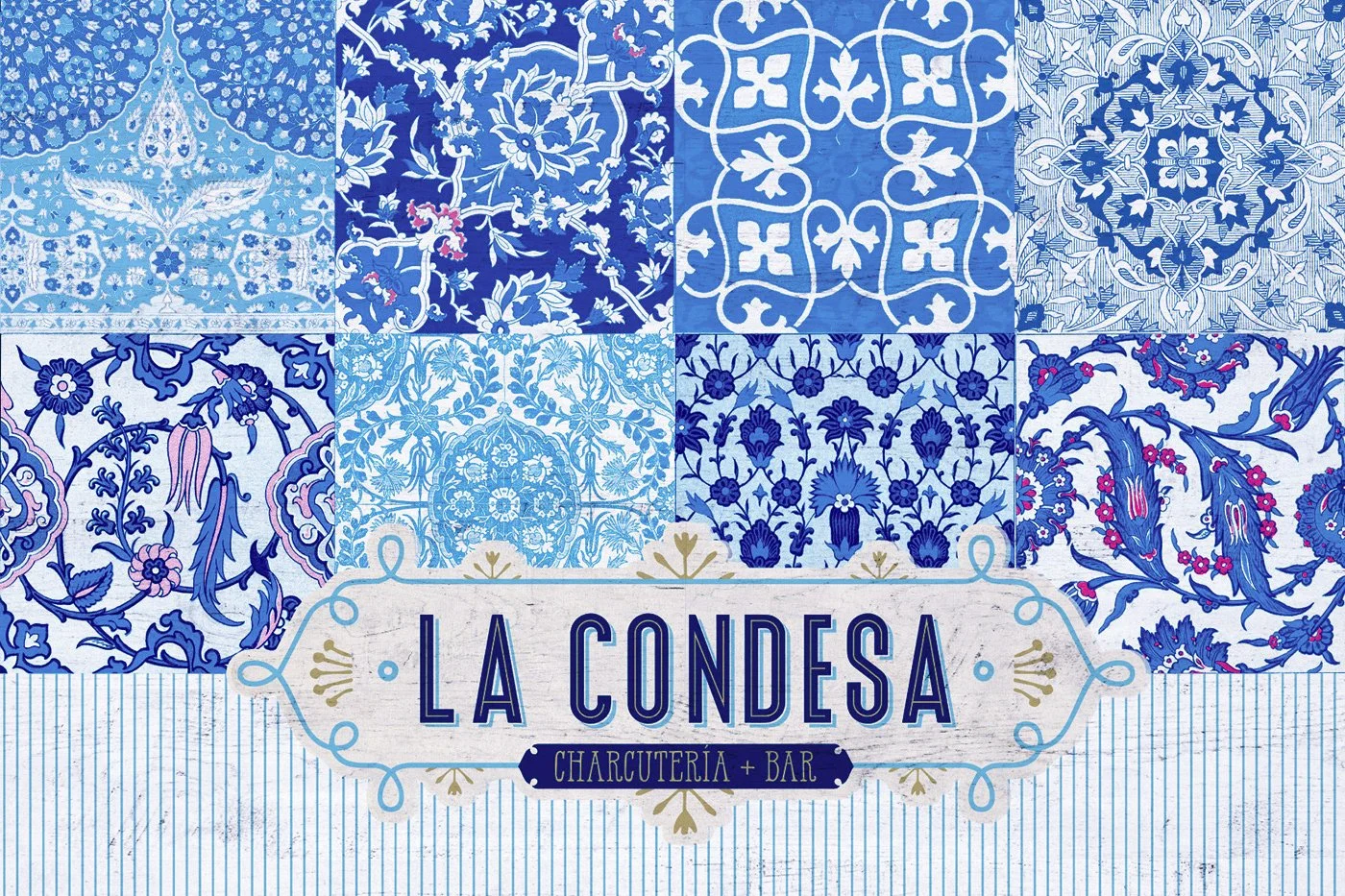
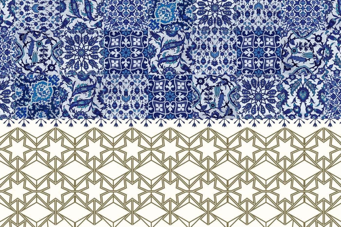
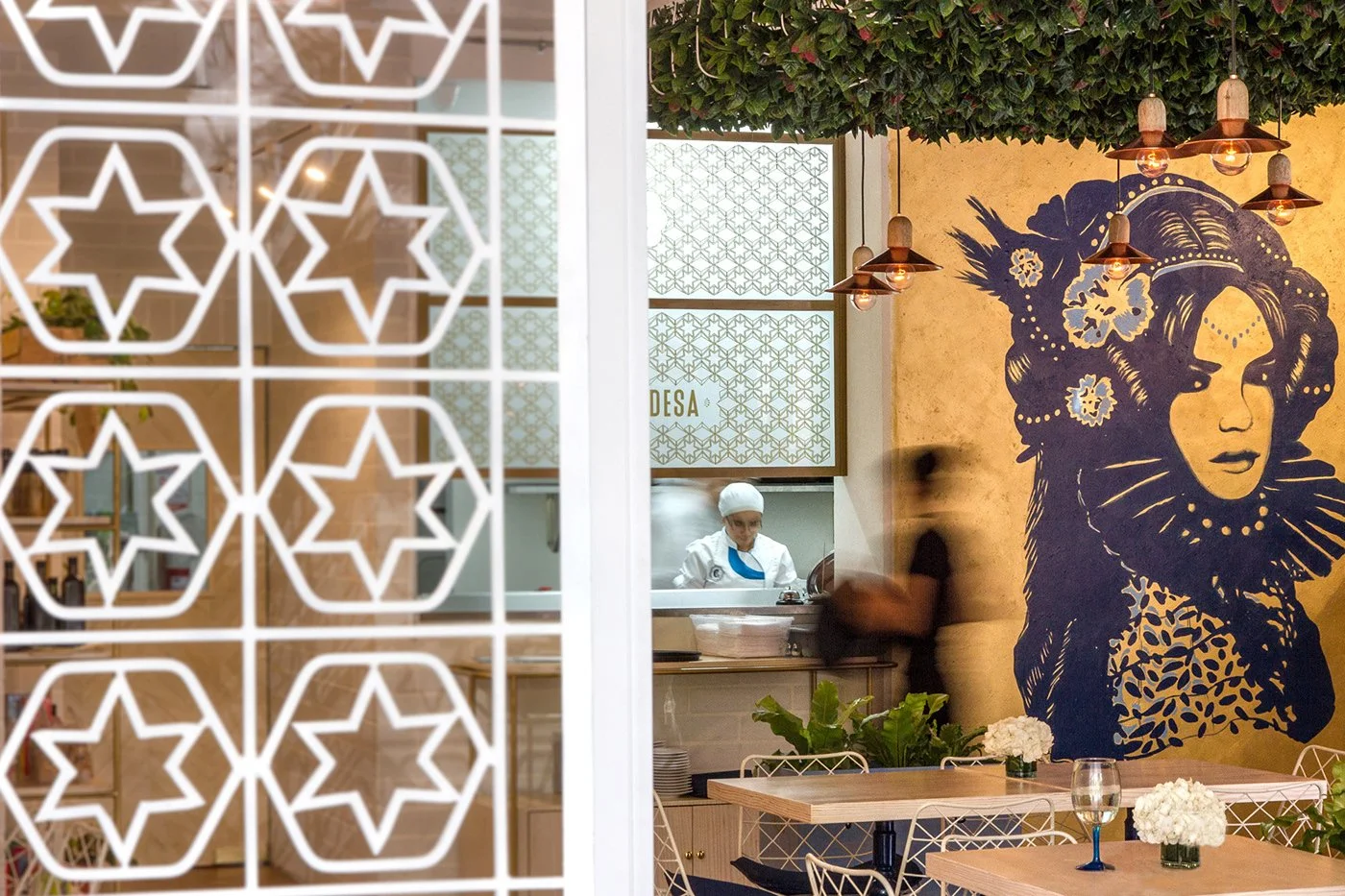
Tiling isn’t just a backdrop here—it’s the story. The walls of La Condesa in Medellín bloom with Portuguese-inspired majolica patterns, but PLASMA Co doesn’t let nostalgia turn stale. These aren’t mere pastiches. They dance. They layer. They flirt with maximalism and then back off right before crossing into chaos. A masterclass in restraint through abundance.
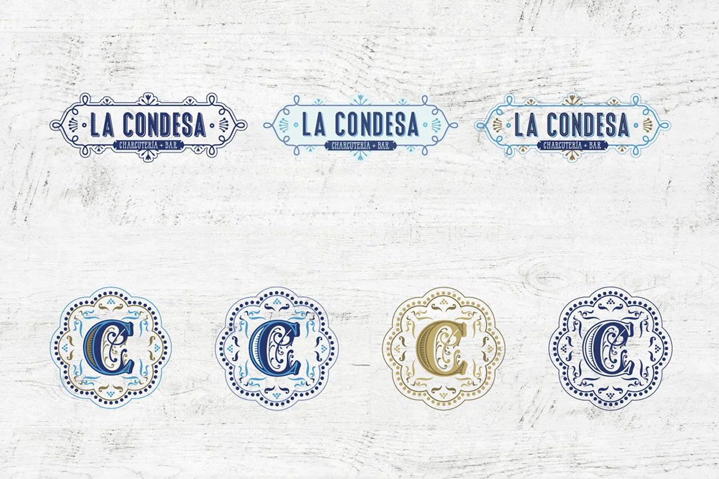
You’d expect visual confusion from a design language this dense. But that’s where the brilliance lies. Every floral burst, every hand-painted tessellation holds its place like a member of a disciplined jazz band—expressive yet composed. The blue-and-white palette does the heavy lifting, establishing harmony before gold accents and typography join in for the punch.
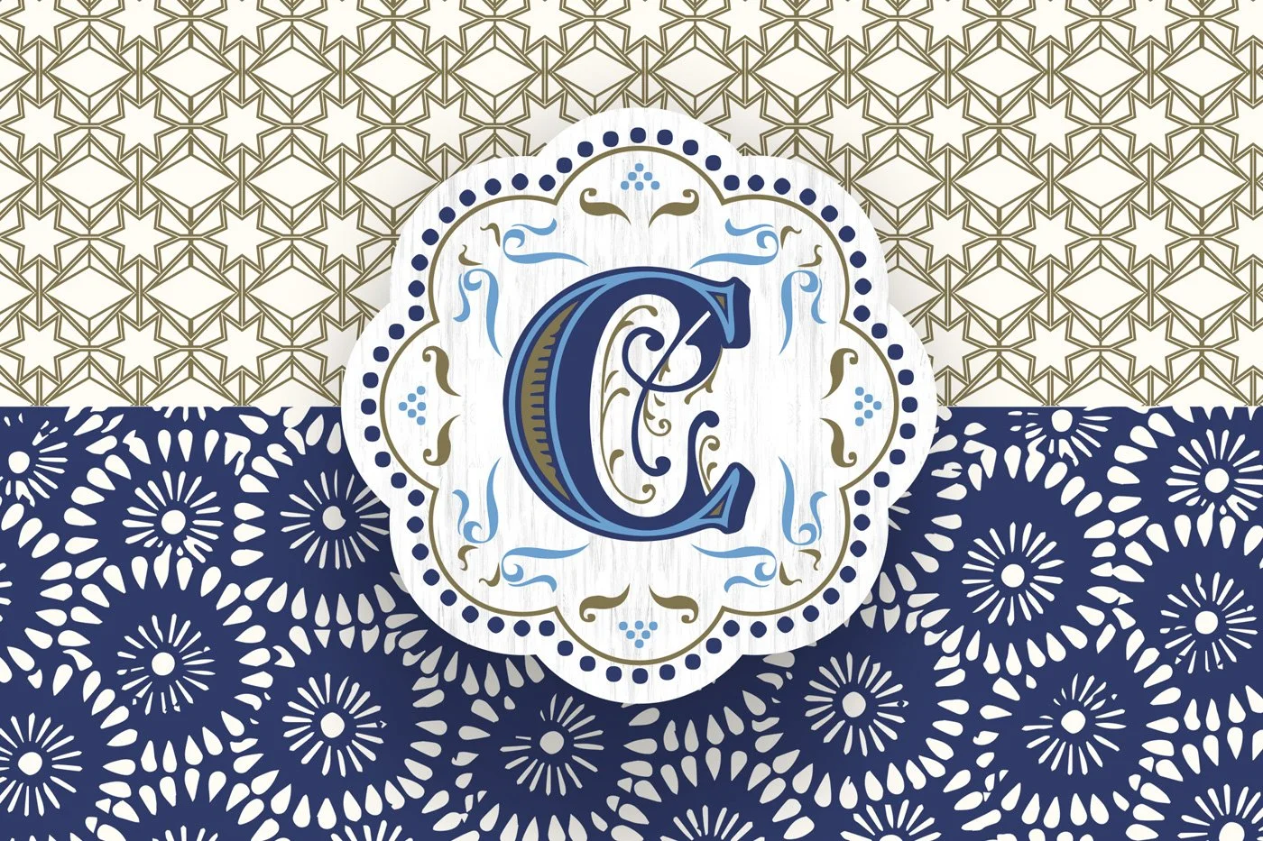
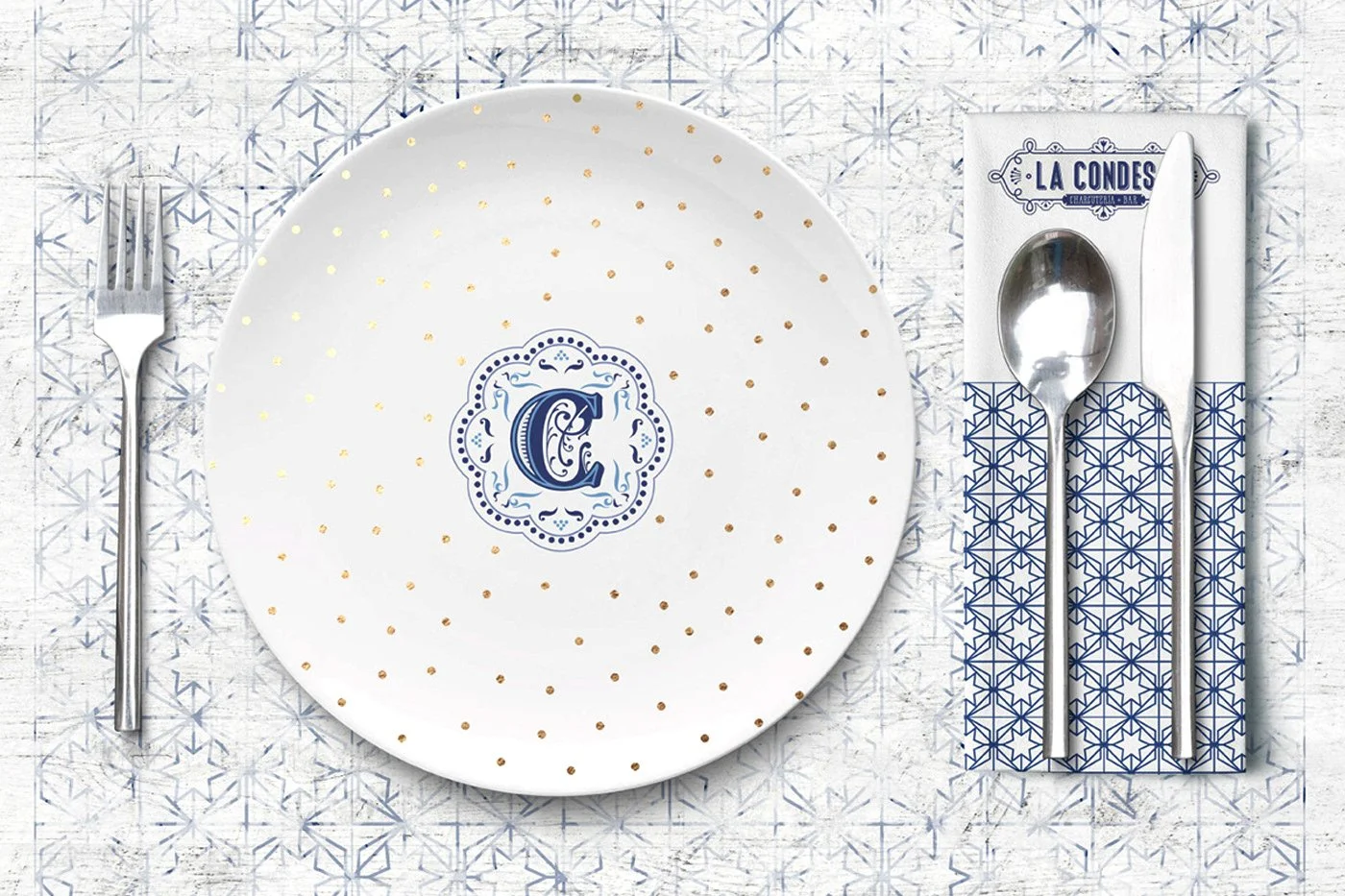
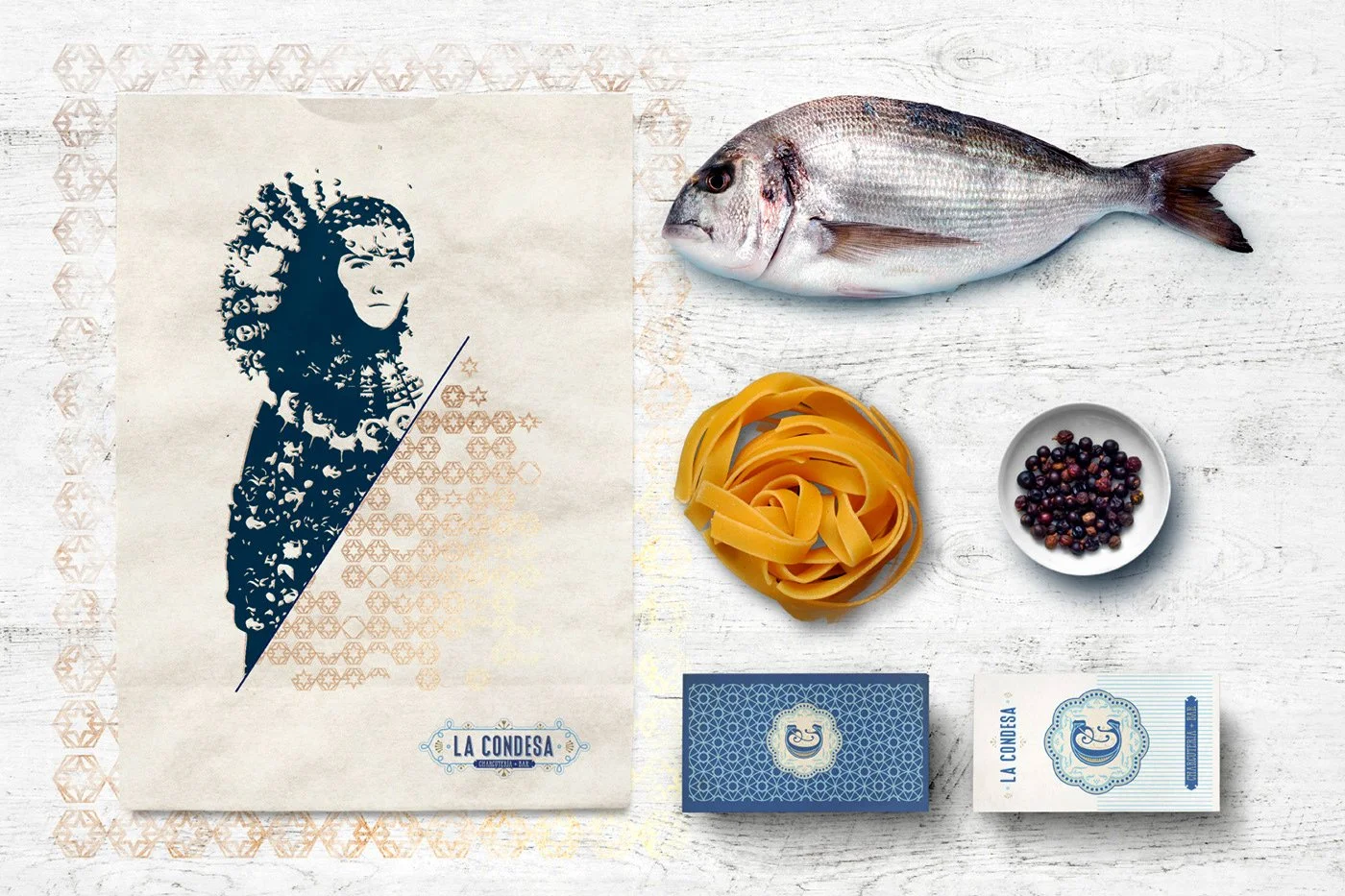
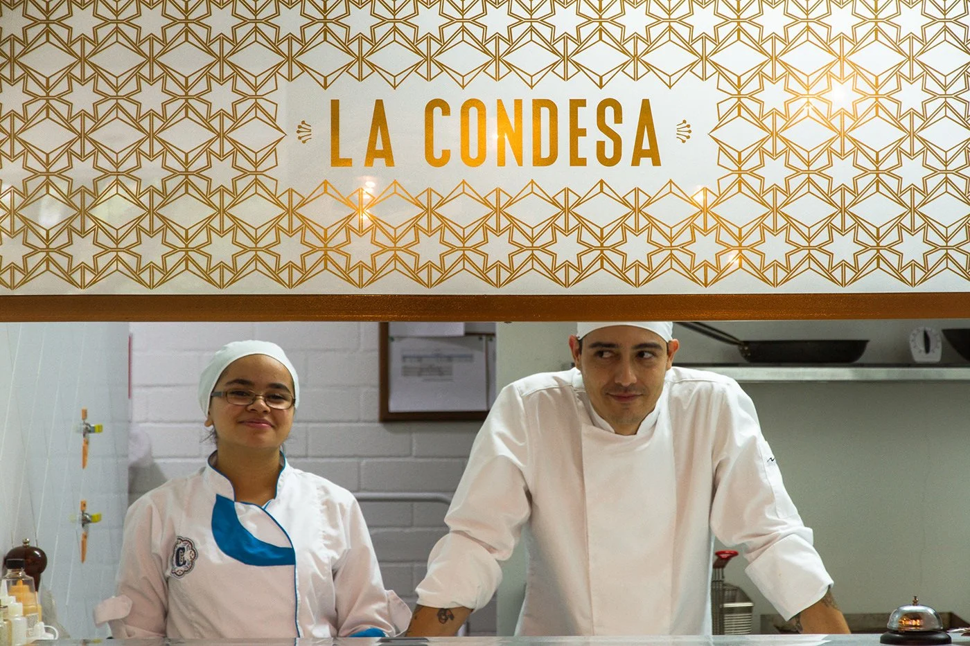
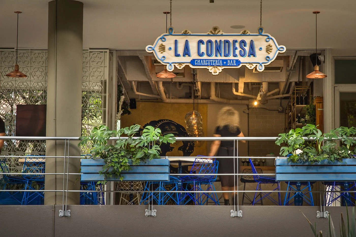
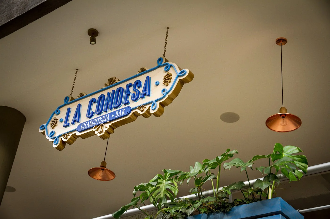
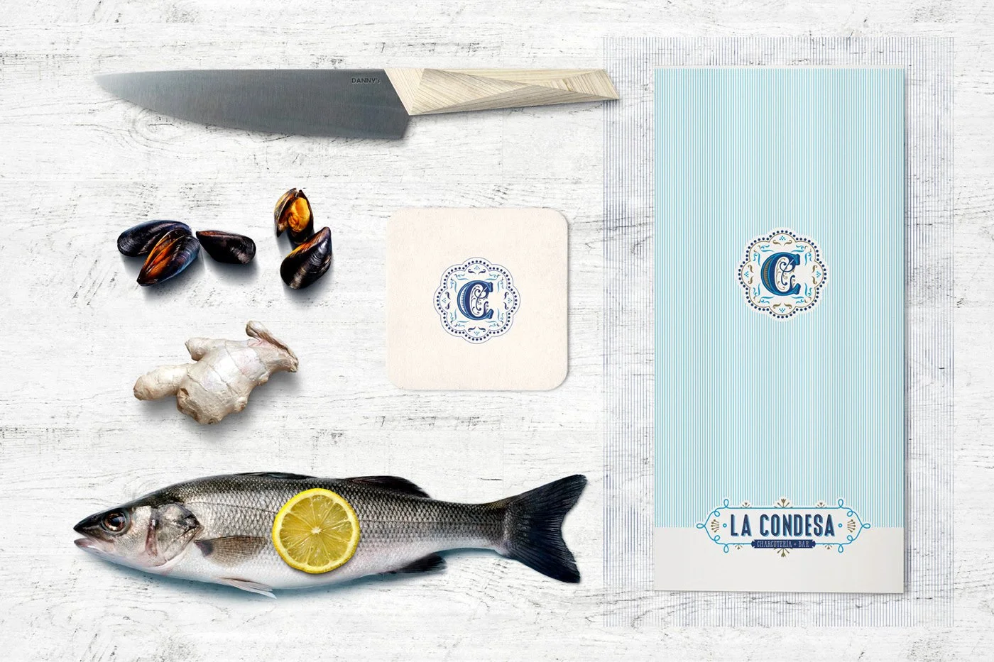
Speaking of type—the signage is confident and elegant. The gold “LA CONDESA” letters sit proudly against the tile, mirroring the gilded chandeliers above. The monogrammed “C” mark with its regal frame leans more decorative, a nod to the restaurant’s namesake nobility. We’d love to see that energy infused more broadly—menus, coasters, campaign material—because that typographic system feels like it has more to give.
The overall brandscape is tightly woven. Patterns aren’t wallpaper—they’re architecture. They’re identity. They show up on napkin sleeves, etched glass, plates, and packaging, always rooted in the brand’s elegant folkloric DNA.
PLASMA Co gave La Condesa more than a visual identity. They built a myth. A place that feels storied before you’ve even tasted the food.
Credits
Brand + Environmental Design: PLASMA Co