Mexican Seoul Restaurant Branding
Mexican Seoul comes in swinging like a mixtape made of molcajetes and soju shots, engineered by Duzi Studio with enough typographic force to rattle the teeth out of tired street food clichés. The entire brand walks the line between Seoul’s neon backstreets and East LA’s lowrider attitude—tight, bold, defiant.
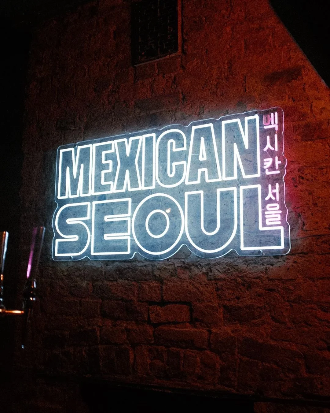
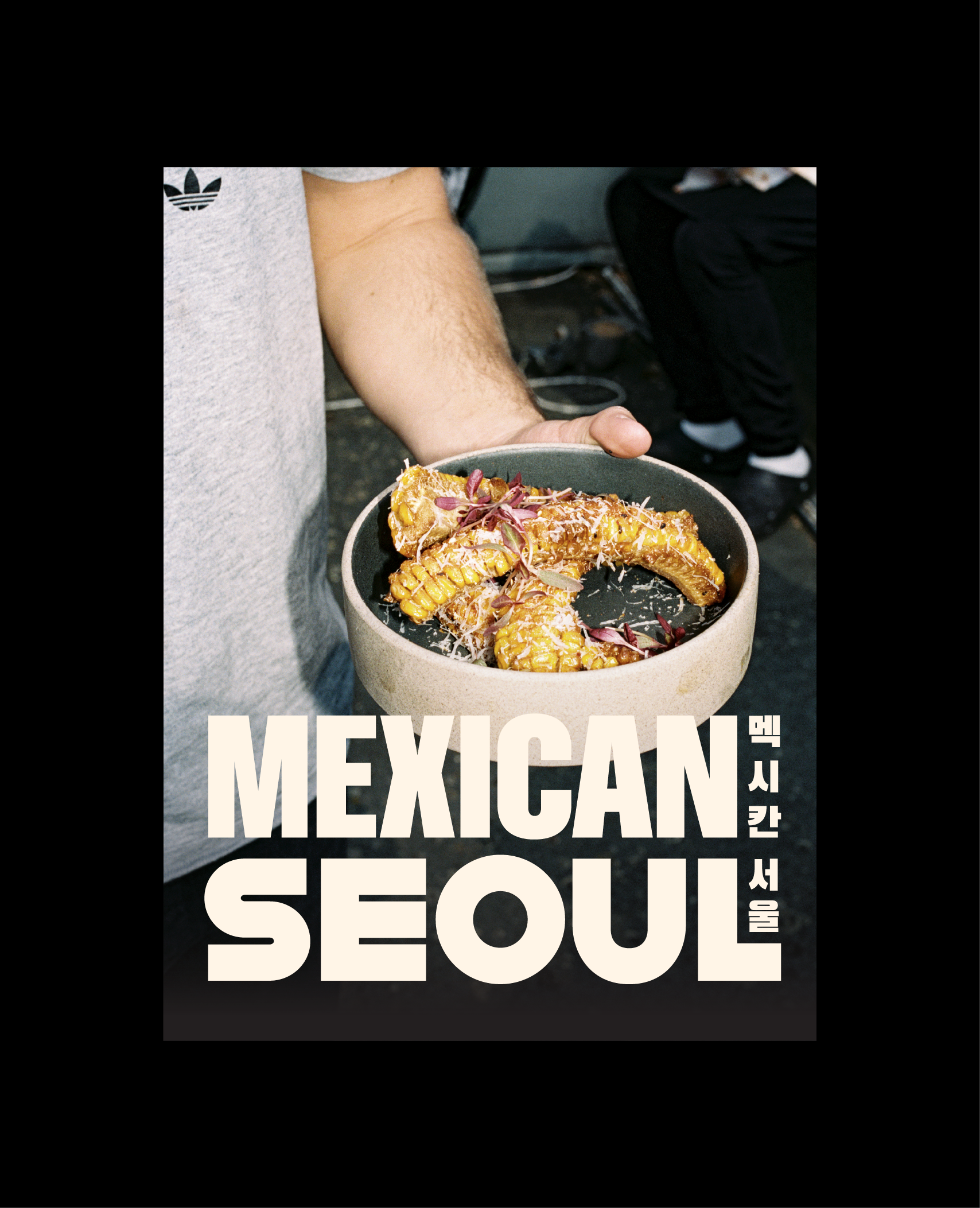
There’s nothing precious here. That heavy, blunt sans-serif is thick like a thumbprint on a hot taco tray—deliberate, brash, undeniable. Whether it’s stacked on a wall, spun into a vinyl motif, or locked up beside Korean characters, it owns its space. This isn’t fusion food. This is collision cuisine, and the logo says that before the food ever touches lips. The vertical Korean characters alongside the name aren’t just translation—they’re part of the architecture. They ground the brand in authenticity without feeling like ornamental garnish. Smart move.
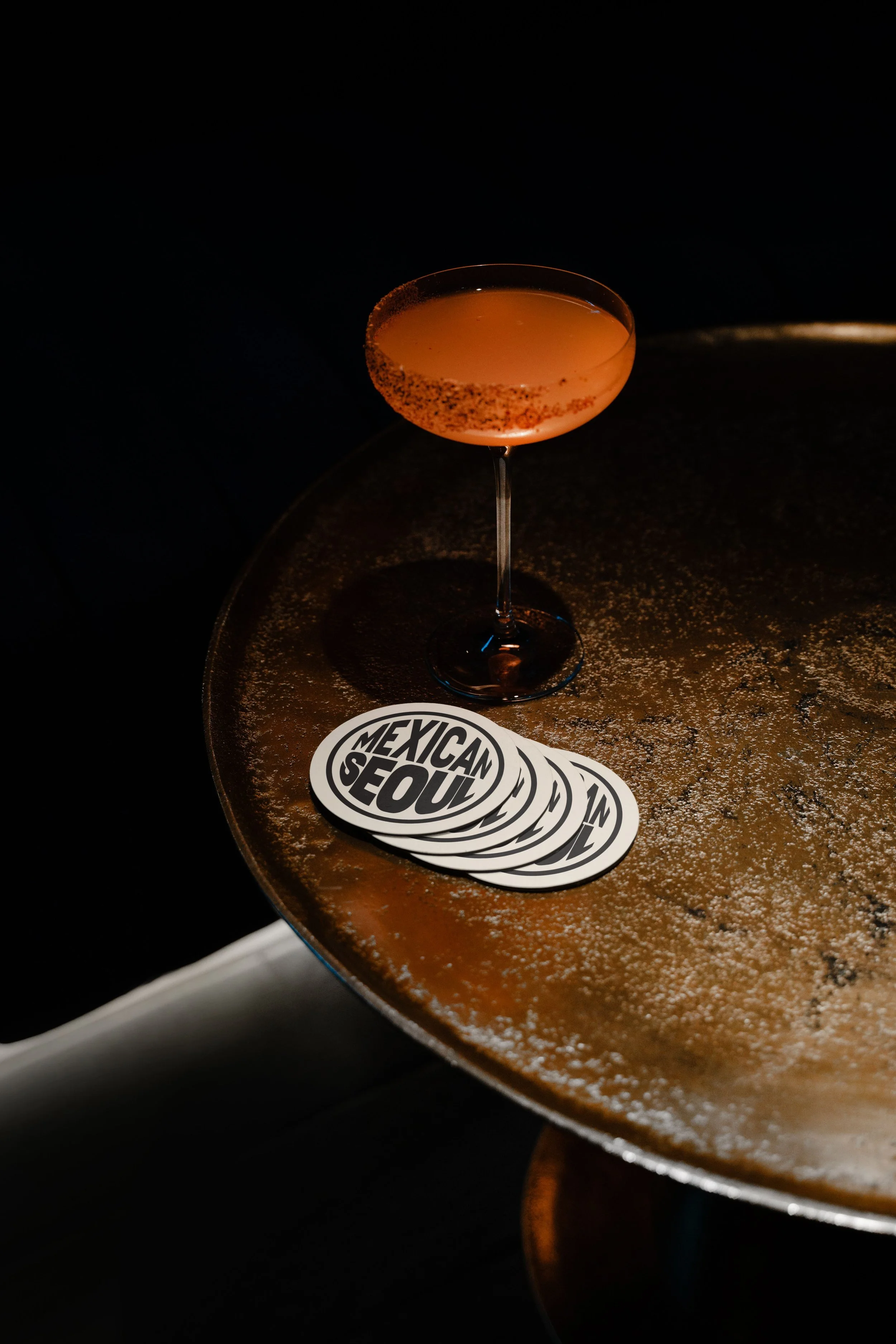
And then come the alt logos and badges. The vinyl thumbprint. The “Souls of Mischief” homage. The tongue-in-cheek, hand-drawn “Seoul” thumbs-up. It’s a visual mixtape—bootleg, boot-stomping, and beautifully self-aware. There’s a hip-hop backbone pulsing through every asset, and it feels lived-in.
This isn’t your grandma’s kimchi taco stand. Duzi didn’t just brand a restaurant—they branded a crew. The tone drips with swagger and a dash of controlled chaos. There’s a punk-band-in-the-kitchen energy. A “we serve it how we want” posture. Even the marketing collateral feels bootlegged in the best way—grainy flash photography, gritty kitchen shots, and copy that talks like the coolest kid in your neighborhood bar.
Black. Bone. And a whole lot of attitude. The restrained palette keeps the branding tight and muscular. It leaves room for the food, the people, and the chaos to take center stage. You don’t need a rainbow when your voice is this loud. It’s Madlib, not Mozart.
Photography pulls no punches. Garage-band editorial. Flash-bang shots in the kitchen. Hands, faces, smirks. Drips of sauce and sweat. Every frame feels like it was stolen mid-shift between fryer pops and tequila pours. It’s messy and intimate, like you just got let into the greenroom after the first encore.
If there’s anything to pick at, it’s that the brand is so confident, it risks becoming a uniform. When everything is shouting, you need to find moments to whisper. A little breathing room in menu systems, maybe. Or a quieter moment in layout to let the food do the talking. But then again, maybe not. Maybe that tension is the point.
This brand isn’t trying to be liked by everyone. It doesn’t do polite. It does presence. It’s a middle finger dipped in mole, served on a black vinyl platter with Korean heat underneath. Mexican Seoul doesn’t just feed—it performs. And Duzi Studio didn’t just brand it—they lit the damn stage on fire.
Credits where they’re due: Brand & Identity Design by Tom Hughes and the crew at Duzi Studio. Photography direction feels like a beautiful mess shared between designer and crew. Find the brand raising hell at @mexican.seoul.
This one doesn’t slap. It body slams.


