Mitchelton hotel branding

Some brands shout. Others whisper. Mitchelton doesn’t bother with either. It simply exists. Unmoved. Unhurried. Uncompromising. A hospitality brand forged from the same soil its wines grow in—rooted, steady, and entirely sure of itself.
This isn’t just branding—it’s architecture in print, signage, and screen.
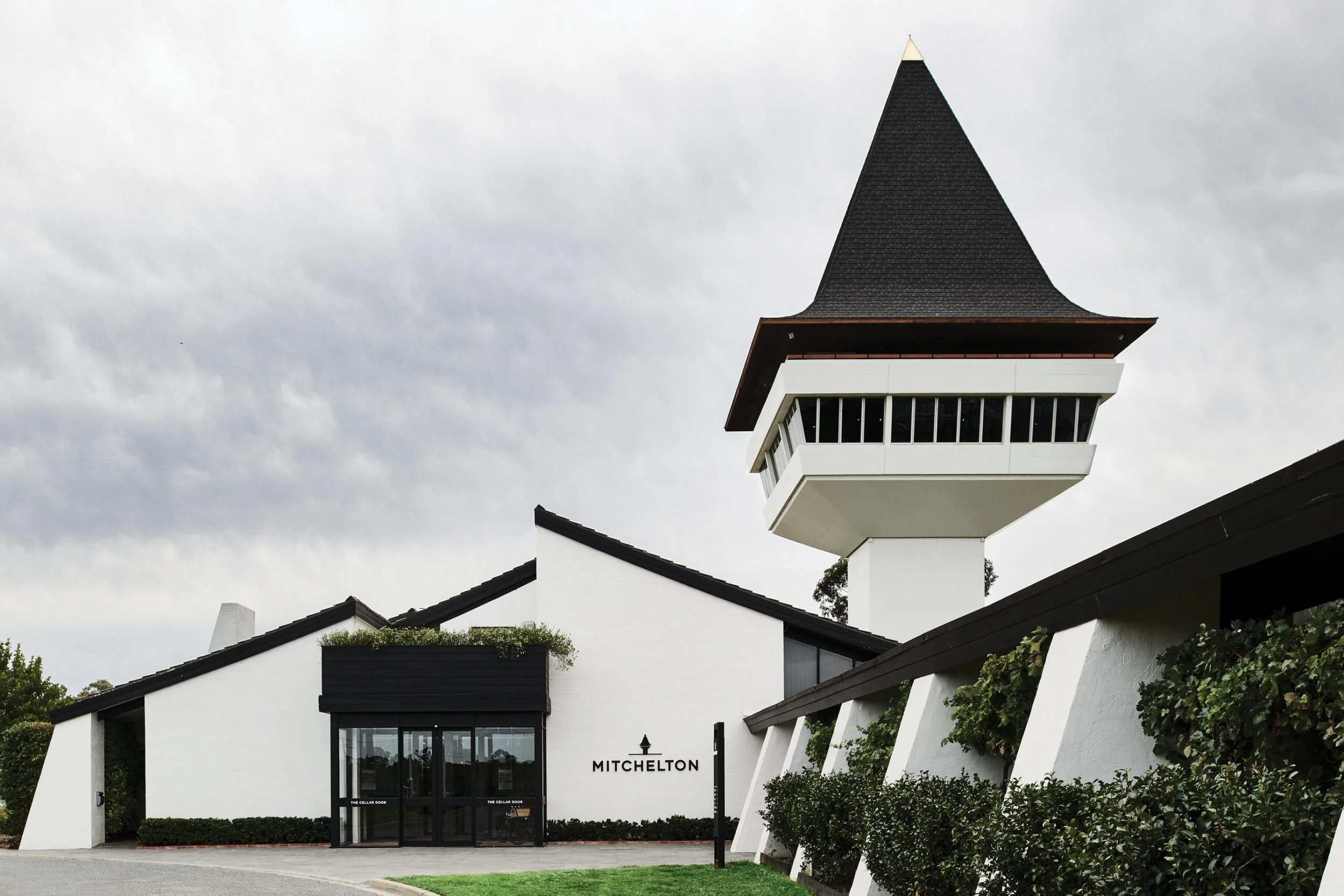
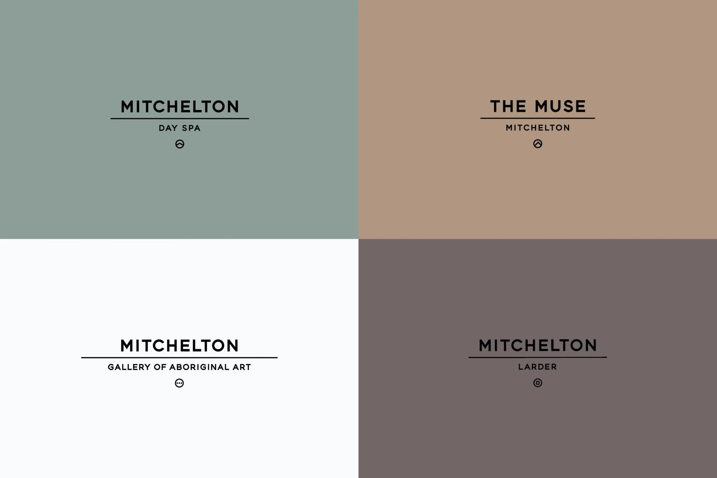
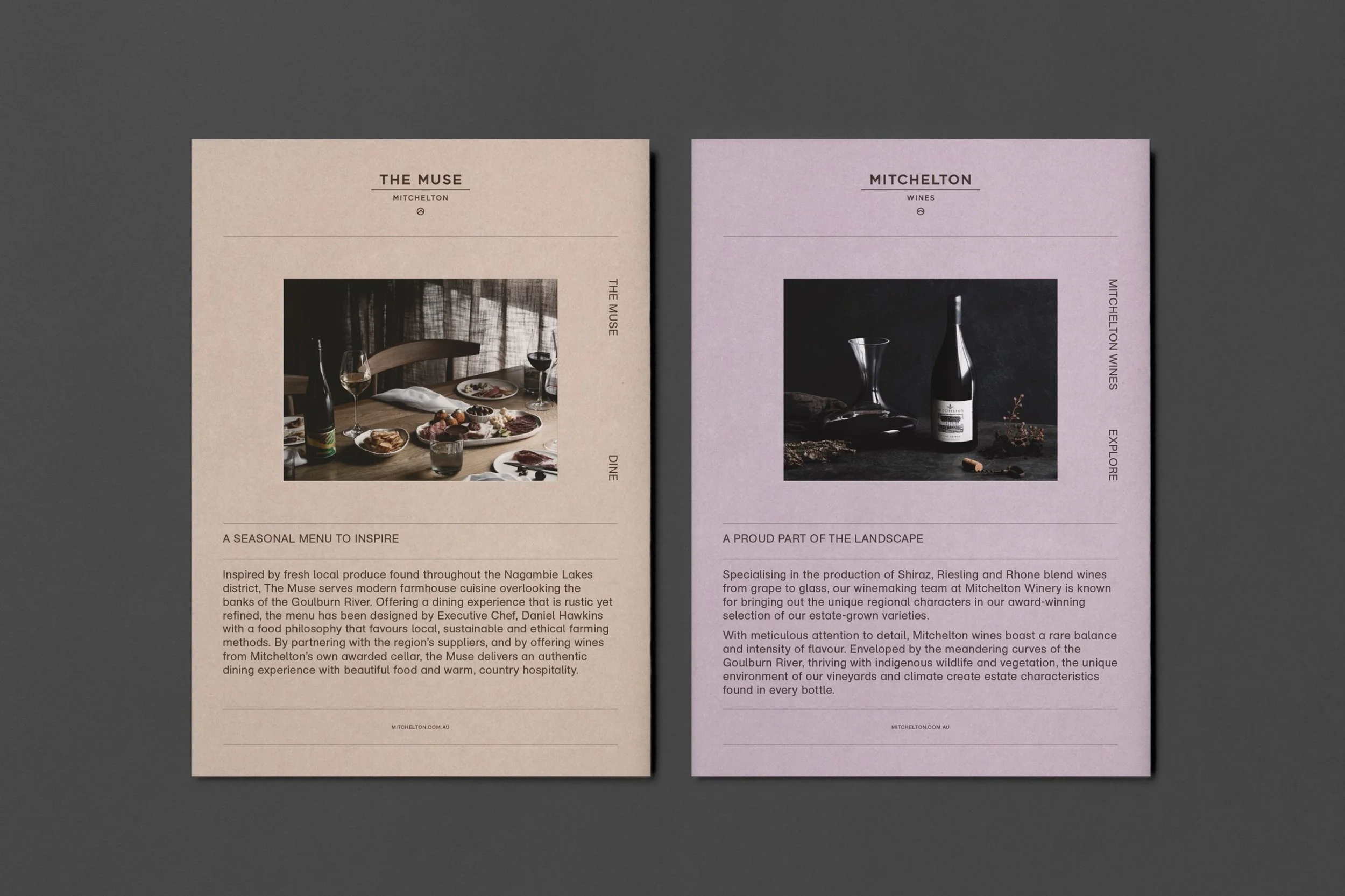
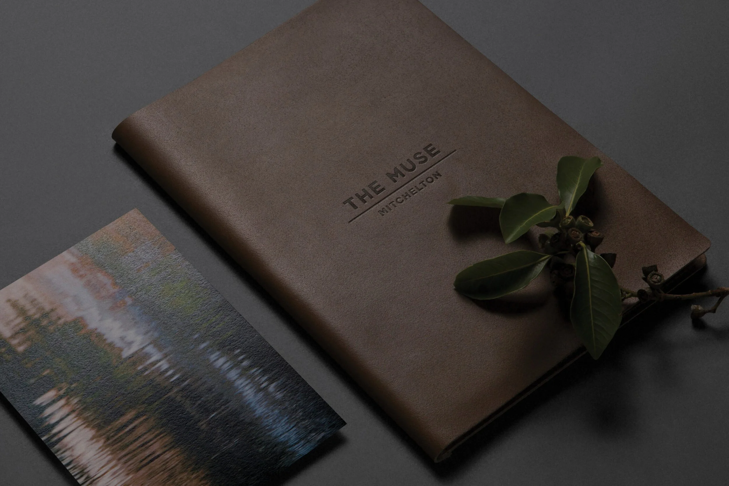
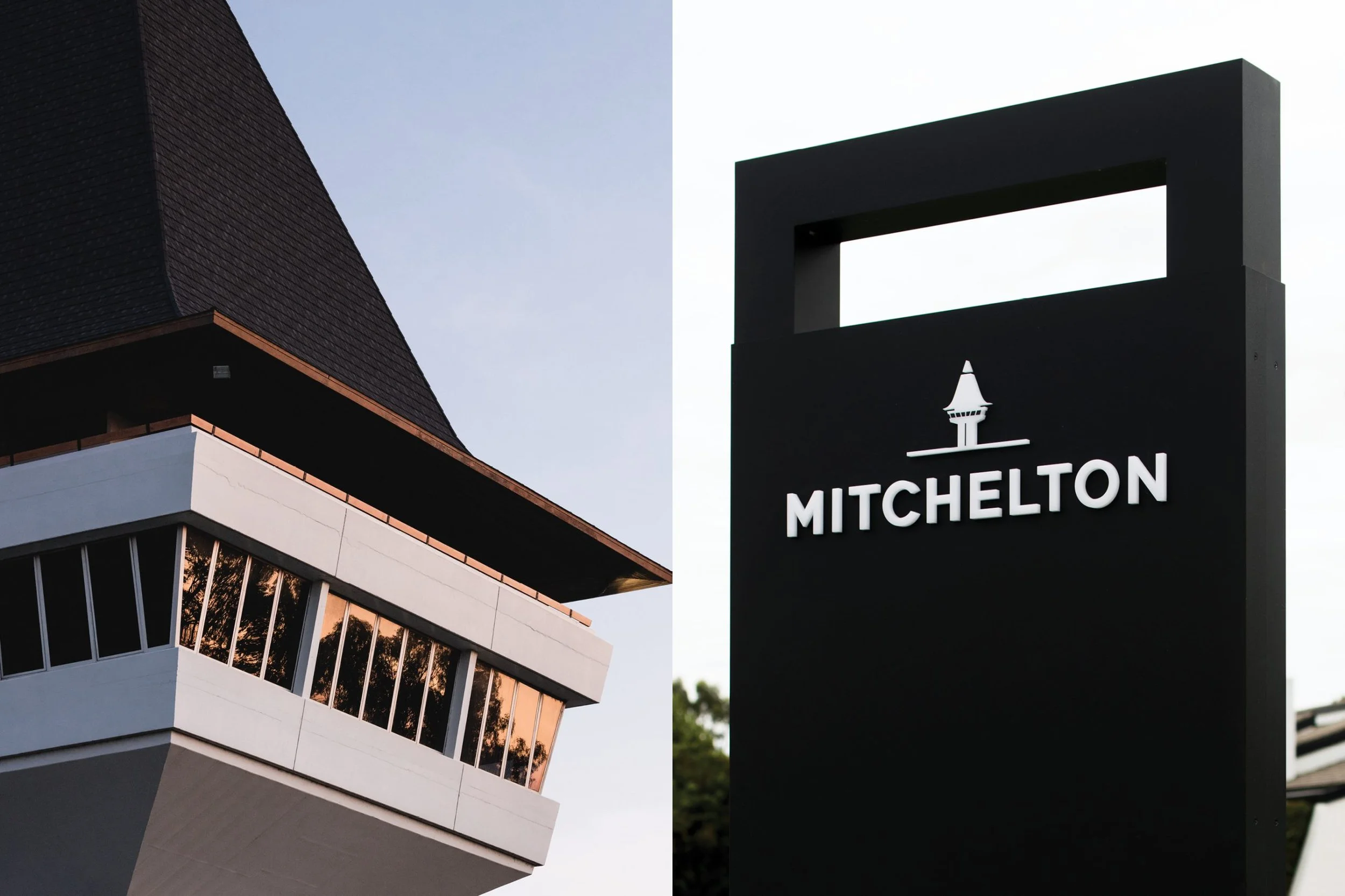
Every inch of this identity system feels like it belongs on the land it represents. Chalky, earthen tones pull from clay, eucalyptus, dusk, and riverbanks. The typography—geometric, bold, yet never boastful—sits on the page like carved stone inscriptions. The underline motif, subtle but deliberate, acts as a structural beam tying together hotels, wines, spa, and restaurant under one roof, yet allowing each space its own quiet distinction.
And the grid? Ruthless—but beautiful. Everything is locked in, squared off, as if designed by surveyors instead of designers. And somehow, it doesn’t feel cold. It feels honest.
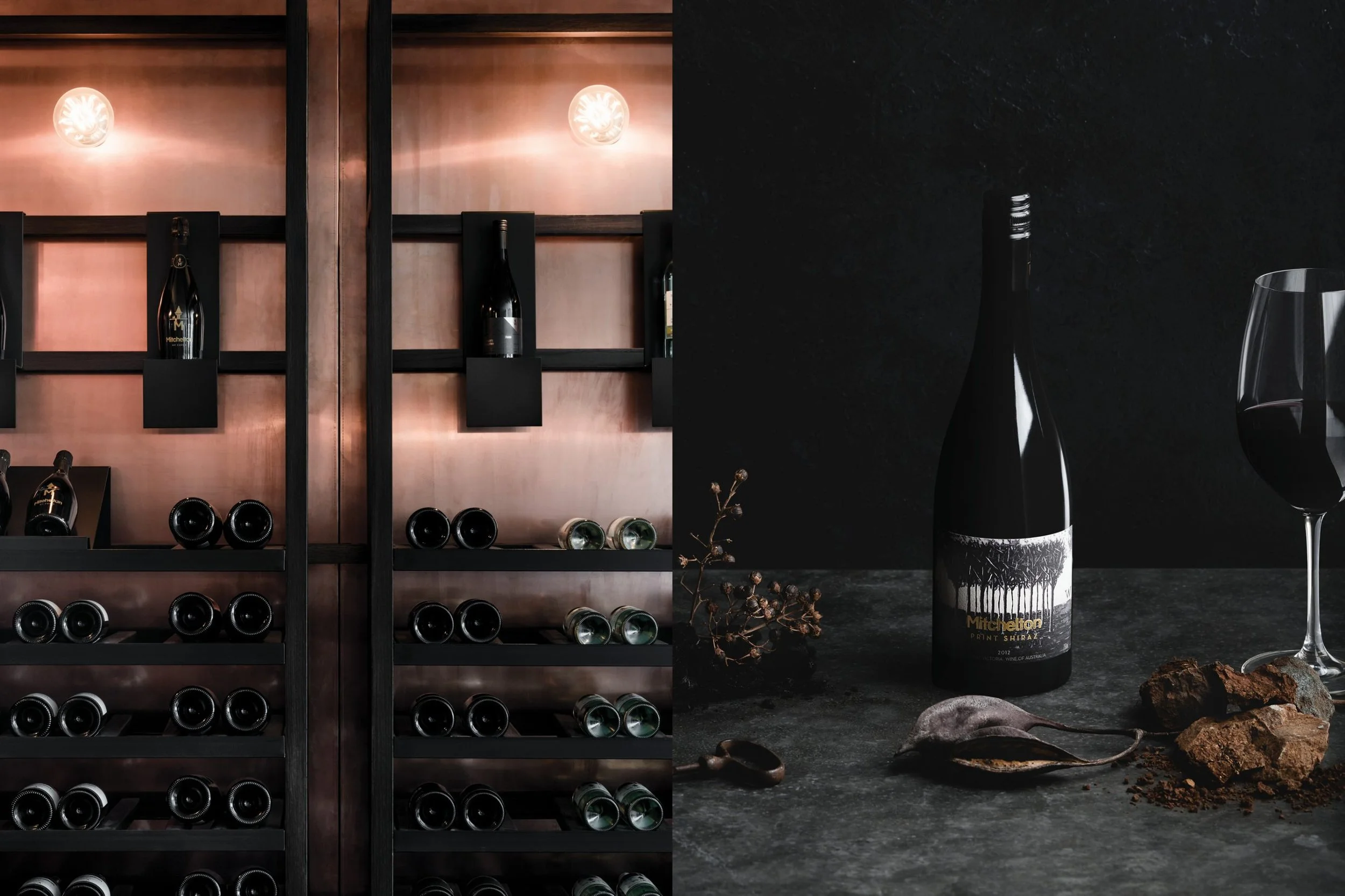
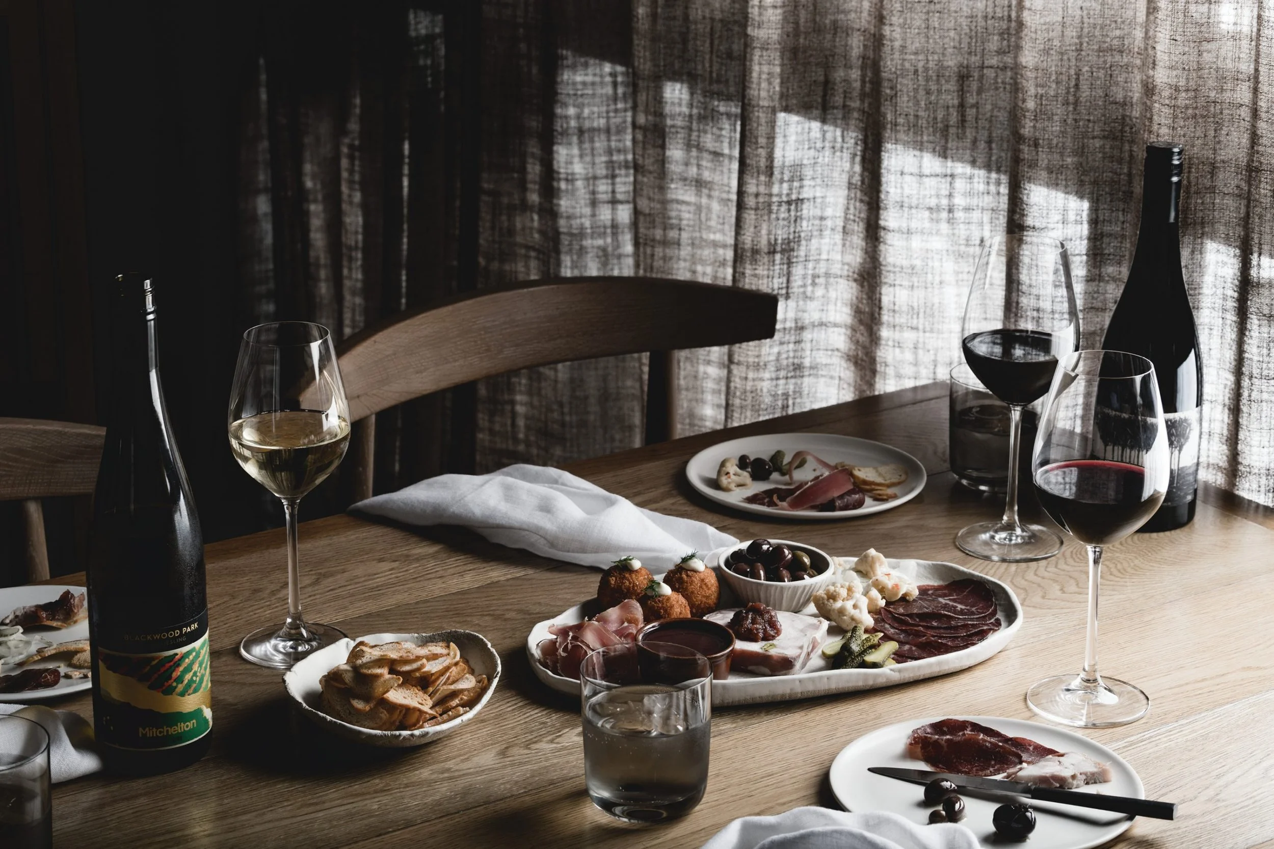
Then there’s the photography—moody, textural, intimate. Tables set but untouched. Wine resting in deep shadow. Linen rumpled just so. It’s the kind of visual storytelling that makes you lean in, breathe slower, and feel the space.
This is a branding system for those who understand that power doesn’t come from noise. It comes from precision, from place, from patience.
The world needs more brands like Mitchelton. Brands that know exactly who they are—and don’t give a damn if you need a second to catch up.
Designed by Pop & Pac in South Melbourne, Australia
Architectural & Interior Design, Hotel by Hecker Guthrie
Copywriting by Big Wordsmiths
Folder Production by Foldercorp
Photography (Environment) by Tom Blachford, Kate Ballis
Photography (Collateral) by Foliolio
Printing by Bambra
Signage Manufacturing by Premier Graphics