Lokol restaurant branding
Lokol, designed by Carla Palette, doesn’t pander to trend. It weaponizes it. This is not your typical neighborhood eatery trying to feel “down the street” cute. It’s a design system that flips the script on community branding and writes its own manifesto in unapologetically chunky forms, sun-faded tones, and an identity that sits somewhere between brutalist zine culture and a handmade farmer’s market stencil kit—on mushrooms.
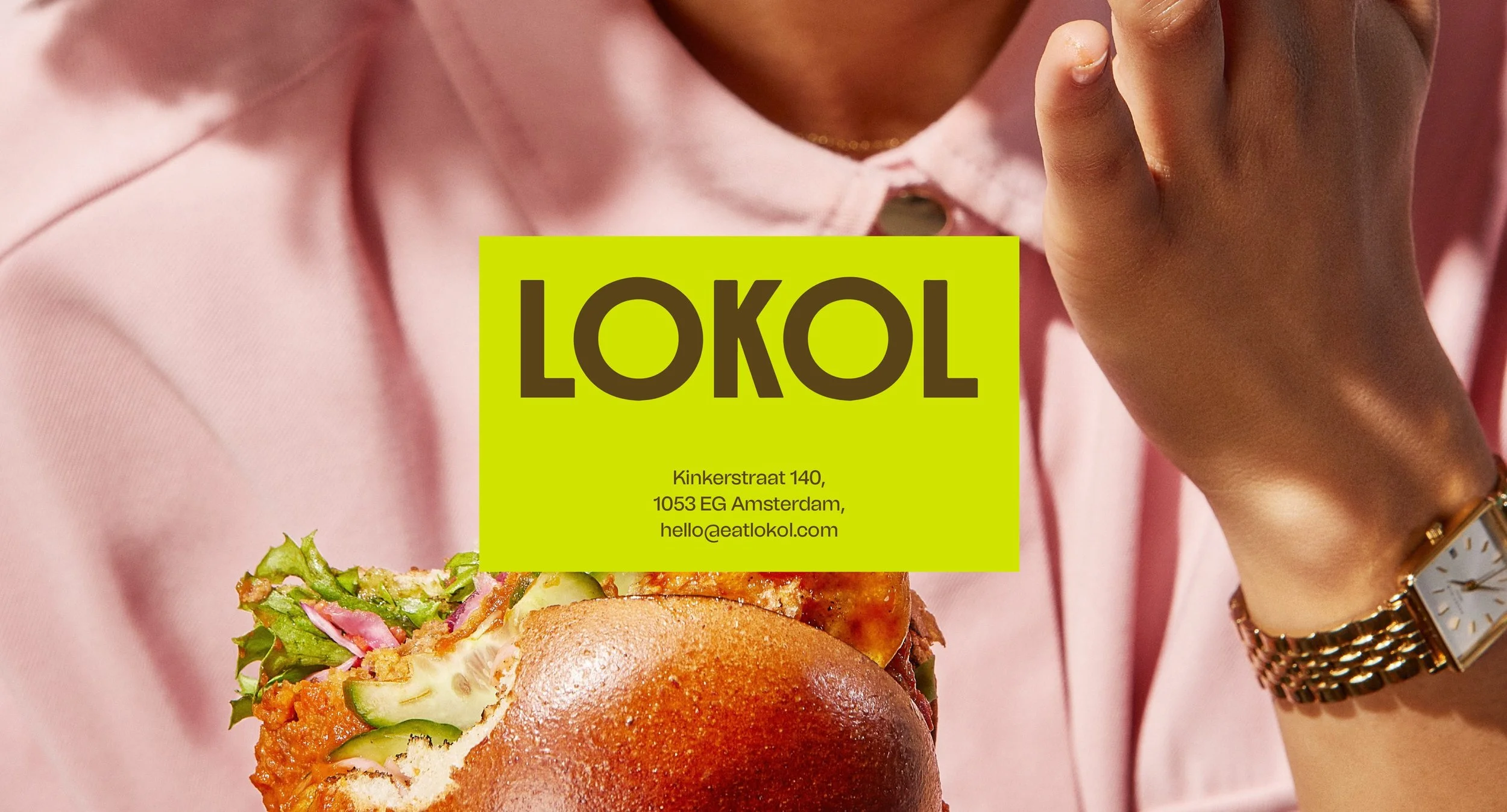
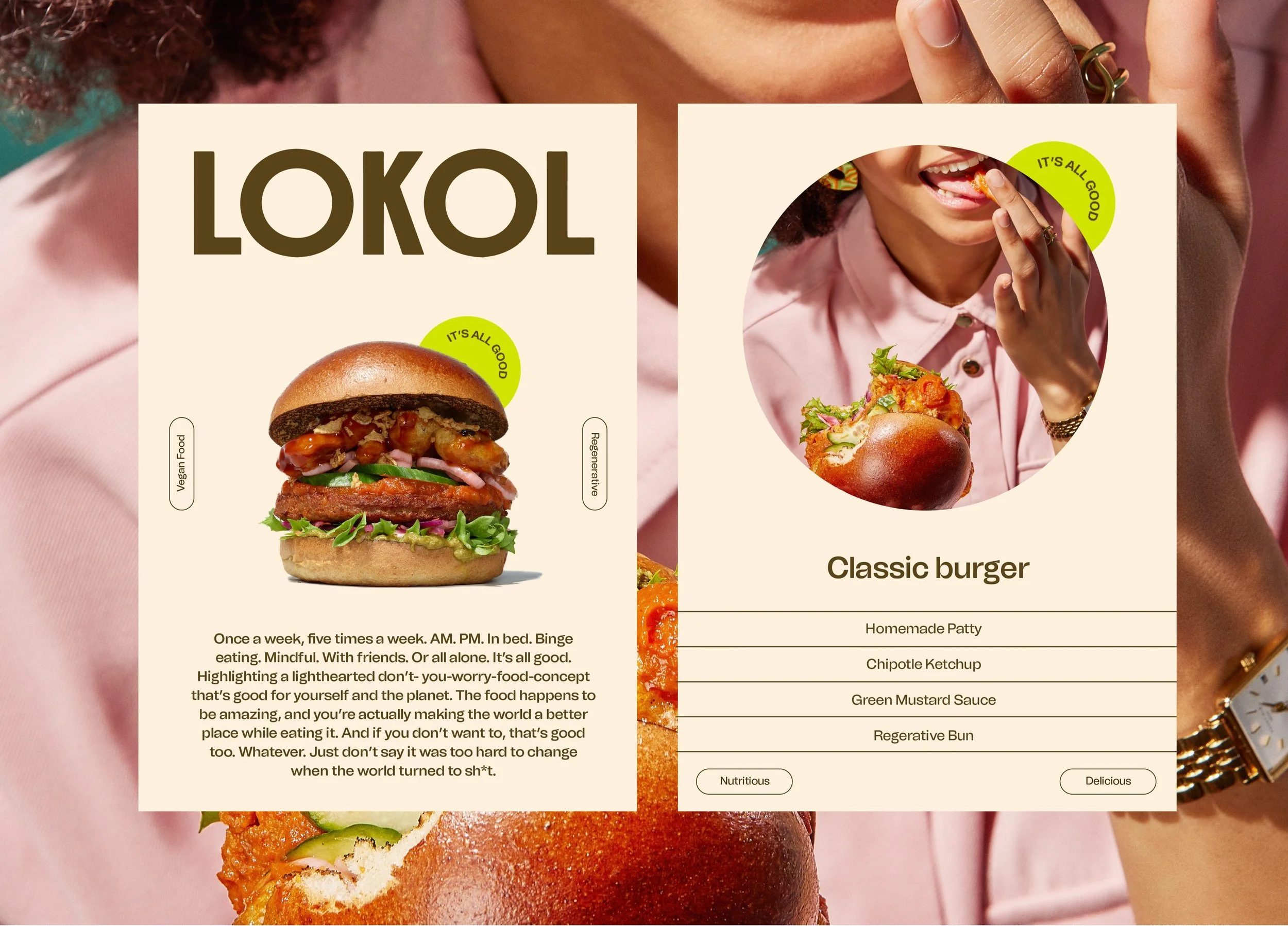
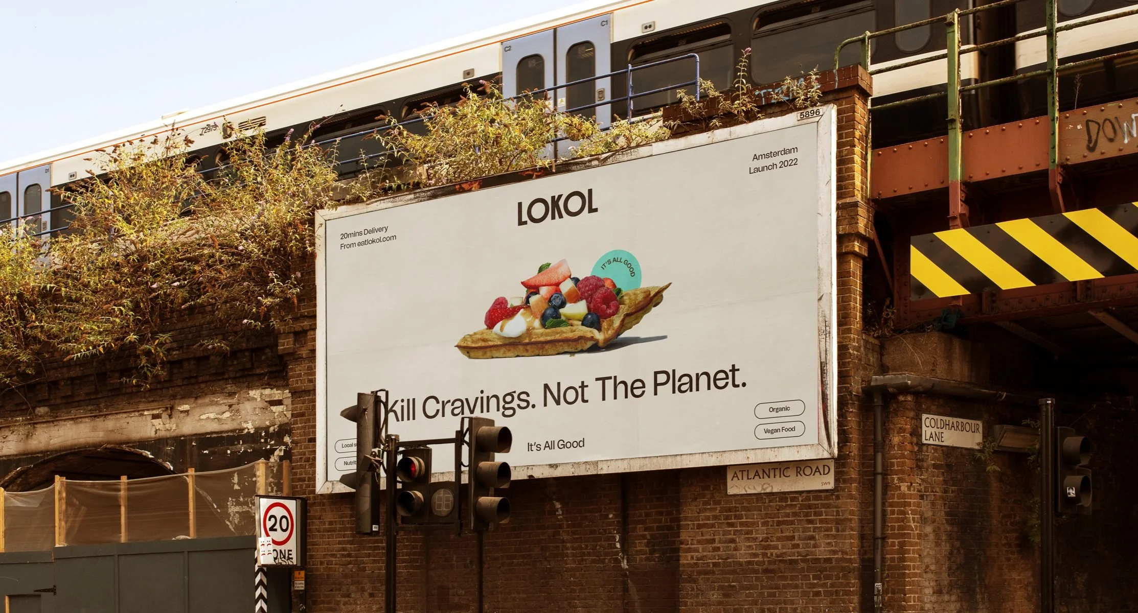
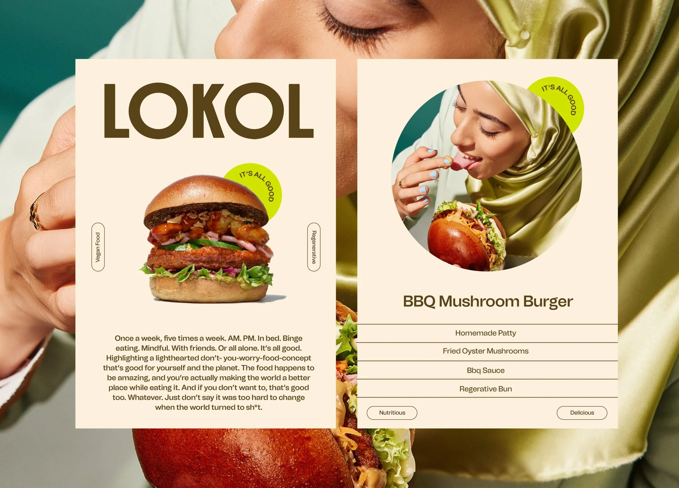
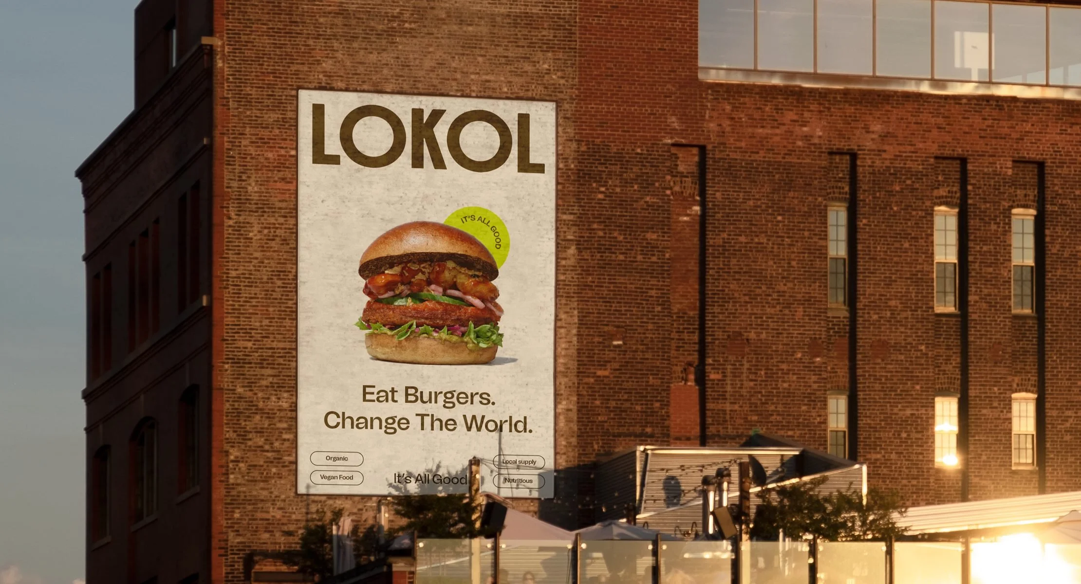
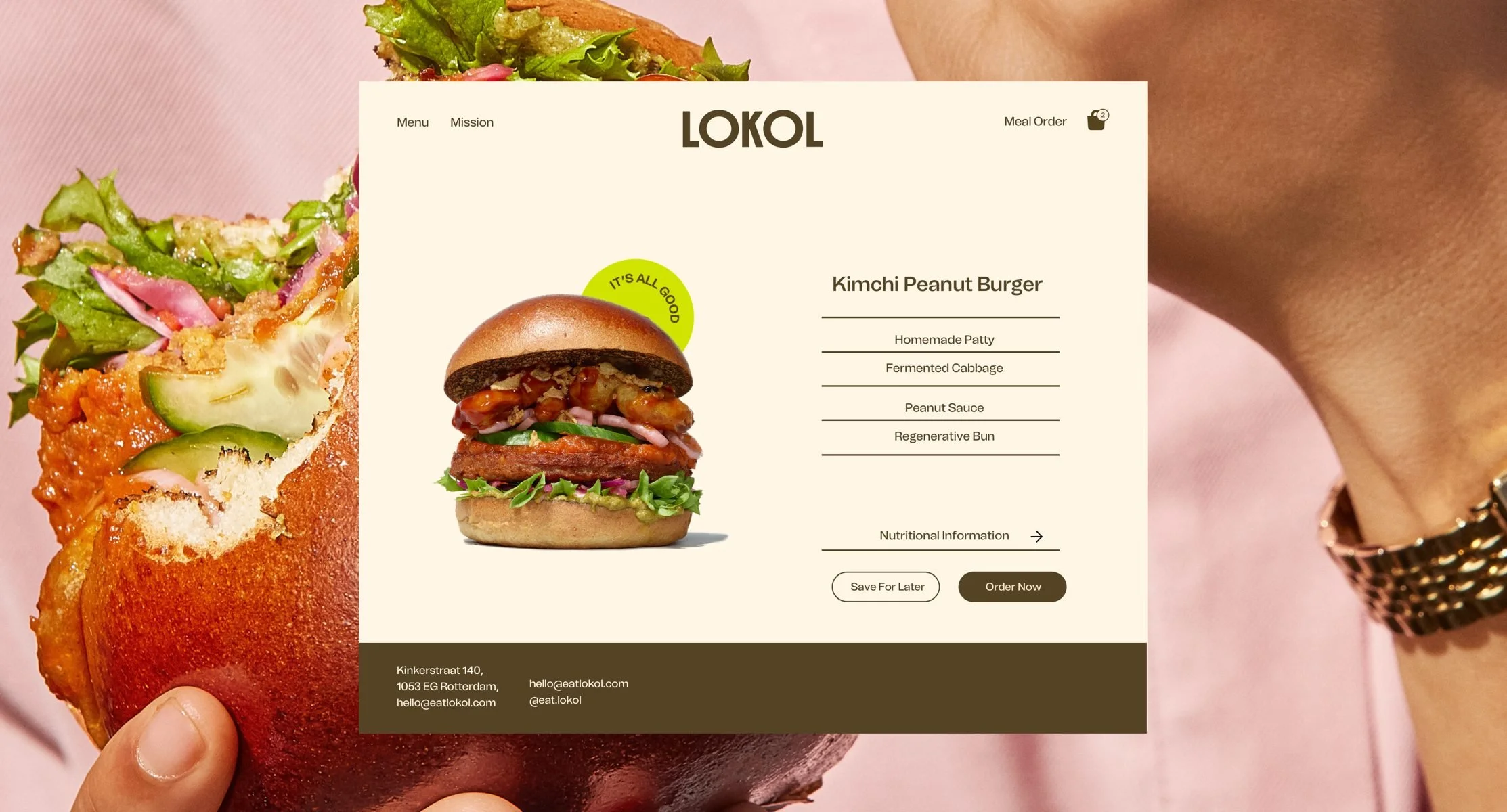
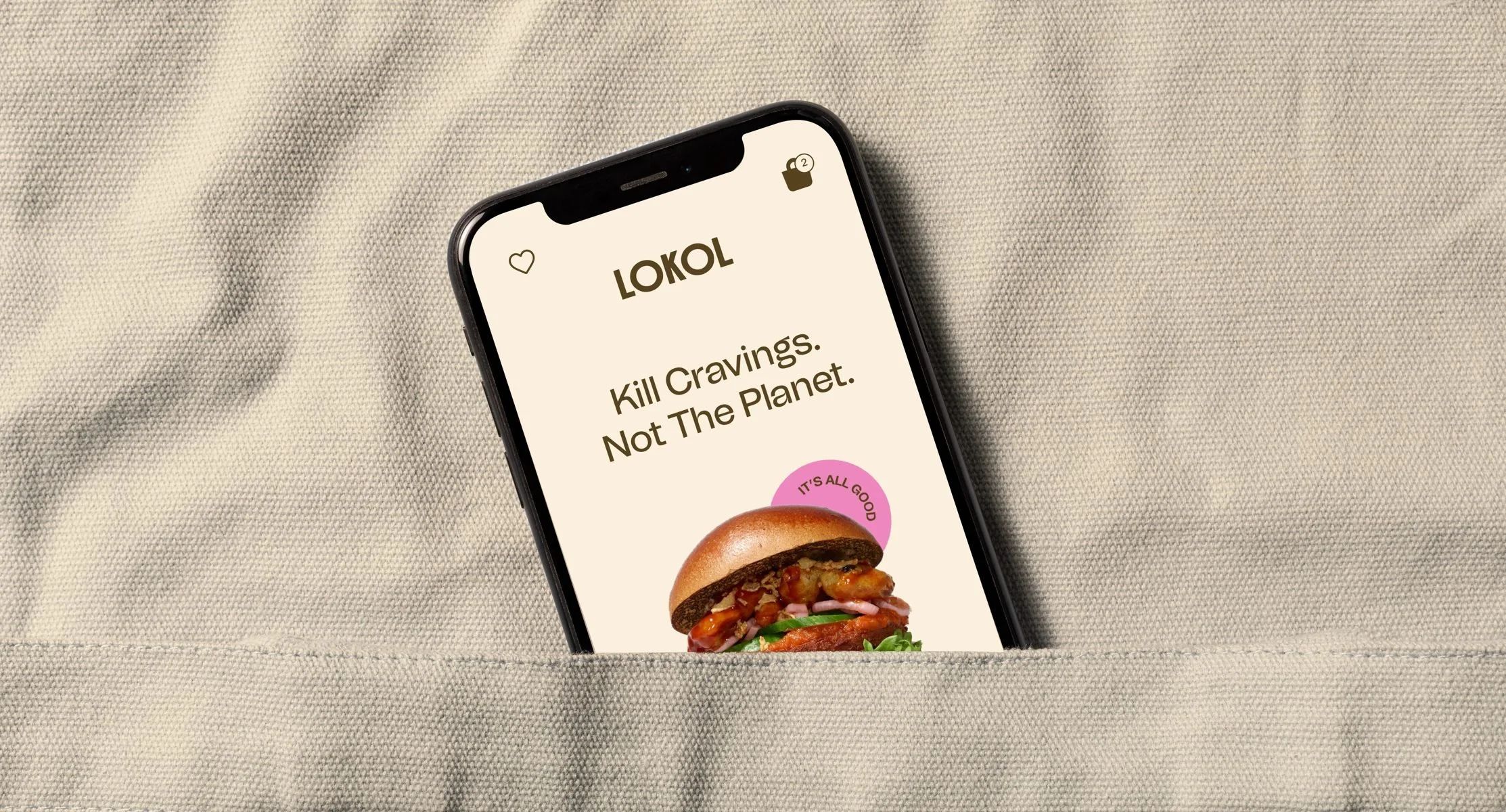
Start with the typography. Thick. Irregular. It’s bold, not just in stroke but in ethos. The logotype isn’t trying to be legible at first glance. It’s trying to be memorable after the third. This kind of typographic treatment isn’t naive—it’s calculated. There’s friction in its asymmetry, charm in its stubbornness. You feel it. That’s the point.
The color palette is grounded in earth and sun—ochres, olives, soot, and clay. These aren’t just “natural” colors—they feel fermented. Alive. Like they were scraped from the walls of a barn and brought to the screen with intention. It’s this kind of patina that gives the system its flavor, avoiding the overly sanitized organic aesthetic that plagues too many wellness-aligned brands today.
Illustration plays a key supporting role. The characters—blocky, playful, and oddly proportioned—feel like cousins of Keith Haring’s line work and kids’ wooden toys from the ‘70s. They hint at inclusivity and warmth but don’t scream it. The restraint here is masterful. Palette lets the forms carry the emotion without overloading the narrative with virtue signals.
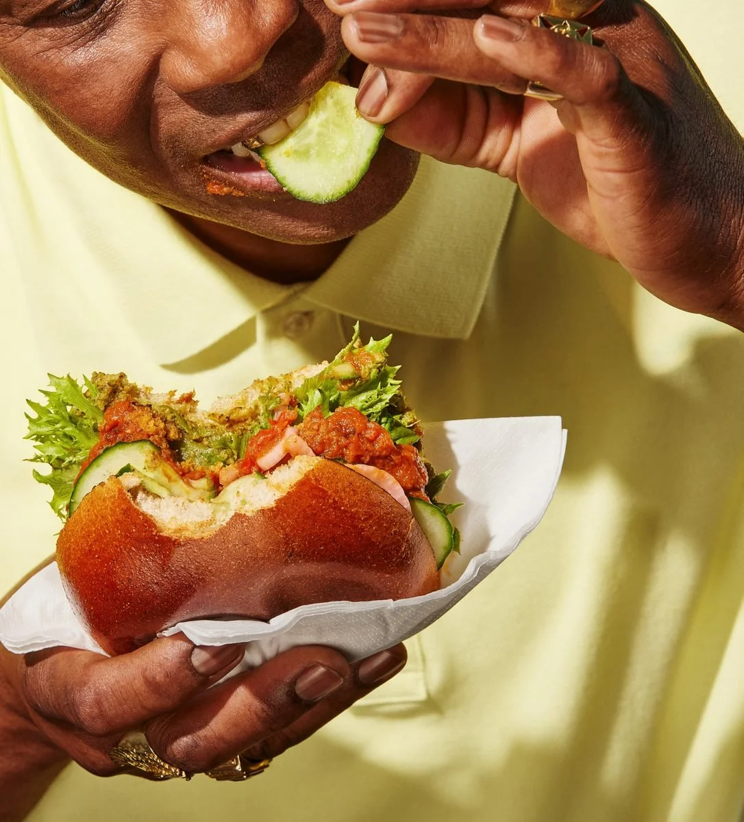
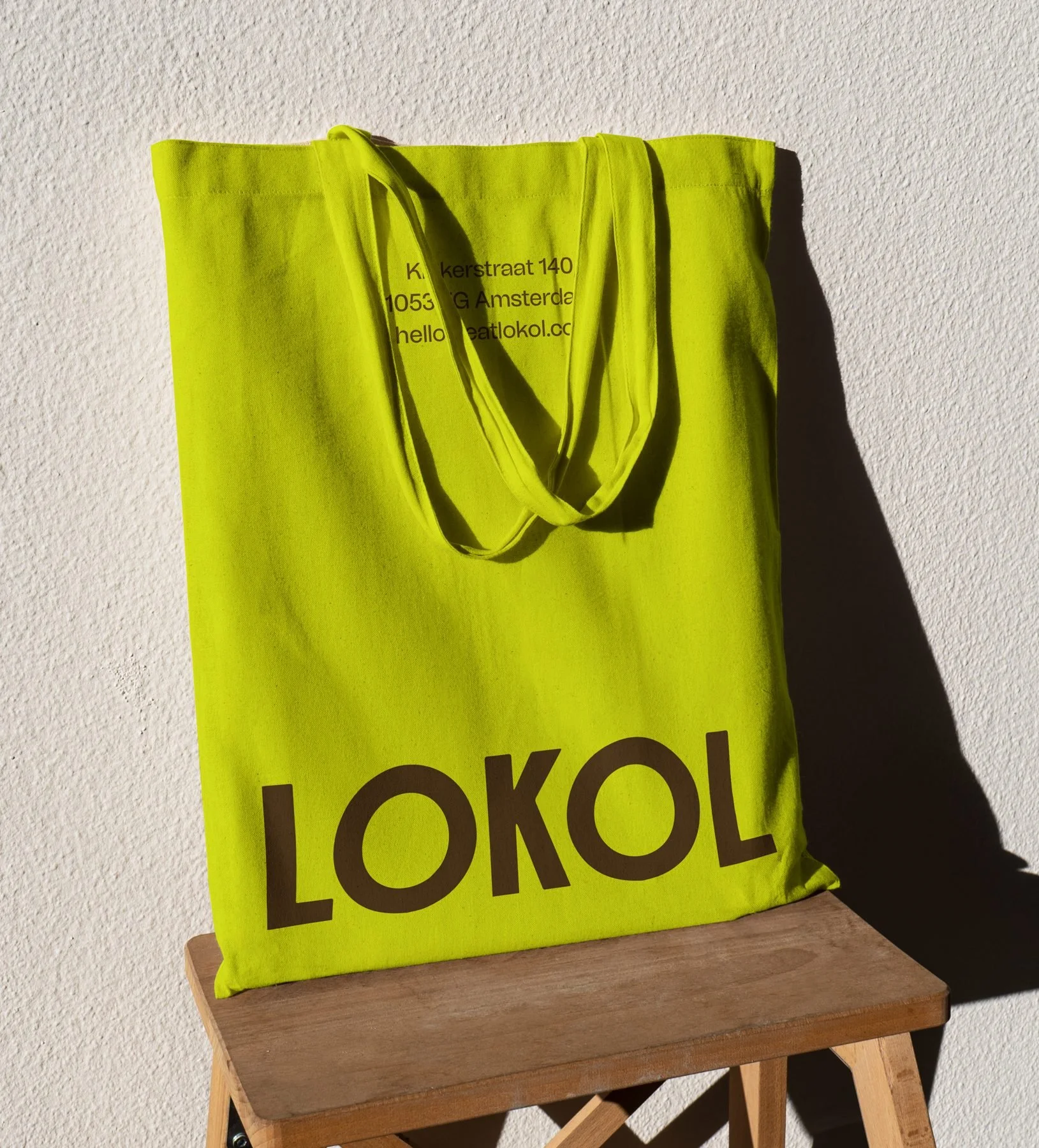
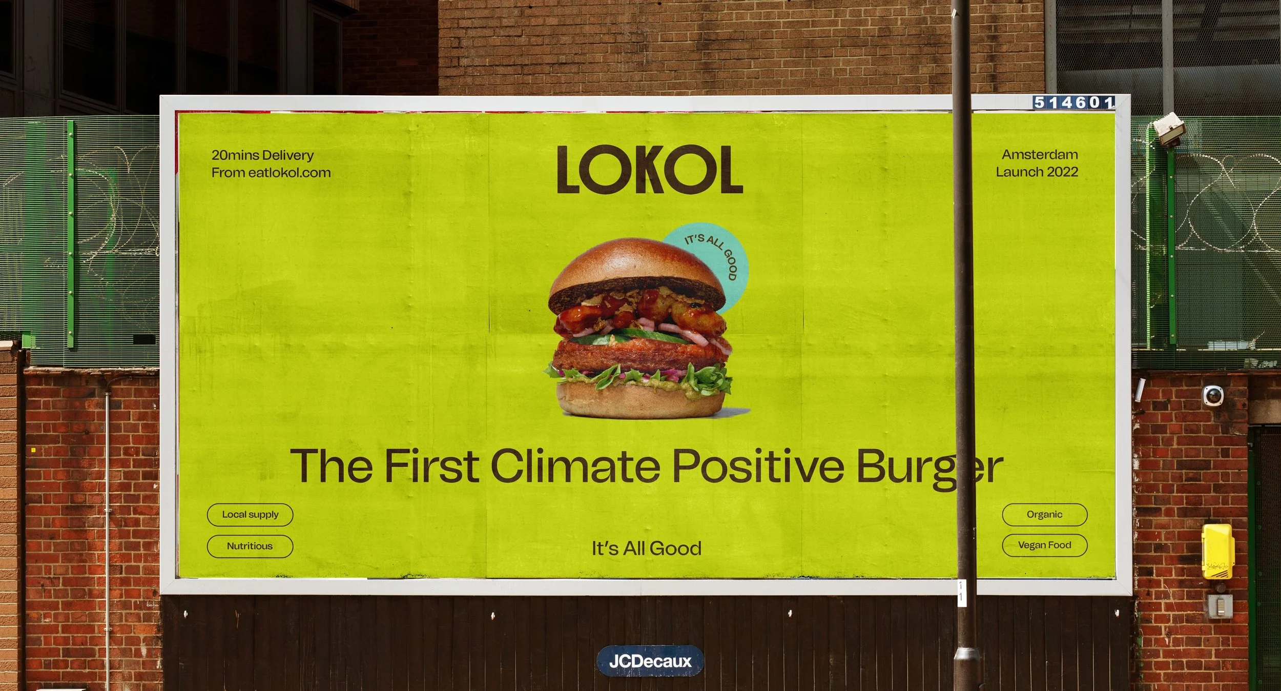
But what really punches is the utility across applications. Uniforms, menus, signage—each execution holds integrity. Nothing feels like an afterthought. The to-go packaging doesn’t just carry food. It carries tone. Voice. Vibe. Even the merch feels like it belongs more in a design museum gift shop than a corner café—and that’s a compliment.
What Palette has pulled off here is hard. She’s created a visual system that feels both local and elevated, both scrappy and smart. It says “community” without becoming a cliché, “fresh” without needing produce photography, and “modern” without being sterile. It’s not just branding. It’s a worldview.
If there’s one note to push further—it’s voice. The verbal identity feels slightly quieter than the visuals. A punchier tone of copy, something that riffs with the blocky mischief of the visuals, could take this from excellent to iconic. But make no mistake: this system holds water. Hell, it brews it into bone broth and sells it out by noon.
This is what happens when branding doesn’t just decorate.
—
Credits
Brand Identity by: Carla Palette
Website: carlapalette.com
Photography: not credited
Copywriting: not credited
Type Design: custom/modified by Carla Palette
Illustration: by Carla Palette
Packaging & Merch Applications: Carla Palette