Cracker Barrel Restaurant Rebranding
This is a design review, not a Yelp rant in disguise. We’re not talking about chicken fried steak, corporate ethics, or the cultural weight of rocking chairs. We’re talking kerning, color theory, and contrast. So park your preconceptions next to the biscuits.
Now, the Internet went full pitchfork when Cracker Barrel rolled out its new look—partly because change is scary when you’ve built your identity on throwback Americana, and partly because people focused way too hard on the logo and ignored the rest of the rebrand system.
Here’s where it hits—and where it hollers.
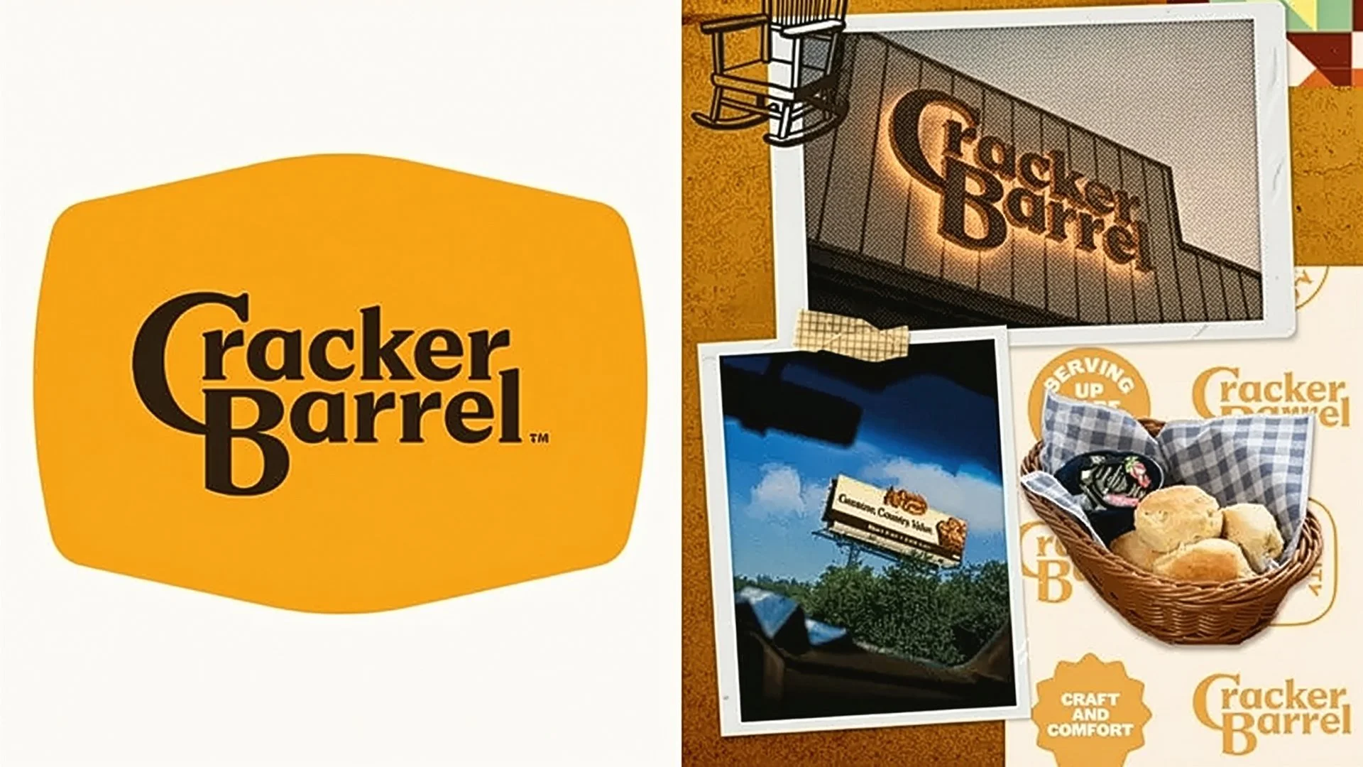
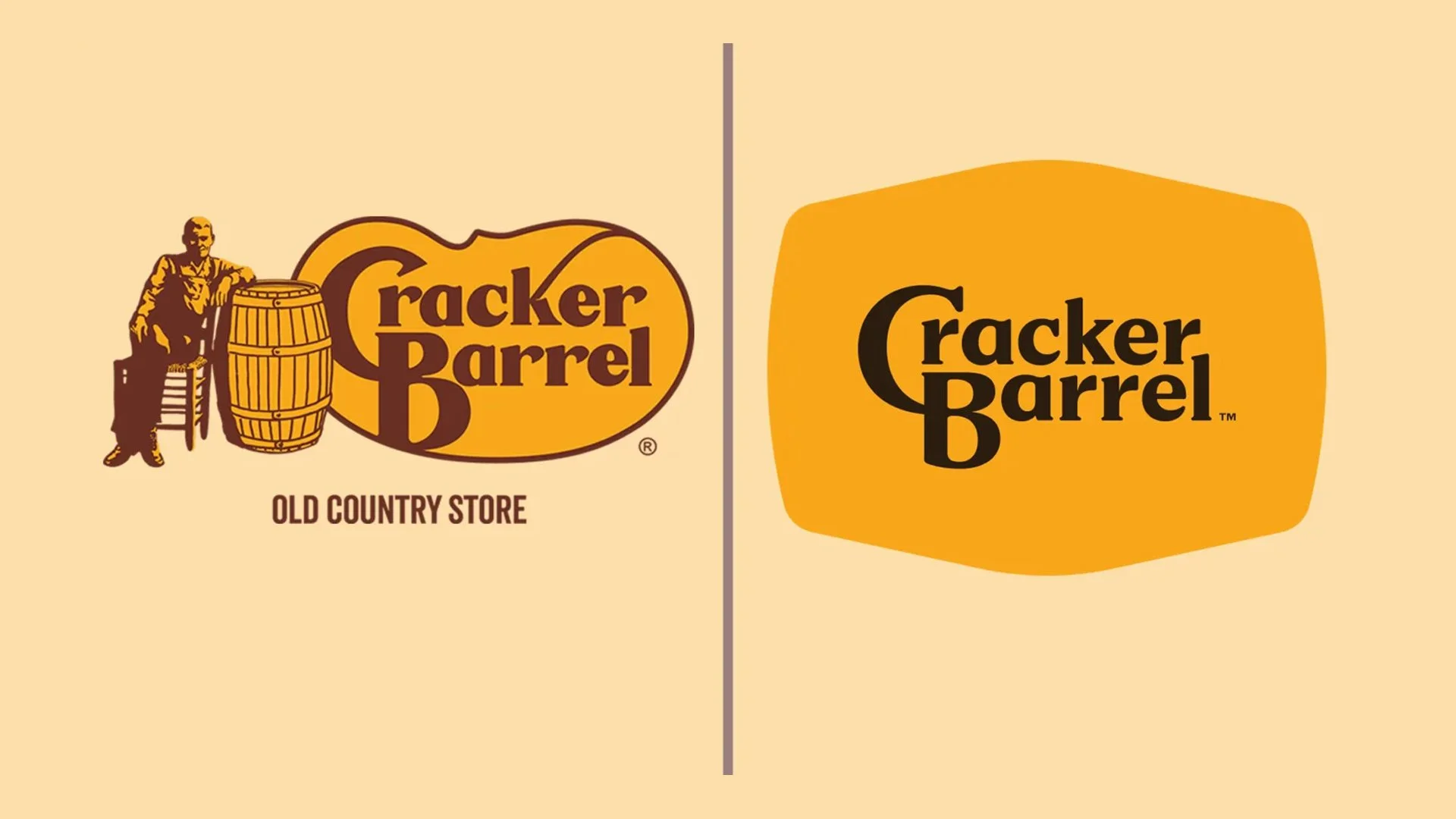
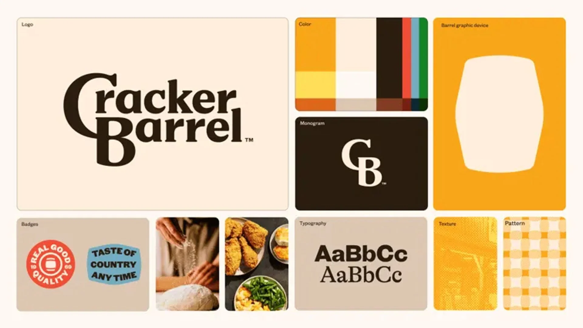
The new logo type is a typographic glow-up. The original was a lovable mess—charming, sure, but it felt like two fonts holding hands at a gas station. The new mark tightens the curves and locks in consistent weight, finally giving the brand the typographic cohesion it never had. It reads cleaner, stronger, and doesn’t whisper “old country buffet.”
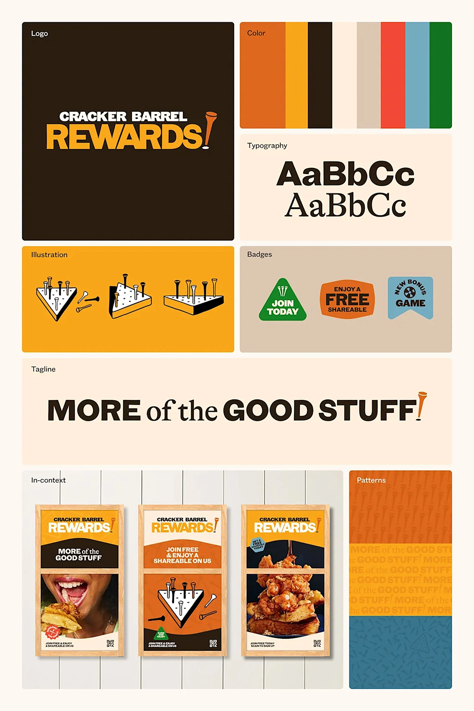
The new palette delivers where the old one muddled. Higher contrast, better legibility, and a path to digital ADA compliance that doesn’t feel like a tacked-on accessibility checkbox. This color system doesn’t just pop—it earns its place in the UI world.
The CB monogram is the kind of mark every legacy brand wants and few actually get right. It’s tight, iconic, and instantly recognizable without shouting. Perfect for favicons, app buttons, loyalty cards, and every other space where the full name just won’t fit. Smart, restrained, and beautifully executed.
Let’s talk about the elephant in the room—or rather, the barrel. As a holding shape for the logo, it feels a bit… forced. Clunky, even. But here’s where nuance comes in: used as a mask for photography? Dynamite. As a framing device for lifestyle shots and product closeups, the barrel silhouette steps into its own. It just shouldn’t be the logo shape—because frankly, it drags the whole system back toward kitsch.
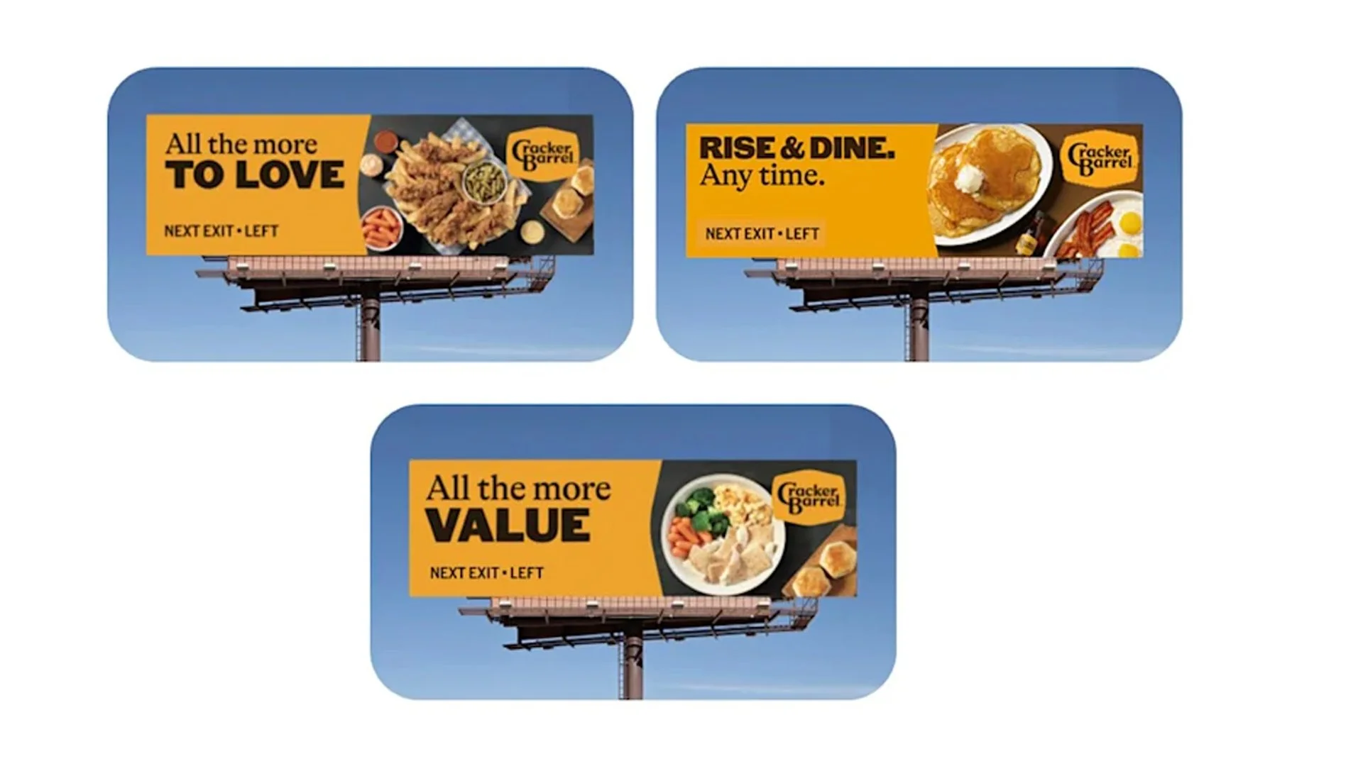
The billboard work? Yawn. Clean, but void of charm. There’s no cheek, no texture, no storytelling. Just blocks of orange and food porn doing the bare minimum. A missed opportunity to lean into some of the brand’s genuine cultural quirk.
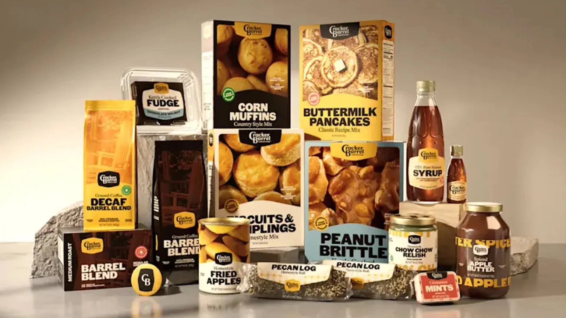
Retail Packaging, On the Other Hand? Chef’s Kiss. This is where the rebrand shows its teeth. The retail line sings. Clear hierarchy, appetizing photography, and a brand system that feels confident and collected across SKUs. It looks like something built for shelves in 2025, not stuck in a time capsule from 1983. The packaging alone justifies the rebrand.
The backlash came loud and fast—but the design is doing exactly what it’s supposed to. It modernizes without sterilizing. It gives Cracker Barrel a toolkit that works across channels. And no, not everything hits (looking at you, billboard copy), but the foundations? Solid. This isn’t a betrayal of the brand. It’s a long-overdue tune-up.
Credits
Designed by Prophet (Not confirmed)
