Pasters restaurant branding

Pasters doesn’t whisper. It walks in, clattering cutlery, setting the wine down before you’ve even looked up. The identity grabs your attention the way a plate of steaming carbonara does—fast, warm, unapologetic.
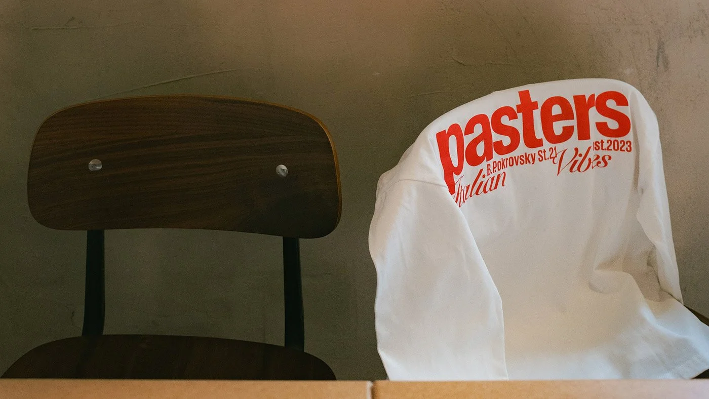
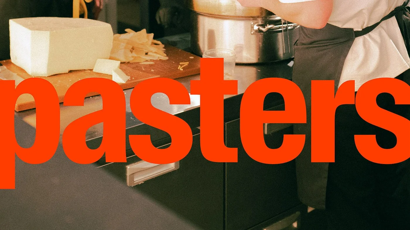
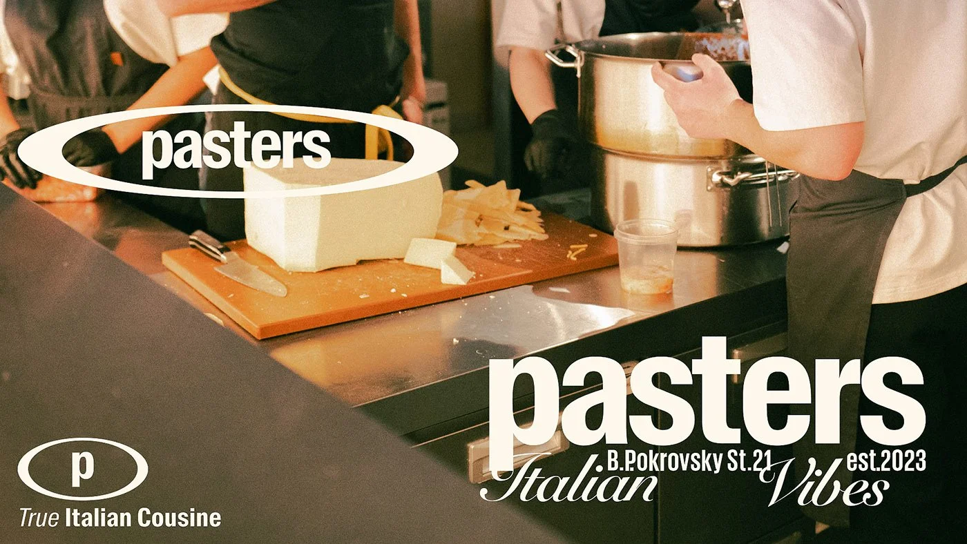
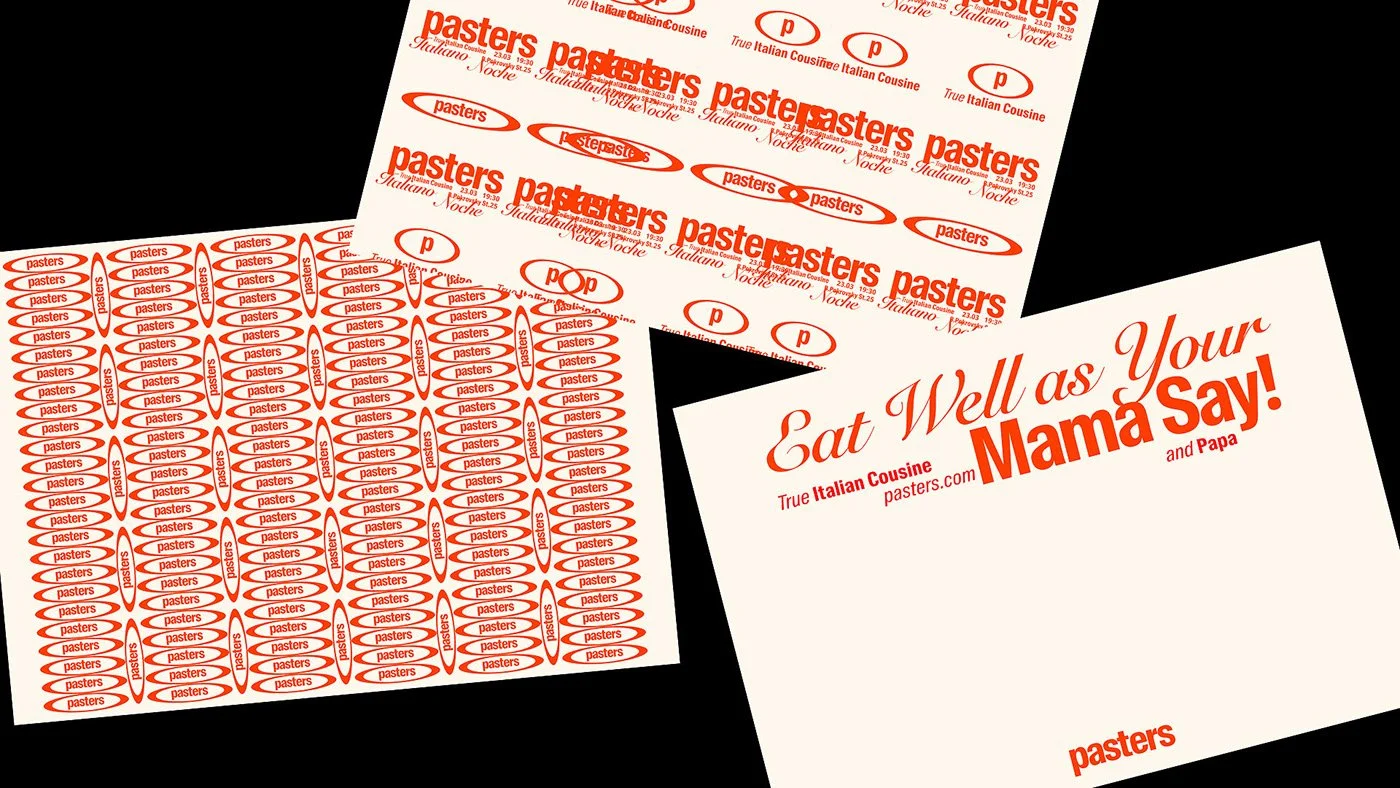
The logo is the first hook. Letterforms curve and stretch like fresh pasta being pulled from the machine, carrying a swagger that says this place isn’t here to play tourist. There’s movement in the mark, a sense that the brand is already mid-conversation before you’ve taken a seat.
Color works like seasoning—measured but unmistakable. Deep tomato reds, sunburnt ochres, and olive greens channel the sensory overload of a late summer meal in Naples. It’s a palette that paints atmosphere, not just identity.
Typography dodges the trap most “Italian” brands fall into. No tired scripts. No predictable Bodoni stand-ins. Instead, there’s a contemporary voice—confident, legible, yet still humming with a faint accent of the old world. The supporting illustrations carry that same energy: loose enough to feel human, refined enough to survive in high-end applications. They feel like the chalkboard outside a bustling trattoria—except the chalk doesn’t smear, and the lines are razor-sharp.
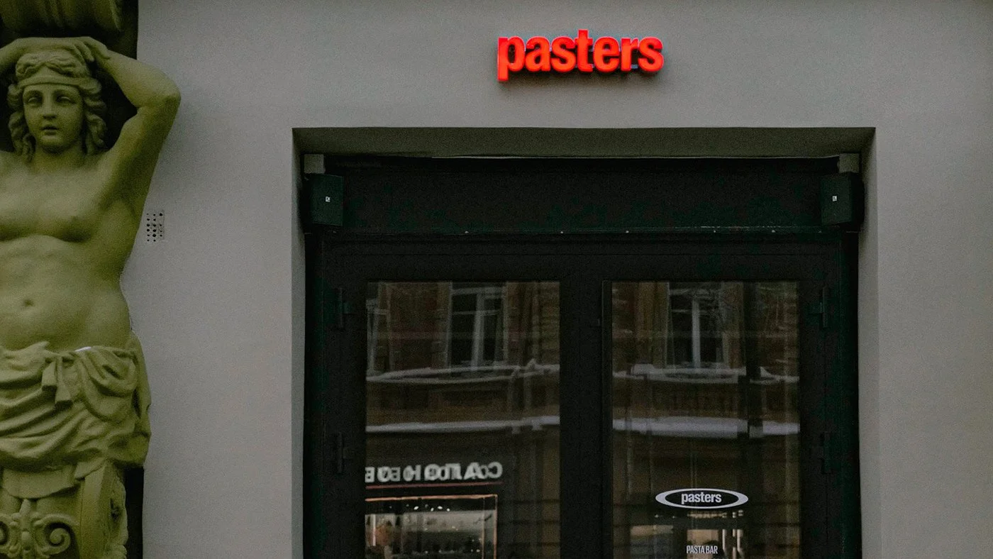
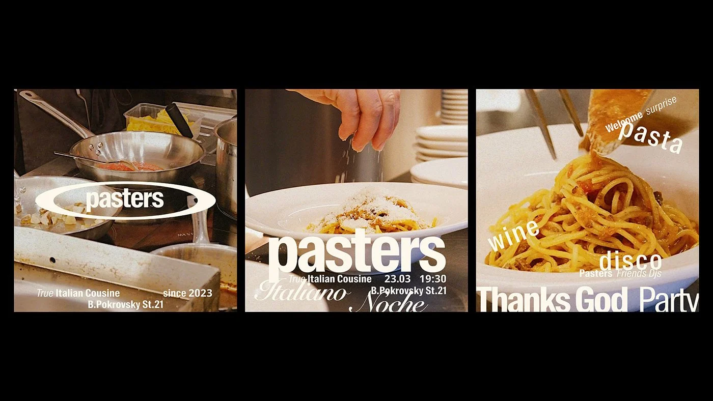
But here’s where it leaves you wanting. The Behance case study shows us the bones—logo, color, type—but holds back the meat. We don’t see menus, interiors, uniforms, or signage. Those are the touchpoints that prove whether an identity can hold up in the chaos of service. Without them, Pasters risks living as a beautiful concept trapped in the safe confines of a design file.
The concept is solid. Pasters isn’t selling dusty nostalgia. It’s remixing Italy. This is pasta culture with one foot in heritage and the other on a slick city sidewalk. But there’s a danger in too much polish. Italian food, at its core, thrives on imperfection—the sauce splatter, the uneven swirl, the olive oil drip running where it shouldn’t. Over-controlled design risks sanding off that warmth.
Still, even without the full execution, Pasters is a visual feast. It proves that you can honor the soul of Italian dining without drowning in the same checkered tablecloth tropes. With the missing pieces in place, it could become a reference point for how modern restaurant branding should taste—full, rich, and just messy enough to be real.
Credits
Design by: RJS Studio (Jenya Shtein & Roman Shtein)