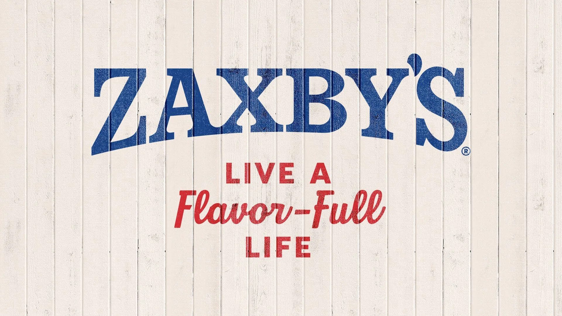
Zaxby’s Brand Evolution
Break Maiden has set a new fire with their recent brand overhaul for Zaxby’s, transforming the beloved southern fast-casual staple into a visually punchy, flavor-forward icon. The revamp manages to respect the brand’s heritage while boldly charging into a lively and memorable new identity, epitomized by the energetic mantra: “Live a Flavor-Full Life.”
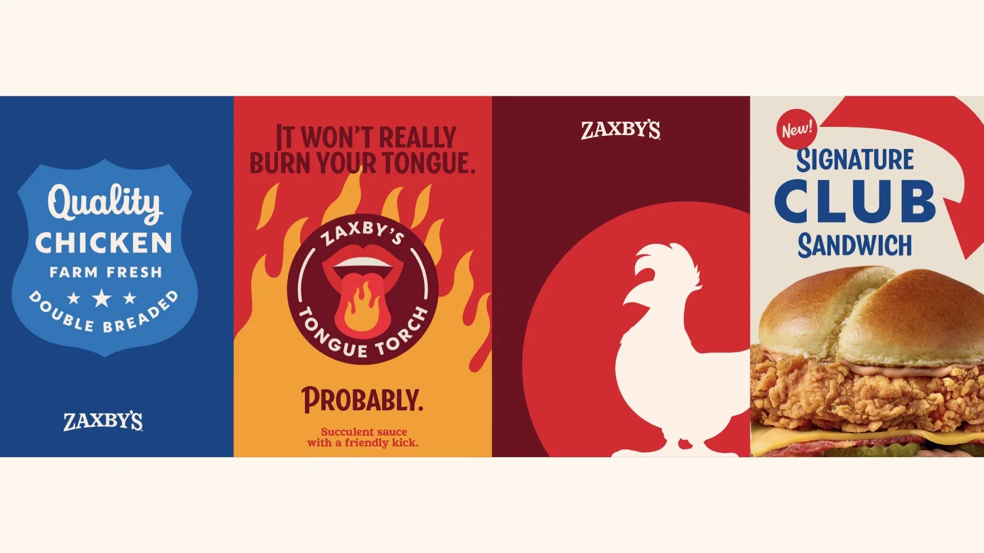
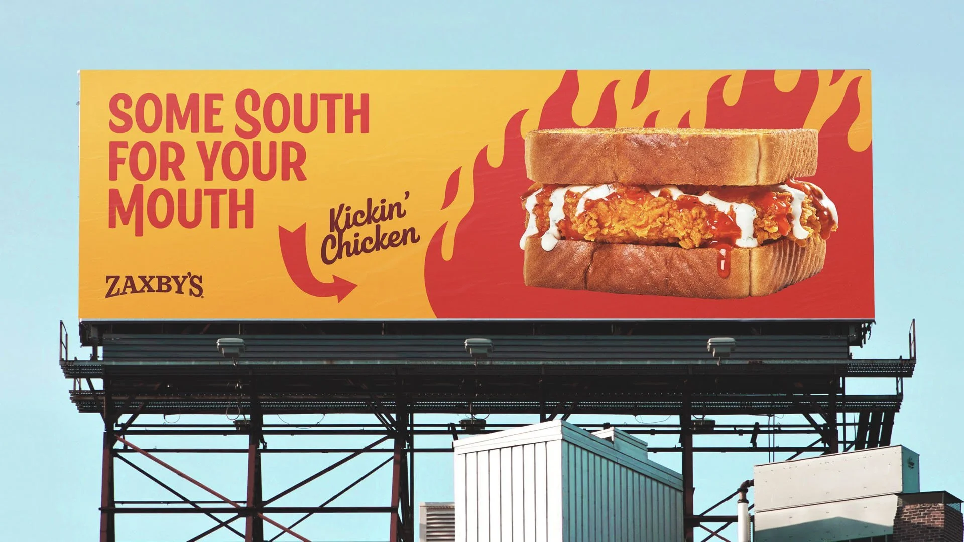
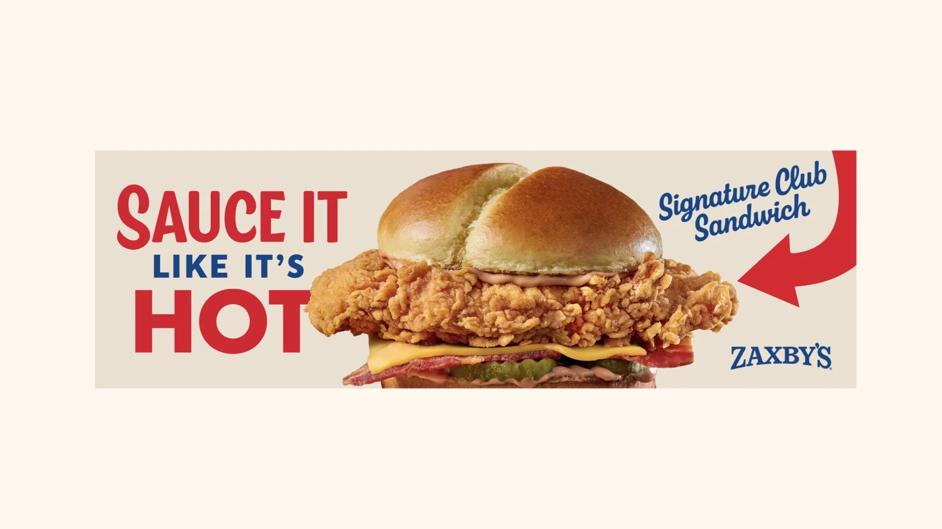
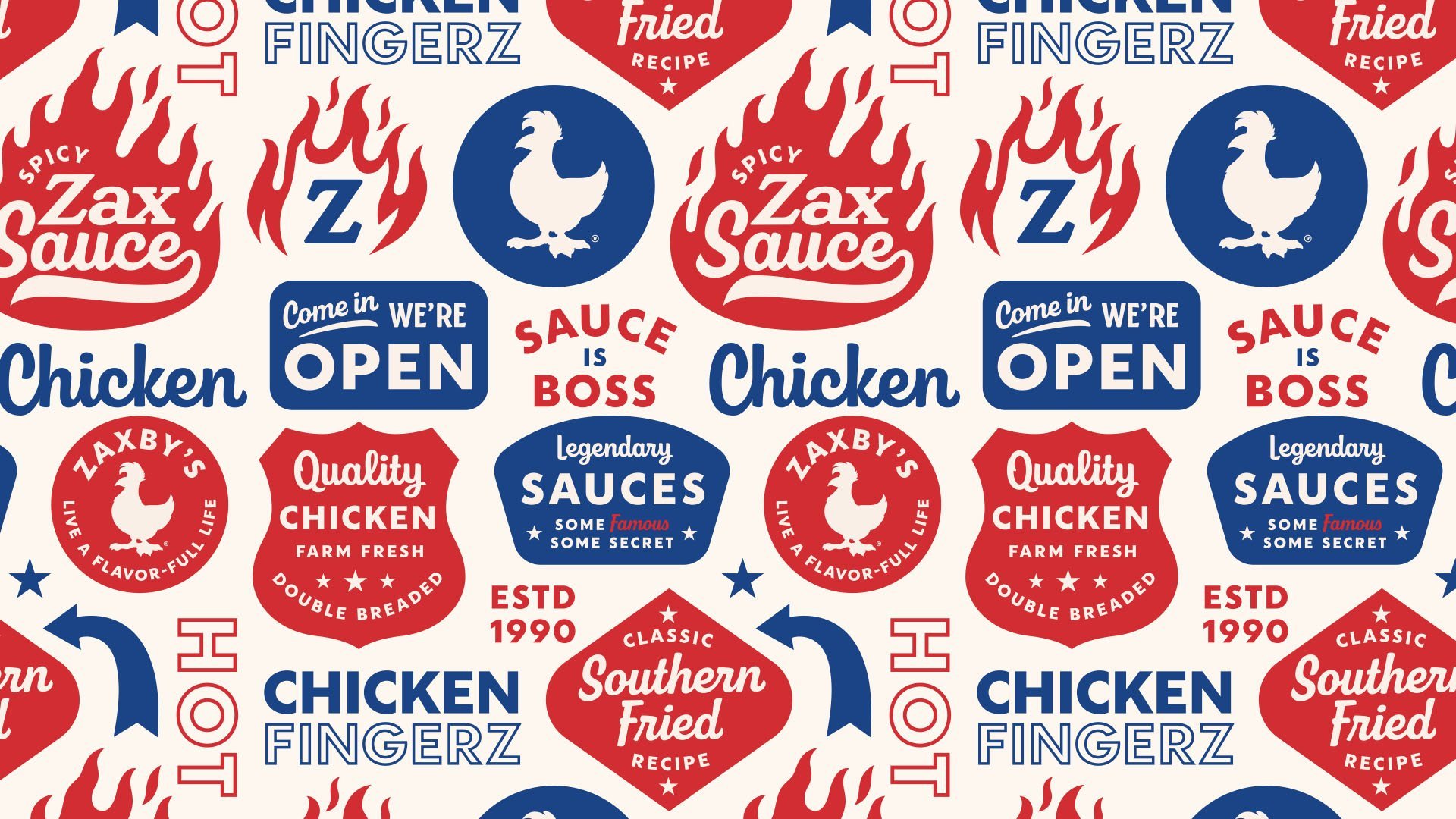
The cornerstone of the refresh is a vibrant, unapologetic color palette dominated by fiery reds and inviting blues—instantly recognizable and visually addictive. Typography moves effortlessly between classic Americana and contemporary boldness, creating an approachable yet dynamic dialogue across all touchpoints.
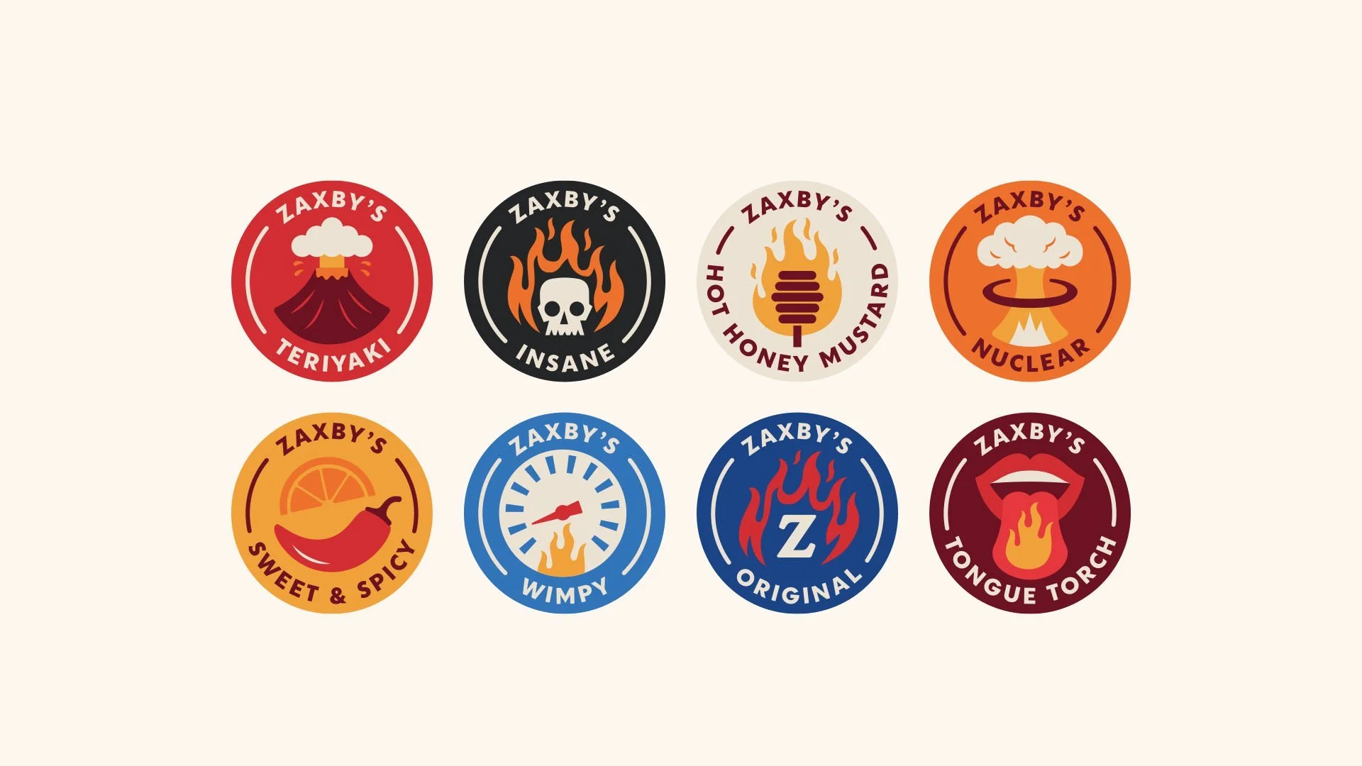
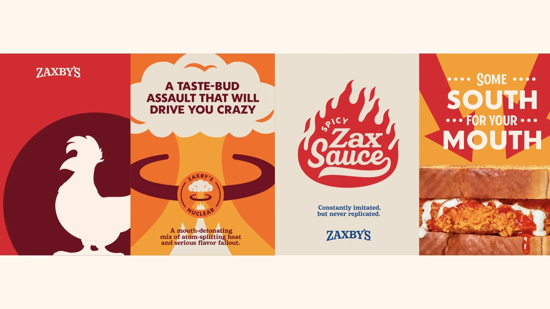
Packaging emerges as a particular standout, with bags, cups, and wrappers that explode with personality. Bold, playful illustrations—tongue-in-cheek icons referencing the heat levels of Zaxby's sauces, such as "Tongue Torch" and "Insane"—make a meal at Zaxby’s an immersive, engaging brand experience. This cheeky approach injects humor and charm into every interaction, inviting customers to participate in the brand's narrative.
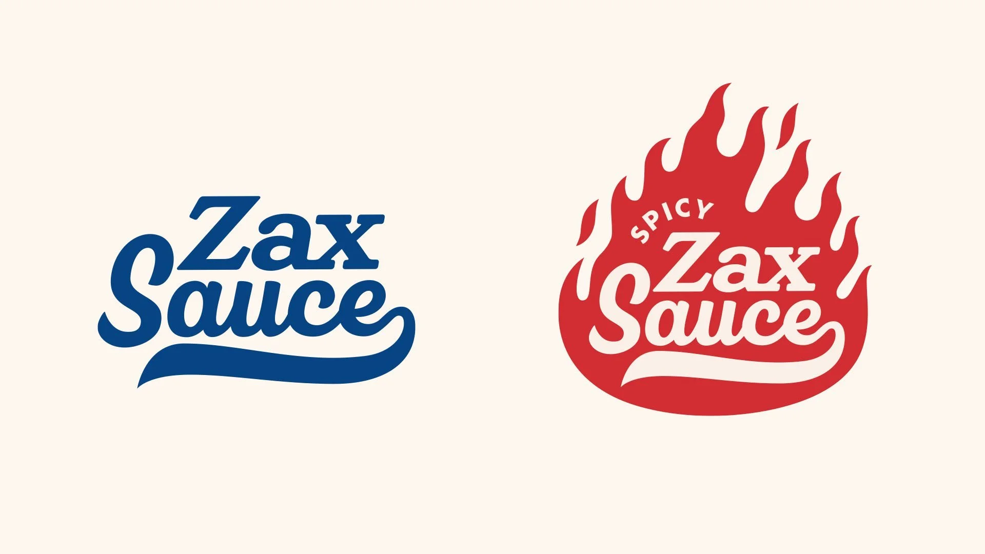
Logos for signature sauces like “Zax Sauce” and “Spicy Zax Sauce” are cleverly reimagined with visual metaphors of flame and fluidity, further amplifying the core brand message of flavorful fun. Moreover, the comprehensive suite of graphics developed for packaging and signage achieves cohesion without monotony, a testament to Break Maiden’s meticulous attention to detail and balance.
The overall visual identity adopts a retro-inspired modernism, drawing influence from mid-century American advertising and contemporary pop-art aesthetics. It’s nostalgic yet refreshingly current, resonating well with both loyal customers and newcomers alike. Through bold design choices and playful storytelling, Break Maiden successfully elevates Zaxby's from a mere restaurant to an experience brimming with flavor and energy.
Design Credits:
Agency: Break Maiden
Location: St. Petersburg, Florida, USA