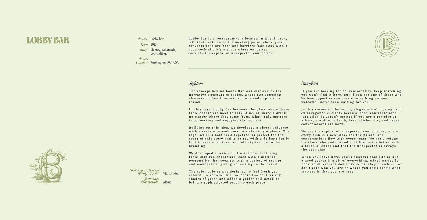
Lobby Bar Branding
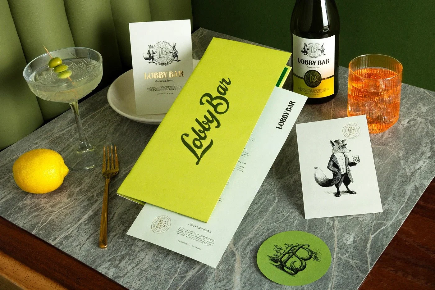
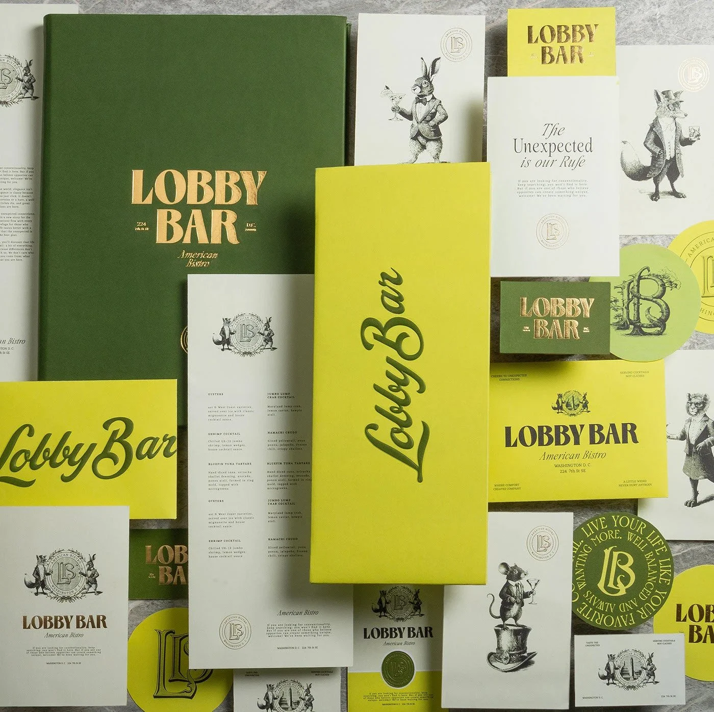
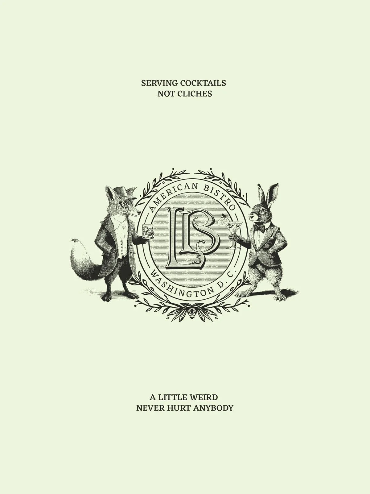
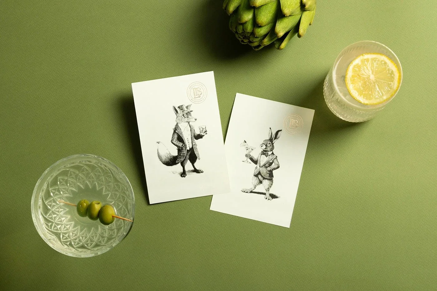
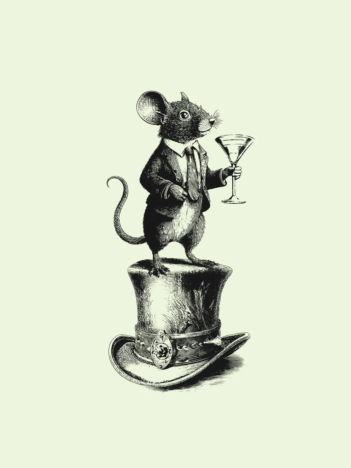
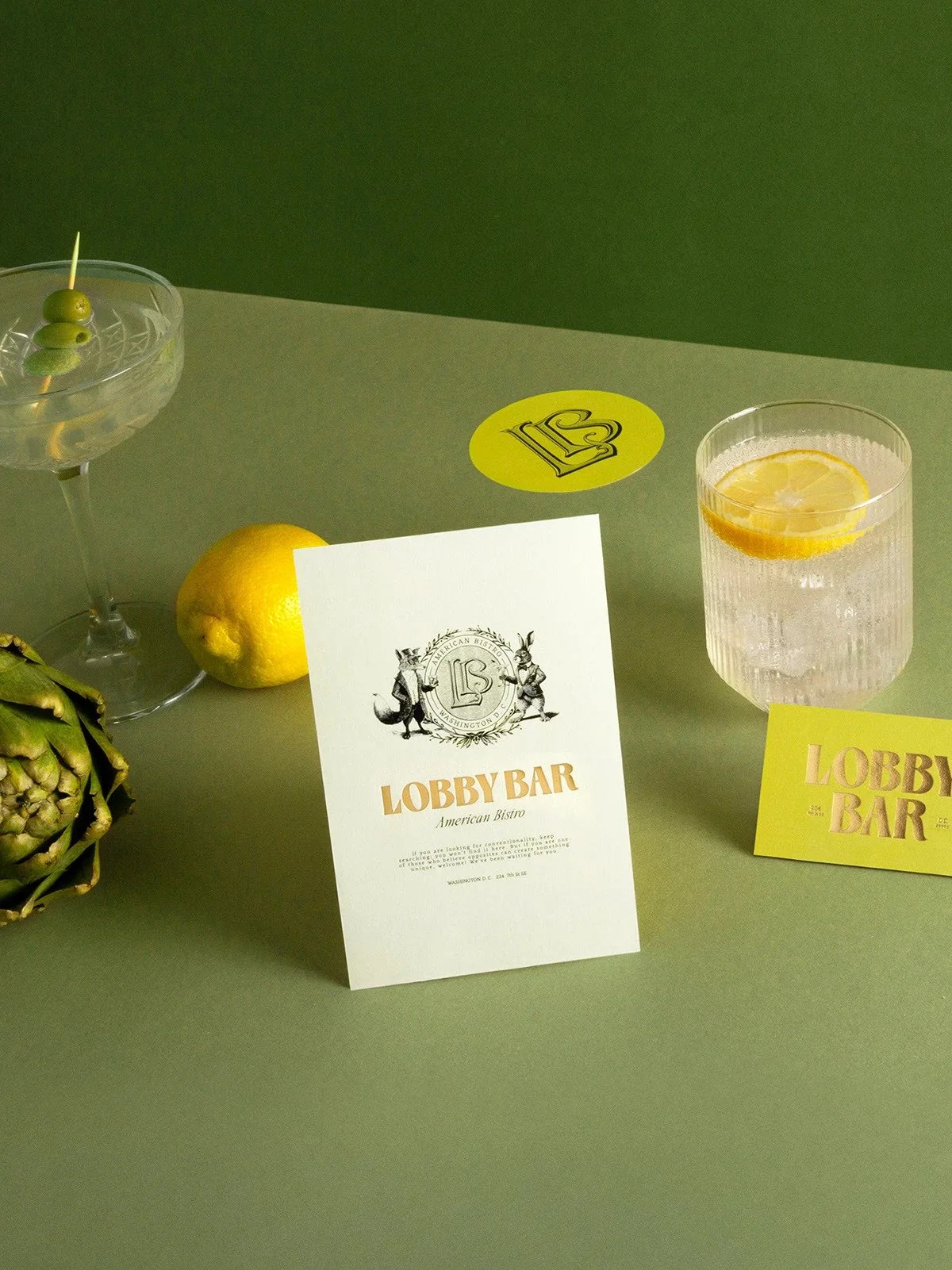
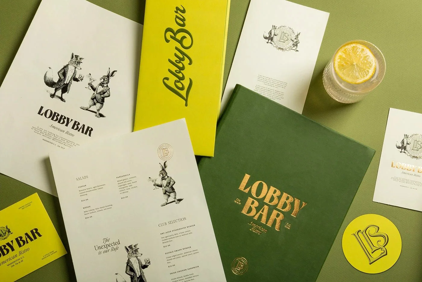
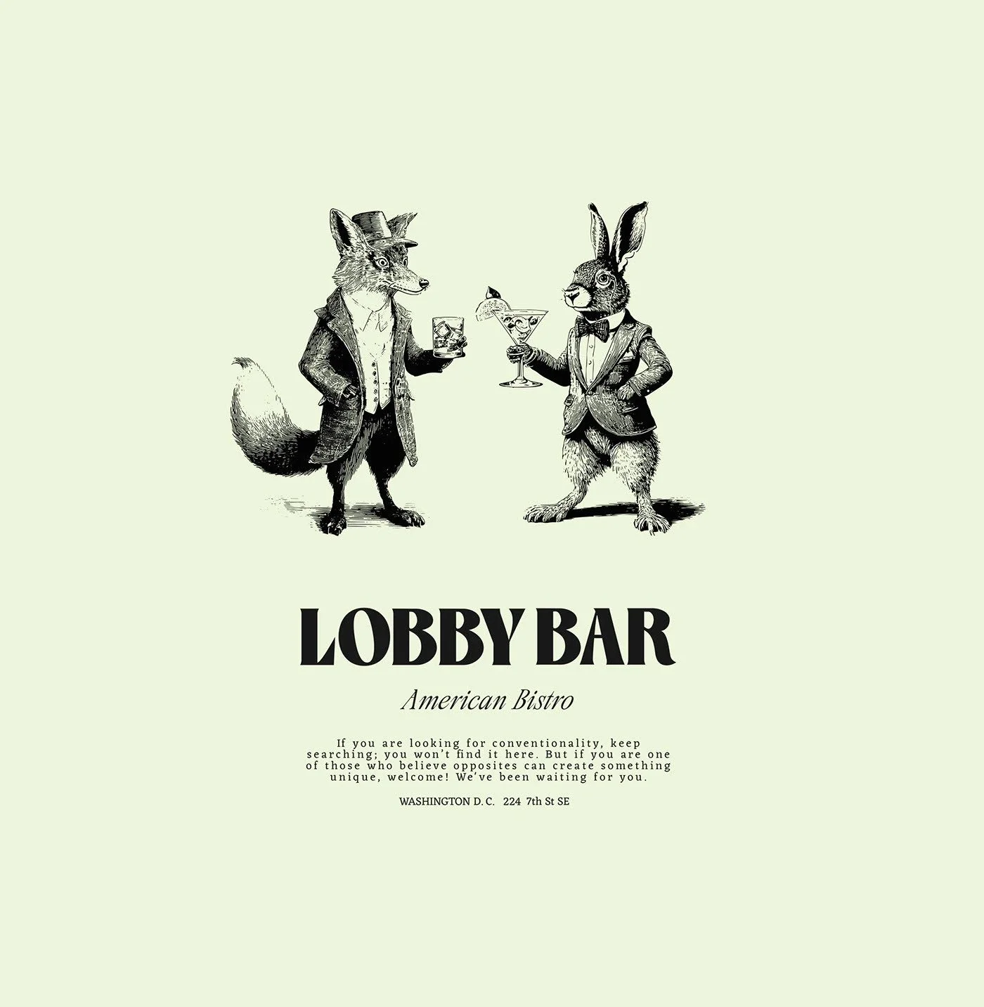
A rabbit in a blazer. A fox with a rocks glass. Gold foil so rich you can practically smell the dry gin. Lobby Bar’s brand identity by Estudio Albino is a cheeky, cinematic delight that dials into surrealism without losing grip on elegance. It flirts with the absurd, then sits up straight and asks for a martini. Extra dry. Three olives.
This isn’t just a bar brand. It’s a whole damn stage play.
Design Movement/Style
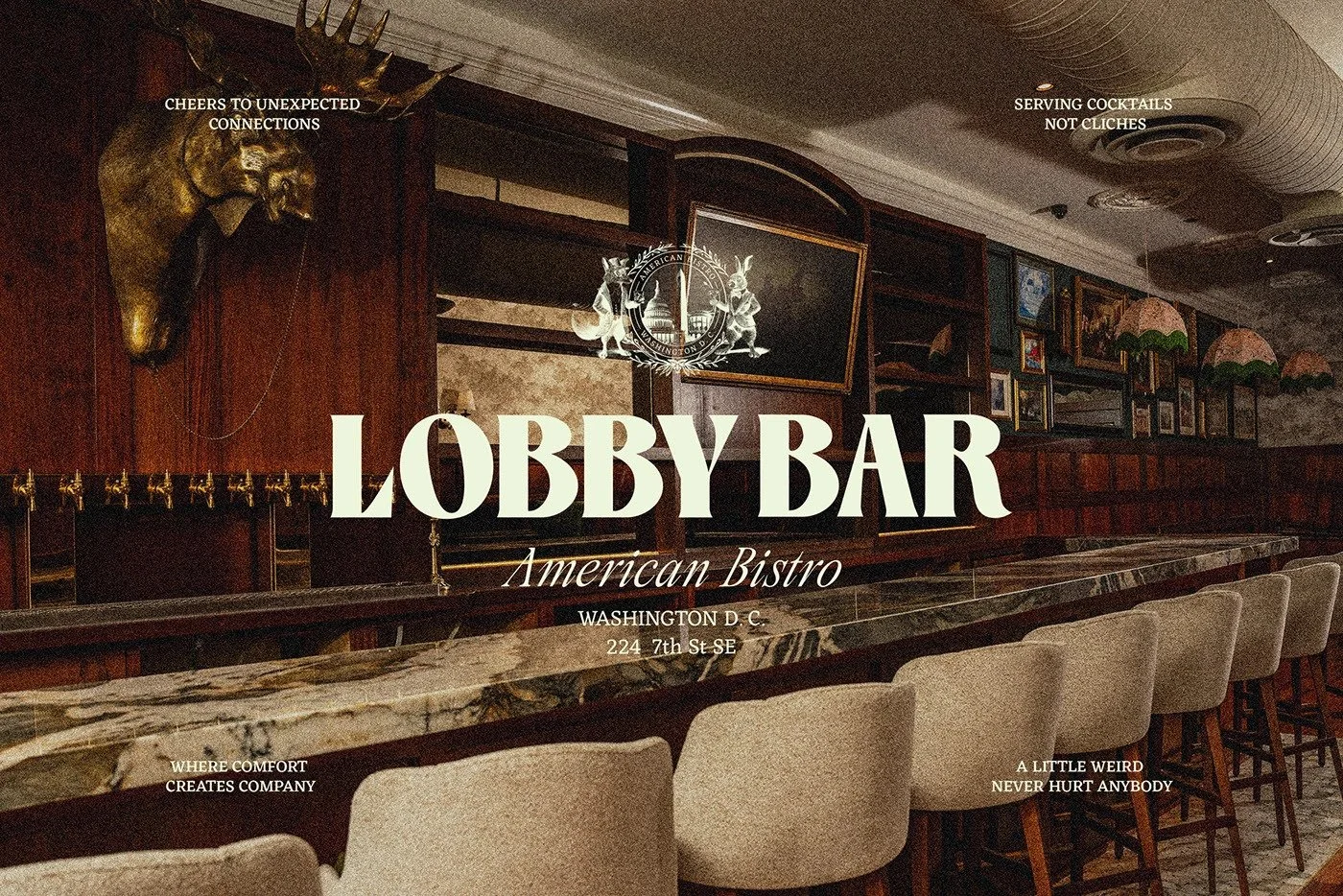
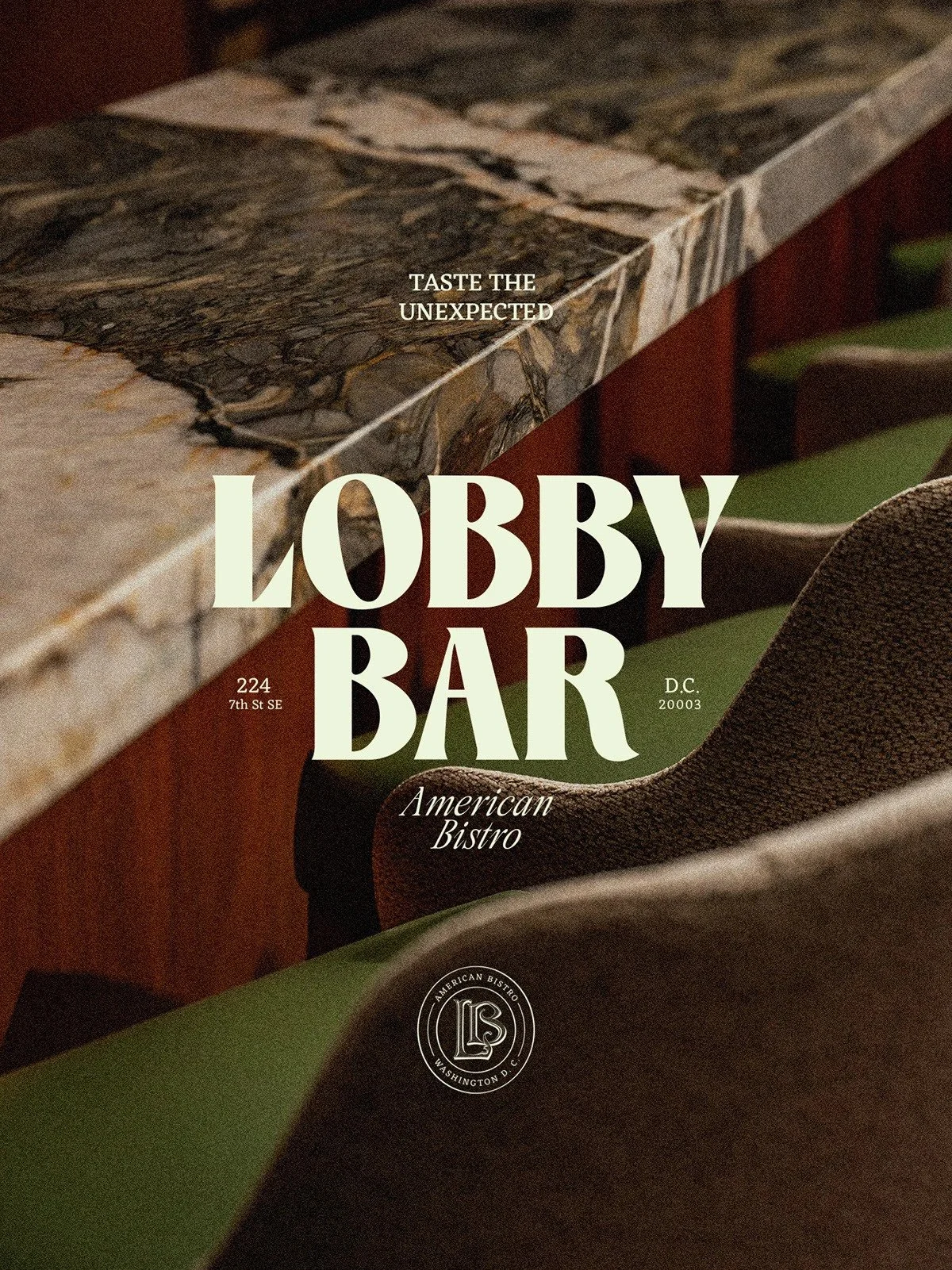
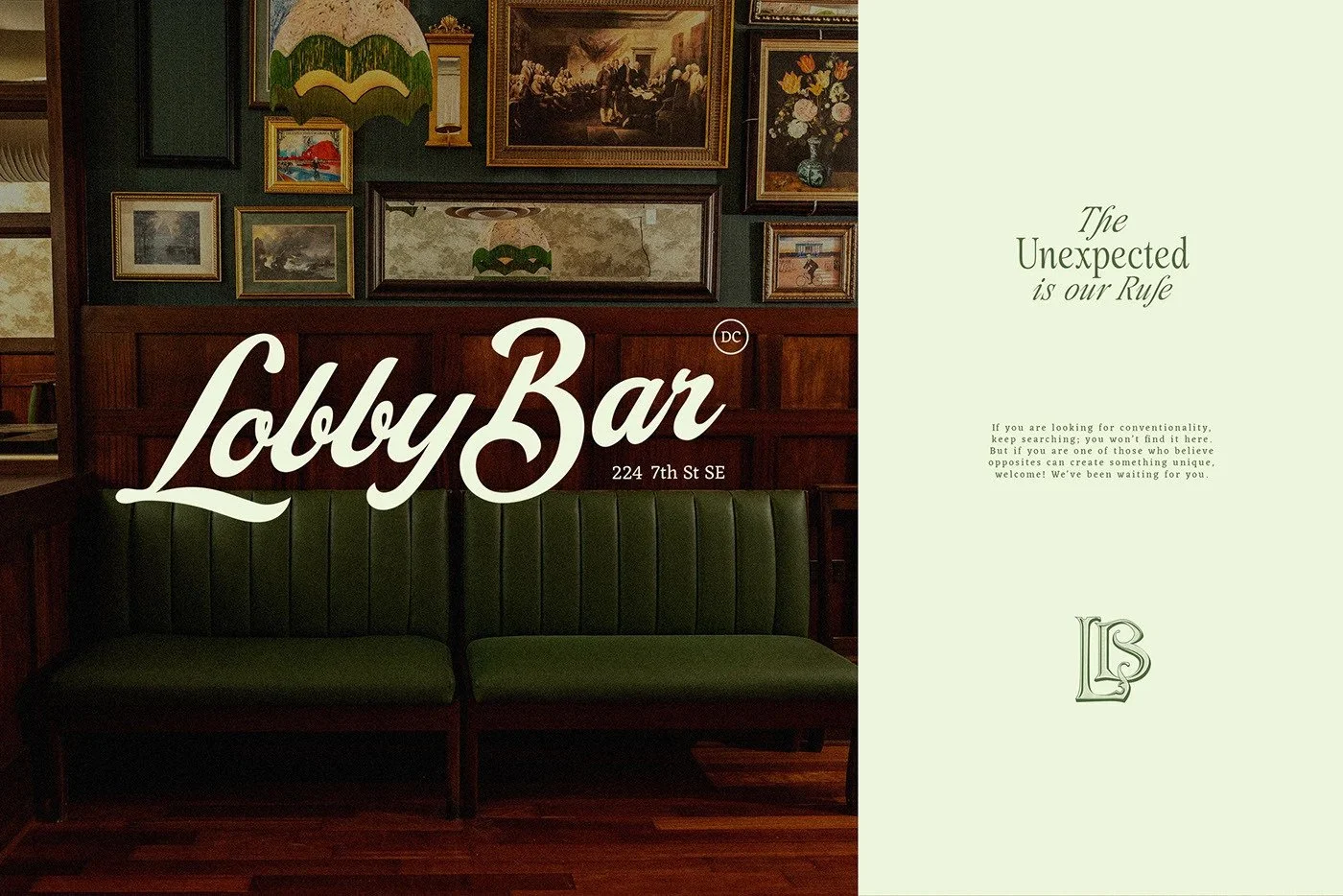
Neo-Victorian maximalism meets modern editorial design. A sophisticated identity system built on contrast—old-world illustrations, contemporary serif typography, high-contrast palettes, and a restrained-but-confident tone of voice. The result is something fresh and theatrical. Think Beatrix Potter walks into The Savoy and orders a Negroni.
What’s Working Well
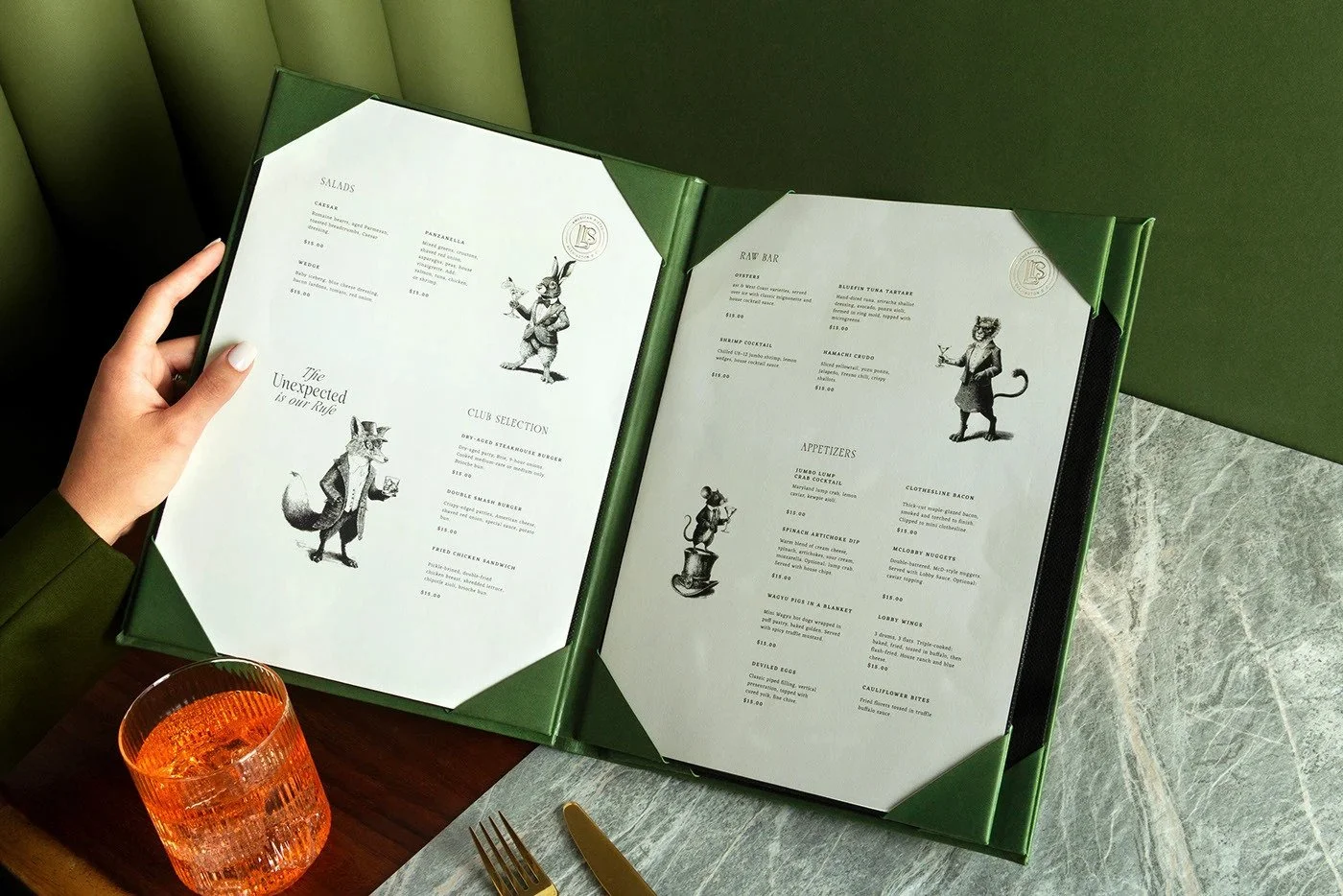
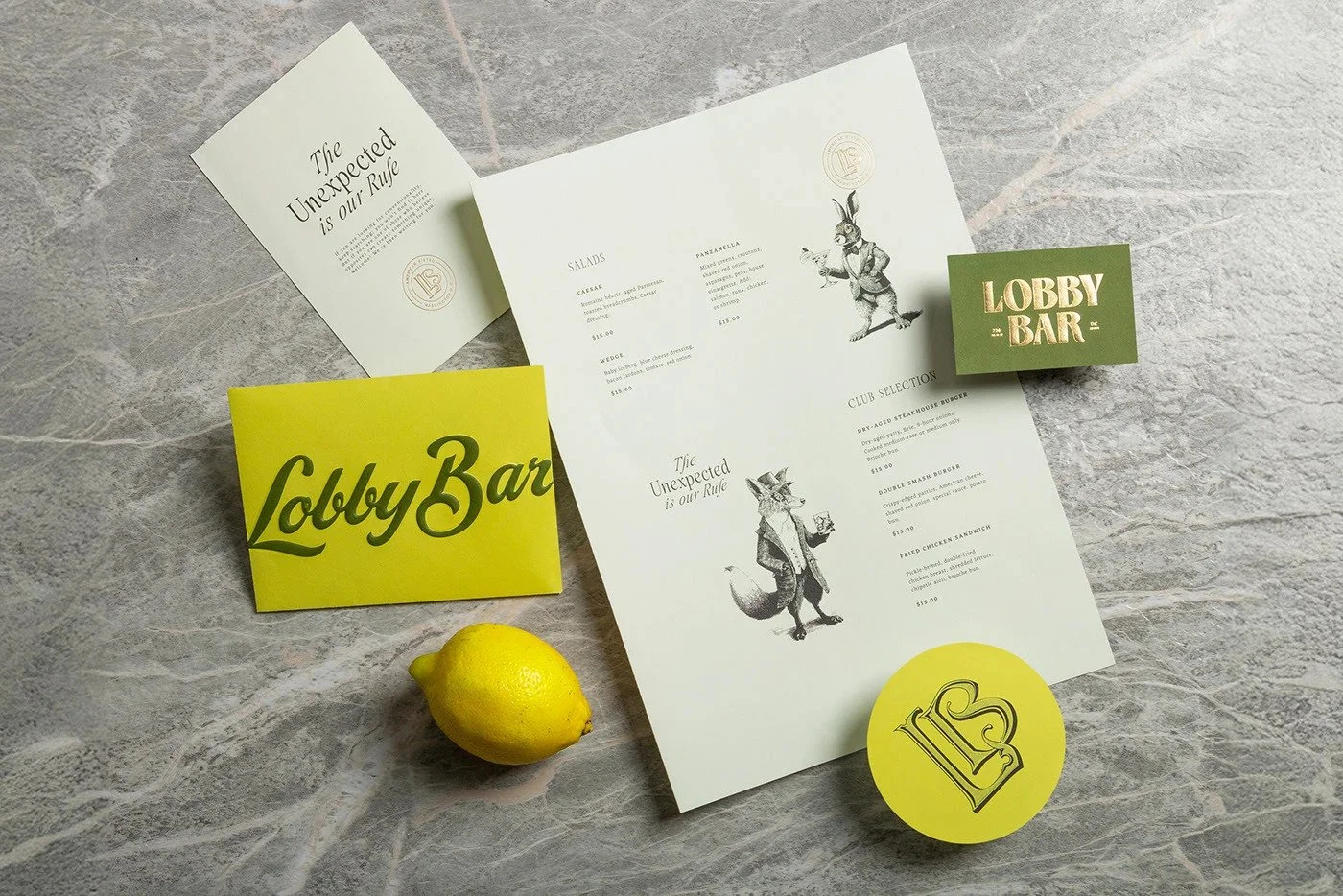
01. Character Illustrations that Carry Narrative
The anthropomorphic rabbit and fox aren’t decoration—they’re protagonists. Dressed to the nines, positioned with posture, and wrapped around a heraldic crest, they create a visual mythology for the brand. They hint at a world beyond the bar—a fabled society of proper misfits who sip rather than shout.
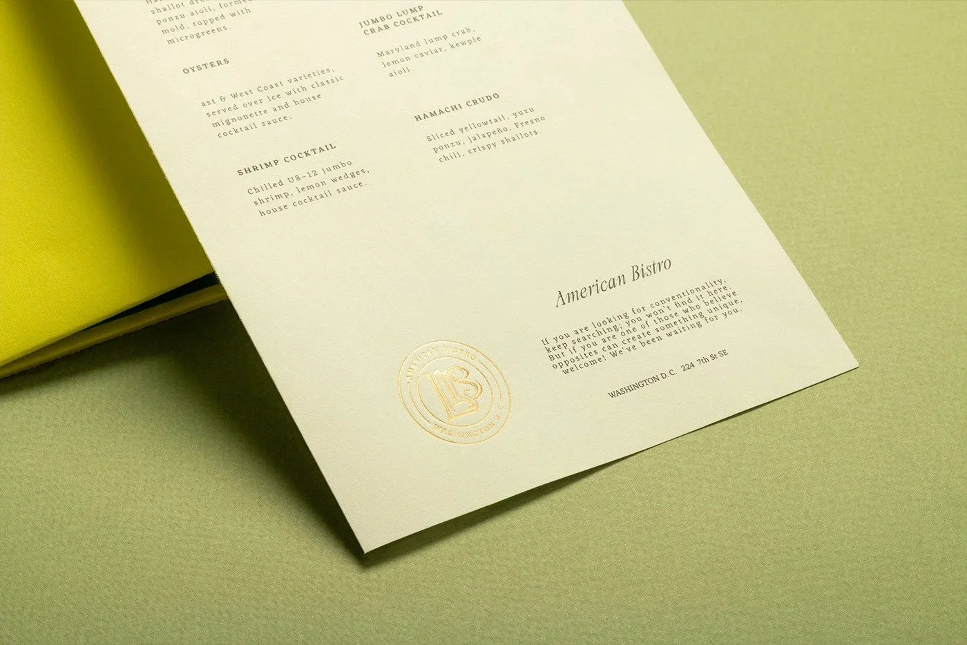
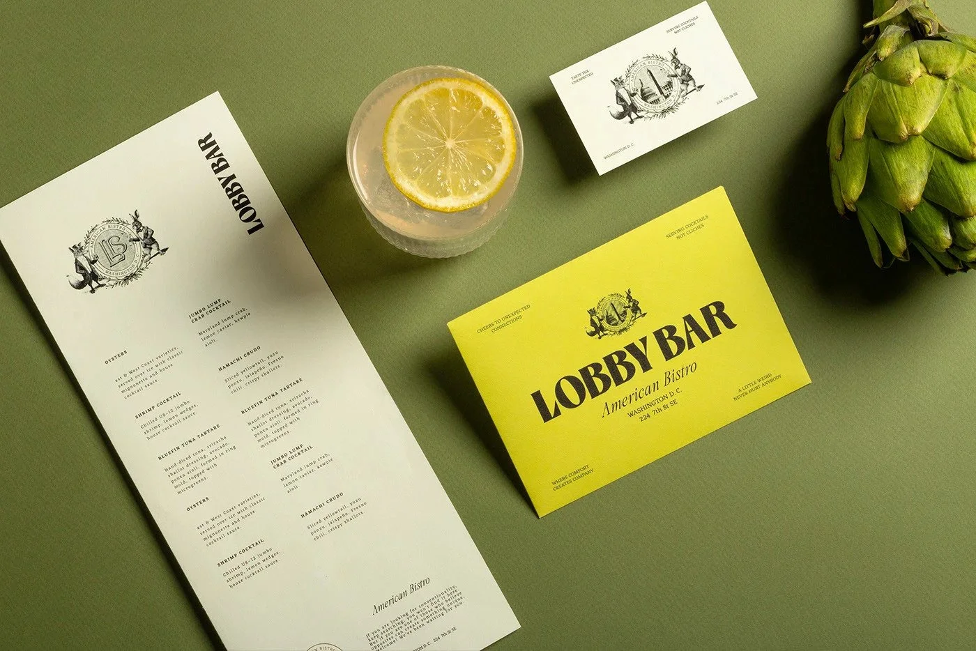
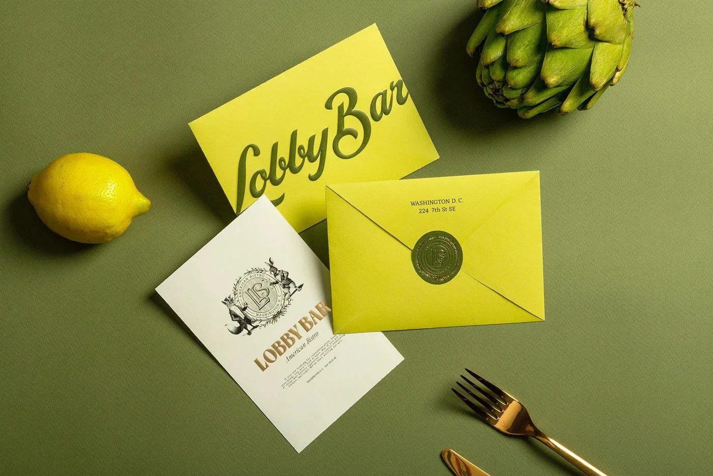
02. Print Production that Tells a Story
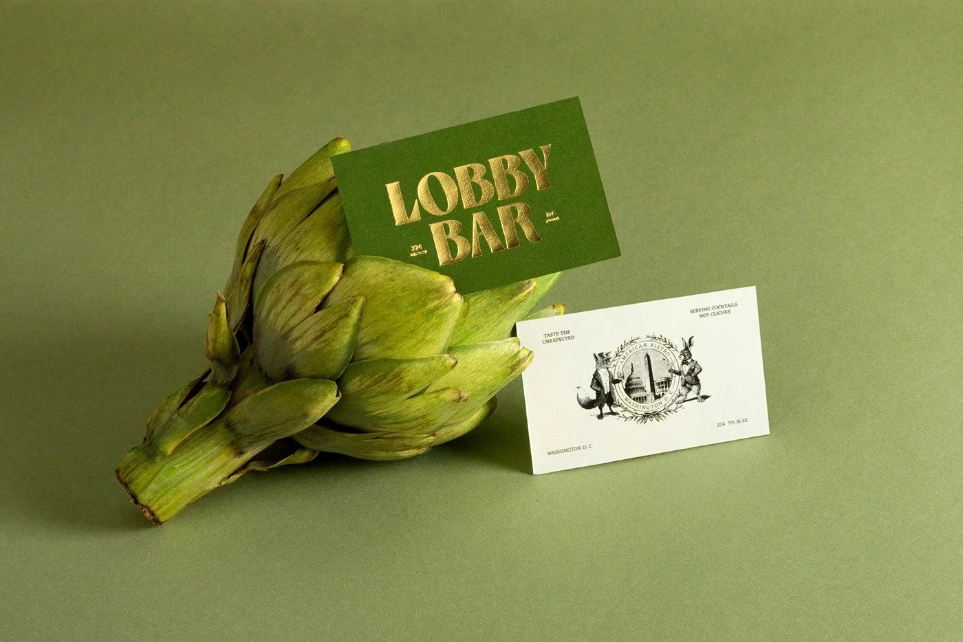
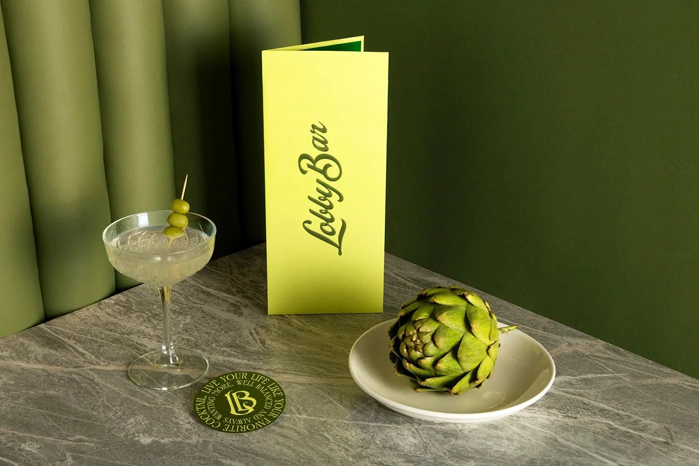
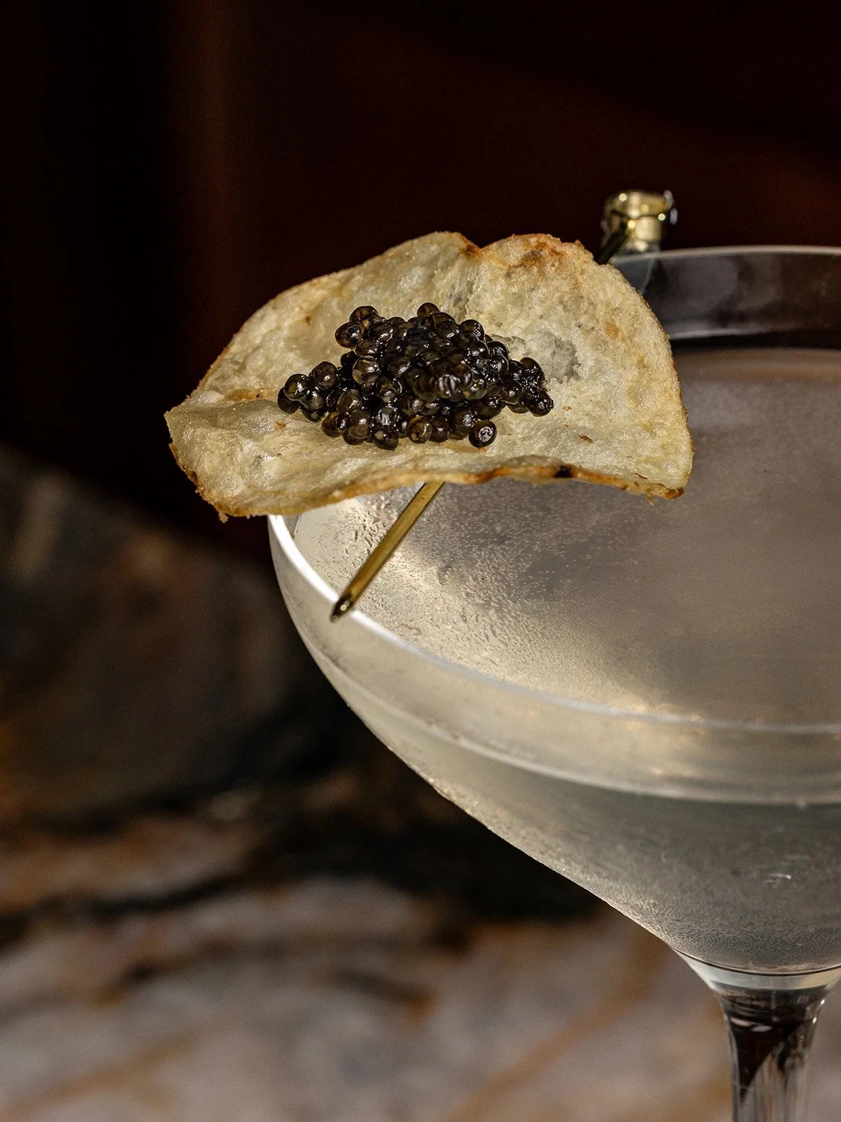
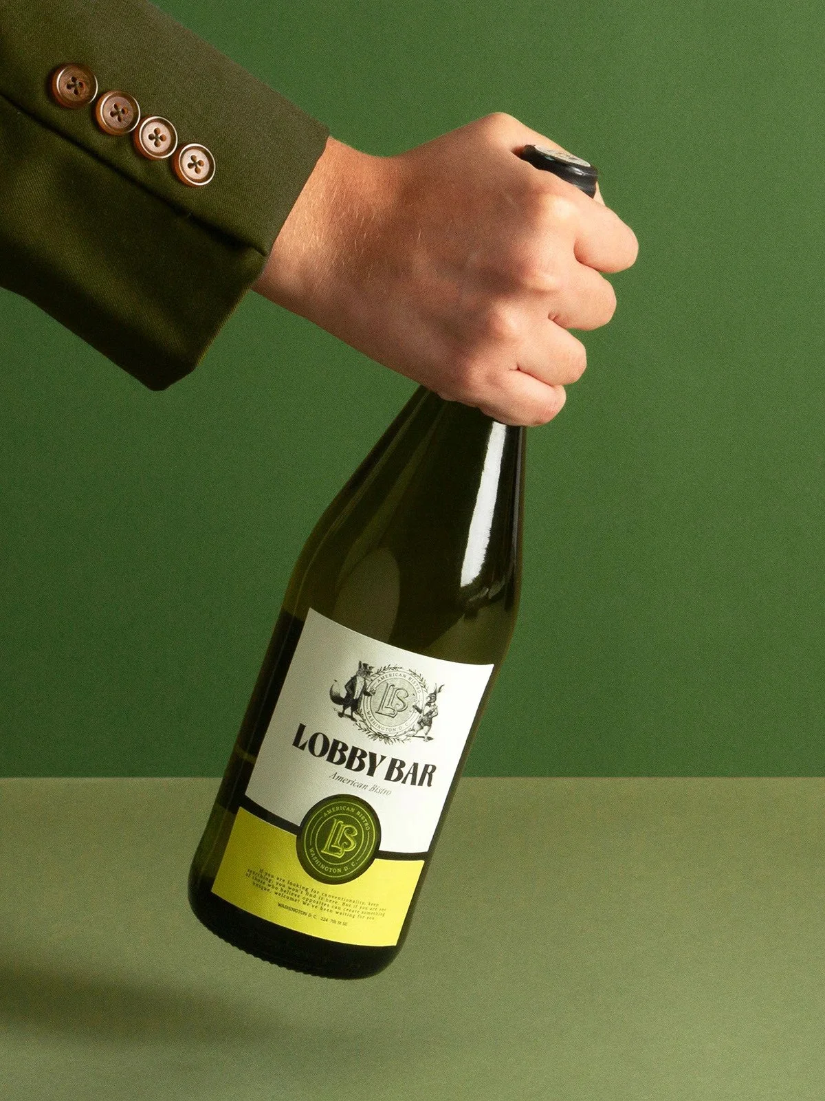
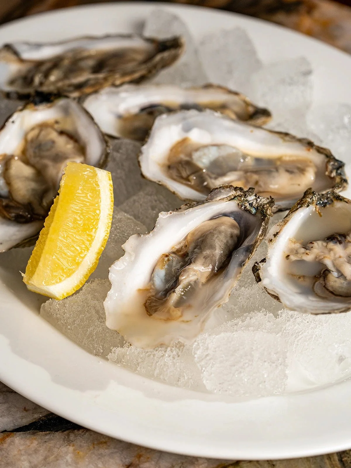
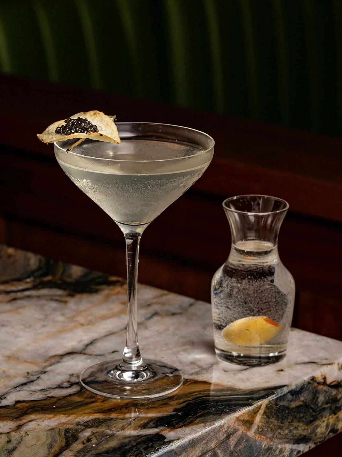
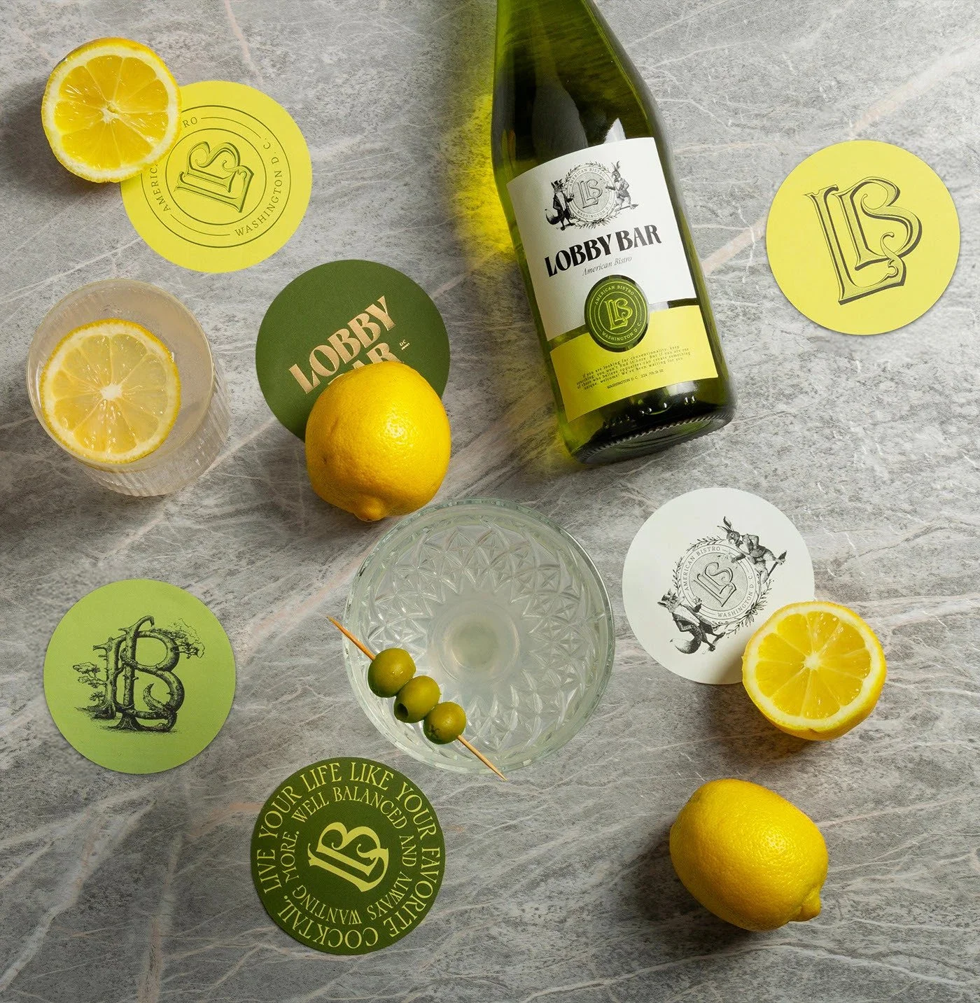
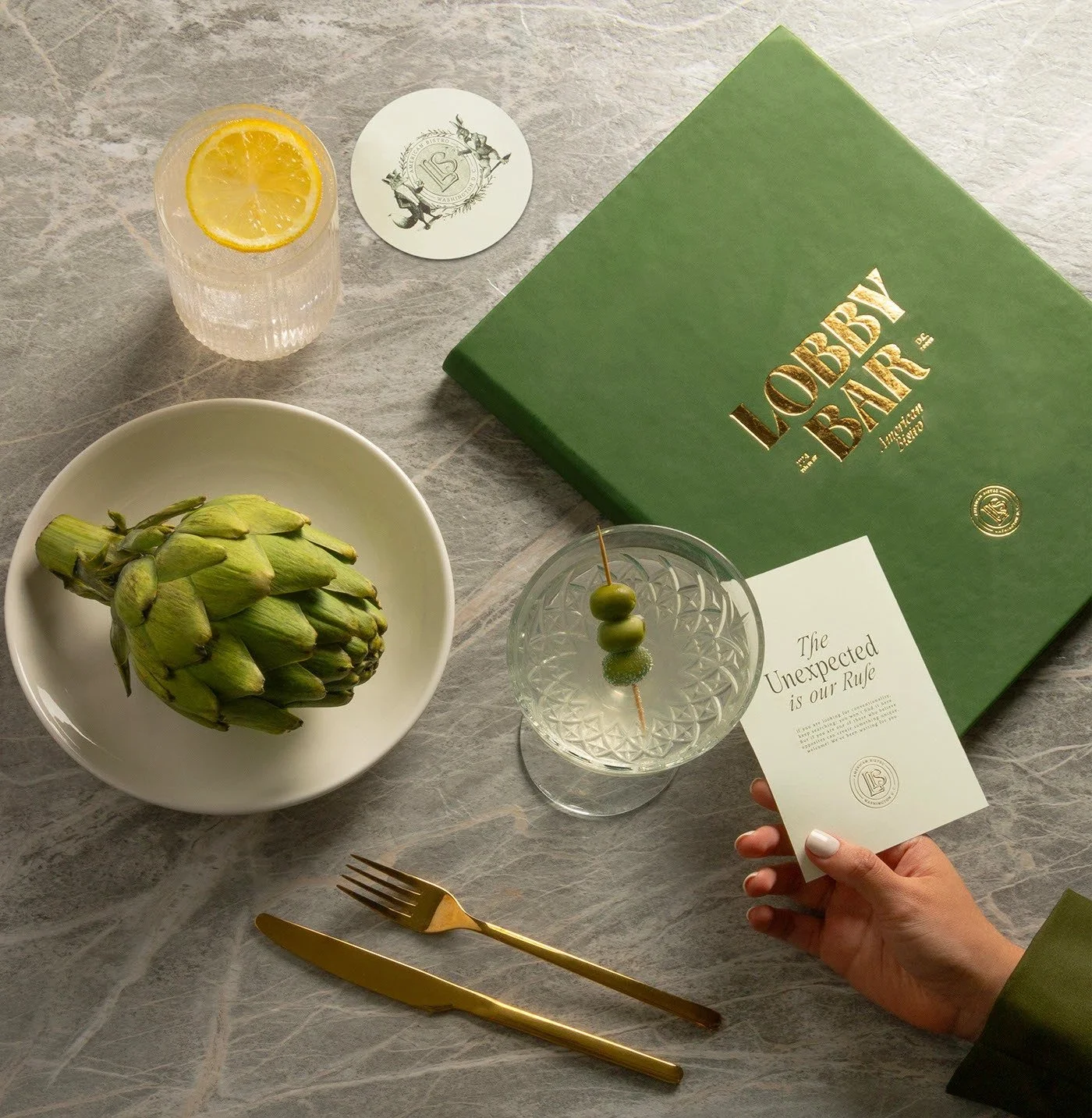
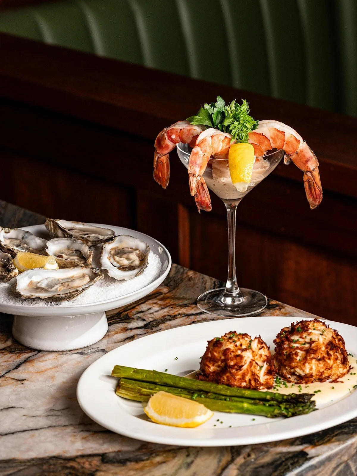
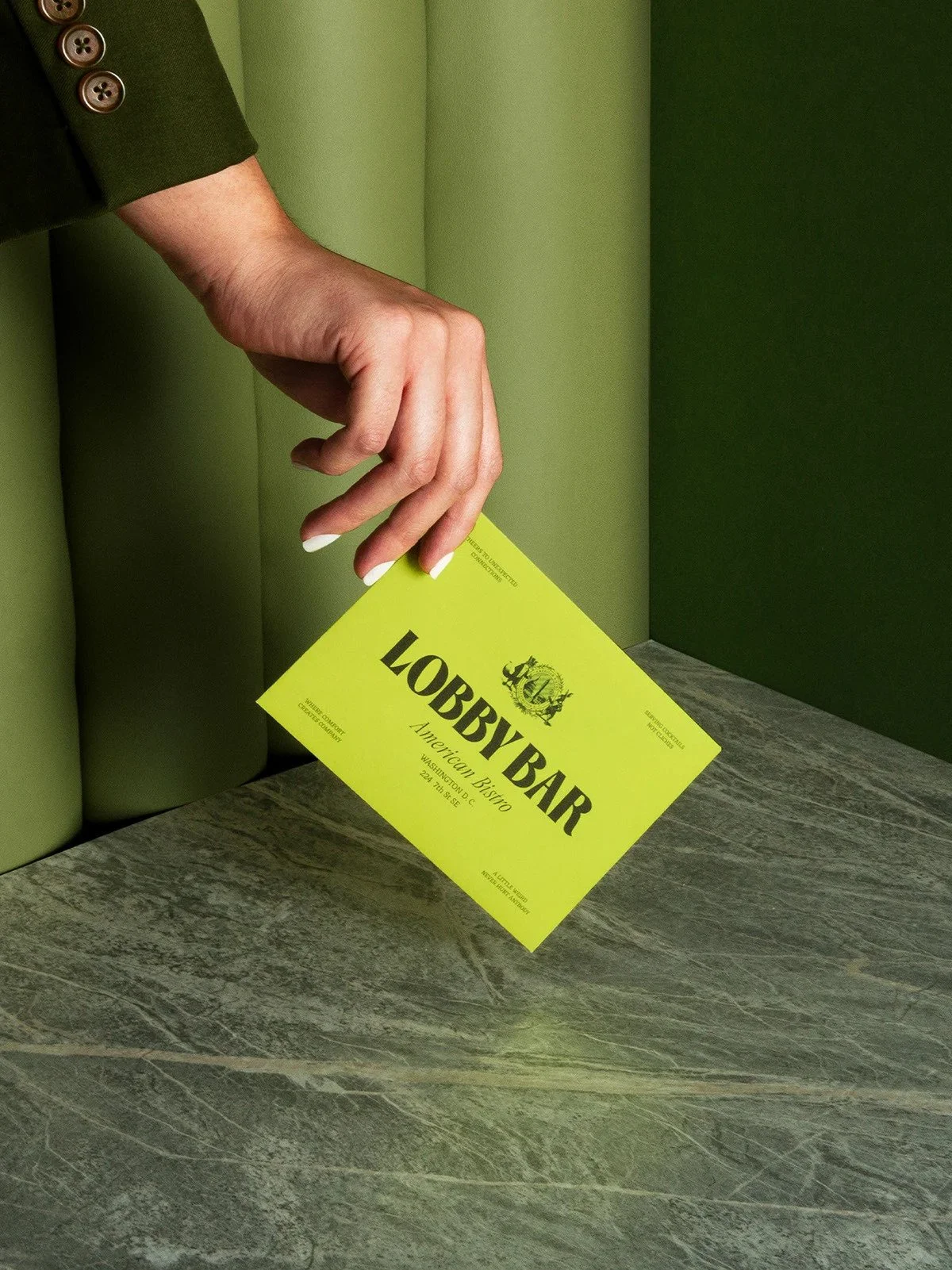
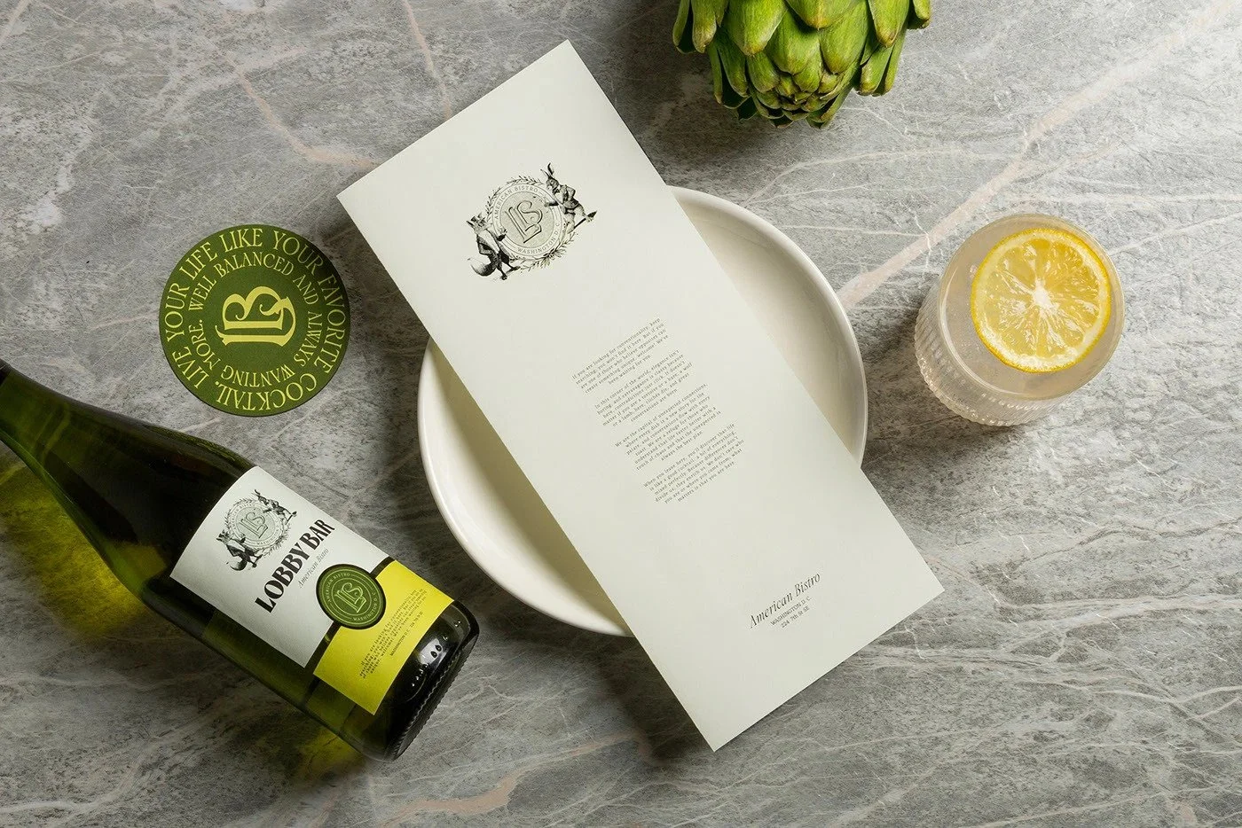
Gold foil stamping. Rich paper textures. Embossed seals. This brand system leans into tactility with zero apology. The physicality of the pieces (menus, business cards, coasters) makes the brand feel high-touch and high-class, without being precious.
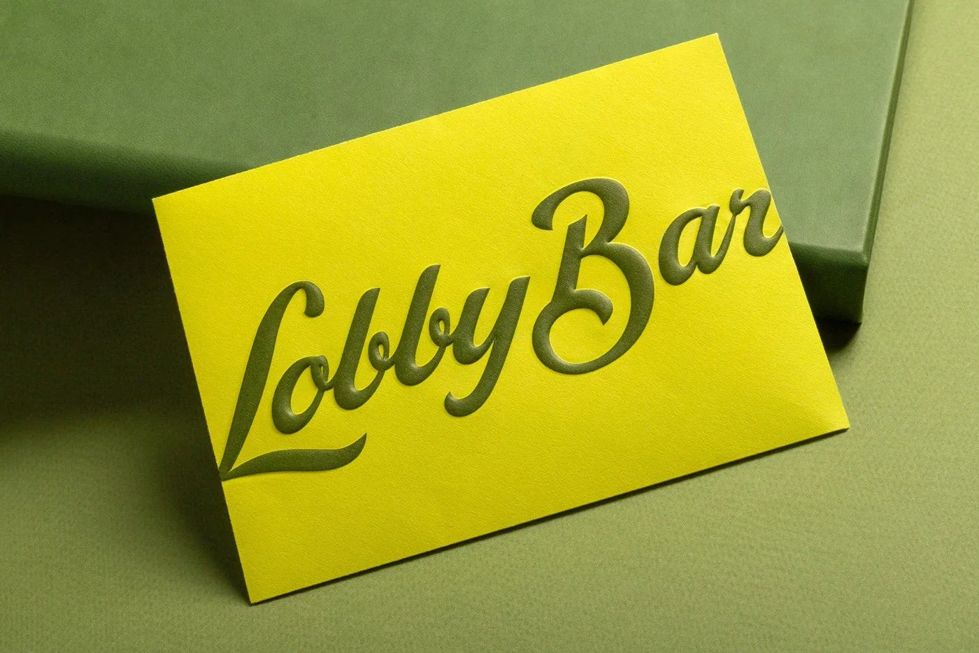
03. Color That Pushes Boundaries
Chartreuse and forest green shouldn’t work. But when paired with deep black ink and crisp white stock, the palette sings. It’s strange, bold, confident—and that’s the whole point.
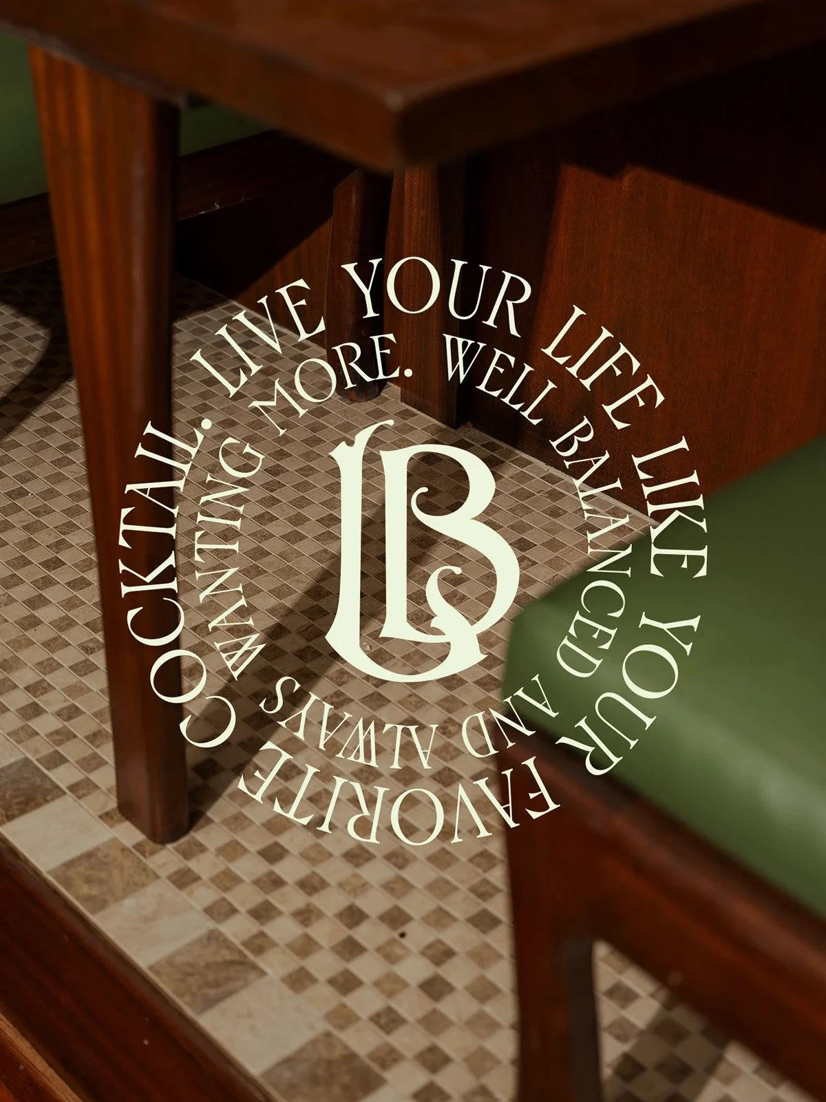
04. Typographic Confidence
“LOBBY BAR” set in a bold serif with dramatic contrast feels pulled from a retro film poster or the spine of a vintage liquor almanac. Paired with clean supporting typography and strong vertical spacing, the system balances visual weight and refinement like a seasoned bartender balances citrus and bitters.
What Could Be Sharper
System Dependence on the Illustrations
Remove the rabbit and the fox and you lose a lot of soul. The core mark and typographic styling hold up, but the brand’s emotional gravity tilts heavily on the narrative illustrations. Without them, it may fall too far into the “nice type, nice paper” category. A digital rollout would need to carefully reimagine their presence.
Scalability in a Real-World Setting
The paper goods are drop-dead gorgeous, but what happens when this brand shows up on a POS screen? On a staff tee? On social? If not handled with the same editorial care, the brand risks looking like a costume without the play.
Best Line in the System
“Serving cocktails, not clichés.”
Cuts through the noise and wraps the whole brand promise in six words. Copy like this builds belief.
Final Take
Lobby Bar is proof that wit and elegance aren’t mutually exclusive. Estudio Albino built a brand system that wears a tuxedo and winks at you at the same time. Every detail feels curated. Every move, deliberate. It doesn’t scream for attention. It invites you in, slides you a menu, and lets the weirdness unfold at its own pace.
This isn’t a bar brand. It’s a world you want to belong to.