Motsa pizza restaurant branding

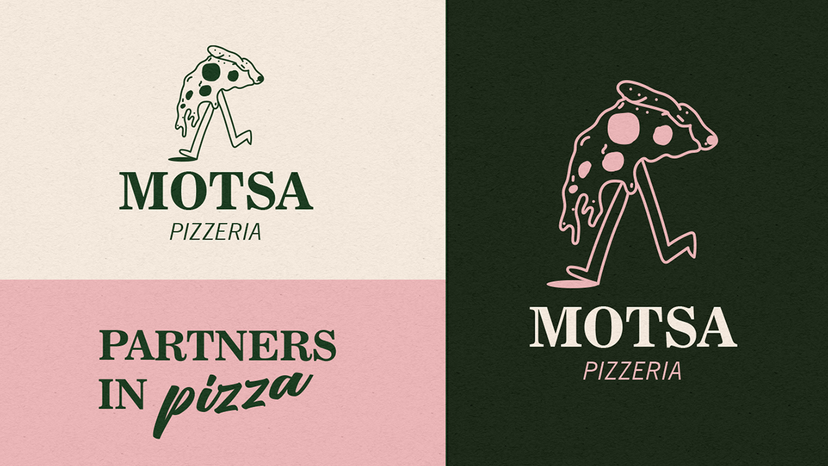
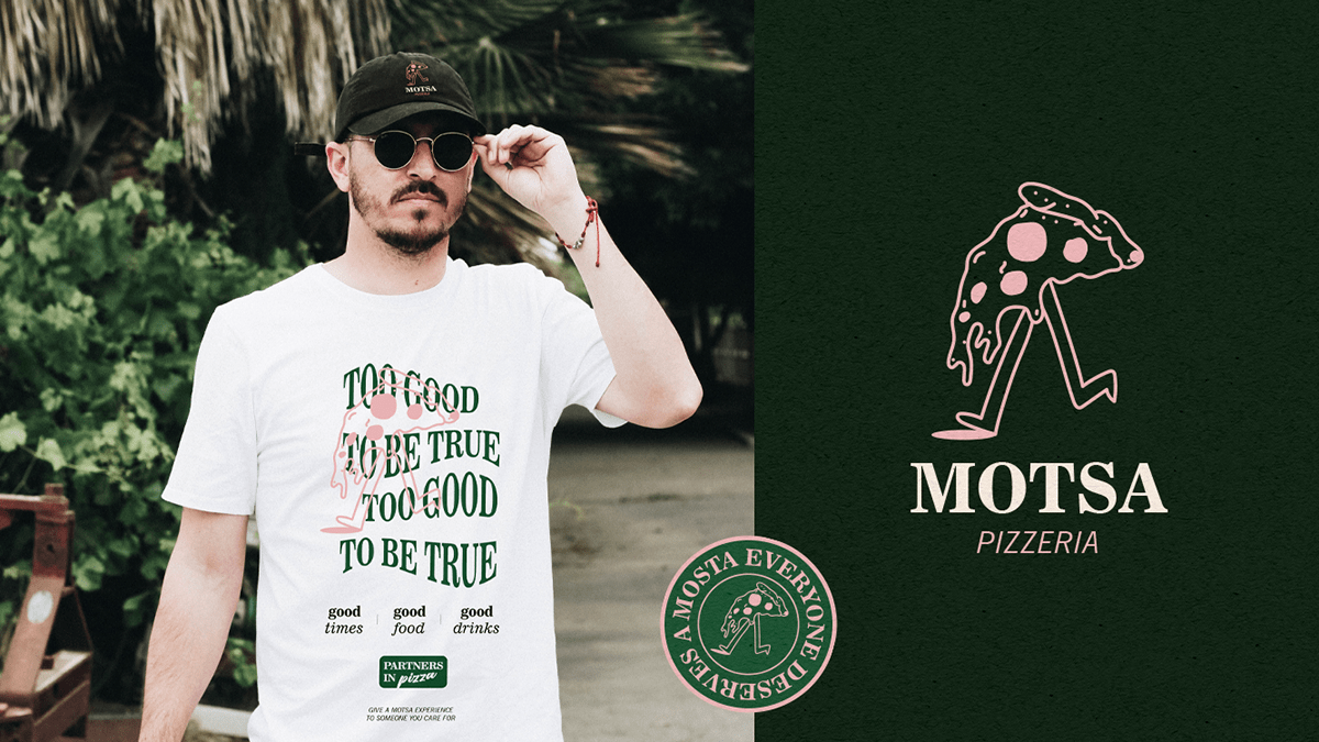
Motsa isn’t slinging your average neighborhood pizza vibes. This brand identity struts into the scene wearing pink and dark forest green—two colors rarely found together in food branding—and makes them look like they’ve been destined for each other all along. It’s the work of Pamela Picoli in collaboration with THE COOL BRANDS CLUB out of Brazil, and it’s a masterclass in balancing attitude with restraint.
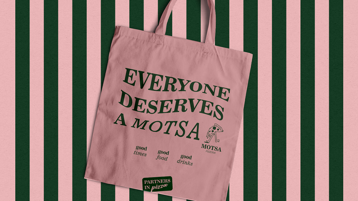
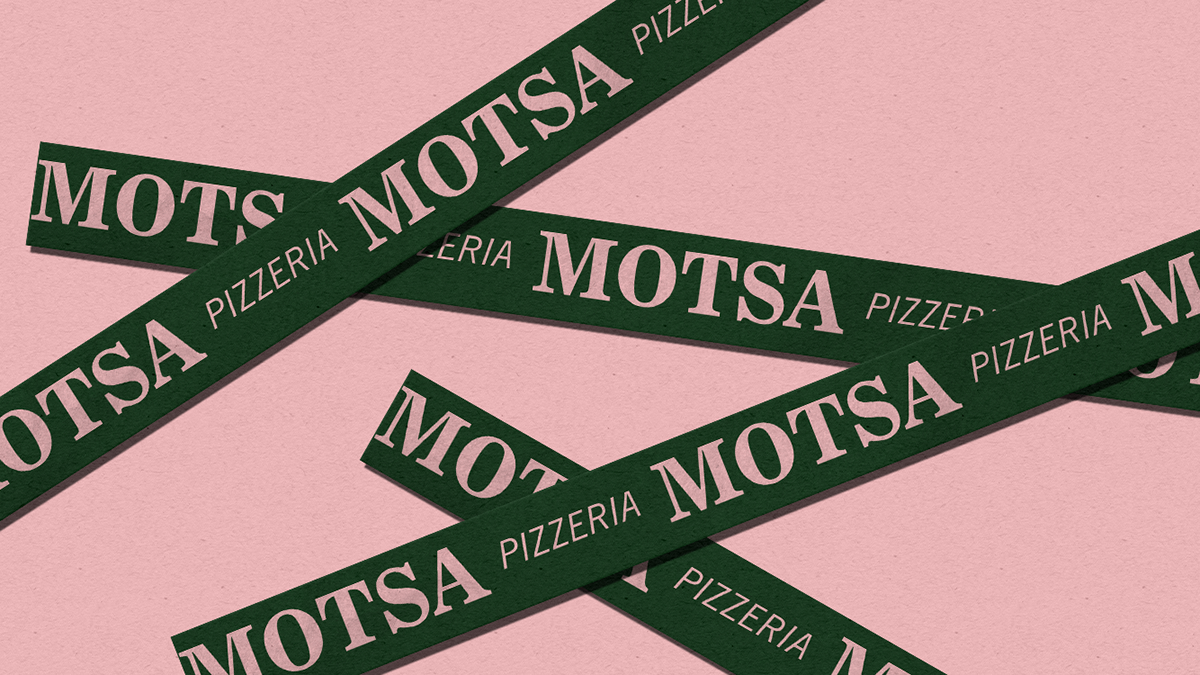
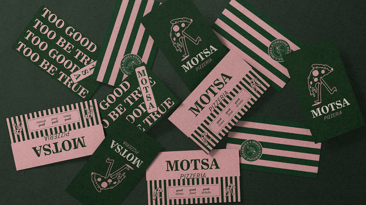
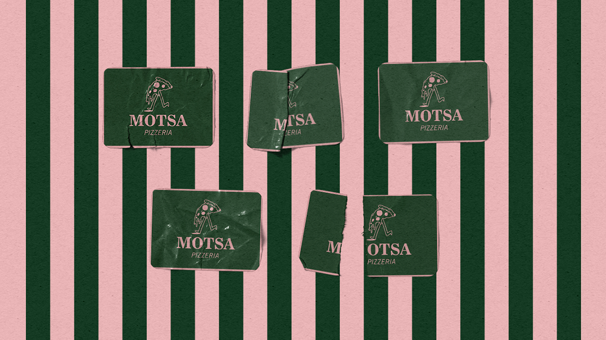
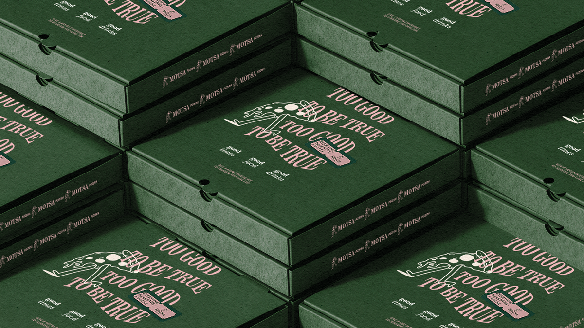
From the jump, the typography reads like a love letter to mid-century charm, but it’s no nostalgia trip. The bold serif headlines keep things grounded, while playful italic treatments inject just enough unpredictability to keep your eyes dancing. Drop in a pizza character—an anthropomorphized slice with legs—and suddenly the whole thing starts breathing. It’s human, it’s cheeky, it’s just a little absurd in the best way possible.
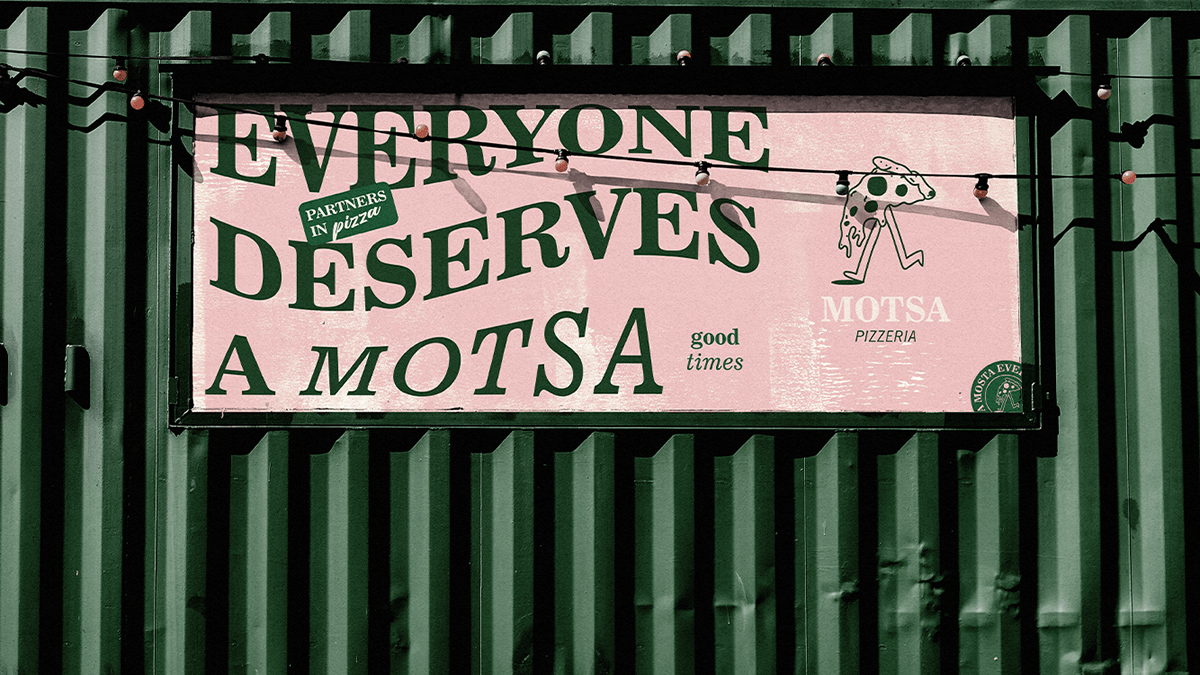
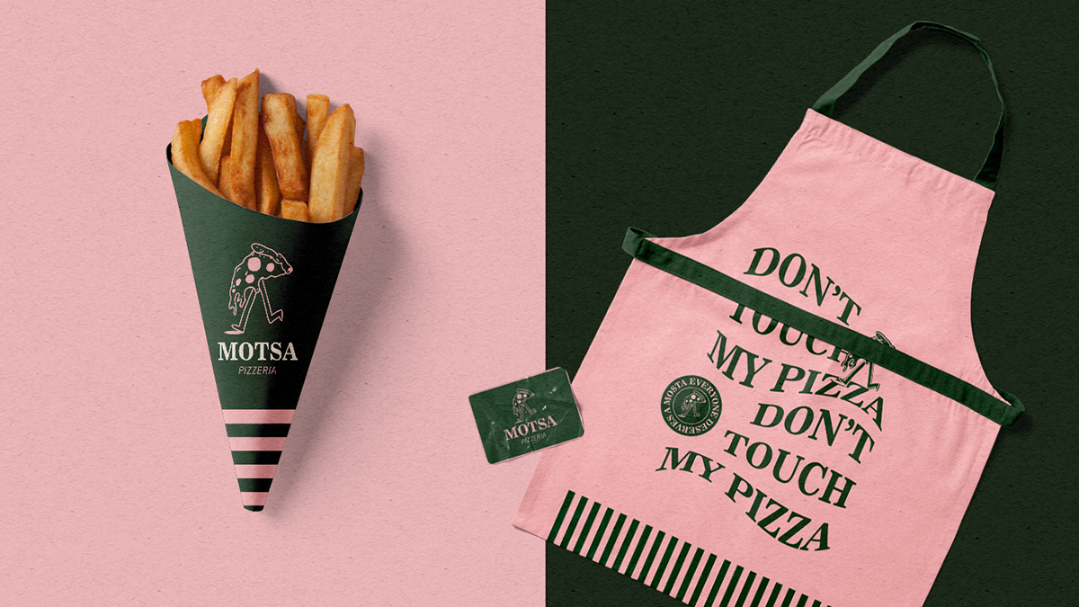
The two-tone palette is the secret weapon. That blush-pink paired with a deep, moody green slices clean through a crowded market of reds and yellows. It photographs beautifully, demands attention on packaging, and sings on social. Across boxes, aprons, signage, and digital touchpoints, the system holds together like a perfectly blistered crust—tight, even, and intentional.
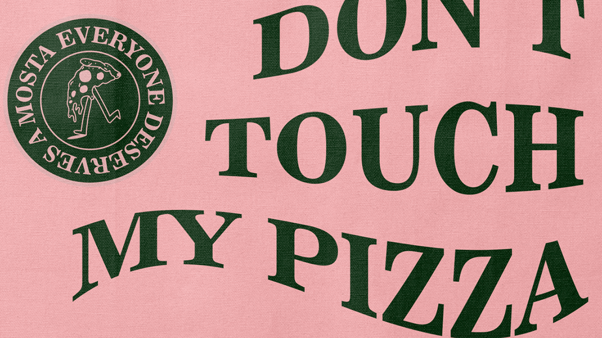
The voice doesn’t whisper. Headlines like “DON’T TOUCH MY PIZZA” slam down personality in caps lock. It’s a defiant, in-on-the-joke energy that sticks, creating a brand experience that’s as much about the attitude as it is about the product.
Still, there are places the dough could proof longer. The italic serif can get finicky at small sizes—menus or quick-glance signage might lose some clarity. And while the two-tone discipline is admirable, it risks feeling flat in applications that demand more visual texture. An accent color or subtle shading could expand the toolkit without breaking its tight rhythm. Lastly, the strong personality needs a dial-down setting for moments where clarity trumps charm—think allergen notes or dense menu sections.
Motsa’s identity doesn’t just position it as a place to eat—it casts it as a personality you want to hang out with. The result is branding that lingers in memory like the scent of wood-fired crust in your hair.