Grub restaurant branding
GRUB doesn’t whisper its presence. It barrels in, ketchup-stained and sunshine-soaked, with branding that practically yells “Take a bite!” from across the street. Dark X Design took the fast-casual burger shop and drenched it in pure dopamine: big type, bold nostalgia, and burger-porn visuals that’ll hijack your cravings on sight.
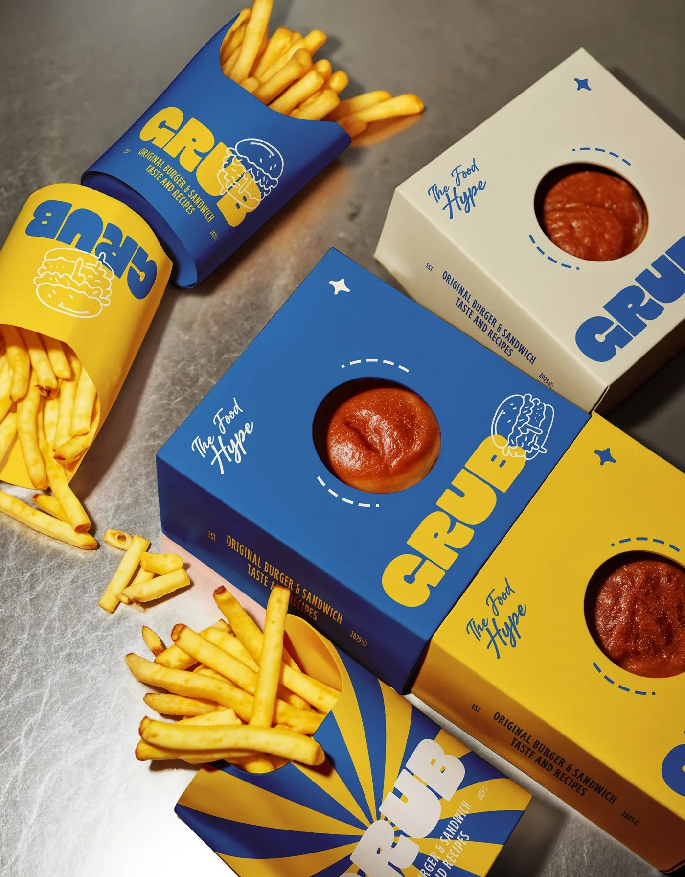
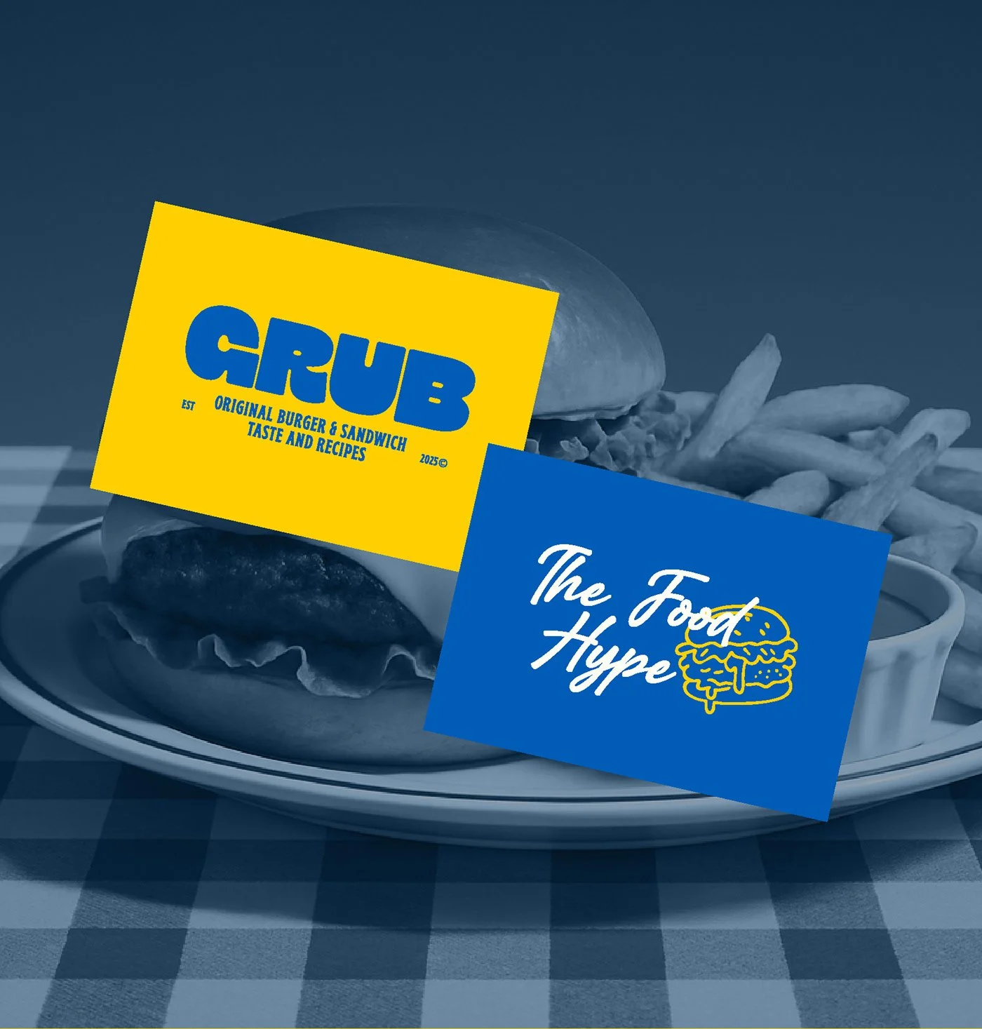
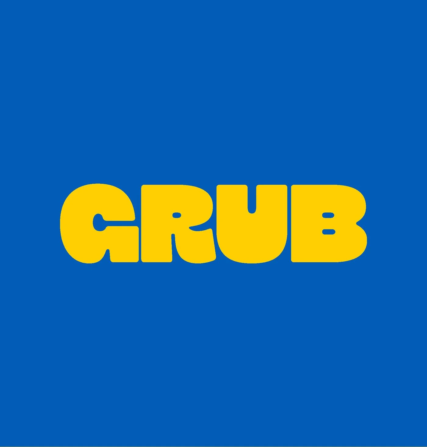
The color palette? Iconic. Blue and yellow aren’t just used—they’re weaponized. Every touchpoint—from the fry cartons to the merch tee—screams cohesion. The typography is a masterstroke in maximalism. “GRUB” in its ballooned slab-serif form carries the bulk of the identity, but never feels overplayed thanks to clever lockups and hand-scripted accents like “The Food Hype” and “Enjoy!”
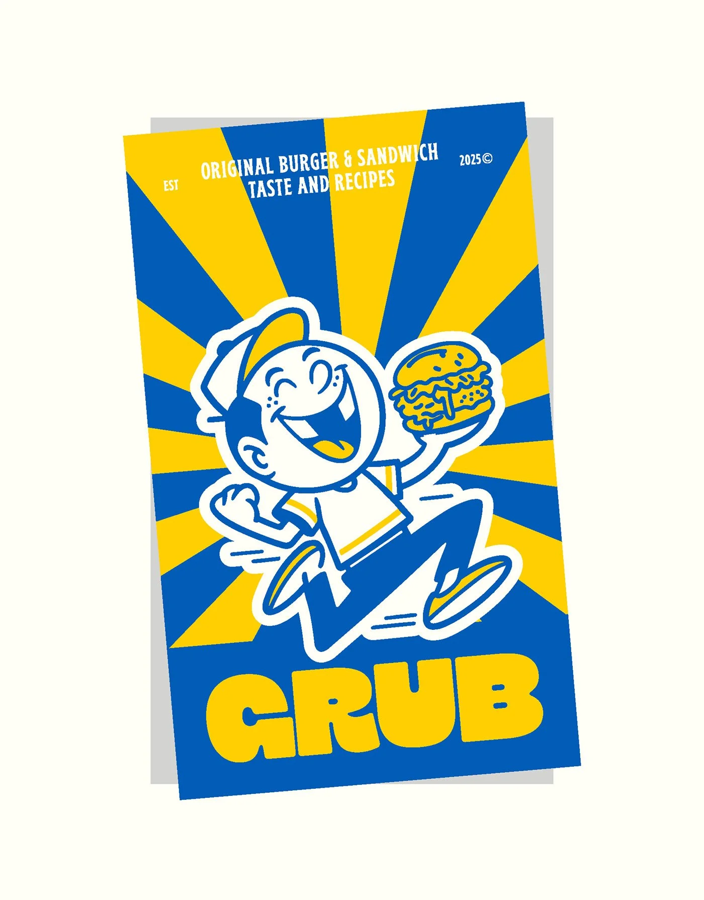
Then there’s the mascot—a joyfully exaggerated, retro cartoon kid running wild with a burger in hand. He feels lifted straight from a 1950s ad but pumped full of Gen Z swagger. It’s a nostalgic throwback with meme-era relevance, avoiding kitsch by going all-in with confidence.
Photography and art direction lean into ultra-saturation, making each image feel cinematic, not stock. The floating packaging shots with checkerboard wraps? Chef’s kiss. And let’s talk packaging—Dark X Design smartly used die cuts, rotating illustrations, and layered logotypes to crank up shelf appeal.
The only critique? A few moments feel more polished than flavorful. While the brand vibe is undeniable, there’s a slight mismatch between the over-the-top optimism of the design and what looks like fairly classic menu fare. It’s less a branding issue and more of a story gap—what sets GRUB’s menu apart from the hundred other gourmet burger joints riding the retro wave?
Still, the execution is so tight it barely matters. GRUB is a love letter to diners, fast food, and food-hyped youth culture—and it hits like a truck full of hot fries and sass.
Agency/Studio Name: Dark X Design