Marianitos food packaging & branding

Who doesn't love a good rebrand. Whether it's an evolution, or revolution, when executed well, a rebrand injects so much life into a legacy brand. Such is the case for the work for Marianitos by Meteorito.
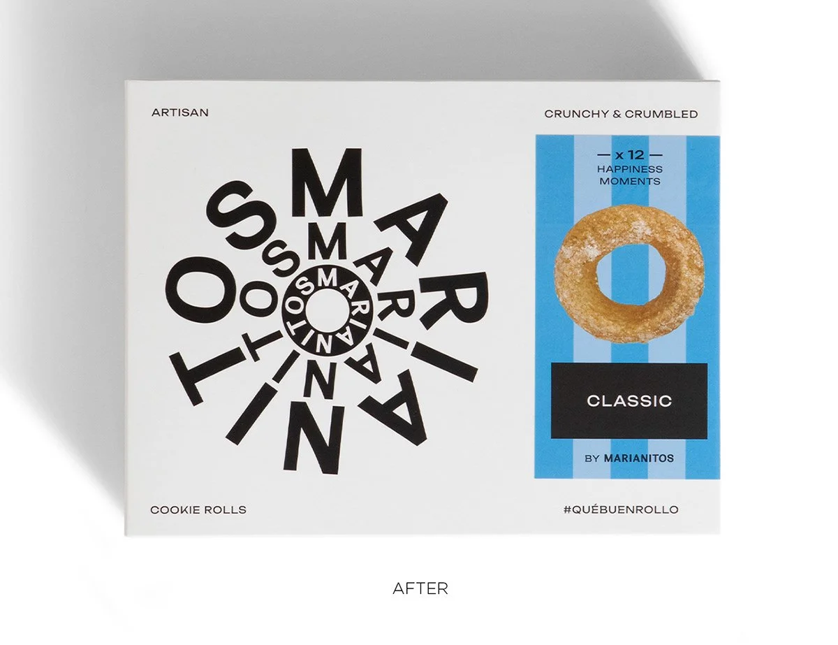
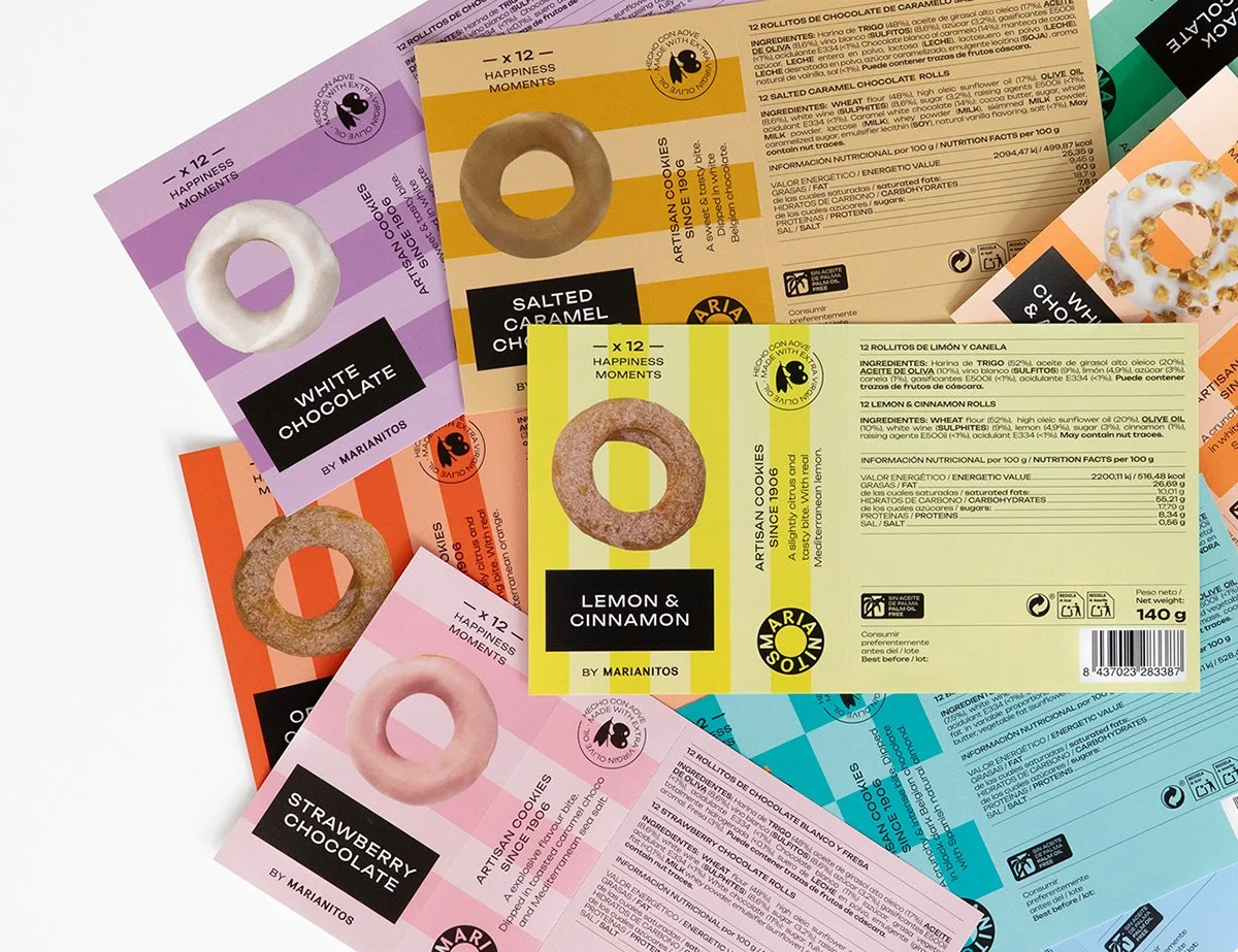
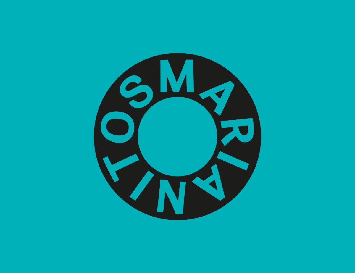
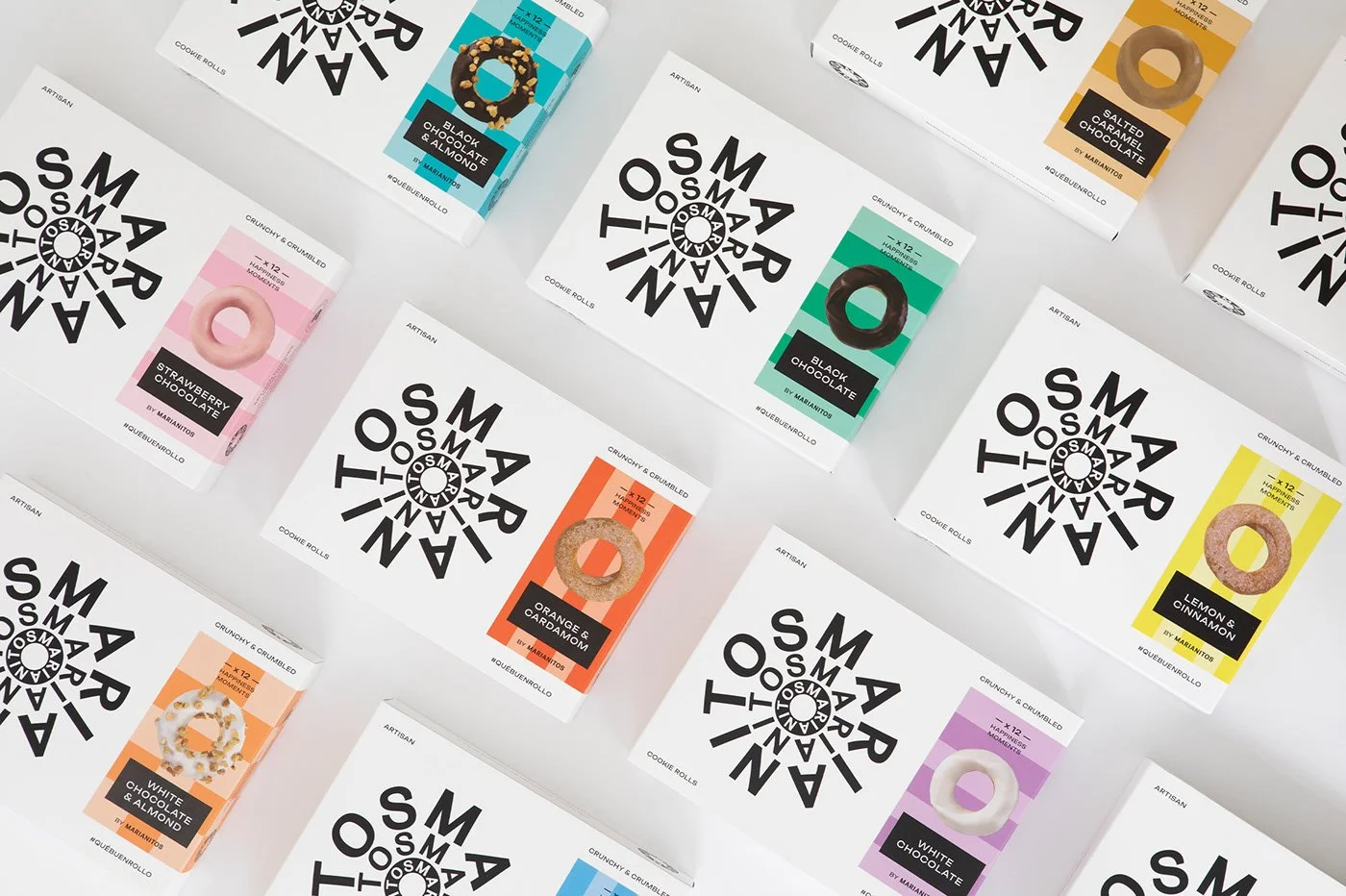
This classic cookie brand is thrust into the modern era with bold, sans-serif typography and a beautiful color palette that pops off of stark white color planes. The typography turns into beautiful concentric circles creating a correlation to the product itself. Color patterns create a categorization device making it easy to find the flavor of choice.
Overall, the new brand is clean and reserved at its base, but breaks out of a would be boredom with brilliant use of color, patterns, typography, and layout techniques.
Designed by Meteorito in Valencia, Spain