Henry's restaurant branding
The restaurant branding design scene has seem to be overrun by a resurgence of the vintage mascot. Classic illustration styles that are jovial and campy seem to adorn a large number of new brand identities. Henry's follows suit with the usage of a mascot, but the design style is different which catches the eye.
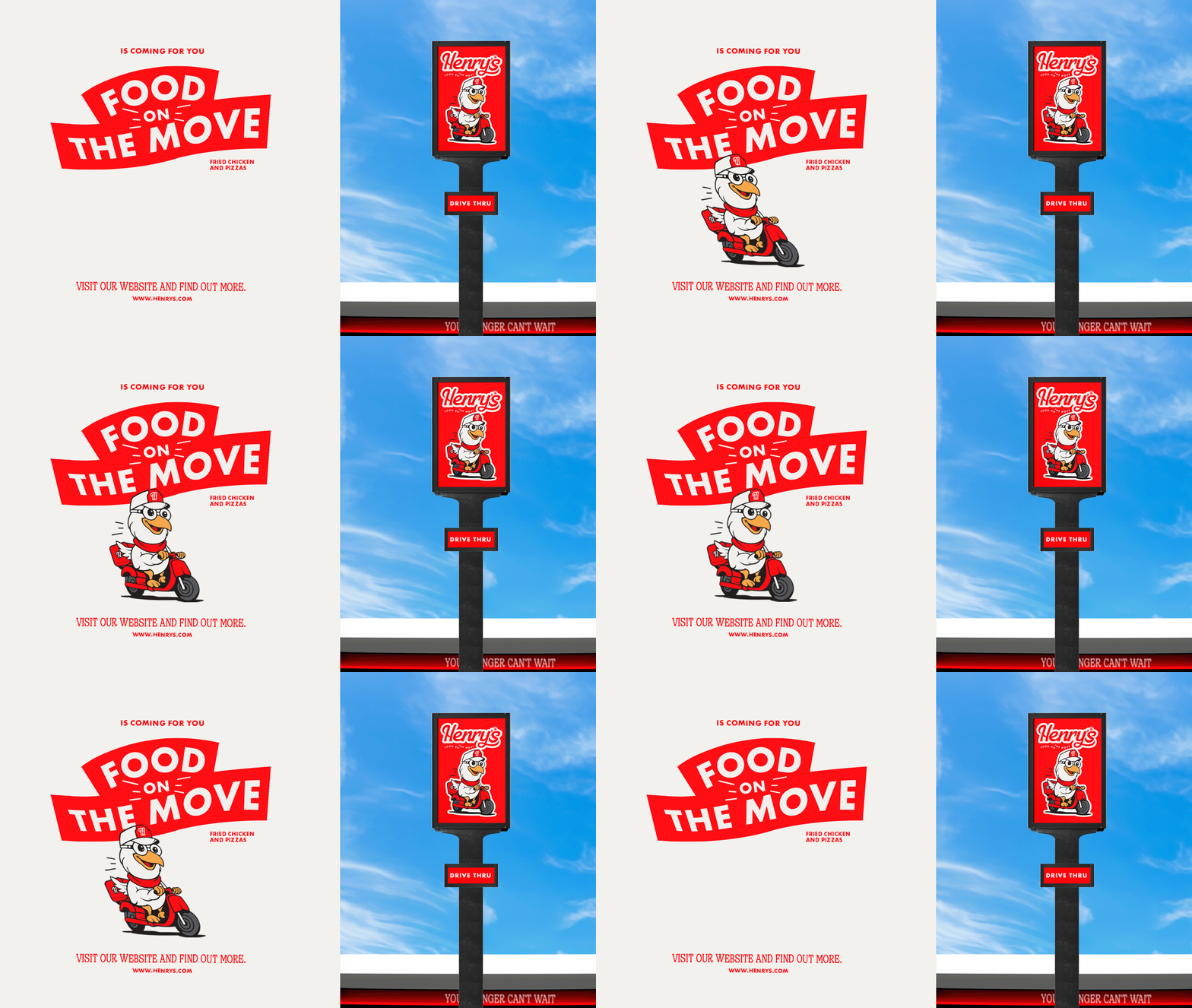
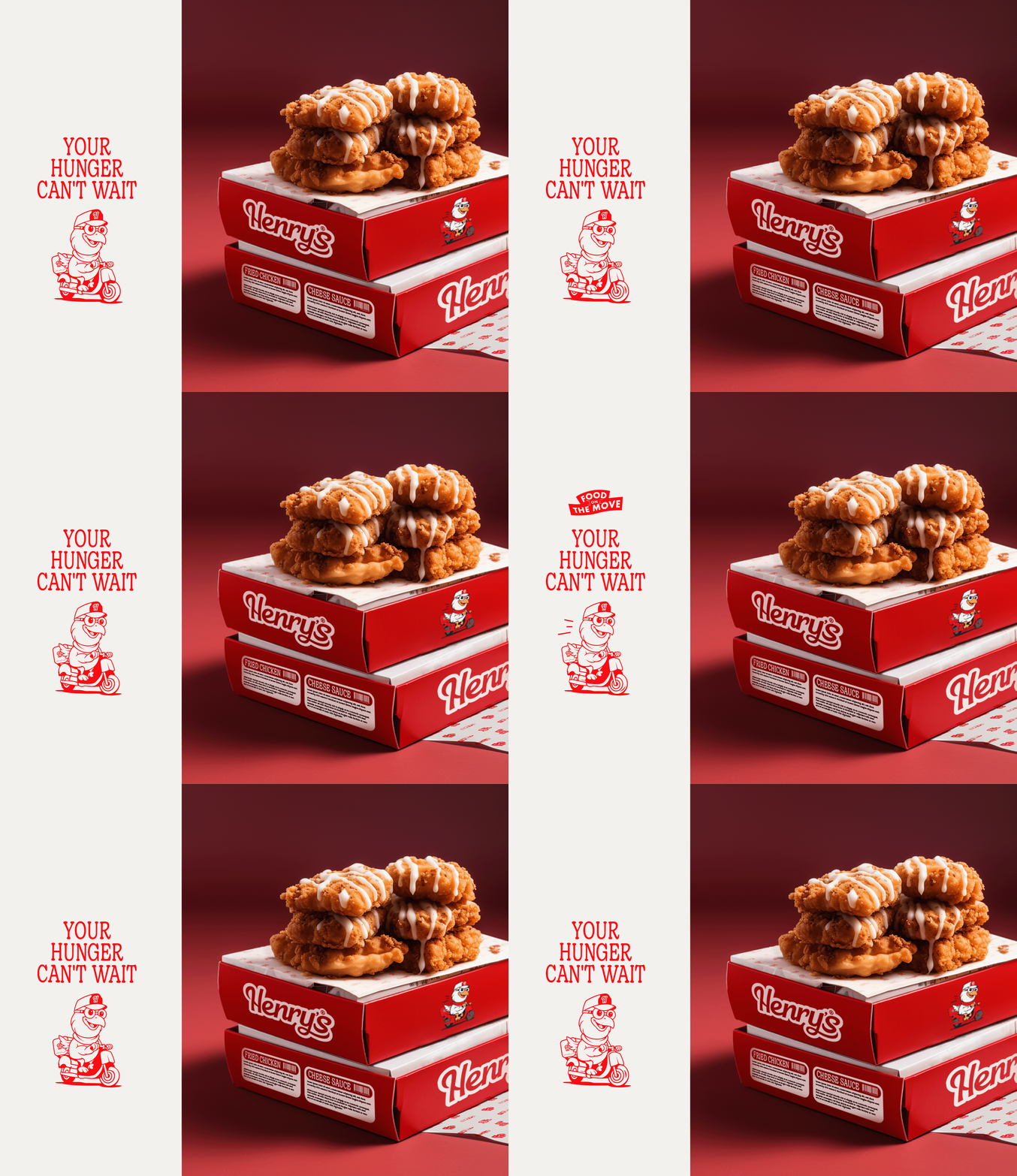
Henry's is a fun concept that sells chicken and waffles. That fun is exemplified in the identity from the scriptlike typography through the chicken mascot that rides a scooter. All of the imagery and type style push the feeling of movement and action which connects to the "food on the move" slogan.
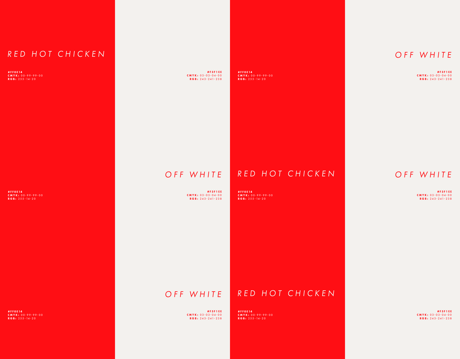
A soft serif typeface adds a throwback feeling to the identity rooting it in the vintage feel. Mixing that with vibrant red and deep red furthers the feeling of energy and high paced vibes.
Designed by Pato in Tatuí, Brazil


